
Most people select a tree topper based on tradition, sentiment, or seasonal whimsy—then hang their lights without considering how the two interact visually. But the topper isn’t just the crown; it’s the visual anchor where light converges, reflects, and resolves. When mismatched with your lighting scheme, even a stunning angel or star can look jarring, washed out, or oddly disconnected from the rest of the tree. A well-chosen topper doesn’t merely sit atop the tree—it completes the lighting narrative: guiding the eye upward, reinforcing color harmony, and lending tonal balance to the entire composition. This requires moving beyond aesthetics alone and thinking in terms of light physics, spatial proportion, and intentional design rhythm.
Understand Your Lighting Scheme First
Before evaluating toppers, audit your lights—not just what they are, but how they behave. Modern LED strings vary widely in color temperature (measured in Kelvin), intensity, diffusion, and dynamic behavior. Warm white (2200K–2700K) emits a candle-like glow with amber undertones; cool white (4000K–5000K) reads crisp and bluish; and true daylight (6000K+) can appear clinical unless balanced intentionally. Multicolor LEDs add another layer: are they saturated RGB, soft pastel, vintage-style muted tones, or programmable with fade effects?
Equally important is light placement density and pattern. Are lights wrapped tightly in concentric spirals (creating even luminance), or spaced loosely for a “starry night” effect? Do you use a mix—say, warm white on lower branches and cool white near the top—or a single consistent string? These decisions dictate how much light reaches the topper and how it interacts with its surface.
Match Color Temperature, Not Just Hue
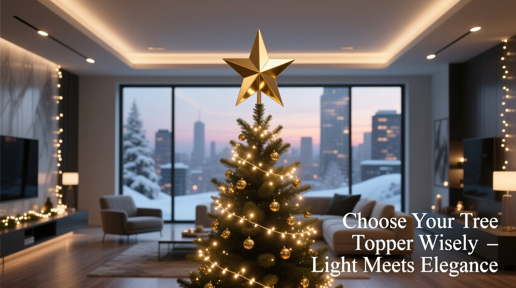
Color matching goes deeper than “gold topper + gold lights.” It’s about aligning the temperature of emitted and reflected light. A warm-white string (2400K) paired with a brushed brass topper creates rich, honeyed highlights. The same brass topper under cool-white lights (4500K) will appear dull, green-tinged, or strangely detached—its warmth visually canceled by the light’s blue bias.
Conversely, a frosted glass or opal resin topper diffuses light gently and reads neutral across temperatures—but only if its base tint is truly clear. Many “white” glass toppers carry faint blue or gray casts that clash with warm schemes. Hold them against a sheet of printer paper under your actual tree lights to check for undertones.
For multicolor schemes, avoid toppers with strong dominant hues (e.g., a vivid red ceramic star). Instead, opt for tonal neutrals—antique silver, matte charcoal, ivory porcelain, or natural wood—that let the surrounding colors shine without competing. As lighting designer Lena Torres notes:
“Topper selection is 70% light physics and 30% symbolism. A cool-toned topper under warm lights doesn’t just look ‘off’—it breaks the thermal continuity of the display, making the whole tree feel like two separate installations stacked vertically.” — Lena Torres, Principal Designer, Lumina Holiday Studios
Scale, Proportion, and Visual Weight
A topper’s physical dimensions must relate meaningfully to both the tree’s height *and* the light density around it. A 6-inch crystal snowflake may vanish on a 9-foot tree lit with dense, bright micro-LEDs—but dominate a 6-foot tree with sparse, low-lumen fairy lights.
Use this proportional guideline: For standard trees (6–7.5 ft), topper height should be 4–7 inches; for tall trees (8–10 ft), 6–10 inches; for slender pencil or slim-profile trees, prioritize width over height—a wide, shallow topper (e.g., a 9-inch diameter woven star) reads larger and balances vertical emphasis better than a tall, narrow spire.
Crucially, consider visual weight, not just size. A lightweight feathered angel with open arms reads heavier than a solid metal orb of equal height because its form occupies more negative space and catches more light scatter. Similarly, a topper with intricate cutouts (like a laser-cut copper star) multiplies perceived presence through layered shadows and backlighting effects—especially when placed above lights angled upward.
| Lighting Density | Ideal Topper Style | Why It Works |
|---|---|---|
| Dense, high-lumen micro-LEDs (e.g., 700+ bulbs) | Medium-weight, reflective materials (brushed brass, mercury glass, faceted crystal) | Reflects abundant light without glare; detail remains legible amid brightness |
| Sparse, low-lumen warm LEDs (e.g., 300 bulbs, 2700K) | Matte, textural, or translucent materials (unglazed ceramic, frosted resin, bleached wood) | Amplifies perceived warmth and softness; avoids looking cold or stark |
| Dynamic multicolor (fade, twinkle, chase modes) | Neutral-toned, geometric, or abstract forms (matte black cone, ivory sphere, brushed nickel spiral) | Provides stable visual grounding amid movement; prevents chromatic overload |
| Vintage-style incandescent or filament bulbs | Ornate, dimensional pieces (hand-blown glass, embroidered fabric, enameled metal) | Matches the craftsmanship and warmth; allows light to glow *through*, not just off, surfaces |
A Step-by-Step Selection Process
Follow this sequence—not as rigid rules, but as a calibrated decision framework:
- Identify your primary light temperature and intensity. Use a color temperature meter app (like Lux Light Meter) or compare your string packaging to known Kelvin references. Note lumen output per bulb if available.
- Assess light distribution. Stand back 6 feet from your lit tree. Does light cluster densely at the top third? Is there a “halo” effect above the tree due to upward-facing lights? This determines whether your topper needs to be highly visible (for sparse coverage) or subtly integrated (for dense coverage).
- Select material family first. Match reflectivity to your light’s behavior: high reflectivity (metal, crystal) for low-intensity or warm schemes needing lift; medium diffusion (frosted glass, matte ceramic) for balanced schemes; low reflectivity (wood, linen-wrapped) for high-intensity or cool schemes needing softening.
- Refine by form and finish. Choose shapes that echo the rhythm of your lights: linear lights (e.g., curtain strings) pair well with angular toppers (geometric stars, origami cones); clustered lights (e.g., net lights) suit organic forms (birch bark spirals, dried citrus wreaths). Finish should harmonize—brushed over polished for warm schemes; satin over glossy for cool schemes.
- Test in situ before finalizing. Place candidate toppers on the tree for 24 hours. View at different times: early evening (when ambient light fades), full dark, and during any programmed light sequences. Note where reflections flare, where detail disappears, and where the eye naturally rests.
Real-World Example: The Urban Apartment Tree
Maria lives in a 650-square-foot downtown loft with large north-facing windows and minimalist Scandinavian decor. Her tree is a 7-foot Nordmann fir in a black iron stand. She uses 500 warm-white micro-LEDs (2400K) wrapped tightly from base to tip—chosen for energy efficiency and subtle glow, not sparkle. Initially, she selected a 9-inch antique-gold wire star. Under her lights, it looked flat and slightly yellowed, its fine wires nearly invisible against the dense branch coverage.
She pivoted using the principles above: recognizing her lights were warm but low-contrast, she chose a 6.5-inch hand-blown glass orb in “amber smoke”—a translucent, gradient-tinted glass that glowed softly when backlit. Its smooth curve caught ambient window light during the day and diffused her warm LEDs evenly at night. The result wasn’t brighter, but deeper: the topper became a quiet focal point that unified the tree’s warmth with the room’s cool-toned architecture. “It doesn’t shout,” she says. “It settles. Like the tree finally took a breath.”
Common Pitfalls & What to Avoid
- Avoid “matching set” temptation. Pre-packaged tree sets often include toppers designed for generic warm-white strings—not your specific Kelvin, lumen count, or wrapping technique. They rarely account for real-world light interaction.
- Don’t overlook stem visibility. A topper’s mounting stem (usually metal or plastic) becomes a visual line drawing attention downward. If your lights are cool-white, a silver stem blends; if warm-white, a brass or copper stem maintains continuity. Black stems work universally but read heavy on delicate toppers.
- Resist over-personalization at the expense of cohesion. A beloved heirloom topper deserves pride of place—but if its color temperature clashes severely (e.g., a 1970s chrome angel under modern 3000K LEDs), consider re-wiring it with warm micro-bulbs inside its frame or adding a removable diffuser sleeve of silk organza.
- Ignore “trend” materials without testing. Shiny acrylic toppers look vibrant in studio photos but often create harsh hotspots under real LED strings. Matte-finish ceramics photograph softly but can disappear entirely on trees lit with cool, directional lights.
FAQ
Can I use the same topper with different light schemes year to year?
Yes—if it’s tonally neutral and physically versatile. A 7-inch matte charcoal ceramic star works with warm whites (by absorbing and deepening warmth), cool whites (by providing contrast and grounding), and even monochrome RGB (by acting as a non-reflective anchor). Avoid strongly colored, highly reflective, or ultra-detailed toppers if you plan to rotate lighting schemes.
My lights have a slight green or purple tint. How do I compensate?
This is common with budget LED strings due to poor phosphor coating. Neutralize it by selecting a topper with an opposing undertone: a faintly pink-tinged ivory porcelain topper counters green bias; a soft lavender-hued frosted glass topper balances purple cast. Avoid pure white or metallic toppers—they’ll amplify the tint.
Do fiber optic or projection toppers change the rules?
They invert them. Fiber optic toppers (e.g., light-up snowflakes) emit their own light, so match their output temperature—not their housing color—to your tree lights. Projection toppers (which cast patterns onto ceilings) require zero color matching but demand careful placement: ensure no light strings run directly behind them, as stray bulbs will distort the projected image.
Conclusion
Your Christmas tree topper isn’t a final flourish—it’s the compositional keystone. When chosen with intention toward your lighting scheme, it transforms from ornament to orchestrator: unifying color, directing light flow, and lending quiet authority to your holiday aesthetic. It asks you to see light not just as illumination, but as material—something you shape, temper, and conduct. That shift in perspective turns decoration into design.
You don’t need expensive gear or professional training to begin. Start tonight: turn off your overheads, power up your tree lights, and hold three topper candidates side by side. Watch how each catches, bends, and absorbs the light. Notice where your eye lingers—and where it skips. That pause, that resonance, is your signal.


 浙公网安备
33010002000092号
浙公网安备
33010002000092号 浙B2-20120091-4
Comments
No comments yet. Why don't you start the discussion?