
Christmas decor is rarely accidental. From the precise spacing of ornaments to the intentional layering of ribbons and garlands, every element reflects a curated vision. Yet many overlook one of the most visible—and personal—canvases in holiday presentation: the nails. Your manicure isn’t just an accessory; it’s a micro-expression of your entire festive aesthetic. When your tree glows in deep emerald and antique gold, or shimmers in icy silver and frosted lavender, mismatched nails can unintentionally fracture that harmony. Coordinating nail art with your tree’s color scheme isn’t about rigid matching—it’s about resonance. It’s about translating the mood, texture, and intention behind your tree into wearable art that feels intentional, polished, and quietly joyful.
Why Color Coordination Matters Beyond Aesthetics
Color psychology plays a subtle but powerful role during the holidays. Warm tones like burgundy, burnt orange, and brass evoke nostalgia, comfort, and hearthside intimacy. Cool schemes—think pine green, slate blue, and pearl white—suggest crisp winter air, quiet reverence, and modern elegance. When your nails echo those emotional cues, they reinforce your environment rather than compete with it. This alignment creates visual continuity across photos, video calls, and in-person gatherings—making your personal style feel considered and calm, even amid seasonal chaos. Designers and stylists consistently observe that guests subconsciously perceive coordinated details as markers of intentionality and care. As interior stylist Lena Torres notes in her 2023 holiday design workshop: “The smallest repeated motif—a ribbon hue on a gift tag, the same metallic in a candle holder and a cufflink—builds trust in the space. Nails are no exception. They’re the punctuation at the end of every gesture.”
Decoding Your Tree’s True Palette
Most people describe their tree using broad terms: “green and red,” “white and silver,” or “rust and cream.” But effective coordination requires moving beyond labels to identify actual pigments, undertones, and proportions. A “red” ornament may be true cadmium red, muted brick, or glossy cherry. A “green” tree might lean cool (blue-based) or warm (yellow-based). Even “white” lights vary—from stark LED cool white to warm incandescent ivory.
Here’s how to extract your tree’s authentic palette in five minutes:
- Observe under consistent light: Turn off decorative lighting and view your tree near a north-facing window or under neutral white bulbs.
- Isolate three anchor colors: Choose one base (e.g., tree green or faux-snow white), one accent (e.g., mercury glass silver or cranberry velvet), and one metallic or neutral (e.g., brushed brass, matte black, or raw linen).
- Test undertones: Hold a pure white sheet of paper beside each color. Does the green make the paper look bluer (cool) or yellower (warm)? Does the red lean purple (cool) or orange (warm)?
- Assess dominance: Estimate the visual weight of each color—roughly 60% base, 30% accent, 10% metallic is a balanced ratio for nail design.
- Consider texture: Glossy ornaments call for high-shine polishes; matte burlap ribbons pair beautifully with velvety matte or satin finishes.
Matching Strategies: From Literal to Interpretive
Coordination exists on a spectrum—from exact replication to poetic abstraction. Choose the approach that suits your skill level, time, and personal style.
| Approach | Best For | Nail Execution Example | Pro Tip |
|---|---|---|---|
| Direct Echo | Beginners, minimalist trees, monochromatic schemes | Single-color polish matching the tree’s primary green or red; add one accent nail with a tiny foil ornament or holly berry. | Use a fine striper brush to outline a single branch silhouette in contrasting metallic on one nail. |
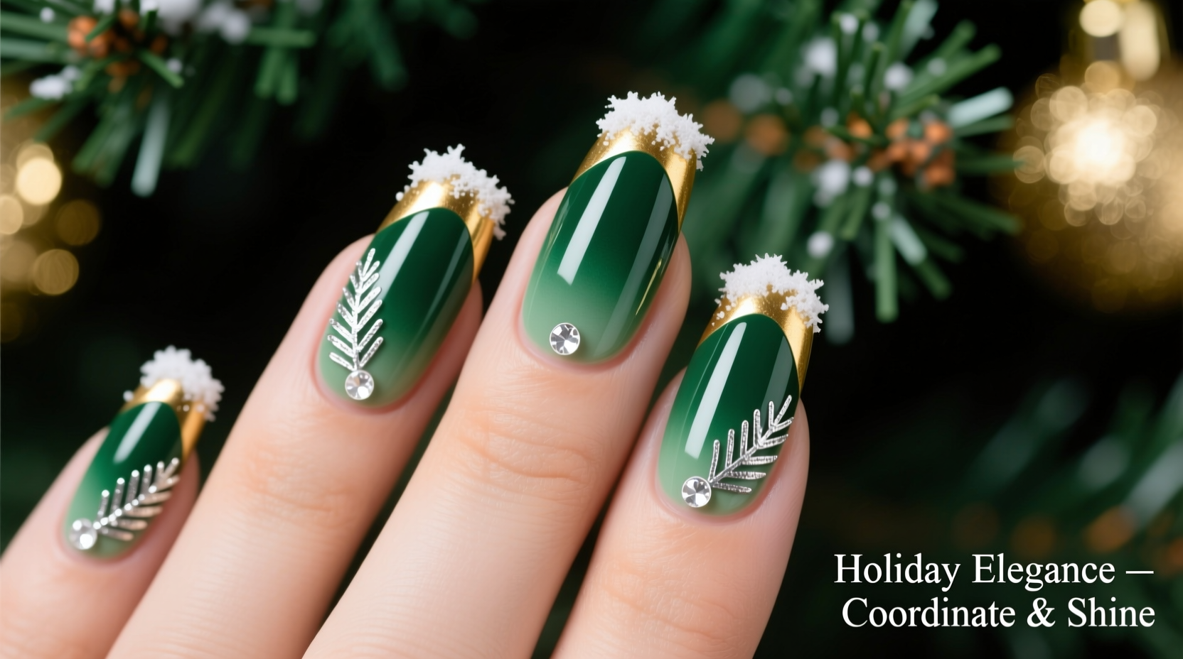
| Complementary Harmony | Trees with strong contrast (e.g., navy + gold, forest green + terracotta) | Base coat in tree green, accent nails in terracotta with gold micro-glitter; negative-space snowflakes in white on two nails. | Avoid equal distribution—let one color dominate 4 nails, the second appear on 1, and the third on just the ring finger. |
| Seasonal Translation | Non-traditional trees (black & white, blush & sage, indigo & copper) | Matte charcoal base, iridescent blue-to-purple shift polish on ring finger, copper foil crescents on pinky. | Reference natural winter elements—frost patterns, pine resin sheen, birch bark grain—to guide texture choices. |
| Mood-Based Abstraction | Abstract or sculptural trees (geometric metal, dried botanicals, sculpted white branches) | Clear base with scattered chrome flakes mimicking light reflection; one nail with asymmetrical white line art suggesting bare branches. | Let the *feeling* of your tree guide you: Is it serene? Use soft gradients. Playful? Try unexpected pops (e.g., lime green on a navy tree for whimsical contrast). |
Step-by-Step: Building Your Coordinated Manicure in Under 90 Minutes
This timeline assumes basic nail prep and intermediate polish application skills. Adjust timing for gel or intricate stamping.
- Prep (10 min): Shape nails, push cuticles, lightly buff surface, clean with alcohol. Apply pH-balancing primer if using gel.
- Base & Dry (20 min): Apply two thin coats of your chosen base color (e.g., “Pine Forest” emerald). Let dry fully—don’t rush this step; smudging ruins cohesion.
- Accent Nail Prep (5 min): While base dries, sketch your accent design on paper. Gather tools: dotting tool, fine brush, glitter topcoat, and your accent polish (e.g., “Cranberry Glaze”).
- Accent Application (25 min): Paint accent nails first (they require precision). Use tape or stickers to protect surrounding nails. Apply one coat of accent polish, then immediately add texture: press micro-glitter, drag a dry brush for marbling, or stamp a tiny motif.
- Detailing & Finishing (20 min): Once all polish is touch-dry, add fine details: white snowflakes with a dotting tool, gold foil accents using tweezers, or delicate line art. Seal with high-gloss topcoat—or matte for modern schemes.
- Final Review (10 min): Step back. View nails beside your tree in natural light. Do they feel like part of the same world? Adjust only if tone or saturation feels off—not if it’s merely different.
Real-World Case Study: The “Midnight Blue & Gilded Pine” Tree
Sarah, a graphic designer in Portland, installed a 7-foot Fraser fir adorned with hand-blown midnight blue glass balls, gilded pinecone clusters, and unlit ivory candles wrapped in raw linen. Her initial instinct was to paint nails “blue and gold”—but swatches looked flat and costume-y. Instead, she followed the palette-decoding method: she identified the tree’s true base as a deep, slightly violet-leaning navy (not cobalt), the gold as antique—not bright yellow—and the linen as oatmeal, not stark white.
Her solution? A sheer navy base with subtle blue-to-violet shimmer, applied in three thin layers for depth. On her ring finger, she used a matte gold foil transfer over a clear base, then pressed crushed walnut shell for organic texture. Her pinky featured a single, imperfect white line mimicking candle wax drip—painted freehand with a 000 brush. The result wasn’t “matching” so much as *belonging*: in photos, her hands looked like natural extensions of the tree’s quiet luxury. Guests repeatedly commented on the “cohesive calm” of her setup—without ever noticing the nails first.
Common Pitfalls & How to Avoid Them
Even with thoughtful planning, coordination can falter. Here’s what derails most attempts—and how to course-correct:
- Pitfall: Matching only the lights, not the tree. Fairy lights distort color perception. Fix: Turn them off before selecting polishes.
- Pitfall: Ignoring nail shape and length. Long stiletto nails amplify bold colors; short square nails suit subtler textures. Fix: Adapt design scale—tiny holly berries work on short nails; large geometric patterns need length.
- Pitfall: Overloading with motifs. Three different symbols (snowflake, star, bow) compete visually. Fix: Choose one signature motif and repeat it minimally—e.g., a single snowflake on the ring finger only.
- Pitfall: Forgetting skin tone. A “perfect match” to your tree may wash out your complexion. Fix: Test polish on your hand—not just the bottle—in the same lighting as your tree. If it dulls your skin, choose a lighter/darker value within the same hue family.
FAQ
Can I coordinate nails with a non-green tree—like a white, black, or gold artificial tree?
Absolutely—and often more elegantly. White trees invite pearlescent, opalescent, or iridescent polishes that catch light like frosted branches. Black trees create dramatic contrast for jewel tones (ruby, sapphire, amethyst) or metallics (rose gold, gunmetal). Gold trees shine alongside rich neutrals (charcoal, cocoa, oyster) with subtle gold shimmer—avoiding literal gold-on-gold, which reads flat.
My tree has multiple clashing colors (e.g., red, green, blue, silver). What do I pick?
Identify the *dominant* color by area coverage—not ornament count. Often, green boughs or white branches constitute 60–70% of visual mass. Use that as your base. Then select the most saturated or emotionally resonant accent (e.g., if blue ornaments are hand-painted ceramic, use that blue—not the cooler, cheaper plastic red). Let the rest recede into background harmony.
How long will this coordination stay relevant? What if I change my tree next year?
Well-chosen holiday palettes have longevity. Deep emerald, charcoal, and antique gold reappear across decades of design. Focus on timeless pigments and natural references (pine, frost, berry, birch) rather than trend-driven shades (e.g., neon tinsel green). Your 2024 nails won’t clash with your 2027 tree—they’ll simply evolve, like your decor sense.
Conclusion
Your Christmas tree is more than decoration—it’s a statement of presence, memory, and care. Extending that intention to your nails isn’t vanity; it’s visual literacy. It’s recognizing that beauty lives in alignment, not isolation. Whether you choose to mirror your tree’s exact emerald, reinterpret its warmth through terracotta and brass, or abstract its stillness into matte charcoal and fractured chrome, the act itself is a quiet ritual—one that roots you in the season’s sensory richness. You don’t need perfect technique or expensive products. You need observation, intention, and permission to treat your hands as part of the story you’re telling with lights, scent, and texture.
So this year, pause before the polish aisle. Pause before the brush touches the nail. Look at your tree—not as backdrop, but as collaborator. Then translate its voice, not its image. That’s where coordination becomes connection.


 浙公网安备
33010002000092号
浙公网安备
33010002000092号 浙B2-20120091-4
Comments
No comments yet. Why don't you start the discussion?