
A Christmas tree is more than a holiday centerpiece—it’s a canvas for storytelling, tradition, and personal expression. Yet even the most beautifully adorned tree can fall flat if its colors clash or feel disorganized. A balanced color scheme brings harmony, depth, and intentionality to your decor. It transforms a cluttered collection of ornaments into a unified display that captures the spirit of the season. The key isn’t just choosing pretty colors; it’s understanding how they interact, complement, and support one another in a way that feels both joyful and serene.
Understanding Color Theory Basics
Before selecting ribbons or unwrapping ornament boxes, take a moment to understand the fundamentals of color. The color wheel is your guide, and its principles apply as much to holiday decor as they do to painting or fashion.
The three main categories are:
- Primary colors: Red, blue, and yellow—the foundation of all other hues.
- Secondary colors: Green, orange, and purple—created by mixing two primaries.
- Tertiary colors: Blends like red-orange or blue-green that add nuance.
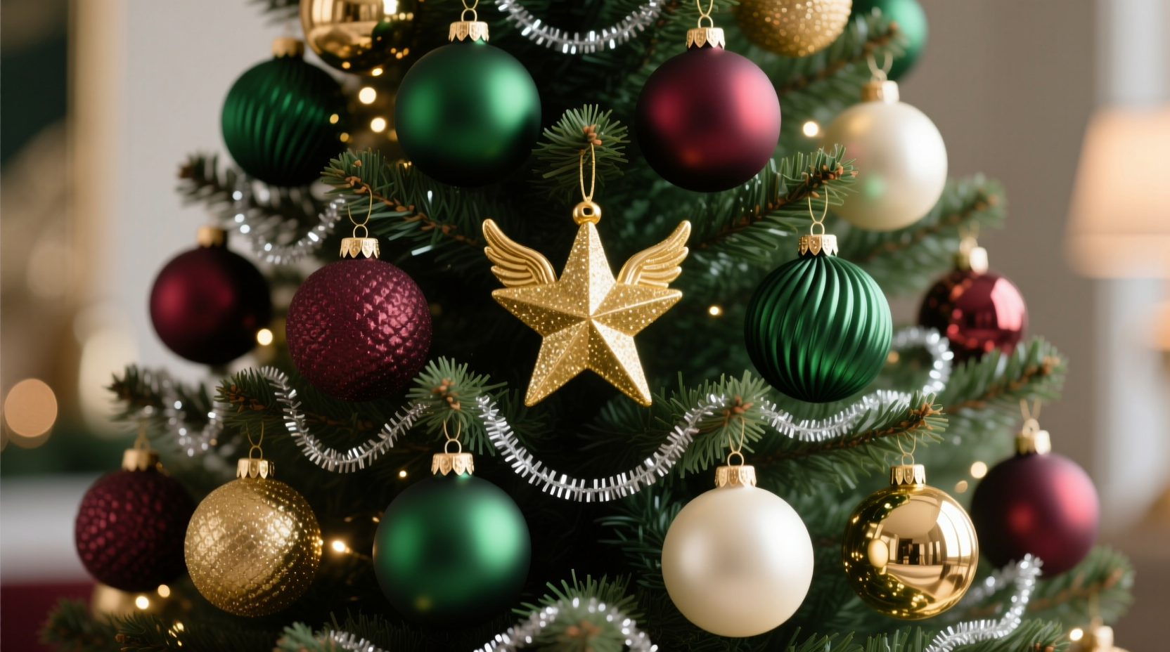
When applied to Christmas trees, traditional combinations often lean on red and green—a classic complementary pair (opposites on the wheel). But balance doesn’t require strict adherence to tradition. Analogous schemes—colors next to each other, like red, burgundy, and gold—create soothing cohesion. Triadic schemes (three evenly spaced colors, such as red, green, and blue) offer vibrancy but need careful proportioning to avoid chaos.
“Color balance isn’t about uniformity. It’s about rhythm. Like music, a tree needs variation in tone, intensity, and spacing to feel alive.” — Clara Mendez, Interior Stylist & Seasonal Design Consultant
Choosing a Focal Point and Building Around It
Every balanced design starts with a focal point. For a Christmas tree, this might be a standout ornament, heirloom piece, or even the tree topper. Begin by identifying what you want to highlight, then select supporting colors that enhance—not compete with—it.
For example, if your focal ornament is a deep emerald glass sphere, build around it with shades of forest green, cream, and antique brass. These tones recede slightly, allowing the emerald to shine. If your star topper has warm gold filigree, consider pairing it with terracotta, mustard, and cocoa brown for a rustic yet elegant look.
Avoid scattering too many “statement” pieces throughout the tree. Instead, space them deliberately—every 12 to 18 inches apart—and surround each with quieter elements that echo its color family.
Step-by-Step: Building Your Color Foundation
- Identify your inspiration piece (e.g., a vintage ornament, room wall color, or fabric from holiday pillows).
- Extract 2–3 core colors from that piece using a digital color picker or paint swatch tool.
- Determine which will be dominant (50–60%), secondary (30%), and accent (10–20%).
- Select ornaments, ribbon, and lights that align with these proportions.
- Test your palette on a small branch before full implementation.
Creating Visual Harmony with Texture and Finish
Color alone doesn’t define balance. The finish and texture of your decorations play a critical role in how colors are perceived. A matte red ball absorbs light differently than a glossy one; brushed gold reflects less intensely than mirrored silver. Mixing finishes adds dimension and prevents a monotonous appearance.
Consider combining:
- Mattes and satins for subtle elegance
- Glossy and metallic accents for sparkle
- Natural textures like wood, felt, or burlap to soften bright palettes
For instance, a predominantly white and silver tree can feel icy and sterile if every ornament is shiny. Introduce matte-finish whites, frosted glass, and wool pom-poms to warm the scheme. Similarly, a bold red-and-green tree benefits from woven ribbon, velvet bows, and ceramic pieces to ground the vibrancy.
Do’s and Don’ts: Finish Pairing Guide
| Combination | Do | Don't |
|---|---|---|
| Matte + Glossy | Use matte for background volume, glossy for highlights | Overuse glossy—can cause glare and visual fatigue |
| Metallic + Natural | Pair gold with wood tones; silver with linen or paper | Mix too many metals without unifying elements |
| Clear + Colored Lights | Use clear lights with pastel themes; colored lights with bold schemes | Use multicolored lights on a monochrome tree—they disrupt unity |
Real Example: From Cluttered to Cohesive
Sarah, a homeowner in Portland, Oregon, inherited over 20 years’ worth of Christmas ornaments from her parents. Each year, she’d hang everything at once—bright red balls, glittery snowmen, hand-painted blues, and neon pink reindeer. The result was festive but chaotic. Guests often said, “It’s so cheerful!” but never lingered near the tree.
After consulting a local designer, Sarah sorted her ornaments by color and finish. She selected navy, cranberry, and cream as her new palette—inspired by her living room’s holiday throw pillows. She kept only those ornaments that fit within that range, storing the rest in labeled bins for future use or themed trees.
She added texture with knitted garlands and velvet ribbons, used warm white LED lights, and placed larger statement pieces at deliberate intervals. The transformation wasn’t about spending more—it was about editing and elevating. Her tree now draws people in, creating a sense of calm joy rather than sensory overload.
“Editing is part of decorating. You don’t have to use every ornament you own. A curated tree tells a clearer story.” — Rafael Torres, Holiday Stylist at Evergreen Interiors
Proportion and Distribution: The Secret to Balance
Even the best color choices fail if poorly distributed. A common mistake is clustering similar items together—like hanging all red balls on one side and silvers on another. This creates visual weight imbalances and makes the tree appear lopsided.
Instead, distribute colors intentionally across three zones:
- Top third: Lighter tones and smaller ornaments to draw the eye upward.
- Middle third: Main color volume and focal ornaments.
- Bottom third: Larger, heavier pieces—often in deeper or warmer tones—for grounding.
Think of it like layering a salad: base greens first, then proteins, then garnishes. On a tree, start with lights (the base), then add filler ornaments in your dominant color, followed by secondary hues, and finally accents.
Checklist: Achieving Even Color Distribution
- ✅ String lights evenly, wrapping around each major branch from trunk to tip.
- ✅ Hang 60% of dominant color ornaments first, spacing them throughout the tree.
- ✅ Add secondary color ornaments, ensuring no two touch unless intentional.
- ✅ Place accent pieces sparingly—no more than one per major branch section.
- ✅ Step back every 10–15 minutes to assess balance from multiple angles.
- ✅ Adjust any dense clusters by relocating or removing pieces.
Frequently Asked Questions
Can I mix traditional and modern colors on the same tree?
Yes—but with intention. Combining classic red-and-green with modern blush pink and sage requires a unifying element, such as consistent ornament shape (e.g., all spheres), shared metallic finish (e.g., rose gold), or neutral lighting (warm white LEDs). Without cohesion, the mix can feel disjointed.
How do I incorporate sentimental ornaments without breaking the color scheme?
Display them proudly, but isolate them thoughtfully. Group mismatched sentimental pieces on a single branch or lower quadrant, framing them with neutral-toned fillers. Alternatively, spray-paint non-conforming ornaments in your palette using matte craft paint—preserving the shape while aligning the color.
Should my tree match my room’s decor exactly?
Not necessarily. Your tree should complement, not copy, your space. If your living room is minimalist gray, a bold jewel-toned tree can serve as a vibrant focal point. Conversely, if your decor is already busy, opt for a restrained palette. The goal is harmony, not duplication.
Final Tips for Lasting Impact
A balanced Christmas tree isn’t created in a single afternoon. It evolves through thoughtful selection, placement, and refinement. As you decorate, keep these final principles in mind:
- Less is more: Overcrowding dulls impact. Leave breathing room between ornaments.
- Lighting matters: Warm white lights flatter warm palettes (reds, golds); cool white enhances cool tones (blues, silvers).
- Seasonal flexibility: Choose a base palette that can adapt—swap out accents yearly while keeping core colors consistent.
- Storage strategy: Store ornaments by color and type to simplify next year’s setup.
Conclusion: Bring Intention to Your Holiday Display
A beautifully balanced Christmas tree doesn’t happen by accident. It’s the result of thoughtful planning, an understanding of color dynamics, and a willingness to edit for impact. Whether you’re drawn to timeless red and green, wintry monochromes, or unexpected palettes like lavender and copper, the principles remain the same: choose with purpose, distribute with care, and decorate with heart.
This holiday season, let your tree reflect not just tradition, but your personal aesthetic. With a balanced color scheme, it won’t just stand out—it will resonate. Start small, trust your instincts, and remember that the most memorable trees aren’t the fullest, but the most harmonious.


 浙公网安备
33010002000092号
浙公网安备
33010002000092号 浙B2-20120091-4
Comments
No comments yet. Why don't you start the discussion?