
A truly memorable holiday space doesn’t rely on abundance—it relies on intention. When your Christmas tree glows with warmth while your sofa throws, dining linens, and mantel garlands echo the same tones in subtle, layered ways, the effect is calm, sophisticated, and deeply inviting. Cohesion isn’t about monotony; it’s about resonance—the quiet harmony between objects that makes a room feel thoughtfully composed rather than assembled. Yet most people begin decorating by grabbing red-and-green ornaments, then wonder why their living room feels chaotic or disconnected from the tree. The solution lies not in more decor—but in a deliberate, scalable color system built before the first bulb is strung.
Why Palette Consistency Matters More Than You Think
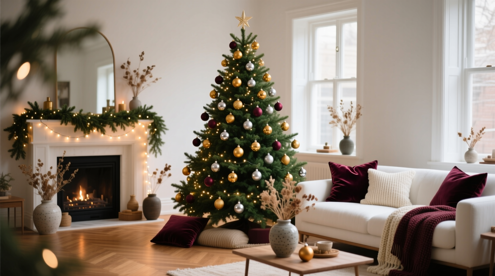
Human visual perception prioritizes relationships over isolated elements. When colors across surfaces lack shared undertones, saturation levels, or temperature (warm vs. cool), our eyes work harder to resolve the dissonance—creating subconscious tension. A study published in the Journal of Environmental Psychology found that environments with chromatic consistency reduced perceived clutter by up to 37% and increased feelings of relaxation and personal control. In practical terms: a forest-green velvet pillow beside a teal-tinted glass ornament feels intentional; the same pillow beside a neon-crimson bauble feels accidental. Cohesion also extends shelf life—decor you love enough to reuse year after year is almost always anchored in a palette you’ve personally curated, not one dictated by seasonal trends.
The 5-Color Framework: Structure Without Rigidity
Forget rigid “rules” like “only three colors.” Real-world spaces need flexibility. Instead, use a proven 5-color framework designed for layered depth and functional versatility:
- Anchor (1 color): Your deepest, most saturated tone—often used sparingly but powerfully (e.g., charcoal black, deep emerald, oxblood). Appears on structural items: base of tree skirt, drawer pulls, curtain lining.
- Primary (1–2 colors): The emotional heart of your palette—what guests will remember (e.g., warm ivory, aged brass, dusty rose). Dominates tree ornaments, main pillows, table runner.
- Secondary (1 color): A supporting hue that adds contrast without competition (e.g., slate blue, olive, terracotta). Used on smaller accents: candle holders, book spines, napkin rings.
- Neutral (1 color): Not beige—but a grounded, textural tone with character (e.g., raw linen, weathered oak, heather grey). Forms the backdrop: walls, rug, sofa upholstery, tree trunk wrap.
- Accent (1 color, optional): A single high-contrast pop used *only once* per zone (e.g., antique gold leaf on one ornament, cobalt glass on one vase). Prevents flatness without disrupting unity.
This structure prevents overwhelm while allowing evolution. You might rotate your Primary color yearly (ivory → cream → oat) while keeping Anchor and Neutral constant—creating both continuity and freshness.
Step-by-Step: Building Your Palette in Under 90 Minutes
- Gather reference materials (10 min): Collect 3–5 physical items you’ll use this season—a candle, fabric swatch, vintage ornament, ceramic mug. Photograph them together in natural light.
- Identify undertones (15 min): Zoom into each photo. Is the “red” leaning orange (warm) or violet (cool)? Is the “green” yellow-based (lime) or blue-based (pine)? Write down all observed undertones—not just names.
- Select your Neutral first (10 min): Choose the wall or largest surface color. This locks your base temperature. If walls are warm-toned (cream, peach), avoid cool-secondaries like icy blue. If walls are cool (greige, dove grey), lean into sage or steel blue instead of rust.
- Build a swatch grid (25 min): Use painter’s tape on a white poster board. Place small fabric scraps, paint chips, or printed color squares in your 5-color order. Step back. Does the Anchor feel too heavy next to the Neutral? Adjust saturation—not hue. Swap a “vibrant red” for a “brick red” if needed.
- Test against light (15 min): Hold your grid near your main window at noon and again at 5 p.m. Note which colors shift dramatically (e.g., some teals turn grey in low light). Replace unstable shades with more lightfast options.
- Finalize & document (15 min): Name your palette (e.g., “Hearth & Hemlock,” “Frost & Flax”) and note exact paint codes (Benjamin Moore, Sherwin-Williams), fabric care tags, and ornament material (wood, mercury glass, matte ceramic). Store digitally and print one copy for your decor box.
Real Example: How a Seattle Home Transformed Its Decor Flow
When interior designer Lena Torres renovated her 1920s Craftsman, she inherited mismatched heirlooms: her grandmother’s tarnished silver bells, her mother’s bright red glass balls, and her own collection of indigo-dyed textiles. Initial attempts to “make it work” resulted in a tree that felt like a thrift-store collage. She applied the 5-color framework, starting with her favorite item: a hand-thrown stoneware mug glazed in iron-rich clay (deep burnt sienna with subtle ash-grey flecks). From it, she pulled:
- Anchor: Charcoal (used on tree skirt hem and drawer knobs)
- Primary: Warm ivory (tree lights, linen table runner, sofa pillows)
- Secondary: Slate blue (hand-blown glass ornaments, ceramic vases)
- Neutral: Raw linen (walls, curtains, upholstered bench)
- Accent: Antique brass (one vintage bell, candle base, frame edge)
The result? A space where the tree didn’t “stand out”—it belonged. Guests commented on the “calm richness,” not the colors themselves. Crucially, Lena reused 80% of her existing decor by simply reassigning roles within the new system: the red glass balls became Secondary accents on a sideboard, not tree centerpieces; the silver bells were polished and grouped as Anchor-weighted clusters on the mantel.
Do’s and Don’ts: Common Pitfalls and Practical Fixes
| Action | Do | Don’t |
|---|---|---|
| Using metallics | Stick to one dominant metal finish (e.g., all brushed brass) + one complementary accent (e.g., matte black iron). Match hardware to lighting fixtures. | Mix polished brass, chrome, and copper without a unifying element (like shared warmth or texture). |
| Handling greenery | Choose one dominant green type (e.g., noble fir) and vary texture—not hue. Add dried eucalyptus (blue-green) or rosemary (silver-green) for tonal depth. | Combine vivid artificial holly, lime boxwood, and deep emerald pine boughs—they compete, not complement. |
| Introducing pattern | Use pattern only where your Neutral appears (e.g., a geometric rug in raw linen + charcoal, or floral wallpaper with ivory ground and slate-blue florals). | Layer multiple bold patterns (plaid pillows + striped tablecloth + damask curtains) without anchoring them to the same base color. |
| Lighting integration | Select bulbs with matching color temperature: 2700K (warm white) for ivory/cream palettes; 3000K (soft white) for cooler schemes. Use dimmers universally. | Pair warm-white string lights with cool-white LED candles—or mix bulb temperatures within the same zone. |
Expert Insight: The Psychology of Holiday Color Harmony
“People don’t remember ‘the red tree’—they remember how safe they felt sitting beneath it. That safety comes from predictability in color relationships: when every surface echoes the same warmth, saturation, or texture, the brain registers stability. It’s why families return to certain palettes generation after generation—not because they’re traditional, but because they’re neurologically soothing.” — Dr. Aris Thorne, Environmental Psychologist & Author of Chromatic Comfort
Dr. Thorne’s research confirms what decorators observe intuitively: consistent palettes reduce decision fatigue for guests and hosts alike. When your tree’s primary hue matches your dinnerware’s glaze, your brain doesn’t pause to reconcile the difference—it settles. That’s the foundation of true hospitality.
FAQ
What if I love multiple colors—can I still be cohesive?
Absolutely. Cohesion isn’t limitation—it’s hierarchy. Assign clear roles: one color as Primary (dominant), one as Secondary (supporting), and others as accents used minimally and intentionally. For example, if you adore burgundy, gold, teal, and cream, make cream your Neutral (walls, sofa), burgundy your Primary (tree ornaments, pillows), gold your Accent (one wreath, candle bases), and teal your Secondary (vase, book covers). The structure contains the energy.
How do I handle family heirlooms that don’t “fit” my palette?
Recontextualize—not reject. An overly bright ornament becomes a focal point on a neutral shelf, not part of the tree. A clashing textile becomes a folded throw at the foot of the bed, where its color interacts only with the rug (your Neutral). Or photograph it beautifully and display the print in a frame using your Anchor color for the mat board—honoring the object while respecting the palette.
Should my outdoor decor match my indoor palette?
Not identically—but harmoniously. Carry forward your Neutral and one Primary or Secondary color outdoors. For example, if indoors you use raw linen (Neutral) and warm ivory (Primary), use natural jute (Neutral) and cream-painted pinecones (Primary) outside. Avoid introducing new dominant hues (e.g., bright red outdoor lights) unless they’re echoed meaningfully indoors (e.g., red velvet ribbon on your tree). Exterior should feel like a gentle extension—not a separate statement.
Conclusion
Creating a cohesive Christmas color palette is less about artistic talent and more about disciplined observation and thoughtful editing. It asks you to slow down—to notice the warmth in your favorite mug, the quiet depth of your sofa fabric, the way afternoon light shifts your wall color from grey to lavender. When you build from those truths, your decor stops being “put together” and starts feeling like an expression of your home’s enduring character. No two years need look identical, but each can resonate with the same grounded calm. Your tree won’t just shine—it will belong. Your room won’t just be festive—it will feel like sanctuary.


 浙公网安备
33010002000092号
浙公网安备
33010002000092号 浙B2-20120091-4
Comments
No comments yet. Why don't you start the discussion?