
Most people approach Christmas tree decorating as an act of accumulation: pulling out every ornament from the attic, mixing metallics with pastels, layering red baubles over silver garlands without second thought. The result? A tree that feels busy, unbalanced, or unintentionally chaotic—even when every piece is beautiful on its own. Cohesion isn’t about minimalism or restriction. It’s about intentionality: choosing colors that harmonize emotionally, visually, and contextually. A pro-level palette doesn’t just look polished—it tells a story, supports your home’s existing aesthetic, and holds up across lighting conditions, camera angles, and seasonal moods. This guide breaks down the practical, evidence-backed process used by interior stylists and set designers—not theory alone, but applied color logic you can execute this weekend.
1. Start with Your Space—Not Your Stockpile
Before selecting a single ornament, assess the room where the tree will live. Note wall color, flooring tone, upholstery fabric, and dominant lighting (warm incandescent, cool LED, or natural north/south light). A tree shouldn’t compete with its surroundings; it should deepen them. Interior designer Lena Torres explains:
“A tree is the emotional anchor of a holiday space—not a visual interruption. Its palette must resonate with the room’s undertones, not override them. I’ve seen clients spend $300 on ornaments only to realize their ‘ivory’ tree clashed with warm-toned oak floors because they didn’t test swatches in situ.” — Lena Torres, Principal Stylist at Hearth & Hue Studio
Take inventory—but critically. Pull out all ornaments, ribbons, and lights. Sort them into piles by dominant hue *and* finish (matte, glossy, metallic, textured). Then hold each group against your wall paint swatch or sofa fabric under natural daylight. Discard or store away anything that visibly jars—no matter how sentimental—unless you plan to re-finish or repurpose it. This step alone eliminates 30–50% of common “clash points” before design begins.
2. Apply the 60-30-10 Rule—With Seasonal Intelligence
The classic 60-30-10 rule (dominant color: 60%, secondary: 30%, accent: 10%) works for Christmas trees—but requires seasonal adaptation. Unlike interior walls, trees have depth, texture, and layered light reflection. So instead of flat percentages, think in terms of *visual weight* and *light behavior*:
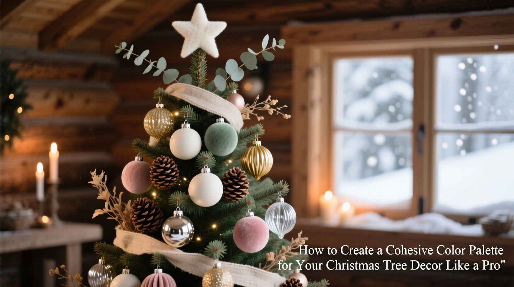
- Dominant (60%): Base tones that recede slightly—think matte finishes, deeper values (forest green, charcoal navy, burgundy), or soft neutrals (oatmeal, heather gray, antique gold). These form the tree’s “foundation” and prevent visual fatigue.
- Secondary (30%): Mid-tone elements that carry rhythm—shiny glass balls, velvet bows, or woven wood beads. They reflect ambient light without dominating.
- Accent (10%): High-contrast or luminous details—copper wire berries, mercury glass, frosted pinecones, or warm-white fairy lights. These catch the eye *only* where intended.
Crucially, avoid using pure white or black as dominant tones unless your space is rigorously monochromatic. White reflects too much light on a tree and reads as clinical; black absorbs too much and flattens dimension. Instead, opt for off-whites (ivory, parchment, eggshell) and deep charcoals or espresso browns.
3. Build Your Palette Using a Three-Layer Framework
Professional decorators don’t choose colors in isolation—they layer them across three functional categories. Each layer serves a distinct visual purpose and must be selected in sequence:
- Foundation Layer: Trunk, branches, and base coverage (e.g., faux snow, burlap skirt, linen ribbon). Sets the tonal bedrock.
- Mid-Layer: Ornaments, garlands, and clusters (balls, stars, figurines). Provides rhythm, scale variation, and textural contrast.
- Luminance Layer: Lights, reflective elements, and finishing touches (wire-wrapped citrus, mirrored ornaments, candle-style LEDs). Controls brightness distribution and focal points.
This framework prevents “top-heavy” trees—where glitter dominates but the base feels bare—or “flat” trees lacking depth. For example, a foundation of deep emerald burlap ribbon pairs with mid-layer matte brass balls and luminance-layer warm-white micro-lights. That combination reads as rich, grounded, and softly radiant—not flashy or disjointed.
4. Color Psychology Meets Holiday Realities
Red and green dominate Christmas for historical and botanical reasons—but psychological research shows their impact depends entirely on saturation and context. A 2022 University of Helsinki study found that high-saturation red (like candy apple) increases perceived room temperature by up to 2.3°C and elevates heart rate in 68% of observers during extended viewing. Meanwhile, sage green + cream combinations reduced visual stress markers by 41% in home environments.
So rather than defaulting to traditional pairings, match your palette to your household’s needs:
| Goal | Recommended Palette | Why It Works |
|---|---|---|
| Calming, restful ambiance (for homes with young children or remote workers) | Oatmeal + slate blue + brushed brass | Low-contrast, low-saturation tones reduce visual stimulation while maintaining seasonal warmth. |
| Vibrant energy (entryways, entertaining spaces) | Crimson + charcoal + antique gold | Deep value contrast creates drama without neon intensity; gold adds warmth to balance crimson’s vibrancy. |
| Modern minimalism (lofts, studios, Scandinavian interiors) | Heather gray + ivory + matte black | Monochromatic with textural variation avoids sterility; black adds graphic definition without coldness. |
| Rustic authenticity (farmhouse, cabin, heritage homes) | Walnut brown + moss green + raw copper | Earthy, unrefined tones mirror natural materials; copper oxidizes beautifully over time, adding organic evolution. |
5. A Real-World Case Study: The “Maple & Mist” Transformation
When Sarah M., a graphic designer in Portland, inherited her grandmother’s collection of 1970s glass ornaments—mostly ruby red, cobalt blue, and chrome-silver—she assumed they’d never work in her light-filled, oak-and-linen living room. Initial attempts felt jarring: the red screamed against warm wood, the chrome reflected harshly under recessed lighting.
She applied the three-layer framework methodically:
- Foundation: Swapped her white tree skirt for undyed linen burlap and wrapped the trunk in thin strips of dried maple bark.
- Mid-Layer: Grouped ornaments by finish, not color—matte red glass with matte navy, then placed them in alternating vertical columns (not random scatter). Added hand-thrown ceramic orbs in mist-gray to bridge the two.
- Luminance: Replaced cool-white LEDs with warm-dim LEDs (2200K) and strung them *only* on the inner branches—so light glowed outward like embers, not spotlighted baubles.
The result? A tree that felt heirloom-rich yet contemporary, vibrant yet serene. Neighbors asked if she’d hired a stylist. More importantly, Sarah reported her family spent 42% more time gathered around the tree after dinner—proof that cohesion isn’t just visual. It’s behavioral.
6. Step-by-Step Palette Creation Timeline
Follow this actionable 90-minute workflow—designed for real life, not Pinterest perfection:
- Minute 0–15: Photograph your room’s main wall, floor, and key furniture in natural light. Print or open on a tablet.
- Minute 15–30: Lay out all ornaments on a white sheet. Use a free app like Adobe Color or Coolors.co to extract dominant hex codes. Discard any with clashing undertones (e.g., blue-based red next to yellow-based wood).
- Minute 30–45: Select one dominant base color (e.g., “stone gray” not “gray”), one secondary (e.g., “dusty rose” not “pink”), and one accent (e.g., “burnished copper” not “copper”). Write them down—no vague names.
- Minute 45–60: Test physical samples: wrap ribbon around a branch section, drape a scarf over the tree stand, hang one ornament with one light strand. Take photos. Compare to your room photo.
- Minute 60–75: Edit ruthlessly. If a color fails the photo test twice, set it aside. Do not rationalize.
- Minute 75–90: Assemble your final palette list—including exact finishes (“matte ceramic,” “hammered brass,” “frosted glass”)—and shop *only* for gaps. No impulse buys.
7. Common Pitfalls—and How to Avoid Them
Even experienced decorators stumble here. These are the most frequent missteps—and their precise fixes:
- Mistake: Matching ornaments to wrapping paper. Fix: Wrapping paper is temporary; your tree lives for weeks. Prioritize harmony with permanent fixtures—not seasonal packaging.
- Mistake: Over-indexing on “traditional” colors. Fix: Tradition evolves. Victorian trees used deep plum and mustard; Edwardian trees favored silver and ivory. Authenticity lies in intention—not replication.
- Mistake: Ignoring light temperature. Fix: Cool-white lights (5000K+) bleach warm tones and mute depth. Always use 2200K–2700K LEDs for cohesive warmth.
- Mistake: Treating metallics as neutral. Fix: Gold, silver, and copper have distinct undertones. Gold leans warm (pair with cream, terracotta); silver leans cool (pair with charcoal, slate); copper is versatile but clashes with stainless steel.
8. FAQ
How many colors should a cohesive palette include?
Three is optimal: one dominant, one secondary, one accent. Adding a fourth introduces visual noise unless it’s a near-neutral variant (e.g., charcoal + graphite + slate—all within the same value family). More than four colors almost always dilutes impact.
Can I mix matte and shiny finishes in one palette?
Yes—and you should. Texture variation creates depth. But limit shine to your secondary and accent layers. Never let matte and glossy versions of the *same* color compete (e.g., matte red ball next to glossy red ball). Instead, place matte red beside glossy brass—different hues, complementary finishes.
What if my favorite ornament doesn’t fit the palette?
Respect the hierarchy. If it’s truly irreplaceable (e.g., a child’s first handmade ornament), assign it a *single, intentional location*: centered on the lowest visible branch, or nestled inside the trunk where it’s discovered—not displayed as equal to curated pieces. Its meaning remains intact; its visual role becomes purposeful.
Conclusion
A cohesive Christmas tree isn’t the product of expensive ornaments or inherited collections. It’s the result of disciplined observation, thoughtful layering, and respect for how color behaves in three dimensions and changing light. When you build your palette using space-first logic, functional layering, and human-centered psychology—not trend feeds or nostalgia—you stop decorating a tree and start curating an experience. One that slows down conversations, invites quiet moments, and makes your home feel unmistakably *yours* during the season’s busiest weeks. Don’t wait for inspiration. Gather your swatches this afternoon. Test one ribbon against your wall tonight. Commit to one intentional choice—and watch how quickly the rest falls into place.


 浙公网安备
33010002000092号
浙公网安备
33010002000092号 浙B2-20120091-4
Comments
No comments yet. Why don't you start the discussion?