
Christmas lights do more than illuminate—they transform spaces into festive experiences. But when colors clash or lack coordination, the result can feel chaotic rather than enchanting. A well-designed lighting display isn’t just about brightness or quantity; it’s about harmony. Creating a cohesive color palette ensures your home becomes a unified visual story, not a random collection of bulbs. Whether you're decorating a single porch or an entire neighborhood-worthy yard, thoughtful color planning elevates your display from ordinary to extraordinary.
Understand the Psychology of Color in Holiday Lighting
Colors evoke emotion. Red stirs warmth and excitement, often associated with Santa, cranberries, and roaring fires. Blue brings calm and serenity—ideal for a wintry, frosty theme. Green grounds the display with tradition, symbolizing evergreens and enduring life. White offers purity and brilliance, mimicking freshly fallen snow. When combined without intention, these emotional signals compete instead of complement.
A cohesive palette aligns the mood of your lighting with your desired atmosphere. For example, a monochromatic blue-and-white scheme evokes a “Winter Wonderland” effect, while a balanced red-and-green layout leans into classic holiday cheer. The key is consistency: every string of lights should contribute to the same narrative.
“Color harmony in outdoor lighting is like orchestration in music—each element must support the whole.” — Daniel Reeves, Landscape Lighting Designer
Choose Your Theme Before Selecting Colors
Start by defining the story you want your lights to tell. Are you going for nostalgic charm, modern minimalism, icy elegance, or joyful festivity? Your theme dictates your palette.
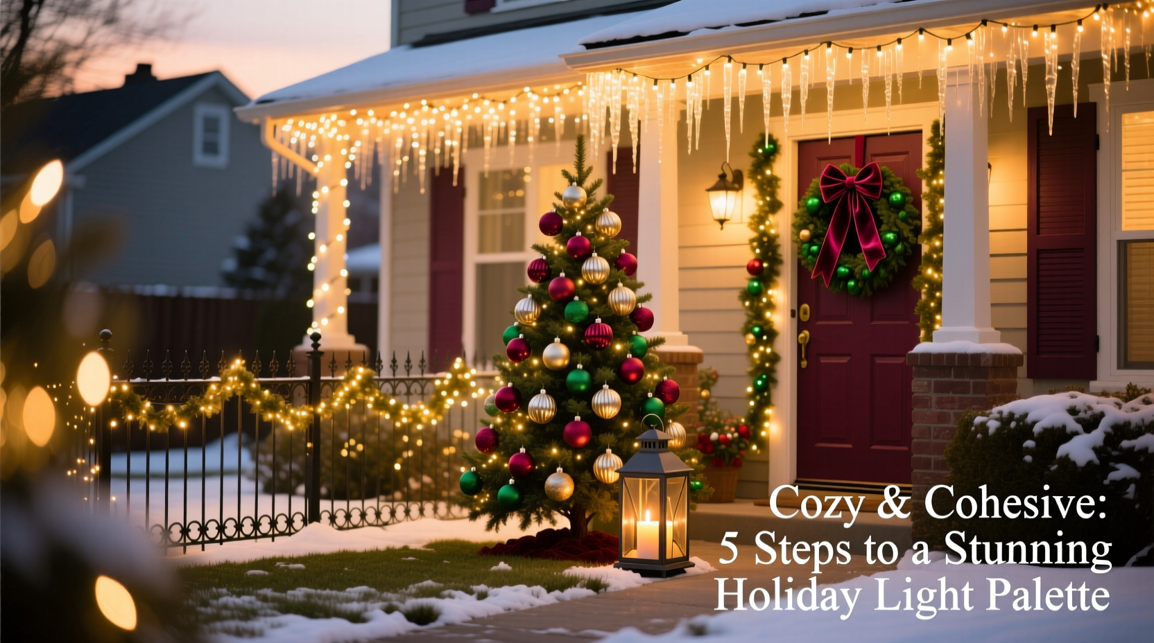
- Traditional Red & Green: Timeless and recognizable, ideal for homes with classic architecture.
- Winter White & Cool Blue: Evokes snow-covered landscapes and serene nights; perfect for contemporary homes.
- Warm White & Gold: Elegant and understated, suitable for upscale neighborhoods or sophisticated displays.
- Retro Multi-Color: Bright, bold, and playful—great for families with young children or whimsical decor.
- Icy Pastels: Soft pinks, mint greens, and lavender create a dreamy, modern twist on holiday lighting.
Once you’ve chosen a theme, stick to it across all areas—roofline, trees, shrubs, walkways, and entryways. Consistency reinforces cohesion.
Apply the 60-30-10 Rule for Visual Balance
Interior designers use the 60-30-10 rule to balance color in rooms. The same principle applies outdoors. Allocate your palette as follows:
- 60% Dominant Color: This is your foundation—usually white, warm white, or green. Use this on large structural elements like rooflines, eaves, and columns.
- 30% Secondary Color: Adds contrast and depth. If your dominant is white, secondary could be blue or red. Apply to trees, railings, or garlands.
- 10% Accent Color: Pops of color that draw attention—gold, purple, or multicolored mini-lights. Reserve for focal points like wreaths, door frames, or sculptures.
This ratio prevents any single color from overwhelming the display while ensuring visual interest.
| Theme | Dominant (60%) | Secondary (30%) | Accent (10%) |
|---|---|---|---|
| Classic Holiday | Green | Red | White |
| Winter Wonderland | White | Blue | Silver |
| Elegant Warmth | Warm White | Gold | Deep Red |
| Modern Minimalist | White | Black (non-light accents) | Copper |
| Playful Retro | Multicolor (even mix) | N/A | Twinkling effects |
Step-by-Step Guide to Building Your Palette
Follow this sequence to design and implement a harmonious lighting scheme:
- Walk Around Your Property at Dusk: Observe natural sightlines, architectural features, and existing exterior colors. Note where light will be most visible to passersby.
- Select a Base Color Based on House Exterior: Match or complement your siding, trim, or roof. A gray house pairs well with cool white and blue; brick homes shine with warm white and gold.
- Pick Two Supporting Colors: Use a color wheel to find complementary (opposite), analogous (adjacent), or triadic (evenly spaced) schemes. Avoid clashing opposites like red and green unless intentionally traditional.
- Test Small Sections First: Install a short run of each color combination on one section of the roof or tree. View it at night under real conditions.
- Adjust Saturation and Brightness: Dimmer strings or warmer tones recede; brighter, cooler lights advance visually. Balance intensity so no area feels overpowering.
- Map Out Placement Zones: Sketch a rough diagram labeling where each color goes—roof (dominant), trees (secondary), entry (accent).
- Install with Intention: Follow your map. Use labeled storage bins during setup to avoid mixing colors accidentally.
This methodical approach prevents last-minute mismatches and ensures professional-looking results.
Real Example: Transforming a Cluttered Display
The Thompson family had decorated their home for over a decade with whatever lights they found on sale. Their display included red net lights on bushes, green icicle lights on one side of the roof, blue on the other, and a mix of warm and cool white on the porch. Neighbors called it “the rainbow explosion.”
In year 11, they decided to redesign. They chose a “Frosted Elegance” theme: 60% cool white on rooflines and walkway stakes, 30% soft blue on evergreen trees, and 10% silver twinkle lights on wreaths and mailbox. They replaced old incandescent strings with uniform LED cool white (6000K) and added dimmable controllers for subtle variation.
The result was striking. Instead of competing colors, the eye moved smoothly across the property. Passersby slowed down. Local news featured their home. The transformation wasn’t due to more lights—it was due to better harmony.
“We didn’t add more—we subtracted chaos and added cohesion.” — Lisa Thompson, homeowner
Common Mistakes That Break Cohesion
Even with good intentions, small errors can undermine your palette:
- Mixing Color Temperatures: Combining warm white (2700K) and daylight white (6500K) creates a jarring yellow-blue contrast.
- Overusing Accent Colors: Too much red or multicolor disrupts balance, especially if not tied to a retro theme.
- Ignoring Architectural Lines: Placing bright colors haphazardly breaks the home’s natural flow.
- Using Non-Coordinating Extension Cords: Bright orange cords against a white display are distracting. Opt for black or green cords that blend with foliage or siding.
- Forgetting Indoor-Outdoor Continuity: If your interior uses cool blue lights, carry that tone outside. Sudden shifts confuse the visual experience.
Checklist: Pre-Installation Palette Review
Before hanging a single strand, verify the following:
- ✅ Selected a clear theme (e.g., Winter Wonderland, Classic Red & Green)
- ✅ Chosen 3–4 colors max, including dominant, secondary, and accent
- ✅ Verified all white lights have matching Kelvin temperature
- ✅ Tested combinations on-site at night
- ✅ Created a simple sketch showing color placement zones
- ✅ Labeled storage containers by color and location
- ✅ Ensured extension cords and clips are neutral-colored
- ✅ Coordinated outdoor palette with indoor lighting theme
Frequently Asked Questions
Can I mix LED and incandescent lights?
Technically yes, but visually it’s risky. LEDs are brighter and more focused; incandescents glow softer and warmer. The difference in output and color rendering can break cohesion. If mixing is unavoidable, keep them in separate zones and match color temperatures as closely as possible.
How do I make red and green look modern instead of kitschy?
Use deep, saturated emerald green and burgundy-red instead of bright kelly green and fire-engine red. Add 60% warm white as the base, then use red and green as accents (10–20%). Incorporate matte finishes and globe bulbs for a refined look. Pair with dark green garlands and pinecones for texture.
What if my neighbor has a completely different color scheme?
You don’t need to match them. Focus on internal cohesion within your own property. However, if you’re part of a coordinated neighborhood display, consider a shared palette guideline. A streetscape of varied themes can still feel unified with consistent brightness levels and installation quality.
Conclusion: Light with Purpose, Not Just Quantity
A stunning Christmas light display isn’t measured in bulb count—it’s defined by harmony. By building a thoughtful color palette grounded in theme, proportion, and emotional intent, you create a display that resonates long after the season ends. The effort spent planning pays off in evenings filled with admiration, social media shares, and the quiet satisfaction of a job done beautifully.
Start today: pull out last year’s lights, assess what works, and sketch a new vision. Let color guide you—not as an afterthought, but as the foundation of your holiday expression.


 浙公网安备
33010002000092号
浙公网安备
33010002000092号 浙B2-20120091-4
Comments
No comments yet. Why don't you start the discussion?