
Most holiday decorators start with enthusiasm—and end with visual whiplash. One room pulses with icy blue LEDs, another glows warm amber, the staircase drips with multicolored candy-cane strands, and the dining room features vintage-style incandescent whites. Without intention, even beautiful individual displays can fracture the emotional resonance of the season. A cohesive color scheme doesn’t mean monotony; it means harmony. It’s what transforms a house full of decorations into a thoughtfully composed, emotionally grounded holiday experience—one where guests feel the quiet confidence of design, not the confusion of competing palettes.
Cohesion begins not with wattage or bulb count, but with strategy: understanding how color functions spatially, how light interacts with architecture and existing finishes, and how human perception shifts from room to room. This guide walks through proven methods used by professional lighting designers and seasoned homeowners alike—grounded in color theory, spatial psychology, and real-world constraints like outlet access, ceiling height, and family preferences.
1. Start with Your Home’s Architectural & Decorative Foundation
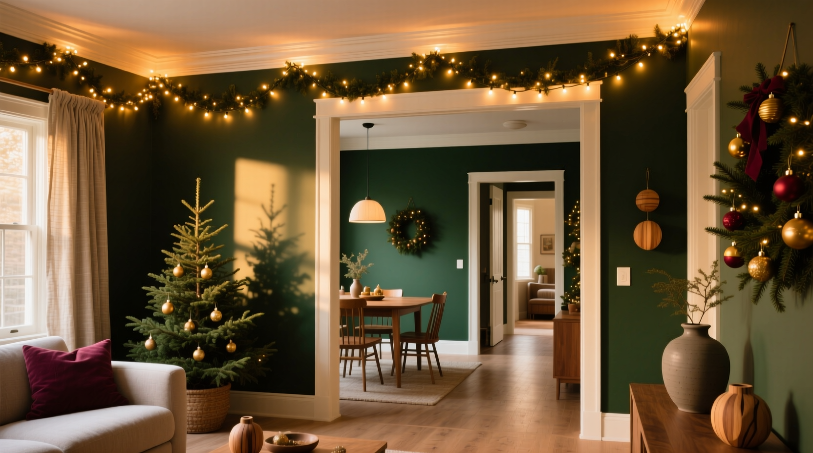
Before selecting a single bulb, assess what’s already present. Your walls, flooring, furniture upholstery, window treatments, and even permanent fixtures (like brass cabinet pulls or stone fireplaces) all emit subtle color temperatures and undertones. These aren’t neutral backdrops—they’re active participants in your light palette.
Warm-toned spaces—think honey-oak floors, cream plaster walls, or terracotta tile—naturally support amber, soft white, and muted gold lighting. Cool-toned environments—gray concrete floors, navy accent walls, or stainless steel appliances—respond best to cool white (4000K–5000K), pale blue, or violet-tinged LEDs. Mismatching light temperature with room tone creates visual tension: cool lights in a warm room feel sterile; warm lights in a cool room appear muddy or dated.
Also consider scale and rhythm. A high-ceilinged living room can carry bold, saturated accents (deep emerald, burgundy, or sapphire), while a narrow hallway benefits from tonal gradation—say, ivory → champagne → antique gold—to avoid visual compression. The goal is continuity, not repetition: adjacent rooms should feel like verses in the same song, not separate genres.
2. Choose a Core Palette Framework (Not Just “Colors”)
Forget “red and green.” Instead, build a three-tiered framework: Anchor, Accent, and Transition. This structure provides flexibility without chaos.
- Anchor (60% of total lights): Your dominant, unifying hue—used in every room. Not necessarily “Christmas red,” but something that grounds the scheme: warm white (2700K–3000K), true white (4000K), deep forest green, or charcoal gray. Anchor lights appear on mantels, stair railings, and primary trees.
- Accent (30%): A complementary or analogous hue introduced selectively—only where it reinforces meaning or function. Examples: cranberry on the dining table (evoking fruit and feast), silver on mirrored surfaces (amplifying reflection), or copper-wire string lights in a reading nook (adding warmth without glare).
- Transition (10%): A subtle bridge between rooms—often monochromatic or textural. Think frosted white globes on the hallway ceiling, matte black wire on outdoor porch lights, or amber fairy lights behind sheer curtains in bedrooms. Its role is to soften edges, not draw attention.
This ratio isn’t arbitrary. Designers at Lightology and The Holiday Collective confirm that 60/30/10 ratios consistently yield balanced, non-fatiguing results across residential spaces—because the eye needs dominance to orient itself, contrast to engage, and subtlety to rest.
“People don’t remember individual colors—they remember the feeling of moving through a space. Cohesion is about pacing light like a composer paces notes: a strong theme, a few variations, and moments of silence.” — Maya Chen, Lighting Designer & Author of *Luminous Interiors*
3. Room-by-Room Implementation Strategy
A cohesive scheme only works if applied intentionally—not uniformly. Each room serves a distinct function and emotional purpose. Your lighting should reinforce that, not override it.
| Room | Primary Function | Recommended Anchor | Strategic Accent Use | Transition Tip |
|---|---|---|---|---|
| Living Room | Gathering, conversation, focal point | Warm white (2700K) or deep evergreen | Add brass-finish LED candles on side tables; use amber twinkle lights inside glass cloches | Run matching warm white lights along baseboards to visually extend floor plane |
| Dining Room | Feasting, intimacy, ritual | Warm white (2700K) or antique gold | Wrap burgundy or plum lights around chair backs; drape ivory micro-lights over linen runners | Use identical warm white lights on chandelier arms and buffet shelf edge for vertical continuity |
| Kitchen | Activity, utility, warmth | True white (4000K) or soft ivory | Hang copper-string lights inside open shelving; wrap cool white rope lights around pendant lamp cords | Install dimmable under-cabinet lights matching your anchor temperature—this links task lighting to decor |
| Bedrooms | Rest, retreat, calm | Warm white (2700K) or lavender-tinged soft white | Use battery-operated fairy lights inside mason jars on nightstands; avoid blinking modes | Line closet interiors with same warm white lights—creates subconscious consistency when opening doors |
| Staircase & Hallways | Navigation, transition, rhythm | Warm white (2700K) or charcoal gray | Alternate step risers with warm white and deep navy lights for gentle visual pulse | Install recessed step lights matching anchor color—no visible wiring, pure flow |
Note the consistency of warm white (2700K) as the most versatile anchor—it appears in four of five rooms—but never identically. In the kitchen, it’s paired with cool white accents for clarity; in bedrooms, it’s softened with lavender undertones for serenity. That’s cohesion: shared DNA, expressed contextually.
4. Technical Execution: Wiring, Dimming, and Control
A beautiful palette fails if execution undermines it. Three technical factors make or break cohesion:
- Consistent Color Temperature: Mixing 2700K and 3000K bulbs—even both labeled “warm white”—creates noticeable inconsistency. Always verify Kelvin (K) ratings on packaging. For multi-room schemes, buy all anchor lights from the same manufacturer and batch number.
- Uniform Dimming Capability: If your living room lights dim smoothly but your hallway strand flickers or cuts out at 30%, the illusion of unity collapses. Use only dimmable LED strings rated for indoor/outdoor use (IP44 or higher), and pair them with compatible smart dimmers (e.g., Lutron Caseta or Philips Hue). Test dimming curves before final installation.
- Wiring Discipline: Hide cords with cord covers painted to match baseboards; route all anchor-light wires along the same architectural line (e.g., always top of door frame, never bottom). Inconsistent wire placement draws the eye to infrastructure—not light.
5. Real-World Case Study: The Miller Residence
The Millers live in a 1920s Craftsman bungalow with oak floors, leaded glass windows, and built-in bookshelves stained dark walnut. Last year, their lights felt “like a craft store exploded”—red everywhere, mismatched brightness, and blinking icicle lights clashing with steady warm strands.
This year, they adopted a three-step process: First, they photographed each room at 6 p.m. on a cloudy day, then desaturated the images in editing software to isolate underlying tones. They discovered their oak floors had strong amber undertones, and their plaster walls carried a faint peach cast—confirming warm white as the only viable anchor.
Second, they selected one brand (Noma Warm White 2700K Micro-Drop) for all anchor applications: tree wraps, mantel garlands, stair railings, and shelf edging. For accents, they chose hand-blown glass ornaments in cranberry and sage—hung on trees and placed in bowls—not lit themselves, but illuminated *by* the warm white anchors, creating depth without added color sources.
Third, they installed a single Lutron dimmer controlling all warm white circuits. At night, they set scenes: “Gather” (100% brightness), “Dine” (75%), and “Wind Down” (30%). Guests consistently remarked on how “calm” and “intentional” the house felt—even though the total number of lights decreased by 22%.
Their cohesion wasn’t achieved through uniformity, but through disciplined repetition of one foundational element, thoughtful contextual accents, and seamless technical integration.
FAQ
Can I mix LED and incandescent lights in the same scheme?
Technically yes—but strongly discouraged. Incandescents emit light at ~2700K with a broad spectrum and subtle flicker; modern LEDs achieve similar Kelvin ratings digitally, often with narrower spectral output and zero flicker. Even “matching” bulbs will differ in CRI (Color Rendering Index), causing materials like velvet or wood grain to look subtly wrong under mixed sources. Stick to one technology across your anchor palette.
What if my partner loves multicolor and I prefer monochrome?
Compromise through hierarchy. Designate one room—the kids’ playroom, a sunroom, or an outdoor patio—as the “multicolor zone,” using a curated palette (e.g., cobalt, mustard, and charcoal) rather than random rainbows. Keep all interior anchor lights strictly monochrome. This satisfies both preferences while preserving overall cohesion—the multicolor space becomes a joyful exception, not a disruptive element.
How do I handle outlets in different rooms with varying circuit loads?
Calculate total wattage per circuit: multiply bulb wattage × strand count × length. Most residential circuits max at 1,800 watts (15-amp). Use a power strip with built-in surge protection and individual switches—label each outlet for its room and function. Prioritize anchor lights on dedicated circuits; run accents off shared or lower-load circuits. When in doubt, consult an electrician—overloaded circuits risk heat buildup and fire hazard, undermining all aesthetic effort.
Conclusion
Cohesion in holiday lighting isn’t about restriction—it’s about resonance. It’s the difference between decoration and atmosphere; between scattered cheer and sustained warmth. When your hallway flows seamlessly into your living room, when your dining table feels like a natural extension of your entryway, and when guests pause—not to admire a single garland, but to breathe deeply in a space that feels whole—you’ve succeeded. That sense of calm, of belonging, of quiet celebration—that’s what people carry with them long after the tinsel is packed away.
You don’t need a designer’s budget or years of experience. You need observation, intention, and one consistent anchor. Start small: choose your anchor color and temperature today. Test it in your main living space at dusk. Then extend it—thoughtfully, deliberately—to just one more room. Let cohesion grow room by room, like light itself: steady, sure, and deeply human.


 浙公网安备
33010002000092号
浙公网安备
33010002000092号 浙B2-20120091-4
Comments
No comments yet. Why don't you start the discussion?