A gallery wall can transform a blank space into a personal storytelling centerpiece. When done well, it feels intentional, balanced, and full of character. But when haphazardly assembled, it risks becoming a visual clutter zone—overwhelming rather than inviting. The difference between a curated look and chaos lies in planning, proportion, and cohesion. With the right approach, even a mix of mismatched frames, sizes, and art styles can come together harmoniously.
Start with a Clear Vision and Theme
Before selecting a single frame, define the mood or narrative you want your gallery wall to convey. Is it a celebration of family memories? A tribute to vintage travel posters? Or an abstract collection of black-and-white photography? Having a central theme provides a filter for what belongs and what doesn’t.
Curated walls aren’t about uniformity—they’re about connection. Each piece should relate to the others through tone, color, subject, or era. For example, a collection of botanical prints in varying sizes but consistent in style (all framed in white with thin black mats) creates unity despite diversity.
Consider using one unifying element—such as all black frames, white mats, or square formats—to tie together otherwise eclectic pieces. This acts as a visual anchor, grounding the composition.
Plan Your Layout Before Hanging Anything
The most common mistake is starting to hammer nails without a plan. Even experienced designers lay out their arrangements on the floor or use paper templates on the wall first. This allows you to experiment with spacing, balance, and flow before committing.
- Lay all your frames on the floor in the intended arrangement.
- Adjust until the negative space between frames feels even and intentional.
- Take a photo from above for reference.
- Transfer the layout to the wall using kraft paper cutouts taped in place.
This method eliminates guesswork and prevents unnecessary holes. For larger walls, consider dividing the space into zones—a triptych on the left, a cluster in the center, and a vertical column on the right—each with its own rhythm but contributing to the whole.
Choosing the Right Frame Style
Framing choices dramatically influence whether a gallery feels cohesive or scattered. While mixing frame styles can add depth, too much variety introduces visual noise. A better strategy is to vary size and orientation while keeping frames within the same family.
| Frame Choice | Effect on Gallery Wall | Best For |
|---|---|---|
| All identical frames | Highly unified, modern, minimalist | Contemporary spaces, monochromatic art |
| Varying sizes, same finish (e.g., all black wood) | Balanced diversity with consistency | Mixed media, family photos, eclectic decor |
| Mixed materials (wood, metal, plastic) | Risky—can appear disjointed unless carefully curated | Eclectic bohemian interiors with strong color themes |
| No frames (canvas or floating prints) | Modern, clean, spacious | Large-scale art, minimal interiors |
When in doubt, opt for frames in the same material and finish. You can still play with width—thin for delicate sketches, wide for bold statements—but keep the base color consistent.
Balance Composition Like a Designer
Professional gallery walls follow principles of visual weight and symmetry—even in asymmetrical layouts. Think of each frame as having “heaviness” based on size, color intensity, and subject matter. A large black frame carries more visual weight than a small white one, even if they’re the same dimensions.
To achieve balance:
- Distribute darker, larger pieces evenly across the arrangement.
- Use smaller, lighter works to fill gaps and soften transitions.
- Avoid clustering all heavy elements on one side.
- Anchor the composition around a central focal point—often the largest or most meaningful piece.
For rectangular walls, a grid or brick pattern offers structure. For square or narrow spaces, a radial cluster or salon-style arrangement adds movement. The key is maintaining consistent spacing—typically 2 to 3 inches between frames—to create rhythm.
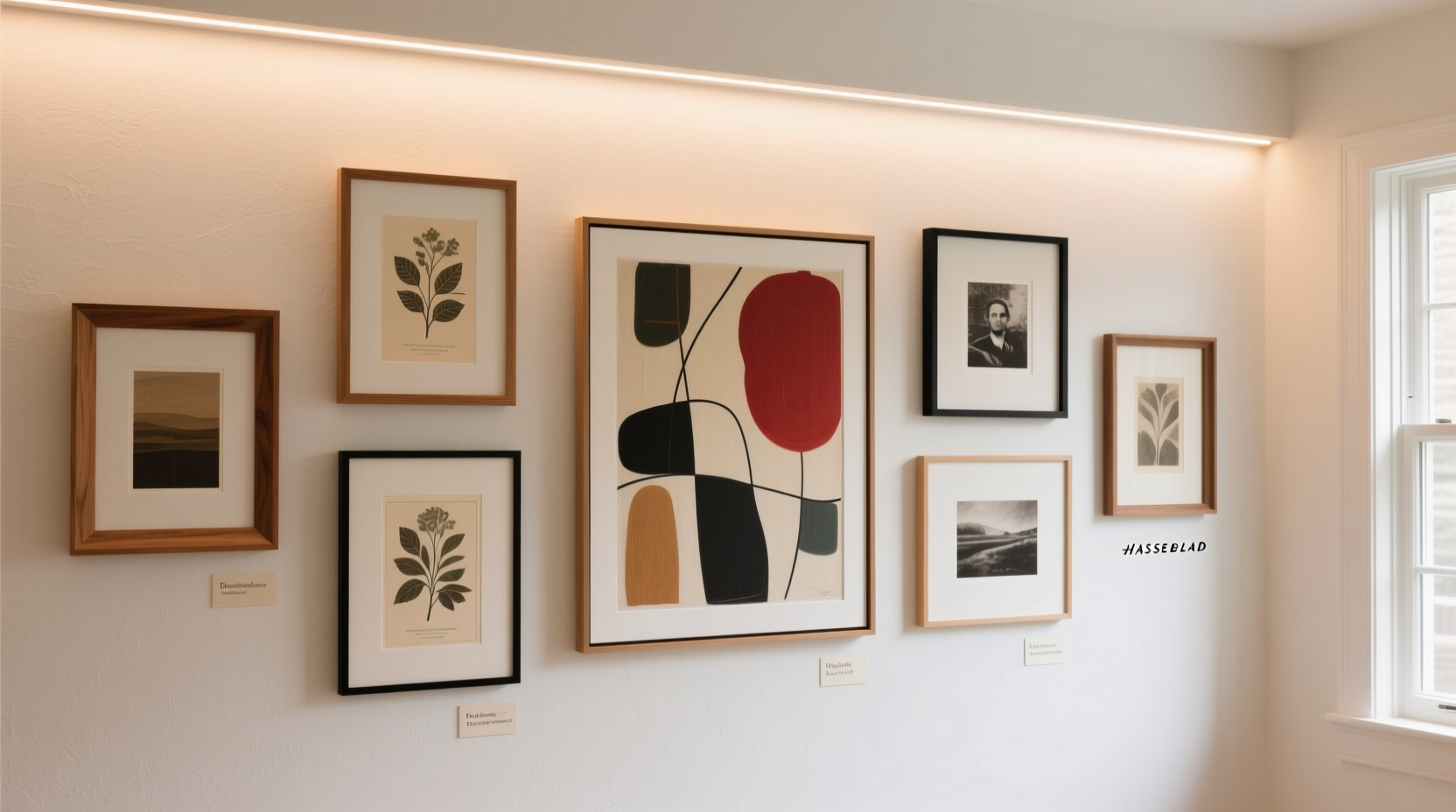
Real Example: From Clutter to Curation
Sarah, a graphic designer in Portland, had accumulated over 20 prints, postcards, and family photos over five years. Her living room wall was a patchwork of mismatched frames and uneven spacing. She decided to rework it using a deliberate process.
She began by sorting her pieces into categories: travel memories, original illustrations, and vintage botanicals. She chose the botanicals as her theme, pulling in only those eight pieces. All were reframed in simple black wood with off-white mats. She laid them out in a staggered rectangle, leaving 2.5 inches between each.
By removing unrelated items and standardizing presentation, the wall transformed from cluttered to curated. Guests now consistently compliment the space as “thoughtful” and “gallery-worthy.”
Step-by-Step Guide to Building Your Gallery Wall
Follow this proven sequence to ensure a polished result:
- Gather and edit your collection. Pull out all potential pieces and select only those that align with your chosen theme or mood. Less is often more—start with 5–9 items.
- Standardize framing where possible. Reuse existing frames or invest in new ones that share a finish. Consider professional matting for a refined touch.
- Determine your wall space. Measure the area and mark boundaries with painter’s tape. This prevents the arrangement from creeping beyond its intended footprint.
- Create paper templates. Cut kraft paper to match each frame’s size, label them, and tape them to the wall. Adjust until spacing and alignment feel balanced.
- Install from the center outward. Start with the central or largest piece, then work symmetrically or according to your template. Use a stud finder or wall anchors for heavier frames.
- Hang and refine. Once all pieces are up, step back. Make micro-adjustments as needed—sometimes a frame appears crooked only after installation.
- Add finishing touches. Include one or two non-art elements like a small shelf, sconce, or mirror to break flatness and add dimension.
This methodical approach removes randomness and ensures every decision supports the overall aesthetic.
Expert Insight: What Interior Designers Know
Professional designers emphasize intentionality over volume. As interior stylist Marcus Bell explains:
“People think more art means more impact. But a truly powerful gallery wall isn’t measured by quantity—it’s defined by curation. One perfectly placed photograph surrounded by breathing room can say more than twenty crowded frames.”
He recommends treating the wall like a magazine spread: every element has purpose, and white space is part of the design. “Negative space isn’t empty—it’s active. It gives the eye a place to rest and the art room to breathe.”
Common Pitfalls and How to Avoid Them
Even with good intentions, mistakes happen. Here are frequent issues and their solutions:
| Pitfall | Why It Happens | Solution |
|---|---|---|
| Uneven spacing | Hanging freehand without measuring | Use templates and a tape measure; maintain 2–3” gaps |
| Visual imbalance | Too many dark or large pieces on one side | Distribute weight evenly; use symmetry or counterbalance |
| Clashing frames | Mixing too many finishes or styles | Stick to one frame family; vary only size and orientation |
| Overcrowding | Adding pieces until no wall is visible | Leave at least 30% negative space; edit ruthlessly |
| Weak focal point | No central anchor or theme | Choose a hero piece and build around it |
Checklist: Build a Curated Gallery Wall in 7 Steps
- ☐ Define your theme (e.g., family, travel, abstract art)
- ☐ Select 5–9 pieces that fit the theme
- ☐ Standardize frames and mats for cohesion
- ☐ Measure your wall and outline the display area
- ☐ Create paper templates and arrange on the wall
- ☐ Install hardware starting from the center
- ☐ Step back, assess, and make final adjustments
Frequently Asked Questions
Can I mix different art types—photos, paintings, and mirrors?
Yes, but with restraint. Mixing media adds interest, but ensure they share a unifying element—such as consistent framing, a common color, or similar subject matter. A mirror can act as a neutral “breather” in a dense arrangement if its frame matches the others.
How high should I hang my gallery wall?
The center of the arrangement should be at eye level—approximately 57 to 60 inches from the floor. If hanging above furniture, leave 6 to 8 inches between the bottom of the lowest frame and the top of the piece. This creates visual connection without crowding.
What if my wall is irregular or has obstacles like switches or outlets?
Work around them. Avoid placing frames directly over electrical outlets for safety and aesthetics. Use the obstacle as a natural boundary—let it define the edge of your layout. You can also shift the entire arrangement slightly to maintain balance while avoiding obstructions.
Final Thoughts: Curation Is a Mindset
A curated gallery wall isn’t just about what you hang—it’s about how you choose, arrange, and refine. It reflects patience, taste, and attention to detail. Resist the urge to fill every inch. Instead, let each piece earn its place through relevance and harmony.
Remember, a gallery wall can evolve. Start with a strong core group, then rotate in seasonal pieces or new acquisitions. Over time, it becomes less of a decoration and more of a living archive—one that tells your story with clarity and confidence.


 浙公网安备
33010002000092号
浙公网安备
33010002000092号 浙B2-20120091-4
Comments
No comments yet. Why don't you start the discussion?