
A themed Christmas tree is more than decoration—it’s an expression of intention, seasonality, and quiet confidence. Yet too many well-meaning efforts veer into visual chaos: mismatched ornaments crowding every branch, garlands that compete rather than complement, or color schemes that read as “random” instead of “refined.” The difference between a memorable, gallery-worthy tree and one that feels hastily assembled isn’t budget or square footage—it’s discipline, editing, and design literacy. This guide distills proven principles used by professional set designers, interior stylists, and award-winning holiday decorators—not as abstract theory, but as actionable, room-tested methodology.
1. Start with Theme Definition—Not Decoration
Most trees fail before the first ornament is hung. Why? Because “theme” is mistaken for “color palette” or “material,” when in truth it’s a narrative anchor—a single, evocative idea that informs every choice. A “forest pine” theme isn’t just green and brown; it implies texture (rough burlap, raw wood slices), scent (dried eucalyptus, cedar sprigs), scale (asymmetrical branches, intentional negative space), and even sound (the imagined rustle of dried grasses). Conversely, “mid-century modern” isn’t just geometric ornaments—it demands clean lines, restrained metallics (brushed brass, not chrome), and deliberate absence: no tinsel, no glitter bombs, no dangling ribbons.
Ask yourself three questions before buying anything:
- What feeling should someone experience when standing in front of this tree? (e.g., hushed reverence, joyful nostalgia, crisp minimalism)
- What three sensory details define this theme? (e.g., matte finish + woody aroma + low-luster metals)
- What would break the illusion? (e.g., plastic baubles on a “heirloom linen” tree; neon accents on a “Victorian inkwell” tree)
2. The 70-20-10 Rule for Visual Hierarchy
Professional stylists don’t rely on intuition—they use proportion-based frameworks. The 70-20-10 rule ensures cohesion without rigidity:
| Element | Percentage of Total Decor | Examples & Purpose |
|---|---|---|
| Base Layer (70%) | 70% | Uniform ornaments in one material or finish—e.g., matte ceramic balls, hand-blown glass in a single hue, or wooden discs. This forms the “canvas” and creates rhythm. |
| Texture & Depth Layer (20%) | 20% | Natural elements or tactile items: dried citrus slices, cinnamon sticks, wool pom-poms, or twisted jute rope. Adds dimension without competing visually. |
| Accent Layer (10%) | 10% | One intentional focal point per 3–4 feet of height: a single antique bell, a vintage book page folded into a crane, or a brass star. Never more than 3–5 total pieces. |
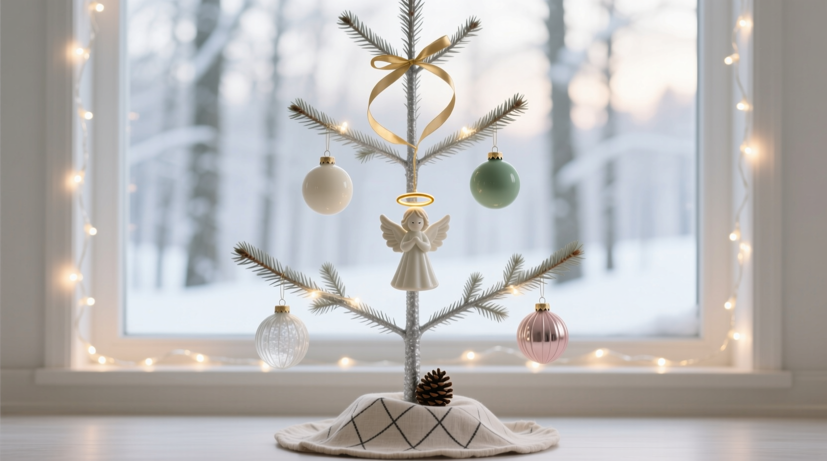
This ratio prevents visual fatigue. When 70% of your tree reads as calm and consistent, the eye rests—and only then does the 10% accent register as meaningful, not distracting. Overloading the accent layer (e.g., mixing velvet bows, crystal pendants, and glittered birds) collapses hierarchy and triggers clutter perception.
3. Edit Ruthlessly—Then Edit Again
Editing isn’t about removing “less important” items—it’s about preserving the integrity of the theme. A decorator’s most valuable tool isn’t a hot glue gun; it’s a cardboard box labeled “Not This Year.” Place it beside your tree during setup. Every time you reach for an ornament, ask: “Does this advance the story—or just fill space?” If hesitation follows, it goes in the box.
Real-world example: Sarah, a textile designer in Portland, spent years building a “Scandinavian farmhouse” tree—white wood beads, cream felt stars, and oat-straw wreaths. One December, she inherited her grandmother’s collection of hand-painted porcelain angels. Beautiful—but their delicate pastel florals clashed with the tree’s earthy, unadorned ethos. Instead of forcing them onto the tree, she displayed them on a nearby shelf with dried lavender and raw linen napkins, creating a thematic satellite display. The tree remained serene; the angels gained context. Both honored the theme—just in different zones.
“The most elegant trees are defined by what’s left out—not what’s added. Restraint isn’t limitation; it’s curation with purpose.” — Lena Voss, Set Designer for *Architectural Digest* Holiday Features
4. Step-by-Step: Building a Cohesive Tree in Under 90 Minutes
Follow this sequence—not chronologically, but hierarchically. Skipping steps invites imbalance.
- Prep the Branches (10 min): Fluff and separate branches outward—not upward. Trim any broken tips. Use floral wire to gently bend stubborn branches into graceful curves. A tree with poor structure cannot support thoughtful decoration.
- Hang Lights First—But Strategically (15 min): Use warm-white LED micro-bulbs (not multicolor or flashing). Wrap lights from the trunk outward, spacing bulbs 4–6 inches apart. Avoid wrapping the very tip of each branch—leave 2–3 inches bare at the end to preserve silhouette.
- Apply Base Ornaments (30 min): Hang 70% of your ornaments using ornament hooks—not string. Place heavier pieces near the trunk, lighter ones toward tips. Maintain consistent spacing: if you hang one ornament at a branch’s midpoint, place the next 8–10 inches away—not randomly.
- Add Texture Elements (20 min): Tuck dried botanicals or fabric ribbons *between* base ornaments—not over them. Weave them horizontally along branch length, not vertically down. This reinforces depth, not density.
- Place Final Accents (10 min): Stand back. Identify 3–5 natural “halos”—open spaces where light pools. Place your 10% accents there. No two accents should be within 12 inches of each other vertically or horizontally.
5. Avoid These Five Clutter Triggers (Do’s & Don’ts)
Clutter isn’t caused by quantity alone—it’s triggered by specific visual conflicts. Recognize these patterns:
| Clutter Trigger | Why It Fails | Do Instead |
|---|---|---|
| Mixed finishes in one color family (e.g., glossy red ball + matte red ribbon + metallic red star) | Creates visual vibration—your eye can’t settle on a single tone. | Pick one finish per color: all matte, all brushed metal, or all frosted glass. Consistency > variety. |
| Ornament size variance without rhythm (e.g., tiny beads next to giant spheres, no transitional sizes) | Breaks flow and suggests randomness, not design. | Use a size gradient: small → medium → large → small → medium… Repeat the sequence across the tree. |
| Over-garlanding (twisting multiple strands around the same branches) | Obscures branch structure and flattens dimension. | Use one garland type, draped loosely *over* branches—not wound tightly. Let 30% of garland hang freely downward. |
| Thematic “add-ons” that lack integration (e.g., miniature sleds glued to ornaments, snow globes dangling mid-air) | Introduces unrelated narratives and visual weight. | Only include thematic objects that serve function: a sled-shaped planter holding moss, or a snow globe placed *on the stand*, not hanging. |
| Ignoring the tree skirt as part of the theme | A mismatched skirt fractures continuity from top to base. | Treat the skirt as the “foundation”: burlap for rustic, velvet for luxe, woven seagrass for coastal. Extend one base-layer ornament (e.g., a wooden slice) onto the skirt. |
6. FAQ: Real Questions from Home Decorators
How do I choose a theme that works with my existing living room?
Don’t match your sofa—match your room’s dominant texture and light quality. A sun-drenched, white-walled space leans into airy themes (linen, bleached wood, pale ceramics). A moody, library-style room with dark walls and leather chairs supports richer themes (burgundy velvet, antique brass, dried figs). Pull one non-Christmas element from the room—the grain of your coffee table, the weave of your rug—and let that inform your theme’s material language.
Can I mix vintage and modern ornaments without looking chaotic?
Yes—if you unify them through finish and scale, not era. A 1940s mercury glass ball and a 2023 minimalist ceramic sphere share the same reflective quality and spherical form. What breaks harmony is pairing that mercury glass with a 1970s glittered plastic snowman. Focus on shared attributes (matte surface, organic shape, weight) over provenance.
What if my theme feels “too quiet” or “boring”?
Quiet ≠ boring. It signals intention. If you crave energy, add it through motion—not clutter. Try a kinetic element: a slow-turning motorized base, wind chimes made of brass tubes that catch light, or a subtle fiber-optic strand woven into the garland that pulses softly. Movement engages the eye without demanding visual processing.
Conclusion
A themed Christmas tree that breathes, balances, and tells a story doesn’t happen by accident. It happens when you treat decoration as design—with constraints, intention, and respect for negative space. You don’t need more ornaments. You need clearer boundaries. You don’t need pricier materials. You need deeper attention to how light falls on matte surfaces, how wool absorbs sound, how silence between ornaments makes the next one resonate. This year, resist the urge to “fill.” Instead, curate. Edit. Pause. Stand back. Ask: Does this serve the feeling I promised myself—and my home? Then hang just enough to say it well.


 浙公网安备
33010002000092号
浙公网安备
33010002000092号 浙B2-20120091-4
Comments
No comments yet. Why don't you start the discussion?