
A beautifully themed Christmas tree is more than decoration—it’s an expression of intention, rhythm, and quiet confidence. Yet many well-meaning decorators fall into the same trap: piling on elements in the name of “cohesion,” only to end up with a tree that feels chaotic, exhausting to look at, or like a department store display gone rogue. The difference between a memorable theme and an overdone one isn’t quantity—it’s curation. It’s editing. It’s knowing when *less* doesn’t mean minimal, but *more intentional*. This article distills proven strategies used by professional holiday stylists, interior designers, and longtime tree artisans—not as abstract ideals, but as actionable, adaptable practices you can apply this season.
1. Start with a Single Anchor Concept—Not a Color Palette
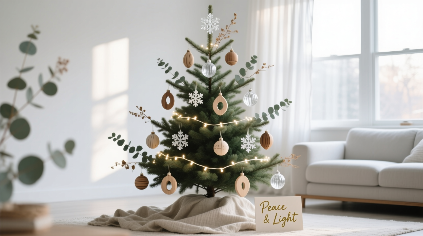
Most people begin with color: “I want a silver-and-white tree” or “Nordic blue and pine.” But color alone rarely sustains a theme—it’s too broad, too easily diluted. Instead, anchor your tree in a singular, evocative concept: forest floor, vintage apothecary, mid-century modern cabin, or crushed velvet opera house. These concepts carry built-in texture, scale, mood, and hierarchy—and they instantly narrow your decision-making.
Consider the difference: A “gold-and-green” palette could include glittery baubles, tinsel, plastic pinecones, metallic garlands, and neon ribbon—all technically “on theme,” yet visually jarring. A “forest floor” concept, however, implies moss-wrapped ornaments, dried botanicals (eucalyptus pods, cinnamon sticks, birch bark discs), matte-finish wooden birds, and low-luster brass wire accents. Every element earns its place because it answers the question: *Does this belong on the forest floor?*
2. Apply the 70/20/10 Proportion Rule
Professional stylists consistently use proportional discipline to avoid visual overload. This isn’t about rigid math—it’s about creating optical breathing room and guiding the eye naturally through layers of interest.
| Component | Recommended Share of Visual Weight | What It Includes & Why It Works |
|---|---|---|
| Base Layer (70%) | 70% | Ornaments that establish tone and texture: matte glass balls, hand-thrown ceramic shapes, fabric-covered spheres. Uniform in finish (all matte, all frosted, all raw wood) but varied subtly in size and shape. This layer forms the tree’s “skin”—calm, grounded, and cohesive. |
| Accent Layer (20%) | 20% | Elements that add narrative or contrast: three to five handmade ornaments (a tiny ceramic fox, a pressed-flower resin disc), one type of natural element (dried orange slices, preserved fern fronds), or a single material accent (brass wire spirals, linen-wrapped twigs). These tell the story—but never shout it. |
| Highlight Layer (10%) | 10% | One deliberate focal point: a single oversized ornament (e.g., a 5-inch blown-glass mushroom), a custom-made tree topper that echoes the concept (a ceramic owl for “forest floor”), or a precisely placed string of warm-white micro LEDs. This is where light, scale, or craftsmanship draws attention—without competing. |
This ratio works because it mirrors how the human eye processes visual information: we first register broad tonal fields (the 70%), then notice meaningful variation (the 20%), and finally lock onto points of emphasis (the 10%). Deviate significantly—say, 50/30/20—and the tree begins to feel busy, unedited, or like a collection rather than a composition.
3. Edit Ruthlessly—Then Edit Again
Editing isn’t just removing items. It’s interrogating every piece: Does it reinforce the anchor concept? Does it harmonize in finish and weight with the base layer? Does it have physical or visual “neighbors” that support—not compete with—it? Stylist Maya Chen, who has styled trees for the New York Botanical Garden and Soho House London, puts it plainly:
“An overdone tree is rarely the result of too many beautiful things. It’s the result of too many *unrelated* beautiful things sharing the same space without hierarchy. Editing isn’t subtraction—it’s assigning roles.” — Maya Chen, Holiday Stylist & Author of The Quiet Tree
Try this two-stage editing process:
- The First Pass (Before Hanging): Lay out every ornament, garland, and accent. Group identical items. Remove anything that lacks clear textural or conceptual alignment with your anchor concept—even if it’s handmade or sentimental. Set those aside in a “maybe” box.
- The Second Pass (After Initial Hang): Step back 10 feet. Blink. Then ask: Where does my eye go first? Is it drawn to one intentional highlight—or bouncing erratically between three shiny objects and a cluster of mismatched ribbons? Remove one item from each cluster that feels “busy.” Wait 10 minutes. Reassess. Repeat until the tree feels calm, not crowded.
This method prevents the common error of “adding one more thing to fix the imbalance”—which almost always deepens it.
4. Real-World Example: The “Library Nook” Tree That Felt Like Home
Sarah, a literature professor in Portland, wanted a tree reflecting her love of old books, ink, and quiet study nooks—but feared it would become a cliché of leather-bound book ornaments and miniature quills. She began with the anchor concept: library nook at dusk. Not “books,” but the feeling: warm lamplight, worn spines, paper dust, hushed reverence.
Her 70% base layer: matte, irregularly shaped ornaments in deep burgundy, charcoal, and oatmeal—hand-blown glass with subtle air bubbles, ceramic orbs glazed like aged paper, and walnut slices sealed with beeswax. All matte. All quiet.
Her 20% accent layer: three antique brass book clasps (repurposed as ornaments), dried lavender buds tucked into small muslin pouches tied with twine, and one vintage-style brass magnifying glass hung from a leather cord.
Her 10% highlight: a single, large (4.5-inch) ornament—a hand-poured candle in amber glass, lit with a warm LED tea light, suspended mid-tree like a reading lamp. No other lights were used on the tree itself; the candle was the sole source of illumination.
The result? Guests didn’t say, “Oh, a book tree!” They said, “It smells like my grandfather’s study,” or “I want to sit beside this and read for an hour.” The theme wasn’t announced—it was *felt*, because every element served atmosphere, not aesthetics alone.
5. Avoid These Five Overdone Traps (and What to Do Instead)
Even with strong intent, certain habits derail thematic clarity. Here’s what to watch for—and how to pivot:
- Trap: Matching Everything Exactly
Using identical ornaments in rows, uniform ribbon bows, or repeating the same motif 20 times. Instead: Vary scale and placement. Use three sizes of the same shape (e.g., small, medium, large ceramic mushrooms), spaced asymmetrically. Let repetition breathe. - Trap: Over-Garlanding
Wrapping multiple heavy garlands (beaded, velvet, pinecone, ribbon) around the same branches. Instead: Choose one primary garland (e.g., dried eucalyptus + cinnamon sticks) and let it drape naturally—no twisting, no doubling. Add texture elsewhere with sparse branch-wrapping (e.g., thin brass wire coiled once around select tips). - Trap: Themed Topper + Themed Lights + Themed Tree Skirt + Themed Stand
When every surface element screams the same idea, the eye has nowhere to rest. Instead: Let the tree itself carry the full concept. Keep the skirt simple (natural burlap, undyed linen, or raw wool felt). Use warm-white micro LEDs only—no colored or patterned lights. Let the stand remain neutral (black iron, unfinished wood). - Trap: Forcing Sentimental Items Into the Theme
Trying to incorporate childhood ornaments, travel souvenirs, or family heirlooms without adaptation. Instead: Edit sentimentality into service. Spray-paint a chipped ceramic angel matte black to match your base layer. Wrap a vintage glass ball in thin copper wire before hanging. Place a beloved ornament *inside* a clear glass cloche on the mantel—not on the tree—where it becomes a curated vignette, not a visual conflict. - Trap: Ignoring Negative Space
Filling every inch of branch, believing “full” equals “festive.” Instead: Embrace asymmetry and openness. Leave lower branches bare to showcase trunk texture. Allow gaps between clusters so light and shadow play across the form. A tree needs silence between its notes.
6. Step-by-Step: Building Your Tree in Four Deliberate Phases
Follow this sequence—not chronologically, but hierarchically—to ensure cohesion builds from structure upward:
- Phase 1: Structure & Light (Day 1)
Fluff branches thoroughly. String warm-white micro LED lights *first*, working from bottom to top, hiding wires deep within inner branches. Use 100 lights per foot of tree height—no more. Let lights settle overnight. This establishes rhythm and warmth before any ornament touches the tree. - Phase 2: Base Layer Anchors (Day 2, Morning)
Hang 70% of ornaments: start at the *back* and *bottom* third of the tree, working outward and upward. Place larger base ornaments deeper in the tree; smaller ones toward tips. Maintain consistent spacing—approx. 4–6 inches between centers. Step back every 10 ornaments. - Phase 3: Accent Layer Integration (Day 2, Afternoon)
Add 20% accents—but only where they enhance, not interrupt, the base layer’s flow. Hang brass clasps *between* clusters of ceramic orbs, not atop them. Tuck lavender pouches into branch forks, not dangling freely. Let accents nestle, not perch. - Phase 4: Highlight & Final Edit (Day 3, Morning)
Place your single 10% highlight. Then, walk slowly around the tree at eye level. Remove *one* ornament from any cluster where three or more share the same plane or orientation. Replace it with a deliberate gap. That gap is now part of the design.
7. FAQ
Can I mix materials—like wood, glass, and metal—without breaking the theme?
Yes—if they share a unifying quality: matte finish, similar weight, or complementary patina. A walnut slice, a frosted glass orb, and a brushed brass disc all feel “grounded” and tactile. Avoid mixing high-gloss acrylic with raw wood or mirrored glass with burlap—they compete in reflectivity and energy. Unify through finish, not material.
What if my theme feels too subtle? Will guests even notice it?
That’s the goal. A successful theme isn’t a billboard—it’s a whisper that lingers. Guests may not name your “library nook” concept, but they’ll pause, inhale, and say, “This feels so peaceful,” or “I love how warm this tree feels.” Subtlety creates emotional resonance; obviousness creates decoration. Trust the atmosphere over the label.
How do I adapt this for a small tabletop tree or a slim pencil tree?
Scale down the ratios, not the rigor. A 24-inch tabletop tree still needs a 70/20/10 structure—but with fewer pieces: 7 base ornaments, 2 accents, 1 highlight. Prioritize vertical rhythm: hang ornaments at varying heights along the central stem, not just at the tips. On a pencil tree, focus ornaments on the lower two-thirds, letting the slender top third breathe—this enhances elegance, not emptiness.
Conclusion
A themed Christmas tree shouldn’t exhaust the eye or overwhelm the room. It should invite presence—not performance. When you choose a single, resonant anchor concept, honor proportion over abundance, edit with the precision of a poet choosing words, and protect negative space as fiercely as you protect your favorite ornament, you stop decorating a tree and start composing an experience. This season, resist the pressure to fill. Instead, focus on what each element *does*—not just what it *is*. Let texture speak, let light linger, let silence hold space for meaning. Your tree won’t just look cohesive. It will feel like a quiet, confident exhalation in the heart of the holidays.


 浙公网安备
33010002000092号
浙公网安备
33010002000092号 浙B2-20120091-4
Comments
No comments yet. Why don't you start the discussion?