
A business card may be small, but its impact is anything but. In an age of digital networking, a well-designed business card still holds weight—serving as a tangible representation of your personal or company brand. Whether you're launching a startup, expanding your freelance work, or refreshing your corporate identity, creating a professional business card requires more than just slapping your name and phone number on a piece of paper. It’s about clarity, consistency, and credibility.
This guide walks you through every stage—from defining your brand message to choosing the right finish—so you can produce a business card that not only looks polished but also functions effectively in real-world interactions.
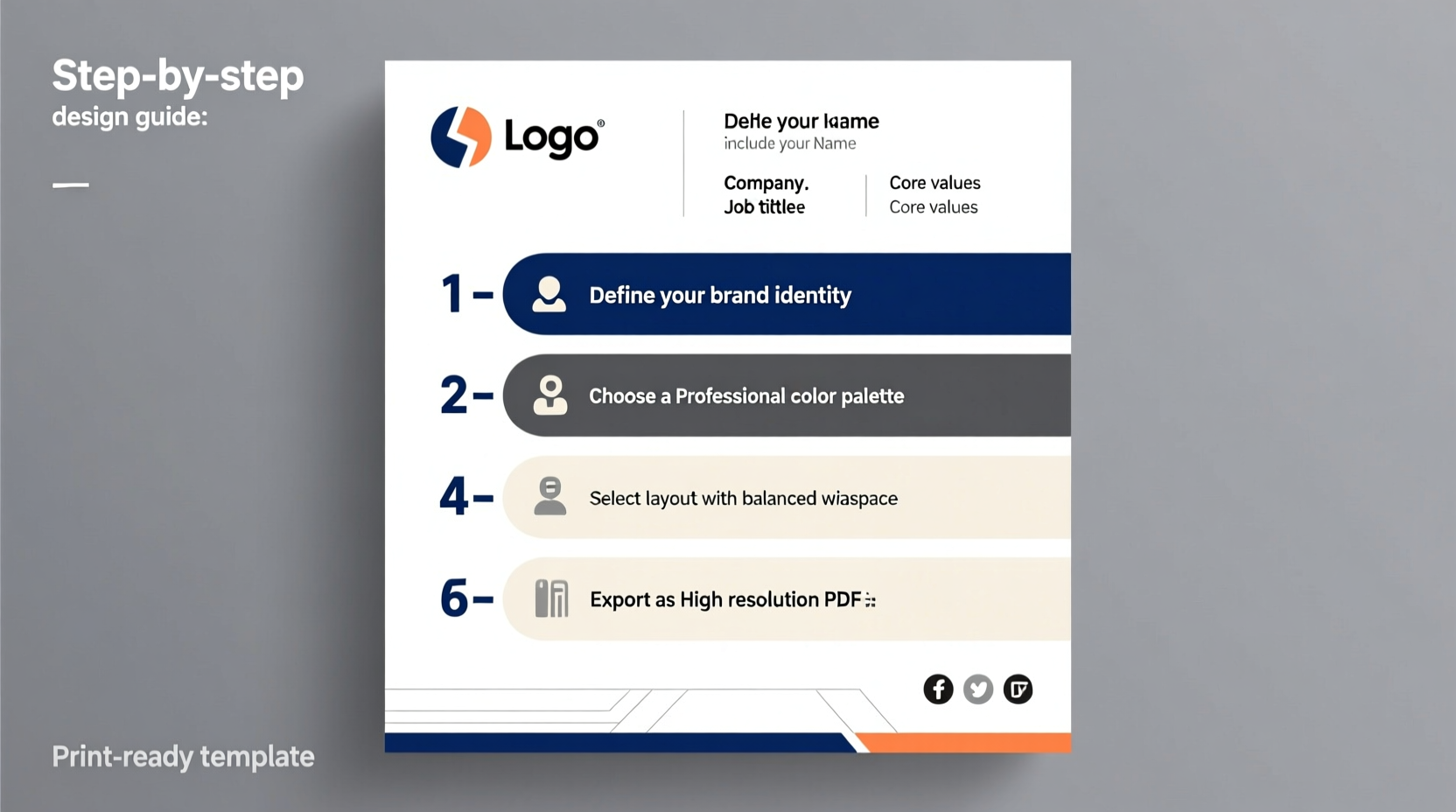
Define Your Brand Identity First
Before any design begins, ask yourself: What does your brand stand for? A cohesive business card starts with a clear understanding of your brand’s voice, values, and visual language. Are you a minimalist designer favoring clean lines and neutral tones? Or a bold entrepreneur using vibrant colors and dynamic typography?
Your business card should reflect the same tone used across your website, email signature, and social media profiles. Consistency builds recognition and trust.
Start by listing key elements:
- Company name (or full name if individual)
- Job title or role
- Core services or industry
- Brand colors and primary typeface
- Logo or visual symbol (if applicable)
“Your business card is often the first physical interaction someone has with your brand. Make it count.” — Laura Kim, Brand Strategist at Studio Nova
Step-by-Step Guide to Creating Your Business Card
Follow this structured process to ensure no detail is overlooked:
- Finalize contact information: Include essential details like name, title, phone number, professional email address, website URL, and relevant social handles (e.g., LinkedIn). Avoid cluttering with unnecessary links.
- Select dimensions and orientation: Standard size is 3.5 x 2 inches (US) or 85 x 55 mm (Europe). Decide between horizontal or vertical layout based on how much text you need and aesthetic preference.
- Choose a design tool or service: Use platforms like Canva, Adobe Express, Vistaprint, or hire a graphic designer via Fiverr or Dribbble for custom work.
- Design with hierarchy in mind: Place the most important information—your name and company—at the top or center. Use font weights and sizes to guide the eye naturally.
- Pick high-quality materials and finishes: Consider paper stock (matte, glossy, recycled), edge styles, and special touches like spot UV coating, foil stamping, or rounded corners.
- Proofread thoroughly: Check spelling, spacing, alignment, and contrast. Print a test copy or request a digital proof from your printer.
- Order a small batch first: Test how the final product feels and looks in person before committing to bulk quantities.
Do’s and Don’ts: Design Best Practices
| Do | Don't |
|---|---|
| Use legible fonts (e.g., Helvetica, Lato, Georgia) | Use overly decorative or script fonts |
| Maintain sufficient contrast between text and background | Place light text on light backgrounds |
| Leave white space to avoid clutter | Cram too much information onto one side |
| Include a QR code linking to your portfolio or contact info | Add outdated tech references (e.g., fax numbers) |
| Align all elements cleanly using grids | Allow misaligned text or uneven margins |
Real Example: From Concept to Client Handoff
Samantha Lee, a freelance web developer based in Portland, wanted to elevate her client outreach. Previously, she relied solely on email introductions, but noticed prospects forgot her after initial meetings. She decided to invest in professionally printed cards.
She began by refining her brand: selecting a deep navy blue as her primary color, pairing it with crisp white, and using Montserrat for clean readability. Her logo—a stylized “SL” monogram—was placed subtly in the corner. On the front: her name, tagline (“Building Fast, Responsive Websites”), and logo. On the back: contact details, LinkedIn, GitHub, and a scannable QR code that opened her online portfolio.
She chose a matte laminate with rounded corners for a modern feel and ordered 100 cards through a local print shop. Within three weeks of handing them out at networking events, she landed two new clients who mentioned, “I kept your card on my desk—it looked so professional.”
Choosing Between DIY Tools and Professional Designers
You don’t need to be a graphic designer to create a strong business card, but knowing when to go pro makes a difference.
For solopreneurs and small businesses on a budget, tools like Canva or VistaCreate offer customizable templates that maintain professional standards. These are ideal if you already have a defined brand and just need a quick, reliable output.
However, if your brand demands uniqueness—such as luxury positioning, intricate illustrations, or bilingual layouts—working with a professional designer ensures originality and attention to technical detail, including bleed areas, CMYK color mode, and resolution (300 DPI minimum).
“Custom design isn’t vanity—it’s strategic differentiation. A unique card sets you apart in saturated markets.” — Marcus Tran, Creative Director at Inkwell Studio
Frequently Asked Questions
Should I include my photo on my business card?
In most Western business contexts, photos aren’t standard unless you’re in industries like real estate, acting, or politics where personal recognition matters. In many Asian countries, however, including a photo is common practice. Know your audience and cultural norms before adding one.
Is it worth paying extra for premium finishes?
Yes—if it aligns with your brand. A soft-touch matte finish conveys sophistication; metallic foil adds luxury; textured paper suggests craftsmanship. But avoid gimmicks that distract from readability. The goal is enhanced perception, not novelty.
Can I update my business card digitally?
Absolutely. Digital business cards are growing in popularity—especially via apps like HiHello, CamCard, or LinkedIn QR codes. Many professionals now use both: a physical card for in-person exchanges and a digital version for instant sharing via smartphone.
Final Checklist Before Printing
Run through this checklist to ensure your file is print-ready:
- ✅ All text is proofread and error-free
- ✅ Fonts are embedded or converted to outlines
- ✅ Images and logos are 300 DPI and in CMYK (not RGB)
- ✅ Bleed area is extended 1/8 inch beyond trim line
- ✅ Safe zone maintained: critical content stays 1/8 inch inside trim
- ✅ File exported as PDF/X-1a (industry standard)
- ✅ Color mode verified (Pantone, CMYK, or grayscale as needed)
Conclusion: Make Every Exchange Count
A business card is more than a piece of paper—it's a micro-representation of your professionalism, attention to detail, and brand ethos. By thoughtfully crafting each element, from typography to texture, you turn a simple exchange into a memorable moment.
Now that you’ve walked through the entire process—from concept to print—take action. Revisit your current card or draft your first one today. Whether you design it yourself or collaborate with a creative expert, make sure it speaks clearly, looks sharp, and feels intentional.


 浙公网安备
33010002000092号
浙公网安备
33010002000092号 浙B2-20120091-4
Comments
No comments yet. Why don't you start the discussion?