
Layering transparent and opaque ornaments on a lit Christmas tree isn’t just about aesthetics—it’s about orchestrating light, texture, and perception. When done well, the result is a tree that appears to glow from within, with dimension that shifts as you move around it and warmth that feels both nostalgic and intentional. Many decorators struggle not with ornament selection, but with spatial sequencing: where to place a crystal ball versus a matte ceramic star, how close to the lights each type should sit, and why some trees look “flat” even with premium decor. The answer lies in understanding how light interacts with material, how human vision perceives depth in three-dimensional space, and how contrast—not uniformity—creates visual richness.
The Science Behind Light and Ornament Interaction
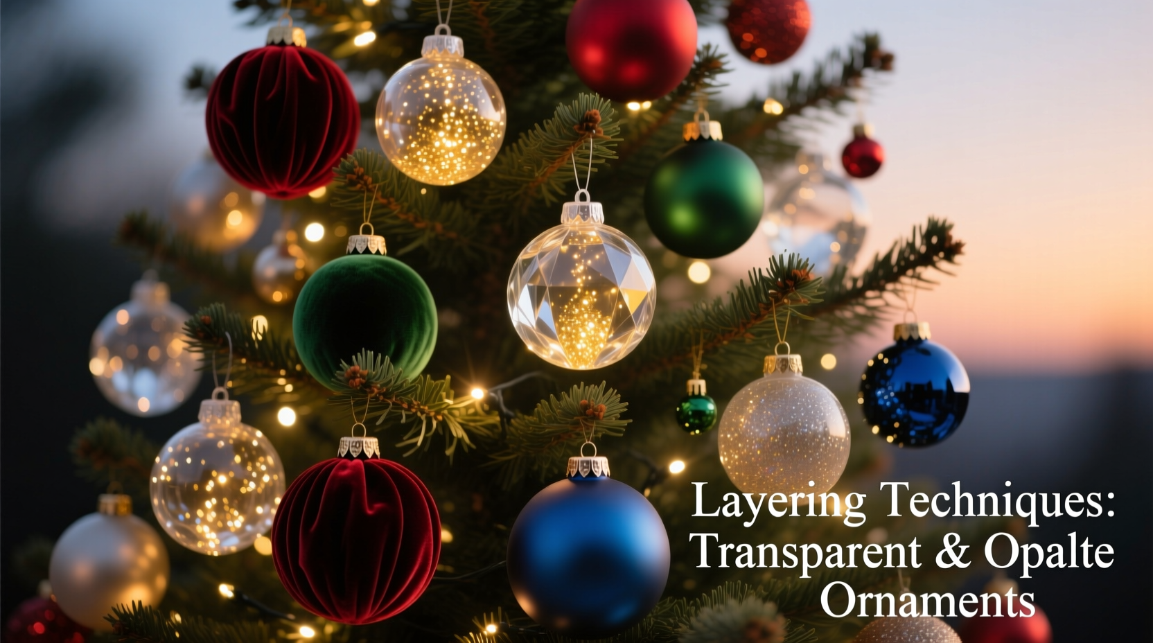
Before placing a single ornament, grasp two foundational optical principles. First, transparent ornaments (glass baubles, acrylic spheres, blown crystal) function as miniature lenses. They refract, reflect, and scatter light from your string lights, creating highlights, rainbows, and soft halos—but only when positioned where light can reach them directly or at shallow angles. Second, opaque ornaments (wood, matte ceramic, velvet-covered balls, painted metal) absorb and diffuse light. They don’t sparkle; they anchor, define shape, and provide tonal contrast. Their value increases dramatically when placed *behind* or *between* transparent pieces, allowing light to skim their edges or backlight their silhouettes.
This interplay is why a tree overloaded with transparent ornaments often looks cold or chaotic: too much refraction without visual rest. Conversely, an all-opaque tree reads as dense and heavy, especially at night—light gets swallowed rather than celebrated. The ideal ratio isn’t fixed, but research by interior lighting designers at the American Society of Interior Designers shows that trees perceived as “most balanced and inviting” consistently feature 40–50% transparent ornaments by visual weight (not count), with the remainder opaque—and crucially, distributed across three distinct depth planes: front, mid, and back.
A Three-Plane Layering Framework
Forget “top to bottom” or “inside out.” Instead, think in terms of depth planes relative to the tree’s silhouette. This method works for flocked, fresh, artificial, or slim-profile trees alike.
- Back plane (deepest layer): 30% of total ornaments. Primarily large, simple opaque pieces—matte wood stars (4–6 inches), linen-wrapped spheres, or deep-toned ceramic bells. Place these *deep within the branches*, near the trunk, where they won’t obstruct light paths but will catch backlighting from strings wrapped along inner branches.
- Mid plane (structural layer): 40% of ornaments. A deliberate mix: medium-sized transparent glass balls (3–4 inches) paired with complementary opaque shapes—e.g., a cobalt blue glass orb next to a navy felt pinecone. Position these on outer-mid branches, spaced 6–8 inches apart. This layer defines the tree’s volume and creates rhythm.
- Front plane (highlight layer): 30% of ornaments. Smaller transparent items (1.5–2.5 inch crystal teardrops, faceted acrylic icicles) and high-contrast opaque accents (gold-dusted wood slices, black matte berries). These go on the very tips of branches and along the front-facing perimeter. They’re the first things the eye sees—and the last to catch direct light.
This framework prevents overcrowding in any one zone and ensures every ornament has room to interact with light. It also solves the common problem of “ornaments disappearing into the green”—by anchoring opaques deep and letting transparencies shimmer forward, the tree gains architectural clarity.
Lighting Strategy: Your Invisible Foundation
Your string lights aren’t just illumination—they’re the compositional backbone. Without intentional light placement, even perfect ornament layering falls flat. Use warm-white LED micro-lights (2700K–3000K color temperature) with a minimum of 500 bulbs for a standard 7-foot tree. Space them evenly *before* adding ornaments: wrap from base to tip in gentle spirals, keeping 4–6 inches between wraps. Crucially, add a second, subtler strand of warm-white fairy lights *only* on the inner branches—these create ambient backlighting that makes deep-layer opaque ornaments glow at their edges.
Avoid cool-white or multicolor lights unless intentionally pursuing a modern aesthetic—they compete with the natural warmth of transparent glass and mute the richness of earthy opaque tones. Also avoid “net lights”: their uniform grid overrides organic depth and flattens ornament hierarchy.
| Ornament Type | Ideal Light Distance | Why It Matters |
|---|---|---|
| Large transparent glass ball (5\") | Within 2 inches of a bulb | Each facet needs direct light contact to refract fully; too far = dull reflection|
| Matte ceramic star (3\") | 1–3 inches behind a bulb | Backlighting creates soft halo and lifts silhouette without glare|
| Crystal teardrop (2\") | Directly strung on tip, bulb at top of hook | Maximizes vertical sparkle and minimizes shadow pooling|
| Felt berry cluster (1.5\") | Adjacent to, not covering, a bulb | Allows light to graze texture while preserving matte depth
Real-World Application: The Henderson Family Tree
In Portland, Oregon, the Hendersons had decorated the same Fraser fir annually for 12 years—always with vintage glass ornaments passed down from the grandmother. By year 10, the tree looked increasingly “busy” and visually tired, despite using identical pieces. Their decorator, Maya Tran of Evergreen Interiors, diagnosed the issue immediately: all ornaments were placed on the outermost branches, with no depth variation and no consideration for light interaction. Transparents sat directly over bulbs, creating harsh hotspots; opaques were clustered mid-tree, casting overlapping shadows.
Tran restructured their approach in one afternoon. She removed all ornaments, rewired inner backlighting, then applied the three-plane framework: matte walnut stars tucked deep near the trunk; mercury-glass balls and hand-blown cobalt orbs alternated on mid-branches; and delicate lead-crystal icicles hung from the very tips. She also rotated several older ornaments 180 degrees so their most reflective surfaces faced outward—not inward toward the trunk. The result? A tree that appeared taller, brighter, and more dimensional—even though no new ornaments were purchased. Neighbors reported it looked “like it was breathing light.” As Tran notes: “Ornaments don’t glow on their own. They respond. You have to ask the right questions of your lights first.”
“Transparency without opacity is spectacle without substance. Opaque without transparency is warmth without wonder. The magic lives in the conversation between them.” — Elena Rossi, Lighting Designer & Author of Seasonal Light: Crafting Atmosphere Through Illumination
Step-by-Step Ornament Placement Sequence
Follow this timed sequence—not a checklist—to build depth organically. Allow 90 minutes for a full-size tree.
- Prep (10 min): Unwrap and sort ornaments into three labeled bins: “Deep/Back,” “Mid/Balance,” and “Front/Highlight.” Test all string lights and replace dead bulbs. Wrap inner backlighting strand first, securing gently with twist ties—not staples.
- Back plane (15 min): Starting at the base, tuck large opaque ornaments deep into the interior. Prioritize weight distribution: heavier pieces lower and centered. Avoid symmetry—place a wood star left of center at knee height, another slightly higher on the right.
- Mid plane (30 min): Working upward in spirals, alternate transparent and opaque ornaments on outer-mid branches. Use a consistent spacing guide: hold a ruler or credit card—6 inches between ornament centers. Rotate each transparent piece so its most reflective curve faces outward.
- Front plane (25 min): Add small transparencies to branch tips first. Then place high-contrast opaques *just behind* them—not directly beside—so light grazes both. Finish with 3–5 statement pieces (e.g., a single oversized matte brass star) at key focal points: top third, left shoulder, right hip.
- Final calibration (10 min): Step back 6 feet. Turn off room lights. Observe where light pools, where shadows feel heavy, where sparkles vanish. Adjust only 3–4 pieces: move one opaque deeper if front feels crowded; rotate a glass ball if it reflects only darkness; add a tiny clear bead behind a dull-feeling felt ornament to lift its edge.
Common Pitfalls and How to Avoid Them
- Overloading the front plane: Placing too many ornaments on visible tips creates visual noise and blocks light from reaching inner layers. Solution: Limit front-plane pieces to one per major branch tip—no clustering.
- Ignoring ornament weight: Heavy glass balls on thin outer branches cause sagging and disrupt silhouette. Solution: Reserve larger transparencies (4\"+) for sturdier mid-branches; use lightweight acrylic for tips.
- Mismatched color temperatures: Combining warm-white lights with cool-toned transparents (e.g., icy blue glass) creates dissonance. Solution: Choose transparencies with warm undertones (amber, honey, rose) when using warm-white lights—or switch to neutral-white (3500K) lights for cooler palettes.
- Forgetting scale progression: Using only one size of transparent ornament flattens depth. Solution: Vary diameters intentionally—large spheres back, medium mid, small teardrops front—to reinforce the plane structure visually.
FAQ
Can I mix vintage glass ornaments with modern acrylic ones?
Yes—strategically. Vintage glass often has subtle imperfections and softer refraction; modern acrylic tends toward sharper, brighter sparkle. Place vintage pieces in the mid and back planes where their gentle glow harmonizes with warm light, and reserve acrylic for the front plane where its intensity reads as intentional highlight. Avoid mixing them side-by-side in the same plane—the contrast can feel jarring.
How do I prevent transparent ornaments from looking “empty” or hollow?
Hollowness occurs when light doesn’t fill the ornament’s interior volume. Ensure bulbs sit within 1.5 inches of the ornament’s surface—and choose ornaments with internal texture (ribbed, etched, or seeded glass) that scatters light inward. Avoid perfectly smooth, thick-walled glass balls unless paired with a dedicated micro-bulb inserted inside (available from specialty ornament suppliers).
Do matte-finish opaque ornaments need special care near lights?
Unlike glossy finishes, matte surfaces don’t conduct heat efficiently and can degrade faster under sustained proximity to incandescent bulbs. With modern LEDs, this is rarely an issue—but still maintain at least 1 inch of clearance between matte fabric or paper ornaments and any bulb. Never use old-school incandescent mini-lights with matte textiles.
Conclusion
A beautifully layered Christmas tree doesn’t happen by accident. It emerges from deliberate choices about light, material, and space—choices grounded in observation and refined through practice. Transparent ornaments are not merely “sparkly”; they are light translators. Opaque ornaments are not just “solid”; they are tonal anchors and textural counterpoints. When you step back from your tree tonight, don’t ask, “Does it look festive?” Ask instead: “Where does my eye travel? Where does light gather? Where does depth invite me closer?” That shift—from decoration to dialogue—transforms seasonal tradition into quiet, luminous artistry.


 浙公网安备
33010002000092号
浙公网安备
33010002000092号 浙B2-20120091-4
Comments
No comments yet. Why don't you start the discussion?