
In today’s digital world, first impressions are made in seconds. When someone lands on your website, they decide almost instantly whether to stay or leave. A well-designed site doesn’t just look good—it guides visitors, communicates value, and encourages action. For beginners, the process can seem overwhelming, but with a clear roadmap, anyone can create a website that truly engages.
This guide walks you through the essential steps of designing a website that captures attention, builds trust, and keeps users interested—without requiring advanced technical skills.
Understand Your Audience and Purpose
Before writing a single line of code or choosing a color scheme, define who your audience is and what you want them to do on your site. Are you selling a product? Sharing information? Building an email list? Each goal shapes your design choices.
Ask yourself:
- Who are my ideal visitors?
- What problems do they have that my site can solve?
- What action should they take after visiting?
A small business owner launching a bakery website, for example, needs to showcase products, display location and hours, and make ordering easy. A blogger might prioritize readability and newsletter signups.
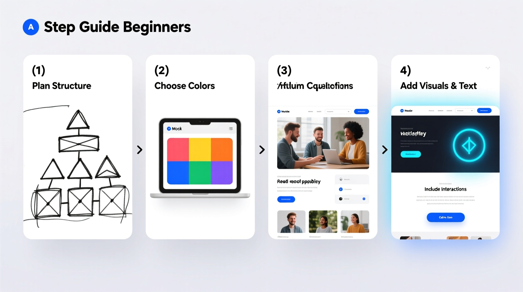
Plan Your Site Structure and Navigation
A confusing layout drives users away. Even the most beautiful visuals won’t help if people can’t find what they’re looking for. Start by mapping out your pages and how they connect.
Begin with core pages like:
- Home
- About
- Services or Products
- Contact
Then sketch a sitemap—on paper or using free tools like draw.io or Whimsical. Keep it simple. Most small websites thrive with fewer than seven main pages.
Navigation should be intuitive. Use clear labels (e.g., “Contact Us” instead of “Reach Out”), place menus at the top or side, and include a footer with links to legal pages and social media.
“Website engagement starts with clarity. If users can’t find what they need in 10 seconds, they’ll likely leave.” — Maya Tran, UX Designer at DesignLab Studio
Design for Visual Hierarchy and Readability
Your site’s layout should guide the eye naturally from one element to the next. This is called visual hierarchy. Use size, color, spacing, and contrast to highlight what matters most.
On your homepage, the primary headline should be the largest text. Follow it with a short subheading and a strong call to action (like “Get Started” or “Learn More”). Avoid cluttering the top of the page with too many elements.
Typography plays a key role. Choose one or two easy-to-read fonts. Sans-serif fonts like Open Sans or Roboto work well for digital screens. Keep font sizes legible—16px minimum for body text—and use plenty of white space around paragraphs to reduce strain.
| Element | Best Practice | Common Mistake |
|---|---|---|
| Headlines | Use large, bold fonts; limit to one main message | Multiple competing headlines |
| Body Text | 16–18px font size; short paragraphs | Long blocks of text without breaks |
| Buttons | Contrasting color; action-oriented text | Vague labels like “Click Here” |
Color and Branding
Choose a color palette of 2–4 colors that reflect your brand personality. A wellness site might use soft greens and whites for calmness, while a tech startup may opt for bold blues and accents of orange.
Use tools like Coolors.co or Adobe Color to generate harmonious schemes. Then apply them consistently—headers, buttons, and links should follow the same color logic across all pages.
Step-by-Step Guide to Building Your First Engaging Website
Follow this timeline to go from idea to launch in under four weeks:
- Week 1: Define Goals & Audience
Create a one-page brief outlining your purpose, target visitor, and desired actions. - Week 2: Plan Structure & Content
Sketch your sitemap, write copy for each page, and gather images or illustrations. - Week 3: Build Using a Website Builder
Use platforms like WordPress, Wix, or Squarespace. Pick a clean template and customize it with your branding. - Week 4: Test & Launch
Check how your site looks on phones and tablets. Fix broken links. Ask friends for feedback before going live.
Mini Case Study: The Local Yoga Studio That Doubled Bookings
Jenna launched a yoga studio in Portland and built her first website using a free Wix template. Initially, her site had no clear call to action, blurry photos, and no class schedule visible on the homepage. Sign-ups were low.
After applying basic design principles, she revised her site:
- Added a bold headline: “Start Your Journey – First Class Free”
- Moved the class schedule to the homepage with a “Book Now” button
- Used high-quality images of real classes and calming earth-tone colors
- Shortened the About page to focus on her teaching philosophy
Within six weeks, online class bookings doubled. Visitors stayed longer, and more people signed up for newsletters. The change wasn’t about complexity—it was about clarity and intention.
Essential Checklist for an Engaging Website
Before publishing, run through this checklist to ensure your site meets engagement standards:
- ✅ Clear headline that explains what you offer
- ✅ Navigation menu that works on mobile and desktop
- ✅ Fast loading time (under 3 seconds)
- ✅ One primary call to action above the fold
- ✅ Contact information visible in the header or footer
- ✅ High-quality, relevant images (no generic stock photos)
- ✅ No spelling or grammar errors
- ✅ Secure connection (HTTPS enabled)
Frequently Asked Questions
Do I need to know how to code to build an engaging website?
No. Modern website builders like Wix, Squarespace, and WordPress with page editors (such as Elementor) allow you to create professional designs without writing code. Focus on layout, content, and usability instead.
How long should my homepage be?
There’s no fixed length, but aim to communicate your value within the first screen (the part visible without scrolling). Then provide additional sections like testimonials, services, and a contact form further down. Most effective homepages scroll between 4–7 full screens.
What makes a call to action effective?
An effective CTA is specific, action-oriented, and visually distinct. Instead of “Submit,” use “Get My Free Guide” or “Join 5,000+ Subscribers.” Use a contrasting color so it stands out from the rest of the page.
Conclusion
Creating a website that engages visitors doesn’t require flashy animations or expensive tools. It starts with understanding your audience, organizing information clearly, and guiding users toward meaningful actions. By focusing on simplicity, readability, and purpose, even beginners can build sites that perform.
You don’t need perfection on day one. Launch, observe how people interact with your site, and refine over time. Every click, scroll, and conversion teaches you something valuable.


 浙公网安备
33010002000092号
浙公网安备
33010002000092号 浙B2-20120091-4
Comments
No comments yet. Why don't you start the discussion?