
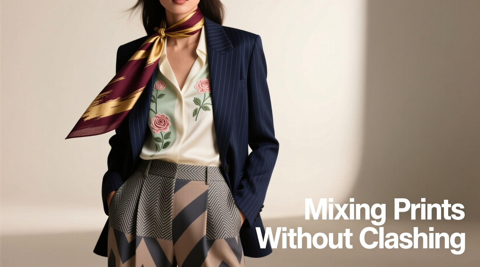
Mixing prints is no longer a fashion faux pas—it’s a statement of confidence, creativity, and personal style. Done well, combining patterns elevates an outfit from predictable to polished with personality. But the line between bold brilliance and visual chaos can be thin. The key isn’t avoiding patterns altogether; it’s understanding how to harmonize them. With thoughtful color coordination, scale variation, and a touch of intentionality, anyone can master the art of print mixing.
This guide breaks down the principles behind successful pattern pairing, offering actionable strategies that work whether you're dressing for a casual weekend or a formal event. Forget rigid rules—instead, embrace a flexible framework grounded in design fundamentals and real-world styling.
Understand the Basics of Pattern Types
Before combining prints, recognize the different types of patterns and their visual weight. Each has its own rhythm and presence, which affects how it interacts with others.
- Florals: Range from delicate vintage blooms to bold tropical arrangements. Often read as feminine or romantic but can be modernized with sharp tailoring.
- Stripes: Classic and structured. Pinstripes feel professional, while wide nautical stripes lean casual. Vertical stripes elongate; horizontal ones widen.
- Checks & Plaids: From subtle windowpanes to bold tartans. These add texture and are inherently geometric, making them grounding in mixed ensembles.
- Animal Prints: Leopard, zebra, snakeskin—these are wildcards with high impact. Best used as accents unless balanced carefully.
- Geometrics: Polka dots, houndstooth, abstract shapes. These offer rhythm and repetition, working best when paired with organic prints like florals.
- Abstract/Artistic Prints: Painterly strokes, watercolor effects, or surreal designs. These behave like statement pieces and should anchor rather than dominate.
The goal isn’t to memorize every pattern category but to develop an eye for contrast and cohesion. When two prints share a common thread—color, theme, or mood—they’re more likely to complement than compete.
Follow the Rule of Scale
One of the most effective ways to prevent clashing is to vary the scale of your prints. Combining two large-scale patterns often overwhelms the eye, while two tiny prints can blur into visual noise.
Instead, pair a large-scale print (like oversized florals or wide stripes) with a small-scale print (such as micro-dots or fine pinstripes). This creates contrast without competition. For example, a maxi floral skirt pairs beautifully with a narrow striped blouse—the small stripes recede slightly, allowing the floral to shine while adding subtle interest.
When in doubt, think of scale like music: one print carries the melody, the other provides harmony.
| Print Combination | Scale Strategy | Example |
|---|---|---|
| Floral + Stripe | Large floral top with fine pinstripe trousers | Red-and-white floral blouse + navy pinstripe pants |
| Plaid + Animal Print | Medium windowpane blazer with leopard-print flats | Gray checkered coat + tan leopard heels |
| Polka Dot + Geometric | Small dot scarf with bold houndstooth coat | Black-and-white dotted silk accessory + tailored houndstooth jacket |
“Scale is everything. A large print needs breathing room. Pair it with something smaller or simpler to avoid sensory overload.” — Lena Torres, Fashion Stylist & Creative Director
Anchor Your Palette with Shared Colors
Color is the invisible thread that ties disparate patterns together. Even if two prints look nothing alike at first glance, they can coexist beautifully if they share at least one common hue.
For instance, a navy-and-crimson plaid shirt can pair seamlessly with emerald-and-crimson paisley pants because crimson appears in both. The shared color acts as a bridge, creating continuity across otherwise contrasting designs.
To apply this principle:
- Identify the dominant and accent colors in each garment.
- Look for overlap—even a minor one, like a trim or lining shade.
- Use neutrals (black, white, beige, gray, denim) as buffers when direct color matches aren’t possible.
A black-and-white striped turtleneck, for example, can go under a burgundy floral midi skirt because the black grounds the look and the white adds brightness, even if burgundy doesn’t appear in the top.
Balance Boldness with Neutrals and Solids
Not every piece in a mixed-print outfit needs to be loud. In fact, strategic use of solids enhances the impact of patterns by giving the eye places to rest.
Consider a head-to-toe approach: if your top and bottom are both patterned, choose accessories—shoes, bag, belt—in solid tones that echo one of the shared colors. Alternatively, wear a bold printed jacket over a solid dress, then pick up another print in your scarf or tights.
This method allows for experimentation without overwhelming the silhouette. It also makes print mixing more accessible for those new to the trend.
Another technique is the “print sandwich”: place a solid layer between two patterned pieces. For example, a solid black turtleneck separates a leopard-print blazer from a striped pencil skirt, reducing visual clutter while maintaining flair.
Mini Case Study: Olivia’s Workwear Upgrade
Olivia, a marketing executive, wanted to refresh her office wardrobe without sacrificing professionalism. She owned a tailored houndstooth blazer and a vibrant floral sheath dress but had never worn them together, fearing they’d clash.
After analyzing the colors, she noticed the dress had subtle charcoal undertones in the background. She layered the houndstooth blazer over the dress, added sheer black tights, and finished with pointed black pumps. The shared dark base created unity, while the scale difference (small houndstooth vs. medium floral) prevented conflict.
Her colleagues complimented her look, and Olivia gained confidence to experiment further—eventually pairing a striped blouse with a checked pencil skirt using the same principles.
Step-by-Step Guide to Mixing Prints Confidently
Follow this five-step process the next time you’re assembling a patterned ensemble:
- Choose a focal point. Decide which piece will be the star—your floral skirt, animal-print coat, or graphic blouse. Build around it.
- Select a secondary print with different scale. If your focal piece is large-scale, opt for a small or medium secondary pattern.
- Find a color link. Ensure at least one color appears in both garments. Use a magnifying eye or hold them side by side in natural light.
- Incorporate structure. Use solid-toned shoes, belts, or outer layers to ground the look and define the silhouette.
- Step back and assess. Before leaving the house, view your outfit in full-length mirror. Ask: Does it feel cohesive? Is there balance? Adjust as needed.
This method turns intuitive guesswork into a repeatable system, helping you replicate success across seasons and occasions.
Checklist: Print-Mixing Do’s and Don’ts
Keep this checklist handy when building patterned outfits:
- ✅ Do pair different scales (large + small)
- ✅ Do share at least one color between prints
- ✅ Do use solids to break up busy combinations
- ✅ Do start simple—try print-on-print with neutrals first
- ✅ Do consider the occasion and setting
- ❌ Don’t combine two equally dominant prints without a unifying element
- ❌ Don’t ignore fit and proportion—poor tailoring distracts from even the best patterns
- ❌ Don’t force combinations just because they’re trendy
- ❌ Don’t overlook accessories—a patterned scarf can be enough
Frequently Asked Questions
Can I mix floral and animal print?
Yes—many designers do it successfully. Choose one as the main print and the other as an accent. For example, pair a leopard-print belt with a pink-and-green floral dress, ensuring the leopard includes a shade present in the dress (like warm brown or cream).
Is it okay to mix more than two prints?
It can work, but only if you follow strict guidelines: vary scale dramatically, unify through color, and anchor with solids. For example, a small polka-dot blouse, medium stripe blazer, and large floral scarf can work if all share navy blue and are balanced with plain navy heels.
What if I don’t have any shared colors?
Introduce a neutral intermediary. Wear a black turtleneck under a red plaid shirt and green paisley pants. Black connects everything. Alternatively, use accessories like a beige handbag or tan boots to bridge unrelated hues.
Final Thoughts: Confidence Is the Ultimate Accessory
Mixing prints isn’t about perfection—it’s about expression. The most compelling style moments happen when someone wears an unexpected combination with conviction. Rules exist to guide, not confine. Once you understand the fundamentals of scale, color, and balance, you’re free to bend them creatively.
Start small. Try a striped tee with a checked overshirt. Then experiment with bolder contrasts. Over time, you’ll develop an instinct for what works—and what feels authentically you.


 浙公网安备
33010002000092号
浙公网安备
33010002000092号 浙B2-20120091-4
Comments
No comments yet. Why don't you start the discussion?