
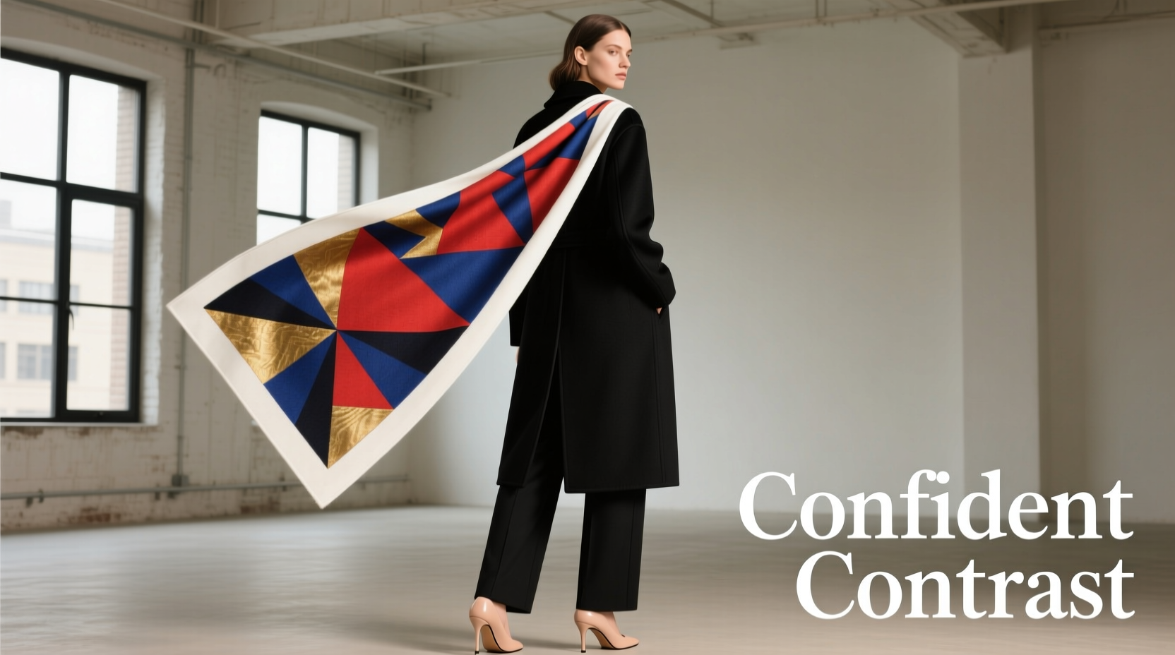
In a fashion landscape where minimalism reigns supreme—think clean lines, neutral palettes, and understated silhouettes—introducing a bold printed scarf can feel like walking a tightrope. Done well, it becomes the centerpiece of an effortlessly chic ensemble. Done poorly, it overwhelms the look, turning sophistication into visual chaos. The key lies not in avoiding contrast, but in mastering it. When you understand how to harmonize a vibrant, patterned scarf with a minimalist wardrobe, you unlock a powerful tool for self-expression without sacrificing elegance.
Bold scarves offer texture, movement, and personality. They can transform a plain white tee and jeans into a curated outfit or elevate a tailored coat into a statement look. But their impact depends entirely on intentionality. It’s not enough to simply drape a colorful silk square around your neck; you must consider proportion, palette, placement, and personal style. This guide breaks down the principles that allow bold prints to coexist—and even enhance—minimalist dressing.
The Art of Balance: Why Contrast Works
Minimalist fashion thrives on restraint. Its strength is in simplicity: solid colors, structured cuts, and functional design. Yet restraint doesn’t mean sterility. A well-placed accent—a pop of color, a dynamic print, a tactile fabric—can breathe life into a monochrome outfit. The secret is balance.
Think of your minimalist base as a blank canvas. A bold printed scarf acts like a stroke of paint—vibrant, expressive, and deliberate. When applied with care, it doesn't compete with the outfit; it completes it. The contrast between stillness (the outfit) and motion (the scarf) creates visual interest without dissonance.
Fashion stylist and color theory expert Lila Chen explains:
“The most compelling minimalist looks aren’t devoid of color or pattern—they’re strategically enhanced by them. A bold accessory isn’t a distraction if it’s treated as the focal point, not an afterthought.” — Lila Chen, Fashion Stylist & Color Consultant
This philosophy shifts the approach from caution to curation. Instead of asking, “Will this clash?” ask, “How can this elevate?” That mindset change is the foundation of confident styling.
Color Coordination: Pulling Hues from the Print
One of the most effective ways to prevent clashing is through intentional color matching. A bold printed scarf often contains multiple colors. Rather than treating them all as equally important, identify the dominant and accent hues, then align your outfit with one or two of them.
For example, if your scarf features cobalt blue, rust orange, and cream, choose one as your anchor—say, cobalt—and build your minimalist outfit around that shade. A navy blazer, white turtleneck, and black trousers create cohesion because they echo the scarf’s presence without replicating its complexity.
Avoid matching every color in the scarf. That approach leads to visual noise. Instead, select a single tone and repeat it subtly—through shoes, a belt, or even nail polish. This repetition creates rhythm, guiding the eye naturally from outfit to accessory.
Understanding Color Temperature
Another layer of coordination involves temperature. Prints may combine warm tones (reds, oranges, yellows) with cool ones (blues, greens, purples). If your minimalist outfit leans cool (e.g., gray wool coat, white shirt), a scarf dominated by warm hues can feel jarring unless balanced.
Solution: Choose scarves where one temperature dominates, or wear them with neutral layers that bridge the gap. For instance, a charcoal coat pairs beautifully with a warm-toned scarf because gray absorbs both warmth and coolness without resistance.
Choosing the Right Scarf Placement
Where you place the scarf affects how much attention it draws. In minimalist dressing, less is more—but placement determines whether “less” means subtle or overlooked.
Consider these common styles and their visual impact:
| Style | Visibility | Best For |
|---|---|---|
| Neck Knot (small knot at front) | Medium | Adding detail to collared shirts or turtlenecks |
| Draped Loop (infinity-style) | High | Cold weather; makes scarf a focal point |
| Shoulder Drape | Low to Medium | Over coats or blazers; adds softness without bulk |
| Ponytail Wrap | Low | Casual looks; introduces print near face |
| Belted Accent (tied over coat at waist) | Medium | Defining silhouette while adding color |
For daytime minimalism—like a crisp white shirt and black trousers—a small neck knot keeps the scarf present but controlled. For evening or creative settings, a draped loop maximizes the print’s drama while maintaining structure.
Scale and Proportion: Matching Pattern Size to Body Frame
Not all bold prints are created equal. Some feature large-scale florals or geometric motifs; others use dense, small-repeat patterns. The size of the print should correspond to your body proportions and the outfit’s silhouette.
- Large prints work best on taller frames or when worn in larger formats (e.g., full-length shawls). On petite figures, they can overwhelm. If you're smaller in stature, position large prints higher—around the neck or shoulders—so they don’t visually cut the body.
- Small-to-medium prints are more versatile. They add texture without dominating, making them ideal for pairing with slim-fit minimalist pieces like straight-leg pants or pencil skirts.
Proportion also applies to fabric weight. A heavy, oversized scarf in a loud print may drown a sleek silk dress. Conversely, a lightweight chiffon square might get lost under a bulky wool coat. Match the scarf’s volume to the outfit’s architecture.
Real-Life Example: The Office-to-Dinner Transition
Take Mara, a graphic designer based in Portland. Her weekday uniform is simple: black cropped trousers, a boxy white blouse, and ankle boots. On most days, the look is polished but predictable. To transition to an evening gallery opening, she adds a rectangular silk scarf with a bold abstract print in deep emerald, gold, and black.
She folds the scarf lengthwise, drapes it around her neck, and lets the ends fall asymmetrically in front. The emerald ties back to her green earrings, while the black in the print echoes her trousers. The white blouse acts as a neutral backdrop, ensuring the scarf stands out without competing.
The result? A seamless evolution from professional to artistic—same core pieces, new energy. No clash, just cohesion.
Step-by-Step Guide: Styling Your Bold Scarf with Minimalism
Follow this five-step process to confidently pair any bold printed scarf with a minimalist outfit:
- Start with a neutral base. Choose an outfit in solid, muted tones—white, black, gray, beige, or navy. Avoid patterns elsewhere in the look.
- Analyze the scarf’s palette. Identify one dominant color and one accent. Write them down if needed.
- Select one color to echo. Wear shoes, a bag, or jewelry in that hue. Even a hint strengthens unity.
- Decide on placement. Will the scarf be a subtle accent or the main event? Choose a tying method accordingly.
- Step back and assess. Look in the mirror from a distance. Does the scarf feel integrated or stuck on? Adjust positioning or re-tie if needed.
This method removes guesswork. It turns styling into a repeatable practice, not a daily gamble.
Do’s and Don’ts: Quick Reference Table
| Do | Don’t |
|---|---|
| Use neutrals as a buffer between print and outfit | Mix multiple bold patterns in one look |
| Match one color from the scarf to an accessory | Wear a busy scarf with textured fabrics (e.g., cable knit + leopard print) |
| Position vibrant areas near your face | Let the scarf hang unevenly or appear messy without intent |
| Choose scarf size relative to your frame | Over-accessorize—let the scarf be the star |
| Experiment with non-traditional placements (belt, bag wrap) | Ignore fabric weight—match drape to outfit structure |
Expanding Beyond the Neck: Creative Uses for Bold Scarves
Minimalist styling doesn’t require traditional scarf-wearing. Sometimes, the boldest move is subtlety. Consider alternative applications:
- Bag Charm: Tie a small square around your tote’s handle. It adds flair without altering your outfit.
- Hair Accent: Fold into a band and wear across the forehead or tie into a low bun. Keeps hair tidy and introduces color.
- Belt Substitute: Use a long scarf to cinch a trench coat or duster. Creates shape and showcases print.
- Top Layer: Drape over shoulders during cooler months. Functions like a lightweight jacket with artistic appeal.
These methods integrate the scarf into the look without making it the sole focus. They honor minimalism’s ethos—function first, beauty second—while allowing room for expression.
Frequently Asked Questions
Can I wear a bold floral scarf with all-black minimalist clothing?
Yes, absolutely. Black is the ultimate neutral and provides a sleek backdrop for any print. Just ensure the floral has at least one dark tone (black, navy, or deep brown) to anchor it. Avoid overly sweet or pastel-heavy florals, which may clash with the sharpness of an all-black ensemble.
What if my scarf has clashing colors like pink and green?
Even seemingly clashing colors can work if they’re contained within a cohesive design. The key is isolation: let the scarf be the only source of color. Pair it with neutrals and carry one of the colors into a small accessory (e.g., pink lipstick or green heels). This validates the combination rather than fighting it.
How do I store bold scarves to keep them usable with minimalist wardrobes?
Fold silk and delicate scarves neatly and store flat or rolled in a drawer. Avoid hanging, which can stretch fibers. Keep them separated by color family so you can quickly pair them with specific neutral outfits. Label storage boxes by dominant hue (e.g., “Red/Orange,” “Blue/Green”) for faster access.
Final Checklist: Before You Wear
Before stepping out, run through this quick checklist to ensure harmony:
- ✅ Outfit is in solid, neutral tones
- ✅ One color from the scarf appears elsewhere (shoes, bag, jewelry)
- ✅ Scarf is tied intentionally—not haphazardly draped
- ✅ Fabric weight matches the rest of the outfit
- ✅ No other competing patterns or textures
- ✅ Overall look feels balanced, not top-heavy or lopsided
Conclusion: Confidence Through Intention
Pairing bold printed scarves with minimalist outfits isn’t about playing it safe—it’s about playing it smart. Clashing occurs not from contrast, but from lack of coordination. When you approach your wardrobe with intention, every element serves a purpose. The scarf isn’t an exception; it’s the exclamation point.
Minimalism doesn’t demand emptiness. It rewards clarity. By grounding vibrant accessories in neutral foundations, repeating key colors, and placing prints with precision, you create looks that are both refined and expressive. Over time, this practice builds confidence. You stop asking, “Is this too much?” and start knowing, “This is just right.”


 浙公网安备
33010002000092号
浙公网安备
33010002000092号 浙B2-20120091-4
Comments
No comments yet. Why don't you start the discussion?