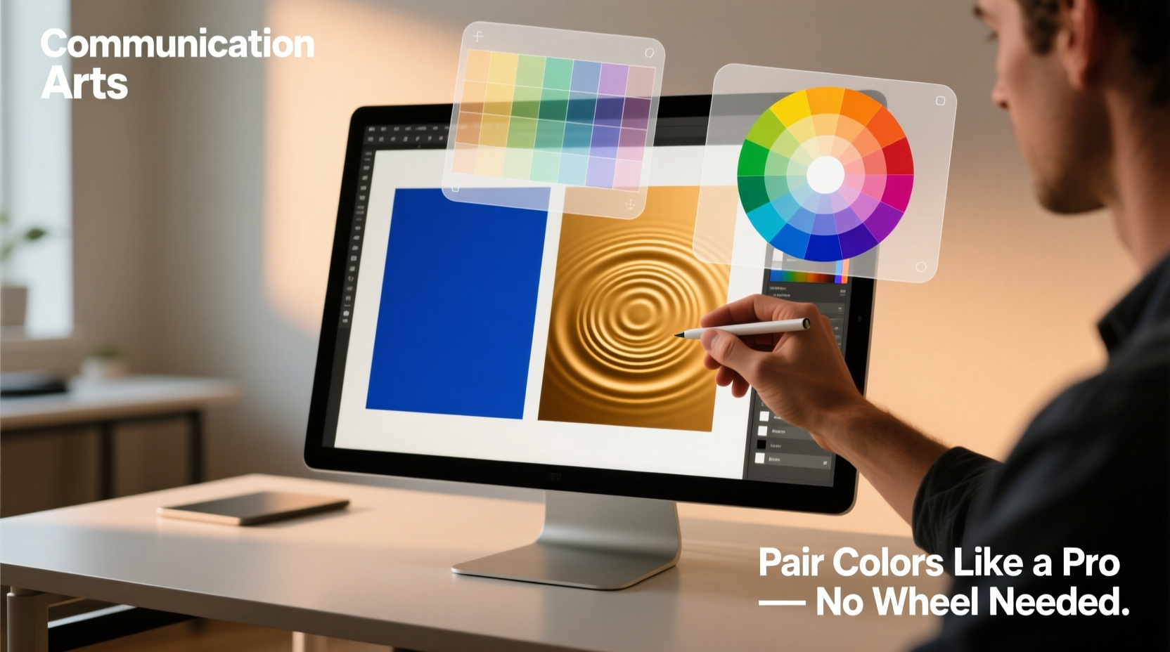
Color is one of the most powerful tools in visual communication, yet many people hesitate to use it boldly, fearing clashing tones or unbalanced combinations. While color wheels are helpful, they’re not the only—or even the best—way to create harmonious palettes. Professional designers often rely on intuition, environment, and emotional resonance more than rigid theory. The truth is, you don’t need to memorize complementary hues or split-complementary schemes to make colors work together. You need observation, context, and confidence.
This guide reveals practical, field-tested methods for pairing colors effectively—without ever opening a color wheel. From nature’s palette to cultural associations and tonal contrast, you’ll learn how to trust your eye and build cohesion through real-world principles.
Use Nature as Your First Reference
Nature has been refining color harmony for millions of years. Sunsets, forests, oceans, and deserts all present balanced, emotionally resonant combinations that feel inherently “right.” These aren’t random—they’re ecosystems where light, texture, and survival have shaped visual balance.
Observe how a desert landscape blends warm ochres, dusty pinks, and pale blues in the sky. Notice how ocean water shifts from deep navy to turquoise near the shore, paired with sandy beige and white foam. These combinations work because they exist in dynamic equilibrium—light reflects off surfaces, shadows deepen tones, and textures mute or intensify hues.
To apply this method:
- Carry your phone or a notebook to record color combinations you see outdoors.
- Focus on transitions—how one color leads into another (e.g., green leaves fading into brown bark).
- Pay attention to weather and time of day. Morning light creates soft pastels; sunset brings saturated oranges and purples.
“Nature doesn’t follow rules—it sets them. If it works in the wild, it can work in design.” — Lena Torres, Environmental Color Consultant
Leverage Emotional Tone Over Technical Harmony
People respond to color emotionally before they do intellectually. A perfectly balanced analogous scheme can still feel “off” if it doesn’t match the mood of the message. Instead of starting with hue relationships, begin with feeling.
Ask: What emotion should this project evoke?
| Emotion | Common Color Associations | Natural Inspiration |
|---|---|---|
| Calm | Soft blue, muted green, pale gray | Morning mist over a lake |
| Energy | Bright yellow, fiery orange, electric red | Desert sunrise |
| Luxury | Deep burgundy, charcoal, gold accents | Twilight over a city skyline |
| Playfulness | Pink, turquoise, lemon yellow | Tropical fruit market |
| Seriousness | Navy, slate gray, crisp white | Storm clouds over concrete |
Once you’ve defined the emotional goal, choose colors that embody it—even if they seem unrelated on a traditional wheel. For example, pairing mustard yellow with deep teal may not be “complementary,” but both appear in tropical foliage and carry warmth and vibrancy. Together, they communicate boldness and organic richness.
Case Study: Rebranding a Wellness Studio
A small yoga studio wanted to refresh its branding but avoid clichéd “earthy greens and browns.” The owner loved the feeling of early morning walks by the river—cool air, soft light, and quiet energy. Instead of defaulting to standard wellness palettes, we pulled colors from a photo taken at dawn: pale lavender (sky), warm sand (path), and deep indigo (water shadows).
The resulting palette felt serene but not sleepy, grounded but not dull. Clients reported it felt “refreshing” and “clear-headed”—exactly the emotional tone intended. No color wheel was used. Only memory, mood, and observation.
Apply the 60-30-10 Rule for Instant Balance
One of the most reliable frameworks in interior design and fashion also applies to digital and print design: the 60-30-10 rule. It’s a proportion-based system that ensures visual hierarchy and harmony without requiring technical color knowledge.
Here’s how it works:
- 60% of the space uses a dominant color (usually neutral or soft).
- 30% introduces a secondary color that complements or contrasts gently.
- 10% is an accent color—bold, vibrant, or metallic—for emphasis.
This structure prevents any single color from overwhelming the composition while creating depth and focus.
For example, a website might use:
- 60%: Warm off-white background
- 30%: Soft terracotta for buttons and headings
- 10%: Deep emerald for icons and calls to action
This palette feels grounded and inviting, with just enough contrast to guide the eye. The colors weren’t chosen for their position on a wheel, but for their warmth, cultural familiarity, and emotional clarity.
Build Palettes from Real-World Objects
Some of the most memorable color schemes come from everyday items: food, clothing, architecture, and art. These objects already contain tested combinations—colors that manufacturers, chefs, or artisans selected for appeal and balance.
Next time you’re in a grocery store, look at a display of citrus fruits: bright yellow lemons, deep orange oranges, and green limes against a wooden crate. That’s a ready-made triad. Or observe a well-dressed person: a navy coat, camel scarf, and rust-colored boots. These aren’t random—they reflect curated taste.
To build a palette from objects:
- Choose an item with 3–5 distinct colors (e.g., a vintage poster, a ceramic bowl, a street mural).
- Identify the lightest, darkest, and most vivid color.
- Test these in your project—use the darkest for text, the lightest for background, and the vivid one for highlights.
This method works because real-world objects are designed for human perception. Their colors already function together in space, under varying light, and within cultural contexts.
Mini Case Study: Packaging Design for a Craft Coffee Brand
A coffee roaster wanted packaging that stood out on shelves without looking artificial. Instead of using a digital color picker, the designer visited a local café known for its hand-painted signage. One wall featured a mural of coffee plants: dark green leaves, reddish-brown beans, and creamy tan steam rising from a cup.
These three colors became the core palette. The result? A package that felt artisanal, warm, and authentic. Retailers noted it “looked expensive without trying too hard.” Again, no color wheel—just observation and translation.
Master Contrast, Not Just Hue
Many failed color pairings stem not from “wrong” colors, but from poor contrast. Two similar tones placed side by side can blend into visual mush, making text unreadable or elements disappear.
Instead of focusing solely on hue, evaluate:
- Lightness contrast: How different are the values (light vs. dark)?
- Texture contrast: Is one matte and the other glossy?
- Temperature contrast: Is one warm and the other cool?
High contrast creates clarity and drama. Low contrast creates subtlety and sophistication—but risks invisibility.
Try this exercise: Squint at your color combination. If the elements blur together, increase contrast in value or saturation. If one color jumps forward aggressively, consider muting it slightly or adjusting placement.
“Great color isn’t about being ‘correct’—it’s about being clear. If the viewer knows where to look, you’ve succeeded.” — Malik Reed, UI/UX Designer
Checklist: Building a Balanced Palette Without a Color Wheel
- ✅ Start with a mood or emotion, not a hue.
- ✅ Find inspiration in nature, food, or urban environments.
- ✅ Use the 60-30-10 rule to distribute colors.
- ✅ Test contrast by squinting at your design.
- ✅ Limit bold colors to 10% or less unless going for high impact.
- ✅ Pull colors from photos of real-life scenes you love.
- ✅ Avoid pairing two equally bright colors head-on—let one dominate.
Frequently Asked Questions
Can I pair two bright colors successfully?
Yes, but only if one clearly dominates and the other serves as an accent. Pairing neon pink with electric blue can work if one covers 90% and the other 10%, or if separated by neutral space. Otherwise, they vibrate and compete. Better yet, mute one slightly to reduce visual tension.
How do I know if my palette feels “professional”?
A professional palette usually includes at least one neutral (white, gray, beige, black) and avoids over-saturation. It also maintains consistent temperature—either mostly warm or mostly cool tones. If your design feels chaotic, reduce the number of active colors and increase neutral space.
What if I’m colorblind or unsure about my choices?
Use tools like online contrast checkers (e.g., WebAIM’s Contrast Checker) to ensure readability. You can also ask someone else to describe what stands out first. If they mention the wrong element, adjust contrast or color dominance. Trust feedback over perfection.
Conclusion: Trust Your Eye, Then Refine
Designers don’t rely on color wheels because they’re essential—they use them as a backup. The primary tool is observation. The real secret to pairing colors confidently is to stop overthinking theory and start engaging with the world around you. Colors exist in context: light changes them, materials affect them, emotions shape how we see them.
You already have the ability to recognize harmony. You’ve admired a sunset, noticed a striking outfit, or felt calm in a well-designed room. Those moments are data. Collect them. Recreate them. Adapt them.


 浙公网安备
33010002000092号
浙公网安备
33010002000092号 浙B2-20120091-4
Comments
No comments yet. Why don't you start the discussion?