
A bookshelf often starts as a functional necessity—somewhere to stash books, hold picture frames, or display a few souvenirs. But too often, it ends up looking flat, monotonous, or worse, like every other shelf in every other home. The good news? A few intentional design choices can turn that lackluster unit into a dynamic focal point. By incorporating texture, strategic lighting, and thoughtful asymmetry, you can elevate your bookshelf from background furniture to a curated expression of style and personality.
The key lies in moving beyond symmetry and uniformity. While balanced arrangements have their place, they can feel sterile when overused. Introducing variation through materials, light play, and uneven composition adds rhythm and intrigue. This approach doesn’t require expensive renovations or professional styling—it’s about perception, layering, and attention to detail.
Create Depth with Layered Texture
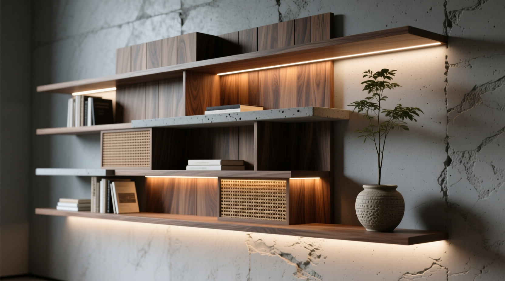
Texture is one of the most underutilized tools in interior styling. On a bookshelf, it breaks up flat planes and invites closer inspection. Instead of lining up identical spines, think about how different surfaces interact: smooth ceramics next to rough-woven baskets, glossy photo frames beside matte wood carvings, or soft fabric-covered boxes against cool metal sculptures.
Start by auditing what you already own. Look for items with contrasting finishes—linen, stone, terracotta, glass, felt, or brass. These materials reflect light differently, which naturally creates visual depth. Even books can contribute to texture. Mix hardcovers with paperbacks, oversized art books with slender novels, and stack some horizontally while others stand upright.
Consider adding small storage boxes in textured fabrics or rattan. These conceal clutter while contributing to the overall sensory experience. When placed behind open shelves, they create a backdrop that feels rich and lived-in rather than staged.
Illuminate with Purposeful Lighting
Lighting transforms not just visibility but mood. A well-lit bookshelf becomes a nighttime feature, drawing the eye and casting subtle shadows that enhance dimensionality. Unlike overhead lighting, which flattens forms, targeted illumination highlights individual objects and creates pockets of warmth.
LED strip lights are ideal for integration into bookshelves. Install them along the back panel or underside of each shelf to cast a gentle glow. Choose warm white (2700K–3000K) for a cozy atmosphere; avoid cool daylight tones unless the space serves a utilitarian purpose like a home office.
For more dramatic effect, use directional puck lights or mini spotlights mounted above or within the unit. These allow you to spotlight specific items—a favorite sculpture, a framed quote, or a rare first edition—turning them into mini exhibits.
“Light doesn’t just reveal objects—it reveals hierarchy. What you choose to highlight tells a story.” — Lena Torres, Interior Stylist & Author of *Curated Spaces*
Don’t overlook battery-powered options. Small LED pucks with adhesive backs offer flexibility without wiring. They’re perfect for renters or those unwilling to drill into cabinetry. Just remember to recharge or replace batteries regularly to maintain consistency.
Embrace Asymmetry for Visual Interest
Symmetry feels safe. It’s orderly, predictable, and balanced. But it’s also static. Asymmetry, on the other hand, introduces movement and surprise. It mimics how things appear in nature—uneven, organic, and alive.
To apply asymmetry effectively, follow the principle of “weighted balance.” This means distributing visual weight unevenly but intentionally. For example, place a tall vase on the left side and counterbalance it with a cluster of three smaller objects on the right. The sides aren’t mirror images, but they feel harmonious.
Try this simple exercise: remove everything from your bookshelf. Now rebuild it using odd numbers—three books stacked, five small objects grouped together, seven total decorative pieces per shelf. Odd-number groupings are inherently more dynamic because they prevent the eye from settling into predictable patterns.
| Approach | Do | Don't |
|---|---|---|
| Asymmetry | Use size contrast and staggered heights | Match left and right exactly |
| Texture | Mix at least 3 material types per shelf | Repeat the same finish throughout |
| Lighting | Highlight 1–2 key objects per shelf | Flood the entire shelf evenly |
Leave breathing room. Crowded shelves feel chaotic, even if styled well. Aim for 60–70% coverage per shelf. Empty space isn’t wasted—it’s part of the composition, allowing each item to be seen and appreciated.
Step-by-Step Guide: Transform Your Bookshelf in 5 Stages
Follow this timeline to refresh your bookshelf over a weekend or spread it across several evenings. Each stage builds on the last, ensuring a cohesive result.
- Stage 1: Edit & Empty (Day 1 – 30 mins)
Remove all items. Wipe down shelves. Decide what stays, what goes. Be ruthless—only keep items that spark joy, serve function, or contribute to texture. - Stage 2: Plan Zones (Day 1 – 20 mins)
Divide the shelf into zones. For example: top shelf = display only, middle = books + decor, bottom = storage boxes. This creates intentionality. - Stage 3: Add Texture (Day 2 – 45 mins)
Place textured objects first—ceramic vases, woven baskets, wooden trays. Build around these anchors. Stack some books horizontally to vary surface levels. - Stage 4: Install Lighting (Day 2 – 30 mins)
Apply LED strips or position puck lights. Test brightness and angle. Adjust placement so light enhances, not overwhelms. - Stage 5: Style with Asymmetry (Day 3 – 30 mins)
Arrange remaining decor in odd-numbered groups. Step back frequently to assess balance. Rotate objects slightly outward for better visibility. Fine-tune lighting focus.
Real-Life Example: From Dorm Room Basic to Living Room Statement
Sophie, a graphic designer in Portland, had a standard IKEA BILLY bookcase in her living room. It held mostly textbooks and mismatched mugs. After reading about textural layering, she decided to reimagine it.
She started by removing everything and painting the back panel a deep sage green—this added instant depth. Then, she introduced texture: a hand-thrown stoneware bowl, a linen-covered notebook, and a small sheepskin drape over one corner. She used adhesive LED strips along the rear edge, setting them to warm white.
For arrangement, she embraced asymmetry. On the second shelf, she placed a tall black candle on the far left, balanced by a trio of small framed sketches on the right. Below, she stacked art books horizontally and topped them with a brass geode. The final result felt personal, layered, and gallery-like—all without buying new furniture.
“It stopped being just storage,” she said. “Now people actually pause and look when they walk by.”
Essential Checklist for a Personalized Bookshelf
- ✅ Remove all items and clean shelves thoroughly
- ✅ Identify 3+ textured objects to incorporate (e.g., ceramic, wood, fabric)
- ✅ Choose lighting type (LED strip, puck light, or clip-on)
- ✅ Paint or line the back panel for added depth (optional but effective)
- ✅ Group decor in odd numbers (1, 3, 5)
- ✅ Balance asymmetrical compositions using visual weight
- ✅ Install and test lighting before final styling
- ✅ Leave 30–40% negative space for breathing room
- ✅ Step back and photograph from multiple angles to evaluate
- ✅ Refresh seasonally with new objects or rotated books
Frequently Asked Questions
Can I use fairy lights instead of LED strips?
Yes, but with caution. Fairy lights can look whimsical, especially during holidays, but they often create visual clutter on a daily basis. If used, tuck them discreetly behind objects or along the top edge. Avoid wrapping them around books or shelves—they diminish the curated effect.
How do I keep a styled shelf functional?
Designate specific shelves for specific purposes. For example, reserve the bottom two for books and bins, and use the top three for display. Use decorative boxes to store everyday items like remotes or notebooks. This maintains aesthetics while preserving utility.
Is asymmetry appropriate in minimalist spaces?
Absolutely. Minimalism benefits from asymmetry because it prevents monotony. In fact, many Japanese-inspired interiors use deliberate imbalance (called *fukinsei*) to evoke natural harmony. The key is restraint—one sculptural object on an otherwise empty shelf can be powerfully asymmetric yet minimal.
Final Thoughts: Make It Unmistakably Yours
A personalized bookshelf isn’t about perfection. It’s about presence—about creating a space that reflects who you are, what you value, and how you live. Texture grounds it in the physical world, lighting gives it soul, and asymmetry keeps it human. Together, they transform function into feeling.
You don’t need designer pieces or a large budget. Start with what you have. Rearrange, experiment, and observe how light shifts across surfaces at different times of day. Let the shelf evolve. Change it with the seasons, your mood, or new discoveries.


 浙公网安备
33010002000092号
浙公网安备
33010002000092号 浙B2-20120091-4
Comments
No comments yet. Why don't you start the discussion?