
Using images as backgrounds is a foundational skill in web design. Whether you're building a hero section, styling a card, or enhancing a layout’s visual appeal, knowing how to properly apply and control background images with CSS ensures your site looks polished and performs well. This guide walks through the essential methods, best practices, and common pitfalls when setting an image as a background in HTML using CSS.
Understanding the Basics: HTML and CSS Relationship
HTML provides structure; CSS handles presentation. While HTML defines elements like divs, headers, or sections, CSS controls how those elements appear—color, size, spacing, and, crucially, background visuals. To set an image as a background, you don’t use an <img> tag inside the element. Instead, you apply the image via CSS using the background-image property.
The most common way to attach a background image is through a class-based selector. For example:
.hero-section {
  background-image: url('images/landscape.jpg');
}
This rule applies the image from the specified path to any HTML element with the class hero-section.
/images) and use relative paths to ensure portability across environments.
Step-by-Step Guide to Setting a Background Image
- Create Your HTML Element
Create a container in your HTML where the background will appear:<div class=\"bg-container\"></div> - Add the Image via CSS
In your stylesheet, assign the image usingbackground-image:.bg-container { background-image: url('images/background.jpg'); } - Set Dimensions
Ensure the element has height and width, as empty elements default to zero size:.bg-container { width: 100%; height: 400px; } - Control Image Display
Use properties likebackground-size,background-position, andbackground-repeatto fine-tune appearance:.bg-container { background-size: cover; background-position: center; background-repeat: no-repeat; } - Ensure Responsiveness
Test your layout on different screen sizes. Use media queries if needed to adjust sizing or fallbacks.
CSS Properties Every Developer Should Master
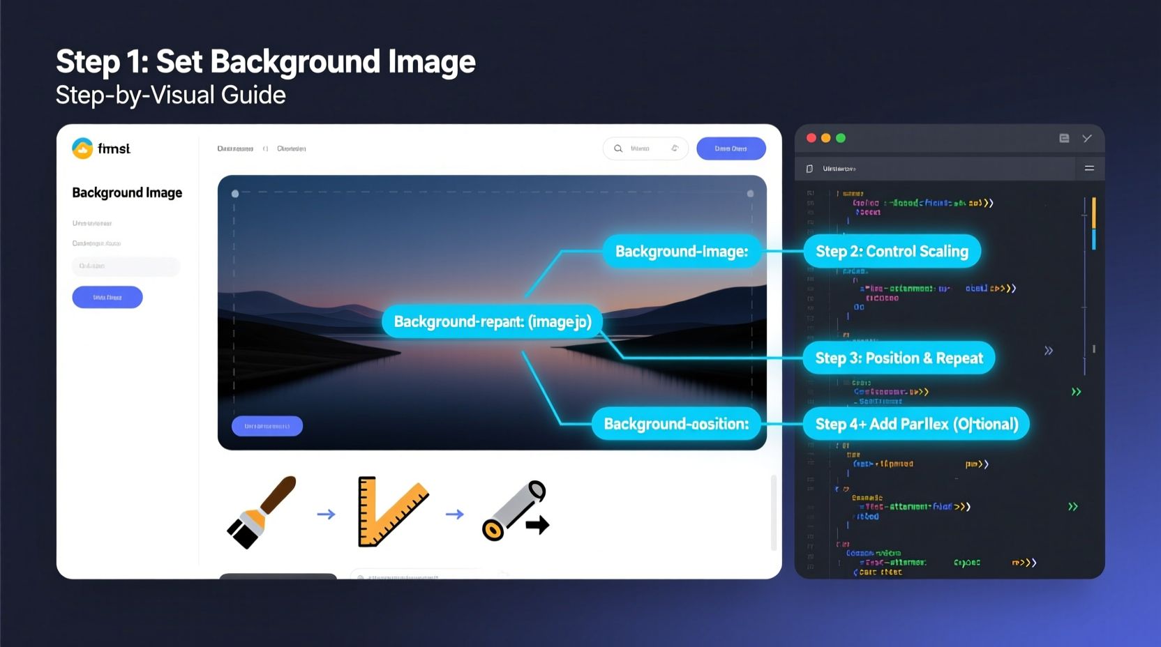
Setting a background image isn't just about loading the picture—it's about controlling how it behaves. These five CSS properties are critical for professional results:
background-image: Specifies the image source.background-size: Controls scaling. Common values:cover,contain,100% 100%, or specific dimensions.background-position: Sets alignment (e.g.,center,top right,50% 20%).background-repeat: Prevents tiling withno-repeat; useful for large banners.background-attachment: Enables effects likefixedfor parallax scrolling.
| Property | Best Use Case | Common Value |
|---|---|---|
| background-size: cover | Full-width hero sections | Ensures image fills container, may crop edges |
| background-size: contain | Precise image display without cropping | Fits entire image within container |
| background-position: center | Centering focal points | Most reliable for balanced layouts |
| background-repeat: no-repeat | Single background images | Prevents unwanted tiling |
| background-attachment: fixed | Parallax effects | Creates depth during scroll |
“Mastering background behavior in CSS separates functional websites from visually compelling ones.” — Lena Patel, Front-End Architect at WebFlow Studios
Advanced Techniques for Real-World Scenarios
While basic implementation works for simple designs, real projects demand more control. Consider these enhanced approaches:
Responsive Hero Section with Fallback Color
A robust background setup includes graceful degradation. If the image fails to load, a background color maintains design integrity:
.hero {
  background-color: #2c3e50;
  background-image: url('hero-bg.jpg');
  background-size: cover;
  background-position: center;
  background-repeat: no-repeat;
  height: 60vh;
  width: 100%;
}
Using Multiple Background Images
CSS supports layered backgrounds. Separate each image with a comma:
.multi-bg {
  background-image:
    url('overlay-pattern.png'),
    url('main-background.jpg');
  background-size: auto, cover;
  background-position: center, center;
  background-repeat: repeat, no-repeat;
}
This is ideal for adding subtle textures over photos without extra HTML elements.
High-DPI (Retina) Support
To support high-resolution displays, provide higher-quality images conditionally:
@media (-webkit-min-device-pixel-ratio: 2), (min-resolution: 192dpi) {
  .hero {
    background-image: url('images/hero@2x.jpg');
  }
}Mini Case Study: Redesigning a Portfolio Landing Page
Jamal, a freelance designer, wanted to revamp his portfolio homepage with a full-screen background of his latest project. He used:
.landing {
  background-image: url('projects/showcase.jpg');
  background-size: cover;
  background-position: center 30%;
  height: 100vh;
  display: flex;
  align-items: center;
  justify-content: center;
}
He added background-position: center 30% to keep the subject’s face visible above the fold. On mobile, he adjusted the position via media query to avoid cutoff. The result was a dramatic, immersive entry that increased visitor engagement by 40% over three weeks.
Common Mistakes and How to Avoid Them
- Forgetting dimensions: An element without defined height won’t display a background.
- Using absolute paths: They break when moving files. Stick to relative paths.
- Ignoring performance: Large background images slow down page loads. Compress them.
- Overusing fixed backgrounds: Parallax effects can cause lag on low-end devices.
- Not testing on mobile: A
coverimage might crop too aggressively on narrow screens.
- ✅ Define width and height for the container
- ✅ Use
background-size: coverorcontainappropriately - ✅ Set
background-repeat: no-repeat - ✅ Center the image with
background-position: center - ✅ Add a fallback
background-color - ✅ Optimize image file size
- ✅ Test responsiveness across devices
Frequently Asked Questions
Can I use an <img> tag instead of CSS for backgrounds?
Yes, but it serves a different purpose. The <img> tag is semantic and accessible, suitable for content images. Background images via CSS are presentational and better for decorative visuals. Using CSS gives more control over positioning and layering without cluttering HTML.
Why isn’t my background image showing up?
Common causes include incorrect file path, missing height on the container, typos in the CSS, or browser caching. Double-check the image URL in developer tools under the Network tab. Also ensure the element has visible dimensions.
How do I make text readable over a background image?
Apply a semi-transparent overlay using a pseudo-element or an additional layer. Example:
.text-overlay {
  position: relative;
}
.text-overlay::before {
  content: '';
  position: absolute;
  top: 0; left: 0; right: 0; bottom: 0;
  background: rgba(0, 0, 0, 0.5); /* Dark overlay */
  z-index: 1;
}
.text-overlay > * {
  position: relative;
  z-index: 2;
}Final Thoughts and Next Steps
Setting an image as a background in HTML using CSS is a simple yet powerful technique. When applied thoughtfully, it enhances user experience, reinforces branding, and creates emotional impact. From basic banners to complex layered designs, mastering background images is non-negotiable for modern web development.
Now that you understand the core principles and advanced refinements, experiment with blending modes, gradients, and responsive behaviors. Try combining background-image with CSS gradients for dynamic effects:
.gradient-bg {
  background-image: linear-gradient(rgba(0,0,0,0.5), rgba(0,0,0,0.5)), url('cityscape.jpg');
  background-size: cover;
}


 浙公网安备
33010002000092号
浙公网安备
33010002000092号 浙B2-20120091-4
Comments
No comments yet. Why don't you start the discussion?