
In expansive display environments—whether in retail spaces, museums, galleries, or event installations—lighting is more than illumination. It's a narrative tool. When used strategically, lighting shapes perception, guides attention, and creates dimensionality where none physically exists. One of the most powerful yet underutilized techniques in visual design is staggering light brightness levels to produce a sense of depth. Unlike flat, uniform lighting that flattens spatial perception, layered brightness mimics natural light gradients, adding realism, drama, and focus.
This method involves intentionally varying the intensity of light across different zones or layers within a display setup. The result? A three-dimensional effect that draws viewers in, emphasizes key elements, and enhances the overall aesthetic coherence of the space. Whether you're illuminating a product wall, a timeline exhibit, or an architectural feature, mastering this technique transforms static displays into dynamic visual journeys.
Understanding Depth Through Light
Human vision interprets depth not just through perspective but also through contrast and luminance. In nature, objects closer to us reflect more light; those farther away appear dimmer due to atmospheric diffusion and distance. This principle—known as aerial perspective—is instinctively recognized by the brain. By replicating these gradients artificially, designers can trick the eye into perceiving depth even on two-dimensional surfaces or in shallow physical spaces.
In large-scale displays, especially those constrained by floor space or ceiling height, creating perceived depth becomes essential. Uniform lighting fails here—it renders everything equally visible, which paradoxically makes nothing stand out. Staggered brightness, however, establishes a visual hierarchy: bright zones attract immediate attention, mid-level areas support context, and shadowed regions recede, suggesting background or distance.
“Lighting isn’t about making things visible—it’s about making them meaningful. Graduated brightness tells the viewer where to look, how long to stay, and what to feel.” — Lena Torres, Environmental Lighting Designer, MuseoLab Studios
The Science Behind Layered Luminance
Staggering brightness isn't arbitrary. It follows perceptual principles rooted in both neuroscience and optical physics. Key among them:
- Luminance Contrast Sensitivity: The human eye detects differences in brightness more readily than color shifts. A 30% difference in lux (luminous flux) between adjacent zones is typically enough to register depth.
- Foveal vs. Peripheral Vision: Central vision focuses on high-brightness targets, while peripheral areas interpret ambient gradients. Strategic dimming around focal points increases immersion.
- Adaptive Pupil Response: Eyes adjust dynamically to average light levels. Sudden changes in brightness between zones create transitions that feel like movement through space.
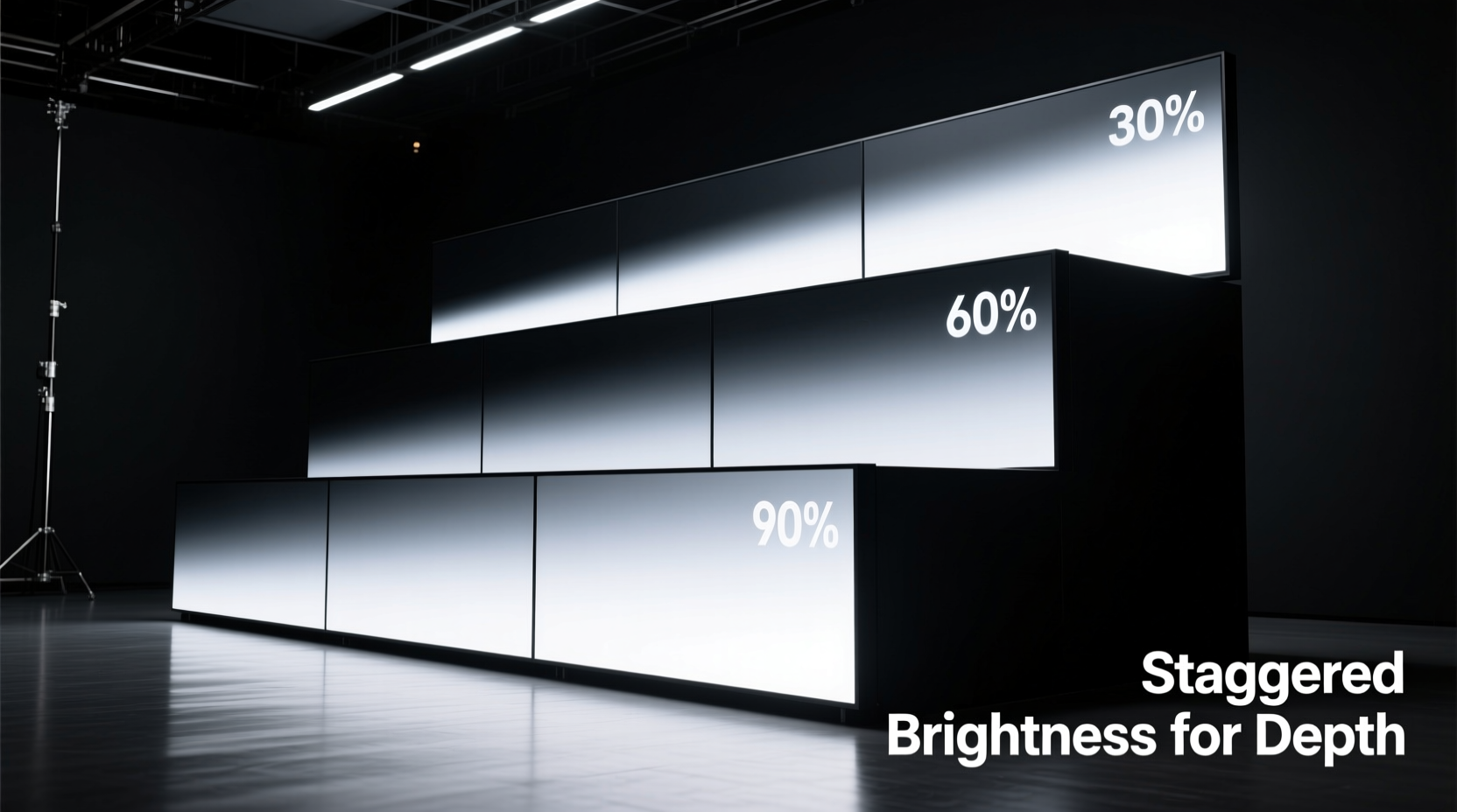
To apply this effectively, think of your display as having three primary luminance layers:
- Foreground (High Brightness): 600–1000 lux. Reserved for hero items, callouts, or interactive stations.
- Middle Ground (Medium Brightness): 300–500 lux. Supports secondary information or contextual elements.
- Background (Low Brightness): 100–200 lux. Used for walls, ambient textures, or directional cues.
Step-by-Step Guide to Implementing Staggered Brightness
Applying this technique requires planning, measurement, and iterative adjustment. Follow this sequence to achieve optimal results:
- Map the Display Layout
Create a scaled plan of the space, identifying all physical elements: products, signage, pedestals, walls, and walkways. Assign each element to one of the three depth zones (foreground, middle ground, background). - Determine Primary Focal Points
Select no more than two to three hero elements per 20 linear feet. These will receive maximum brightness. Avoid overloading the space with competing highlights. - Select Fixtures with Dimming Control
Use LED spotlights, track lights, or recessed downlights with 0–10V or DALI dimming capability. Ensure each zone can be independently controlled. - Set Initial Brightness Levels
Start with foreground at 800 lux, middle ground at 400 lux, and background at 150 lux. Use a calibrated light meter at viewing height (typically 5–6 feet from floor). - Test Viewer Flow
Walk the intended path through the display. Note where attention stalls or skips. Adjust brightness ratios if transitions feel abrupt or unclear. - Refine with Ambient Balancing
Introduce subtle uplighting or grazing on textured backgrounds to maintain visual interest without increasing measured lux. This preserves depth while avoiding \"black hole\" effects. - Document Settings
Save control presets for consistency across days and shifts. Label circuits or channels clearly (e.g., “Front_Product_Spots,” “Rear_Wall_Grazing”).
Common Pitfalls and How to Avoid Them
Even experienced designers fall into traps when layering brightness. Here are frequent issues and their solutions:
| Pitfall | Impact | Solution |
|---|---|---|
| Overlapping Bright Zones | Visual clutter; loss of depth hierarchy | Ensure at least a 1.5x brightness ratio between adjacent zones. Use barn doors or snoots to confine spill. |
| Neglecting Vertical Surfaces | Flat walls undermine horizontal depth | Graze backdrops with narrow beams (10°–15°) at 30% of foreground brightness. |
| Ignoring Time-of-Day Changes | Natural light alters artificial gradients | Install photocell sensors or schedule dimming curves to compensate for daylight gain. |
| Using Mixed Color Temperatures | Disrupts cohesion; confuses depth cues | Stick to one CCT (Correlated Color Temperature), ideally 3000K–3500K for warmth and clarity. |
Real-World Application: Museum Exhibit Case Study
The Urban Evolution exhibit at the Metro City History Center spanned 80 linear feet but had only 18 feet of depth. Curators wanted visitors to experience a journey from industrial past to digital future, but early mockups felt cramped and overwhelming.
The lighting team applied staggered brightness in three acts:
- Act I – Industrial Era (Background): Walls were washed with 180 lux of warm amber light (2700K), simulating gaslamp glow. Artifacts sat behind glass, minimally lit to avoid reflections.
- Act II – Mid-Century Transition (Middle Ground): Freestanding kiosks received 450 lux from adjustable track spots. Neutral white (3000K) distinguished this era as a bridge.
- Act III – Digital Age (Foreground): Interactive touchscreens and holograms operated at 900 lux with crisp 3500K LEDs, creating a forward-pushing energy.
The result was transformative. Visitor dwell time increased by 40%, and post-exhibit surveys showed 87% perceived the space as “larger than expected.” One attendee noted, “It felt like walking through time—the light pulled me forward.”
Checklist: Pre-Launch Verification
Before finalizing any large display setup, run through this checklist to ensure effective brightness staggering:
- ☐ All luminaires are individually addressable or grouped by zone
- ☐ Lux levels have been measured at multiple points in each zone
- ☐ Transitions between zones are smooth, not jarring
- ☐ No direct glare is visible from standard viewing angles
- ☐ Emergency or exit lighting does not disrupt the gradient
- ☐ Dimming profiles are saved and backed up
- ☐ Maintenance access allows for bulb/output checks without dismantling
Expert Tools and Accessories
Professional-grade execution depends on reliable tools. Consider integrating the following:
- Digital Lux Meter: Models like the Extech LT300 offer ±5% accuracy and data logging.
- Beam Angle Calculator: Online tools from manufacturers (e.g., Zumtobel, Philips) help predict spread and intensity based on mounting height.
- DMX or DALI Controller: Enables precise, programmable control over hundreds of fixtures. Useful for timed sequences or adaptive lighting.
- Mockup Software: Programs like DIALux or Relux simulate lighting layouts in 3D, allowing virtual testing before installation.
For temporary or modular displays, battery-powered LED strips with built-in dimmers (e.g., Govee or Nanoleaf) offer flexibility. While less precise, they allow rapid prototyping of brightness layering concepts.
Frequently Asked Questions
Can I stagger brightness without smart lighting systems?
Yes. Even simple setups using plug-in lamps with manual dimmer switches can achieve basic layering. The key is intentional placement and consistent intensity within each zone. However, scalability and precision improve significantly with addressable systems.
How do I prevent darker areas from looking neglected?
Low brightness doesn’t mean low quality. Maintain clean finishes, subtle texture, or faint graphic elements in shadowed zones. A softly lit brick wall or faint timeline graphic keeps the background visually active without competing for attention.
Does this technique work for outdoor displays?
With limitations. Outdoor environments face higher ambient light, especially during daytime. Staggering works best at dusk or night, using focused fixtures with high lumen output. Consider using motion-activated boosts in foreground zones to draw attention when visitors approach.
Final Considerations for Long-Term Success
Staggered brightness is not a set-and-forget solution. Over time, LED outputs degrade (typically 3–5% per year), dust accumulates on lenses, and visitor patterns shift. Schedule quarterly reviews:
- Re-measure lux levels at critical points.
- Clean all fixtures and diffusers.
- Observe visitor behavior—do people pause where intended?
- Update presets if content or layout changes.
Also consider accessibility. Some neurodivergent individuals or older adults may find strong contrasts disorienting. Offer a secondary, lower-contrast mode via a wall switch or app toggle in public installations.
“Great lighting disappears. You don’t notice the fixtures—you notice the story.” — Rajiv Mehta, Architectural Lighting Consultant, Lumina Design Group
Conclusion
Staggering light brightness levels is a foundational skill for anyone designing large display environments. It turns passive observation into immersive experience, guiding the eye and shaping emotional response through carefully modulated luminance. From retail windows to museum halls, the technique adds depth where structure cannot.
Start small: experiment with two zones in a single case. Measure, observe, refine. Then scale outward. With practice, you’ll develop an intuitive sense of how light sculpts space—not just revealing objects, but giving them context, weight, and narrative momentum.


 浙公网安备
33010002000092号
浙公网安备
33010002000092号 浙B2-20120091-4
Comments
No comments yet. Why don't you start the discussion?