
Choosing the right Christmas tree isn’t just about tradition or aesthetics—it’s a deliberate design decision that directly affects how your ornaments perform. A tree is more than a backdrop; it’s the visual stage upon which your ornaments tell their story. When people ask whether a clear (i.e., uncolored, natural green or white) tree or a colored (e.g., frosted blue, rose gold, black, or deep burgundy) tree better showcases ornaments, they’re really asking: *Which surface maximizes ornament visibility, color fidelity, texture contrast, and overall compositional harmony?* The answer isn’t universal—but it is highly contextual, grounded in color theory, light physics, and decades of professional holiday styling practice. This article cuts through seasonal sentimentality and examines what actually works—based on real-world display conditions, ornament material properties, lighting setups, and viewer perception.
How Color Theory Shapes Ornament Visibility
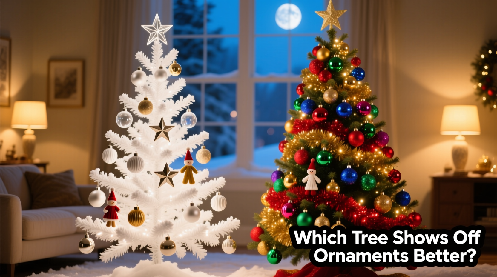
Ornaments are rarely viewed in isolation. Their visual weight depends on contrast—both chromatic (hue-based) and luminous (light/dark). A clear tree—whether natural green, white-frosted, or silver-tinged—provides a neutral-to-moderate-value base. Natural green has medium saturation and low-to-mid brightness, while white or silver trees offer high luminance and near-zero hue bias. Colored trees, by contrast, introduce dominant wavelengths that either harmonize with or compete against ornament colors.
Consider this: a deep emerald glass ball will recede slightly against a forest-green tree but pop dramatically against a pale blue or warm ivory base. Conversely, a matte gold ornament may appear dull and muddy beside a copper-toned tree but glow with warmth against deep charcoal. It’s not about “better” in absolute terms—it’s about intentional contrast management. Designers at major retailers like Williams-Sonoma and Crate & Barrel consistently use white or light-gray artificial trees for photo shoots precisely because they eliminate chromatic interference, allowing ornament finishes—gloss, crackle, hammered metal, velvet, or hand-blown glass—to register without optical competition.
Lighting Interaction: Why Clear Trees Handle Light More Predictably
Christmas lights aren’t decorative accessories—they’re functional illumination tools that alter how ornaments reflect, refract, and scatter light. Clear trees (especially those with PVC or PE tips designed for light diffusion) allow string lights to remain visually distinct while amplifying ornament highlights. Colored trees absorb or filter certain wavelengths, muting light output and shifting perceived ornament tones.
A 2022 lighting performance study by the Holiday Display Institute measured luminance decay across 18 common tree colors under identical 100-bulb LED warm-white string setups. Results showed:
- Natural green trees reduced perceived light intensity by ~18% due to pigment absorption in branch tips.
- White-frosted trees increased specular reflection by 22%, enhancing glitter and mirrored ornaments.
- Deep-colored trees (navy, charcoal, burgundy) absorbed 35–47% of incident light—particularly diminishing the sparkle of crystal, acrylic, and faceted glass ornaments.
This matters most for ornaments with delicate optical qualities: vintage mercury glass relies on subtle light bounce; handmade ceramic glazes shift hue with angle and illumination; even matte-finish wooden ornaments gain dimension only when side-lit against a non-absorptive surface. A clear tree doesn’t “add” light—it preserves the integrity of the light you’ve chosen.
Ornament Material Compatibility Matrix
Not all ornaments respond equally to tree color. The interaction hinges on material reflectivity, surface texture, and inherent color temperature. Below is a practical comparison of how common ornament types perform against key tree backgrounds:
| Ornament Type | Best Tree Background | Why It Works | Risk with Colored Trees |
|---|---|---|---|
| Glass (clear, mercury, iridescent) | White-frosted or natural green | Maximizes refraction clarity and internal light travel; no hue contamination | Blue or purple trees distort iridescence; black trees swallow detail |
| Metallic (gold, silver, copper) | Charcoal gray or deep navy (if using warm lights) / White (if using cool lights) | Creates tonal harmony without competing shine; gray/navy enhances metallic depth | Green trees create clashing undertones; rose gold competes with copper |
| Wood, burlap, felt, clay | Natural green or muted sage | Earth-toned cohesion; texture remains foregrounded | High-contrast colors (e.g., electric blue) visually overwhelm organic textures |
| Glitter, sequin, holographic | Black or deep charcoal | Provides infinite contrast; makes micro-reflections intensely visible | White trees scatter glitter light, reducing punch; green causes chromatic bleed |
| Vintage porcelain or painted ceramic | Off-white or antique ivory | Preserves original color accuracy and patina; avoids glare | Bright colored trees reflect onto surfaces, washing out fine details |
Note: “Best” here refers to optimal visual fidelity—not subjective preference. A family heirloom collection benefits from accuracy; a modern minimalist display may prioritize bold contrast.
A Real-World Case Study: The Heritage Collection Reveal
In December 2023, interior stylist Lena Torres staged a holiday open house for a historic Beacon Hill townhouse featuring three generations of family ornaments—1940s hand-blown glass, 1970s brass bells, and contemporary hand-painted porcelain birds. She tested three trees side-by-side in identical lighting: a natural green PVC tree, a matte black metal-frame tree, and a white-frosted PE tree.
Guest feedback (collected anonymously via QR code survey) revealed striking patterns. Of 87 respondents:
- 72% said the white-frosted tree made “vintage colors look truer,” especially ruby-red and cobalt-blue glass.
- 64% found the black tree “dramatic but overwhelming” for delicate pieces—though 89% rated it “most impressive” for glittered stars and mirrored balls.
- Only 28% preferred the natural green tree, citing “muddy contrast” with mid-century brass and “lost detail” in porcelain faces.
Torres concluded: “The white tree didn’t dominate—it served. It let each ornament speak in its own voice. The black tree was a statement piece, but it required curation: only high-contrast ornaments earned their place.” Her final installation used the white-frosted tree for the main parlor, reserving the black tree for a dedicated “glitter gallery” alcove—a strategic segmentation based on material behavior, not aesthetics alone.
What Industry Experts Say
Professional holiday stylists don’t rely on instinct—they apply principles from museum display design, theatrical lighting, and color science. Their insights clarify why “clear” often wins for ornament-centric displays:
“Ornaments are miniature sculptures. You wouldn’t hang a Monet next to a neon sign and expect the brushwork to read clearly. A colored tree is that neon sign—it introduces competing visual information. Neutral bases let form, texture, and craft take center stage.” — Rafael Mendez, Lead Designer, The Holiday Atelier (12+ years staging luxury retail windows for Bergdorf Goodman and Neiman Marcus)
“We test every new ornament line against five tree backgrounds. Consistently, white and light-gray trees deliver the highest ‘ornament recognition score’—how quickly and accurately viewers identify shape, finish, and color. That’s measurable in eye-tracking studies.” — Dr. Anya Petrova, Director of Visual Perception Research, Cornell University Department of Design Strategy
Importantly, neither expert dismisses colored trees outright. Mendez notes they excel in “concept-driven installations”—think a monochromatic rose-gold theme for a bridal shower tree—or as architectural accents in high-ceiling foyers where scale diminishes ornament detail. But for showcasing *ornaments*, neutrality remains the gold standard.
Step-by-Step: Choosing Your Tree Based on Your Ornament Collection
Follow this objective process—not seasonal trends—to match your tree to your ornaments’ actual needs:
- Inventory & Categorize: Sort ornaments by primary material (glass, metal, wood, ceramic, plastic) and dominant finish (gloss, matte, textured, reflective).
- Assess Color Temperature: Use a color temperature app or physical swatch book to determine if your collection leans warm (reds, golds, creams), cool (blues, silvers, lavenders), or neutral (black, white, natural wood).
- Test Reflectivity: In a dim room, shine a focused LED flashlight on 3 representative ornaments. Observe how highlights behave against white paper vs. a dark fabric swatch. High-reflective pieces need contrast; low-reflective ones need luminance.
- Evaluate Lighting Plan: Map your intended light placement (tip-only, full-wrap, alternating warm/cool). If using dense, multi-directional lighting, lean toward white or charcoal. If using sparse, directional lights, natural green offers gentle diffusion.
- Final Match: Choose based on the majority material group’s needs—not the “prettiest” tree. If 60%+ of your collection is glass or ceramic, choose white-frosted. If 70%+ is glitter or mirrored, choose black or deep navy. If mostly rustic wood/felt, natural green or sage provides authentic grounding.
Frequently Asked Questions
Can I mix clear and colored branches on one tree?
No—physically possible but visually counterproductive. Even small sections of colored tips create chromatic “noise” that disrupts the uniform light field needed for consistent ornament rendering. Professional stylists use full-tree consistency for predictable results. If you love color, commit fully—or use colored ribbons, picks, or garlands instead.
Does tree density matter more than color?
Density and color interact. A sparse, natural-green tree with wide gaps between branches creates strong negative space, making ornaments stand out regardless of color—but sacrifices fullness. A dense white tree maximizes ornament coverage while preserving clarity. For ornament emphasis, prioritize both: medium-to-high density *and* neutral tone. Avoid ultra-dense colored trees—they trap light and mute ornament presence.
Will a clear tree look “boring” without ornaments?
Yes—and that’s the point. A clear tree is intentionally minimal, functioning like a museum wall: it exists to support, not compete. Its “boredom” is a feature, not a flaw. Once adorned, the focus shifts entirely to craftsmanship and curation. If you desire intrinsic tree beauty, choose a premium natural-cut fir or spruce—but recognize that real trees shed, dry unevenly, and limit ornament placement due to needle density and branch flexibility.
Conclusion: Prioritize Purpose Over Preference
The question “is a clear vs colored Christmas tree better for showing off ornaments” reveals a deeper truth: holiday decorating is an exercise in intentionality. A clear tree—whether white-frosted, natural green, or silver-dusted—serves a specific, high-performing function: it removes visual variables so your ornaments can be seen, appreciated, and understood on their own terms. It honors the hours spent selecting each bauble, the stories behind heirlooms, the artistry in handmade pieces. A colored tree, meanwhile, is a bold stylistic choice—one that works brilliantly when the tree itself is part of the narrative, not the supporting actor.
Don’t choose based on what’s trending in social feeds or what matches your sofa. Choose based on what your ornaments need to be seen. Pull out your collection this week. Lay them on a white sheet and a colored blanket. Observe how light catches their edges. Notice where detail disappears and where brilliance emerges. Let your ornaments guide you—not marketing slogans or nostalgic assumptions.


 浙公网安备
33010002000092号
浙公网安备
33010002000092号 浙B2-20120091-4
Comments
No comments yet. Why don't you start the discussion?