
Choosing the right fabric pattern can transform a simple project into a statement piece. Among the most visually compelling options are labyrinth (or maze) prints and floral patterns—two designs that carry strong symbolism, cultural roots, and aesthetic power. While both have enduring appeal, their impact varies dramatically depending on context, color, scale, and application. Whether you're designing clothing, crafting accessories, or styling interiors, understanding the visual psychology and practical use of these patterns is key to making your work truly pop.
The Visual Language of Labyrinth Patterns
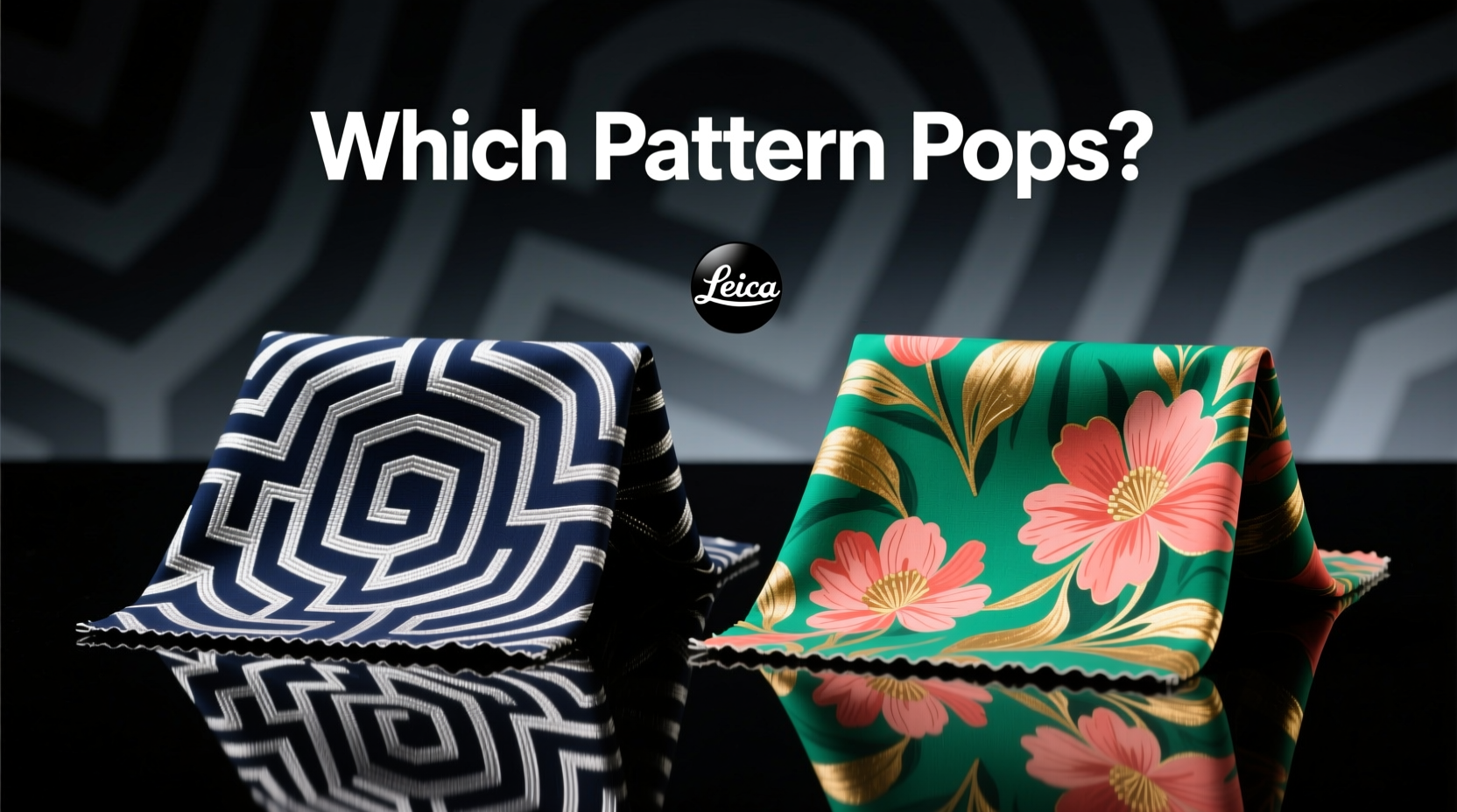
Labyrinth prints feature intricate, geometric pathways that loop and turn in continuous flow. Unlike random abstract designs, labyrinths suggest movement, journey, and introspection. Historically rooted in ancient architecture and spiritual symbolism—such as the Cretan labyrinth or medieval cathedral floor mazes—this motif carries depth beyond mere decoration.
In modern textile design, labyrinth patterns often appear in monochrome or tonal palettes, emphasizing contrast and structure. Their angular precision creates a sense of order, making them ideal for minimalist or contemporary aesthetics. When used in apparel, they add subtle drama without overwhelming the silhouette. In home decor, especially on cushions or wall hangings, they draw the eye with hypnotic rhythm.
The Emotional Resonance of Floral Prints
Floral patterns, by contrast, speak a language of nature, romance, and vitality. From delicate Victorian-era rose motifs to bold tropical hibiscus explosions, florals evoke emotion through color, bloom density, and botanical accuracy. They’re among the most versatile fabric prints, adapting easily across seasons, cultures, and design styles.
What makes floral prints so effective at making projects \"pop\"? Their organic asymmetry breaks visual monotony. A well-placed daisy cluster or trailing jasmine vine creates focal points naturally, mimicking how flowers grow in real life. Designers like Emilio Pucci and Dolce & Gabbana have long leveraged large-scale florals to command attention on runways.
For crafters, the emotional warmth of florals makes them especially powerful in children’s wear, summer dresses, and soft furnishings. However, not all floral prints are created equal—scale, color harmony, and background contrast determine whether the effect is vibrant or vintage, playful or elegant.
“Florals aren’t just decorative—they tell stories of place, season, and mood. A single bloom can anchor an entire design.” — Lena Torres, Textile Designer at Atelier Bloom
Comparing Impact: When Each Pattern Shines
So which pattern makes your project stand out more? The answer depends on intent. Below is a detailed comparison to guide your choice based on common project types.
| Project Type | Best Pattern | Why It Works |
|---|---|---|
| Statement Dress | Floral (large-scale) | Bold blooms create instant visual interest; evokes confidence and femininity. |
| Modern Throw Pillow | Labyrinth (geometric) | Structured lines complement clean furniture; adds intellectual intrigue. |
| Kids’ Room Decor | Floral (pastel, whimsical) | Natural themes feel nurturing; soft colors promote calm. |
| Menswear Shirt | Labyrinth (subtle tonal) | Conveys sophistication without being flashy; appeals to minimalist tastes. |
| Art Quilt | Either (depends on theme) | Florals for narrative warmth; labyrinths for conceptual depth. |
Case Study: Redesigning a Living Room with Purpose
A designer in Portland was tasked with revitalizing a dimly lit urban apartment living room. The client wanted “energy” but disliked cluttered visuals. Initially, the team leaned toward a large floral upholstery fabric for the sofa. However, testing swatches revealed that florals, while cheerful, felt too busy under low natural light.
The solution? A deep navy labyrinth-print accent chair paired with cream walls and walnut flooring. The geometric repetition drew the eye inward, creating a meditative focal point. To balance warmth, small floral throw pillows in coral and sage were added. The result: a space that felt dynamic yet grounded. Visitors consistently remarked on the chair’s “hypnotic presence.” This hybrid approach demonstrated that while florals bring life, labyrinths can anchor it.
How to Choose Based on Your Project Goals
Selecting between labyrinth and floral isn’t about trend—it’s about alignment with purpose. Follow this step-by-step decision framework:
- Define the mood: Is the project meant to energize (floral) or focus (labyrinth)?
- Assess the environment: Will it be viewed up close (detail matters) or from afar (scale dominates)?
- Consider the audience: Florals often resonate emotionally; labyrinths appeal intellectually.
- Test color interaction: Florals need balanced backgrounds; labyrinths thrive on contrast.
- Evaluate durability needs: Busy patterns hide wear better—both styles score well here.
Common Pitfalls to Avoid
- Overloading with scale: Pair one bold-patterned item with solids. Two large prints compete.
- Mismatching eras: Vintage florals clash with ultra-modern labyrinths unless intentionally curated.
- Ignoring fabric weight: Heavy brocade florals may overwhelm a lightweight scarf; fine cotton suits delicate labyrinths.
- Underestimating dye lot variation: Both patterns can shift subtly between batches—buy extra yardage.
Expert Checklist: Picking the Right Pattern
Use this checklist before finalizing your fabric choice:
- ✅ Does the pattern align with the emotional tone of the project?
- ✅ Have I tested the fabric in the actual space or lighting?
- ✅ Is the scale proportional to the finished item (e.g., small print on a tiny pouch)?
- ✅ Are there enough solid elements nearby to prevent visual fatigue?
- ✅ Can I source matching thread, lining, or trim if needed?
- ✅ Does the care instruction match the intended use (e.g., washable for kids’ items)?
Frequently Asked Questions
Can I mix labyrinth and floral prints in the same project?
Yes—but do so intentionally. Use one as the dominant pattern and the other as an accent. For example, a floral dress with labyrinth-print buttons or lining adds surprise without chaos. Ensure shared color tones to unify the look.
Which pattern is easier to sew with?
Floral prints are generally more forgiving when matching seams because their asymmetry hides minor misalignments. Labyrinth patterns require precise pattern matching at seams due to their repeating geometry, especially on garments with symmetry like collars or pockets.
Are these patterns suitable for professional or corporate settings?
Subtle labyrinth prints in dark tones work well in professional menswear or office accessories, conveying thoughtfulness. Small, muted florals—like sprigs of lavender or ferns—can also be appropriate in blouses or ties, provided they’re not overly bright or large.
Final Thoughts: Make Your Mark with Meaning
The choice between labyrinth and floral print isn't merely aesthetic—it's narrative. A floral pattern connects us to nature, memory, and emotion. A labyrinth invites contemplation, challenge, and journey. When you select one over the other, you're not just choosing a design—you're setting a tone.
If your goal is immediate visual impact, especially in personal or expressive projects, floral prints often deliver faster recognition and emotional response. But if you're aiming for lasting intrigue, modern elegance, or conceptual depth, a well-executed labyrinth print can elevate your work into art.
Ultimately, the pattern that makes your project pop is the one that aligns with your vision—not just what's trendy. Test both. Drape them. Live with them for a day. Then trust your instinct.


 浙公网安备
33010002000092号
浙公网安备
33010002000092号 浙B2-20120091-4
Comments
No comments yet. Why don't you start the discussion?