
Color block cardigan sets have emerged as a staple in modern wardrobes—versatile, bold, and expressive. Yet, their vibrant panels can intimidate even the most fashion-savvy individuals. The secret to wearing them well isn’t just about personal taste; it’s rooted in understanding color theory, proportion, and harmony. When done right, a color block ensemble elevates your look from casual to curated with minimal effort. This guide breaks down the principles of color coordination so you can wear these statement pieces confidently and cohesively.
The Psychology and Power of Color Blocking
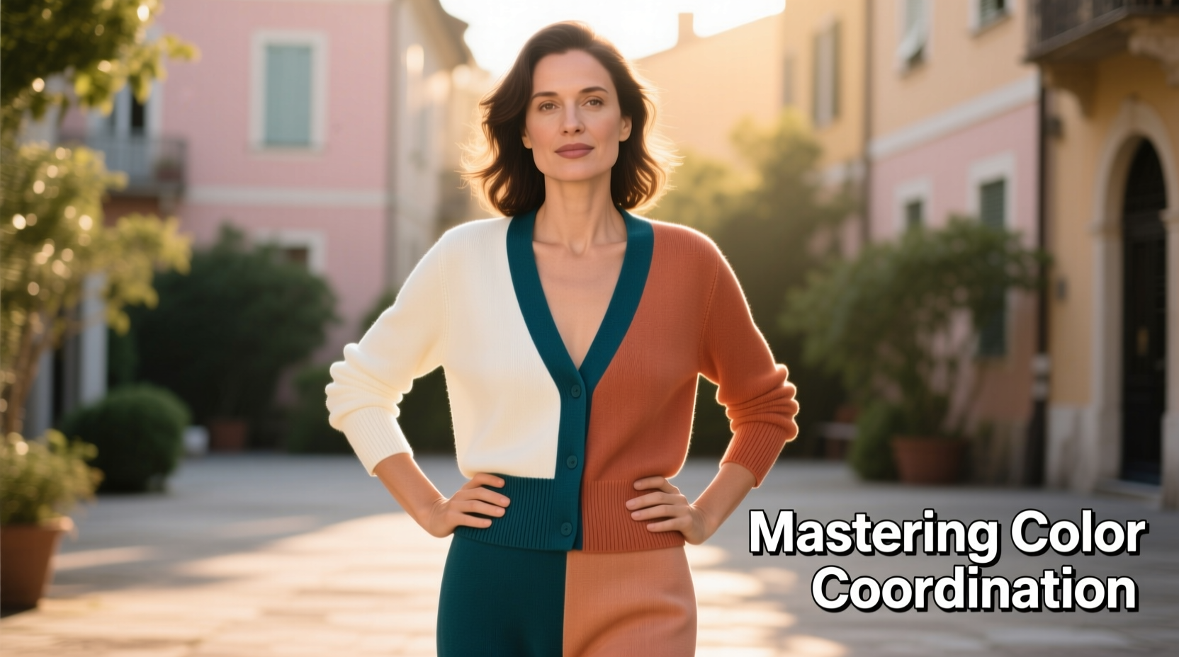
Color blocking is more than an aesthetic choice—it’s a visual language. By combining solid, contrasting colors in deliberate sections, you create dynamic shapes that draw attention and communicate mood. A red and navy panel might convey energy and stability, while soft peach paired with sage green evokes calm sophistication. The effectiveness of a color block cardigan set hinges on how well its hues interact with each other—and with your skin tone, environment, and personal style.
Designers use color blocking to define silhouettes and direct focus. For example, a vertical block down the center can elongate the torso, while horizontal bands may add width. Understanding this gives you control over not just appearance but also perception. The goal isn’t to follow rigid rules, but to develop an intuitive sense of balance.
“Color is the keyboard, the eyes are the harmonies, the soul is the piano with many strings. The artist is the hand that plays.” — Wassily Kandinsky
Understanding the Color Wheel: Your Coordination Compass
To master color matching, begin with the basics: the color wheel. It’s divided into primary (red, blue, yellow), secondary (green, orange, purple), and tertiary colors. From this foundation, three key schemes emerge:
- Analogous: Colors adjacent on the wheel (e.g., blue, teal, green). Creates a serene, cohesive look.
- Complementary: Opposite colors (e.g., purple and yellow). Delivers high contrast and vibrancy.
- Triadic: Three evenly spaced colors (e.g., red, yellow, blue). Offers bold balance without clashing.
A color block cardigan set often uses one of these combinations intentionally. If your set features coral and turquoise, they’re analogous with a tropical flair. If it pairs mustard with deep violet, it’s likely complementary for dramatic effect. Recognizing the scheme helps you extend the palette into the rest of your outfit.
How to Match the Rest of Your Outfit to a Color Block Set
The cardigan set is the centerpiece—your top and bottom already contain multiple colors. The challenge lies in choosing accessories, shoes, and under-layers that don’t compete but complement.
Start by identifying the dominant, secondary, and accent colors in your set. For instance, a piece might be 50% oatmeal, 30% rust, and 20% olive green. Use the dominant shade as your anchor. Pair neutral bottoms or tops in the same base tone to ground the look. Then, pull one accent color into your scarf, bag, or footwear to create continuity.
Avoid introducing a fifth unrelated color. Four hues max—including neutrals—is ideal for cohesion. If your set has bright tones, keep accessories muted. Matte finishes help tone down intensity, while metallics like gold or bronze can bridge warm and cool palettes.
| Cardigan Color Composition | Recommended Base Layer | Accessory Accent Strategy |
|---|---|---|
| Oatmeal, Rust, Olive | Cream turtleneck | Brown leather tote + olive silk scarf |
| Navy, White, Coral | White tank top | Coral loafers + navy hoop earrings |
| Black, Mustard, Teal | Black camisole | Teal clutch + mustard beret |
| Gray, Blush, Lavender | Light gray tee | Lavender ankle boots + blush belt |
Step-by-Step Guide: Building a Balanced Look
Follow this five-step process to ensure your color block cardigan set integrates seamlessly into a polished outfit:
- Assess the Palette: Lay the set flat and identify all colors. Label them by dominance.
- Choose a Neutral Base: Select underwear, tops, or pants in the lightest or darkest neutral present (e.g., cream, charcoal, black).
- Select One Accent to Echo: Pick one non-neutral color to repeat in shoes, bag, or jewelry. Avoid matching exactly unless fabric and finish align.
- Consider Proportion: If the cardigan has large blocks, keep accessories simple. If blocks are small and busy, opt for clean lines elsewhere.
- Test in Natural Light: Step outside or near a window. Artificial lighting distorts color perception. Adjust if tones appear too harsh or dull.
This method prevents visual clutter and ensures the outfit feels intentional rather than chaotic.
Real Example: Olivia’s Office-to-Dinner Transition
Olivia owns a color block set in heather gray, burgundy, and mustard. For work, she wears a white shell beneath it, paired with tailored gray trousers and black loafers. Her burgundy leather portfolio ties in the mid-tone, while her watch strap echoes the mustard. After hours, she swaps the loafers for mustard suede ankle boots, adds a silver pendant, and removes the cardigan to reveal a burgundy camisole. The transition feels effortless because the core palette remains consistent, allowing flexibility without mismatch.
Avoiding Common Color Coordination Mistakes
Even with good intentions, missteps happen. Here are frequent errors and how to fix them:
- Mistake: Wearing clashing patterns. Solution: Keep everything else solid. Let the cardigan be the only patterned element.
- Mistake: Ignoring undertones. A cool pink next to a warm orange can look jarring. Solution: Stick to either warm-based or cool-based palettes within one outfit.
- Mistake: Over-accessorizing. Solution: Limit colored accessories to one or two pieces. Let the cardigan breathe.
- Mistake: Mismatched skin tone. Bright blues may wash out someone with warm undertones. Solution: Test colors near your face. Choose combinations that brighten your complexion.
Frequently Asked Questions
Can I wear a color block cardigan set with jeans?
Absolutely. Opt for classic blue, black, or gray denim to avoid adding another competing hue. Make sure the wash tone aligns with the set’s neutrals—light denim with pastel blocks, dark denim with deeper tones.
What if my set has clashing colors? Can I still wear it?
Yes. Sometimes designers intentionally use tension between colors for artistic effect. In such cases, neutralize the look with monochrome layers underneath and minimal accessories. Let the garment be the sole focal point.
How do I store color block sets to preserve color integrity?
Store folded in a cool, dry place away from direct sunlight. Turn inside out before washing in cold water on a gentle cycle. Air dry flat to prevent fading and distortion.
Final Checklist: Your Color Coordination Quick Reference
- ✅ Identified dominant, secondary, and accent colors in the set
- ✅ Chosen base layer in a neutral from the set
- ✅ Selected one accent color to repeat in accessories
- ✅ Ensured all colors share the same undertone (warm or cool)
- ✅ Tested the full outfit in natural light
- ✅ Kept patterns and additional colors to a minimum
- ✅ Verified the look complements your skin tone
Conclusion: Wear Color With Confidence
Mastering color coordination isn’t about memorizing rules—it’s about developing an eye for balance and intention. A color block cardigan set is not a challenge to overcome, but an opportunity to express creativity with structure. When you understand how hues interact, you stop asking, “Do these colors go together?” and start knowing they do. Apply these principles consistently, and soon, pairing colors will feel as natural as breathing. Experiment, observe, refine. The most stylish people aren’t those who follow trends—they’re the ones who wear color with purpose.


 浙公网安备
33010002000092号
浙公网安备
33010002000092号 浙B2-20120091-4
Comments
No comments yet. Why don't you start the discussion?