Brown is one of the most versatile yet misunderstood colors in visual art and design. Often dismissed as dull or simple, it actually holds immense depth when approached with intention. Whether you're a painter, illustrator, or designer working digitally, understanding how to create rich, nuanced browns can elevate your work dramatically. Unlike other hues, brown isn’t found on the standard color wheel—but it’s made through careful blending. This guide breaks down exactly how to mix brown effectively, predictably, and creatively.
The Science Behind Brown: Why It’s Not on the Color Wheel
Brown doesn't appear as a distinct hue on the traditional color wheel because it's not a spectral color like red or blue. Instead, brown emerges when complementary colors—those opposite each other on the wheel—are mixed together. These combinations neutralize saturation, lowering intensity and shifting toward earthy tones.
For example, red and green (a classic complement) blend into a muddy brown. The same happens with orange and blue, or yellow and purple. The key lies in balance: too much of one color skews the result; just enough creates warmth, depth, and variation.
“Brown is never just ‘mixed wrong.’ It’s often the most intentional color on the palette.” — Lila Chen, Mural Artist & Color Theory Instructor
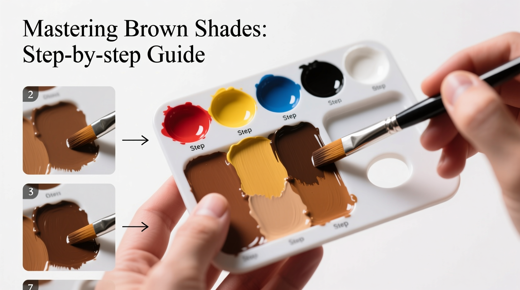
Step-by-Step Guide to Mixing Basic Brown Shades
Creating brown from scratch gives you full control over its tone, temperature, and richness. Follow these steps for consistent results:
- Start with primary colors: Use cadmium red, ultramarine blue, and lemon yellow (or their equivalents).
- Mix equal parts red and yellow: This forms an orange base.
- Add a small amount of blue: Begin with ¼ the amount of orange. Stir thoroughly.
- Evaluate the tone: If too warm, add more blue. If too cool or grayish, increase red or yellow.
- Adjust darkness: For deeper browns, gradually add more blue or a touch of black (sparingly).
- Refine with white or medium: Lighten to create tans or beiges without washing out the pigment.
Variations Using Complementary Pairs
Different pairs produce unique browns suited to specific subjects:
- Red + Green: Warm, brick-like tones ideal for skin, wood, or terracotta.
- Blue + Orange: Cooler chocolate or espresso shades perfect for shadows or night scenes.
- Purple + Yellow: Earthy ochres and sienna-like hues great for landscapes.
Use transparent pigments like alizarin crimson or phthalo green for layered effects. Opaque paints like burnt umber give immediate coverage but limit subtlety.
Creating Natural-Looking Browns: Temperature and Context
Not all browns are created equal. A tree trunk in sunlight looks vastly different from a shadowed leather sofa. That’s where temperature comes in.
Warm browns lean toward red, orange, or yellow undertones. They feel inviting and energetic. Mix them by emphasizing red and yellow in your blend.
Cool browns contain more blue or gray, giving them a reserved, somber quality. Ideal for shaded areas or modern interiors.
| Brown Type | Best Used For | Suggested Mix |
|---|---|---|
| Warm Chocolate | Wood grain, hair, coffee | Red + Orange + Touch of Blue |
| Cool Ash Brown | Shadows, concrete, metal | Blue + Orange + White |
| Golden Tan | Skin tones, sand, paper | Yellow + Red + Minimal Blue |
| Deep Umber | Soil, bark, boots | Pre-mixed Burnt Umber + Alizarin Crimson |
Tips for Avoiding Muddy or Flat Browns
One common frustration is ending up with lifeless, murky browns. This usually happens due to overmixing or combining too many pigments at once.
Overworking the paint physically blends out subtle variations that create visual interest. Instead, try layering—apply one color wet-on-dry over another to preserve vibrancy.
Avoid relying solely on black to darken browns. Black tends to deaden color. Opt for deep blues (like indigo) or dark purples to maintain tonal richness while deepening value.
Mini Case Study: Painting a Realistic Tree Trunk
An artist attempting a forest scene struggled with flat-looking bark. Their initial brown was a heavy mix of all three primaries, resulting in a dull, uniform tone.
They revised their approach: first laying down a warm orange-red base, then glazing thin layers of phthalo green and ultramarine blue in shadowed areas. By allowing underlying colors to show through selectively, they achieved textured, dimensional bark with natural highlights and depth.
The final trunk wasn’t one brown—it contained at least six variations, all derived from controlled complementary mixing.
Advanced Techniques: Customizing Browns for Realism
Once you’ve mastered basic mixing, refine your palette with advanced methods:
- Glazing: Apply transparent layers of complementary colors over dry underpaintings to build complex browns.
- Broken color: Place small dabs of red, green, and yellow side-by-side instead of pre-mixing. From a distance, they visually blend into vibrant brown.
- Using earth pigments: Pre-made browns like raw sienna, burnt umber, or Indian red offer consistency and authenticity.
When matching real-world objects, hold your mixed swatch next to the subject. Adjust until the eye accepts the match—not necessarily identical under artificial light, but perceptually correct.
Checklist: How to Make Better Browns
- ☑ Start with clean brushes to avoid contamination
- ☑ Use complementary pairs instead of defaulting to black + white
- ☑ Test mixes on scrap paper before applying to canvas
- ☑ Label your custom browns if reusing them later
- ☑ Store leftover mixes in sealed containers for future use
- ☑ Observe natural browns in daily life—notice warmth, texture, and variation
Frequently Asked Questions
Can I make brown without using black?
Absolutely. In fact, avoiding black often leads to more dynamic results. Combine any complementary pair—red and green, blue and orange, purple and yellow—to create rich, chromatic browns naturally.
Why does my brown look gray or dull?
This typically occurs when colors are overmixed or when incompatible pigments cancel each other out. Try reducing the number of pigments used and focus on two dominant hues. Also ensure your paints are fresh and not dried out.
What’s the difference between burnt umber and raw umber?
Raw umber is a natural clay pigment with a greenish-brown tone, cooler and less intense. Burnt umber is heated raw umber, resulting in a deeper, redder, and warmer brown. Both are excellent starting points for mixing.
Conclusion: Embrace the Depth of Brown
Brown is far from boring—it’s the color of soil, wood, stone, and skin. Mastering its creation unlocks realism, mood, and sophistication in any artwork. With practice, you’ll learn to see brown not as a single shade but as a spectrum shaped by light, environment, and emotion.
Now that you understand the principles behind mixing brown, experiment fearlessly. Create your own palette of custom earth tones. Name them. Reuse them. Let brown become one of your most expressive tools.


 浙公网安备
33010002000092号
浙公网安备
33010002000092号 浙B2-20120091-4
Comments
No comments yet. Why don't you start the discussion?