
Throw pillows are more than decorative accents—they’re the punctuation marks of your living space. When styled thoughtfully, they can elevate a room from ordinary to exceptional. Yet many hesitate to mix cushion covers, fearing clashing patterns or visual chaos. The truth is, pattern mixing isn’t about luck—it’s about strategy. With the right principles, anyone can create layered, dynamic arrangements that feel intentional and inviting.
This guide demystifies the art of combining cushion covers, offering actionable techniques for balancing scale, color, texture, and style. Whether you're refreshing a sofa or reimagining a bedroom nook, these insights will help you design with clarity and flair.
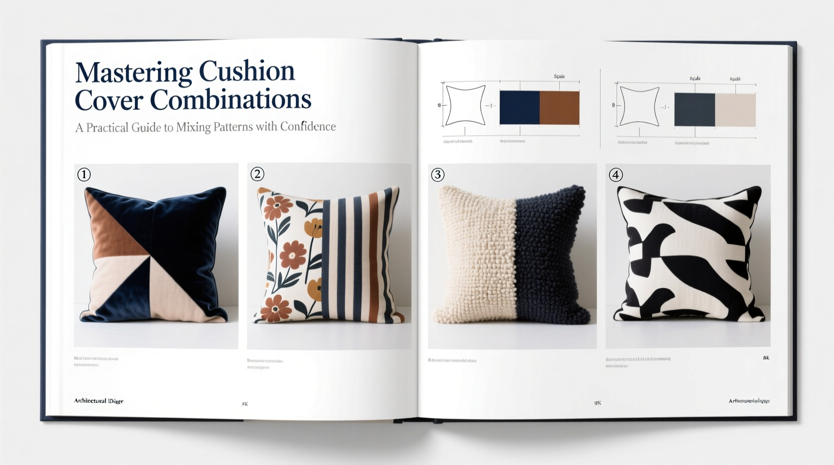
Understanding Pattern Scale and Proportion
One of the most common mistakes in mixing cushion covers is using patterns of similar size. When all prints are medium-scale florals or busy geometrics, the eye struggles to focus, resulting in visual fatigue. The key is contrast—specifically, varying the scale of patterns.
Think of pattern scale in three categories: large, medium, and small. A balanced arrangement typically includes at least two scales, often all three. For example:
- Large-scale (e.g., oversized botanicals): draws attention, works best as an anchor.
- Medium-scale (e.g., classic stripes or paisleys): provides continuity and rhythm.
- Small-scale (e.g., tiny checks or micro-dots): adds detail and subtle movement.
Begin by selecting one dominant large-scale print as your focal point. Build around it with smaller patterns that echo its colors or theme. This creates hierarchy without competition.
Building a Cohesive Color Palette
Color is the glue that holds mixed patterns together. Even wildly different designs can harmonize when tied by a shared palette. Start by identifying the dominant hues in your largest-patterned cushion or main upholstery fabric.
Aim for a base of three core colors: a primary (60%), a secondary (30%), and an accent (10%). These don’t need to be evenly distributed across each cushion—but should appear throughout the grouping as a whole.
For instance, if your sofa is navy blue, choose cushions that incorporate navy along with complementary tones like mustard yellow and soft gray. A floral might showcase all three, while a geometric focuses on navy and yellow, and a textured solid brings in gray.
“Color consistency is non-negotiable in pattern mixing. It’s what transforms randomness into rhythm.” — Lena Torres, Interior Stylist & Author of *Textured Spaces*
Texture as a Silent Unifier
Not every cushion needs a bold print. In fact, incorporating solid-color covers with rich textures—like bouclé, linen, velvet, or woven cotton—adds depth without visual noise. These pieces act as “rest zones” for the eye, allowing busier patterns to shine.
Consider pairing a sleek, printed cotton cover with a nubby wool blend or a glossy silk-cotton jacquard. The contrast in sheen and handfeel enhances tactile interest, making the arrangement feel curated rather than chaotic.
When in doubt, include at least one textured solid in your lineup. It serves as both a neutral and a connector, bridging disparate patterns through material harmony.
| Pattern Type | Suggested Pairings | Use Case |
|---|---|---|
| Floral (large-scale) | Small gingham, solid velvet, pinstripe | Living room sofa, sunroom seating |
| Geometric (medium) | Trellis weave, abstract watercolor, solid linen | Modern lounge, entry bench |
| Stripes (narrow) | Botanical print, herringbone, tasselled solid | Bedroom bench, window seat |
| Paisley (vintage) | Damask, tweed, embroidered neutral | Reading nook, formal sitting area |
Step-by-Step Guide to Mixing Cushion Covers
Follow this five-step process to confidently assemble a balanced pillow arrangement:
- Start with your anchor piece. Choose the boldest cushion—the one with the largest pattern or most vibrant color. Place it first.
- Select a unifying color. Identify 2–3 colors from the anchor and use them as your palette foundation.
- Add a contrasting scale. Introduce a smaller or simpler pattern that shares at least one color with the anchor.
- Incorporate a textured solid. Include one cushion with no print but high tactile appeal—this grounds the set.
- Edit ruthlessly. Step back. Remove any cover that feels redundant or overwhelming. Odd numbers (3, 5, 7) often compose better than even ones.
Real Example: Transforming a Beige Sofa
Sarah had a neutral-toned sectional that felt flat despite quality construction. She wanted warmth and character without overwhelming the space. Her solution:
- One large-scale rust-and-cream floral (anchor)
- One medium-scale charcoal trellis pattern (contrast)
- One small black-and-white ikat (dynamic accent)
- Two textured solids: rust velvet and oatmeal bouclé
By ensuring all cushions included at least one shared hue and varying both pattern size and fabric type, Sarah created a layered yet cohesive look. Guests now consistently compliment the “effortless elegance” of her living room—proof that thoughtful mixing pays off.
Common Mistakes to Avoid
Even experienced decorators stumble when combining patterns. Watch out for these pitfalls:
- Matching everything too closely – identical patterns in slight variations look dated, not coordinated.
- Ignoring room context – a playful polka dot may clash with traditional wood furniture unless balanced intentionally.
- Overcrowding the surface – too many cushions inhibit comfort and visual breathing room.
- Skipping lighting checks – some prints look great in stores but garish under home lighting.
“The goal isn’t perfection—it’s personality. A slightly imperfect mix often feels more human and welcoming.” — Marcus Bell, Home Styling Consultant
Checklist: Your Cushion Combination Quick Reference
Before styling your next throw pillow display, run through this checklist:
- ✅ Have I chosen a dominant anchor pattern?
- ✅ Do all cushions share at least one common color?
- ✅ Are there at least two different pattern scales?
- ✅ Is there a textured solid to balance the prints?
- ✅ Does the overall mix reflect the room’s mood (e.g., calm, energetic, cozy)?
- ✅ Have I stepped back to assess the full composition?
Frequently Asked Questions
Can I mix vintage and modern patterns?
Absolutely. Combine a retro-inspired geometric with a contemporary abstract print, as long as they share a color family. The contrast adds intrigue and avoids predictability.
How many cushion covers should I use on a standard sofa?
For a three-seater, 3 to 5 cushions offer balance without clutter. Use larger cushions at the ends and smaller ones toward the center for visual flow.
What if my furniture is already patterned?
Lean into solids and textures. If your sofa has a subtle weave or faint stripe, avoid competing prints. Opt for cushions in solid colors pulled from the upholstery’s undertones.
Conclusion: Design with Confidence
Mixing cushion cover patterns isn’t reserved for design insiders. With a clear framework—scale variation, color cohesion, and textural contrast—anyone can create arrangements that feel polished and personal. The most memorable interiors aren’t those without risk, but those where risks are taken with intention.
Your living space should reflect your taste, not fear. Start small: swap out one solid pillow for a subtly patterned one. Then build from there. Each combination you try teaches you more about your aesthetic instincts. Soon, you won’t just tolerate pattern mixing—you’ll master it.


 浙公网安备
33010002000092号
浙公网安备
33010002000092号 浙B2-20120091-4
Comments
No comments yet. Why don't you start the discussion?