
Placing text within shapes or non-rectangular elements is a common challenge in graphic design, UI/UX development, and digital publishing. Whether you're designing a logo, formatting an infographic, or building a responsive website, the way text interacts with its container affects readability, aesthetics, and user experience. Poorly placed content can confuse readers, disrupt visual flow, or render information illegible. Mastering this skill requires understanding both technical constraints and design principles.
Unlike standard paragraph blocks, shaped containers—such as circles, polygons, ribbons, or irregular paths—introduce spatial limitations that demand intentional planning. The goal isn’t just to fit words into a space but to ensure they remain legible, balanced, and aligned with the overall message. This article explores proven techniques for writing inside shapes and elements while maintaining clarity and visual harmony.
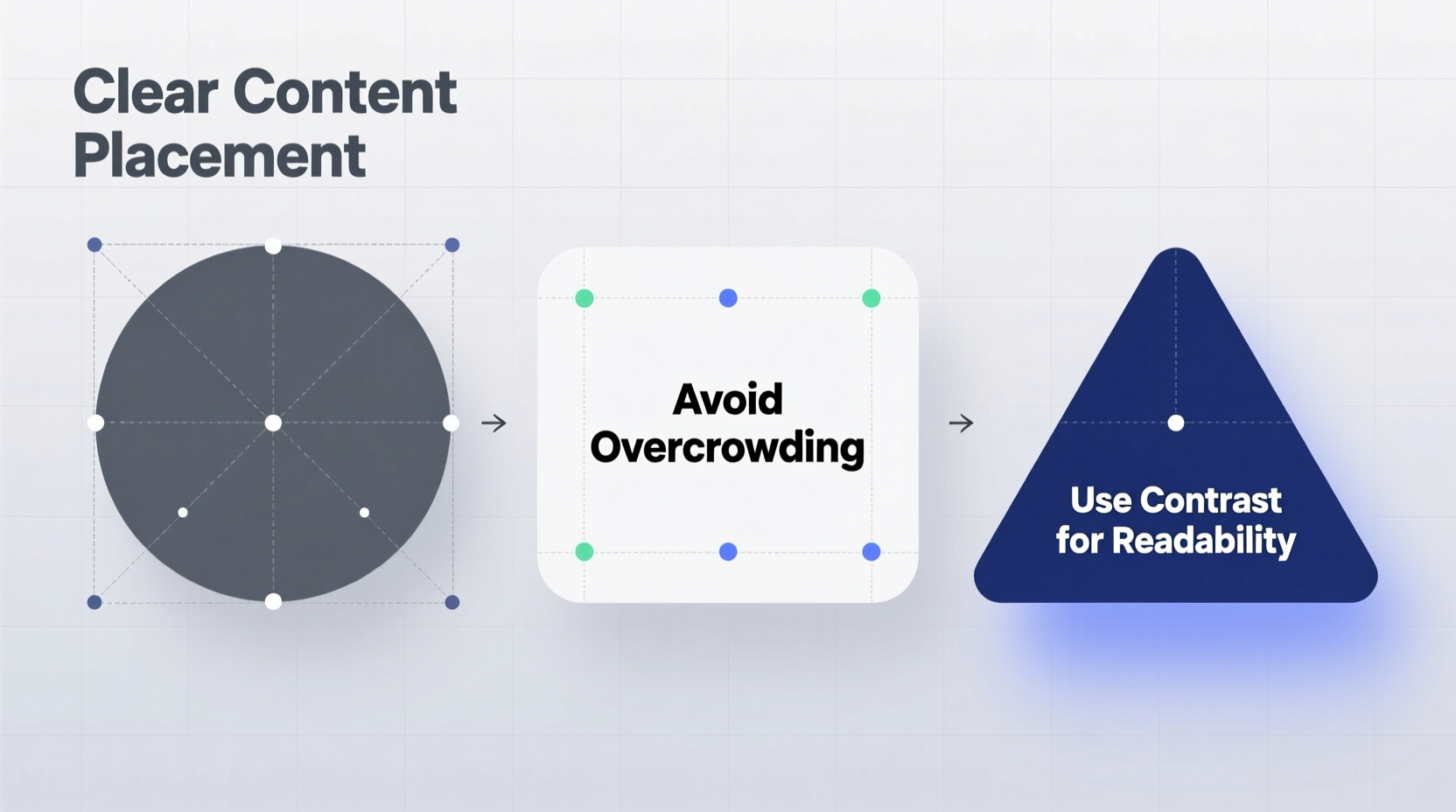
Understanding the Challenges of Text-in-Shape Design
When text enters a confined or irregular shape, several issues arise: character truncation, awkward line breaks, poor spacing, and misalignment. These problems are amplified on responsive devices where scaling alters proportions dynamically. Designers often underestimate how font choice, kerning, and line height impact legibility when constrained by borders that don't follow conventional reading patterns.
For example, attempting to center-align text within a narrow diamond shape may result in single letters per line, breaking word recognition. Similarly, wrapping text along a curved path without adjusting baseline alignment can make it appear distorted or difficult to scan.
“Text should never be forced into a shape at the cost of readability. The form must serve the function.” — Lena Torres, Senior UX Designer at TypeForma Studio
Successful integration of text within shapes begins with recognizing these challenges early and applying solutions that balance creativity with usability.
Practical Tips for Effective Content Placement
- Choose appropriate fonts: Sans-serif typefaces with open letterforms (e.g., Open Sans, Lato) perform better in tight spaces than decorative or condensed fonts.
- Adjust tracking and leading: Slightly increase letter spacing (tracking) and line height (leading) to prevent crowding, especially in circular or angular shapes.
- Use text masking wisely: In design tools like Adobe Illustrator or Figma, use clipping masks instead of distorting text to fit boundaries.
- Break long text into fragments: For complex shapes, divide sentences into short phrases placed strategically rather than trying to fill every corner.
- Leverage transparency and contrast: Ensure sufficient color contrast between text and background. Avoid placing dark text over busy textures within the shape.
Step-by-Step Guide: Placing Text Inside a Circle
- Determine the purpose: Is the circle a badge, icon, or standalone graphic? Purpose informs text length.
- Select a maximum of 2–3 words or a short phrase (e.g., “New,” “Sale,” “50% Off”).
- Pick a bold, legible font and set it in all caps if space allows—it improves uniformity.
- Center-align the text both horizontally and vertically using alignment tools.
- Scale the text until it fits comfortably within the inner margin of the circle, leaving padding equal on all sides.
- Test visibility: View from 2 feet away; if individual letters blur together, reduce size or simplify wording.
Do’s and Don’ts When Writing Inside Shapes
| Do | Don’t |
|---|---|
| Keep text concise and purpose-driven | Force full paragraphs into small icons |
| Use high-contrast color combinations | Place light gray text on white backgrounds |
| Leave breathing room around text | Fill every pixel of the shape with letters |
| Test readability on mobile screens | Assume desktop-only viewing conditions |
| Apply subtle shadows or outlines for legibility | Rely solely on drop shadows to fix poor contrast |
Real-World Example: Redesigning a Mobile App Badge
A fintech startup once struggled with their transaction notification system. Their app used circular badges to display amounts due, such as “$127.50.” However, users frequently missed payments because the numbers were too small and poorly centered within the red circle icon.
The design team revised the approach: they reduced decimal precision to whole dollars (“$128”), increased font weight, added a slight white stroke around the text for contrast against red, and ensured vertical centering through precise baseline adjustment. After A/B testing, the updated badge improved payment completion rates by 23%, proving that even minor typographic refinements inside shapes can have measurable business impact.
Expert Techniques Across Platforms
Different environments require different methods for handling text within shapes:
- CSS & Web Development: Use
display: flexwithalign-itemsandjustify-contentto center text in divs styled as circles or hexagons. Combine withtext-overflow: ellipsisfor dynamic content. - SVG Graphics: Apply
<textPath>to wrap text along custom paths. AdjuststartOffsetandtext-anchorfor precise positioning. - Graphic Design Software: In Adobe Illustrator, use Area Type tools to define text boxes within drawn shapes. In Figma, create frames with auto-layout and text overflow settings.
Checklist: Preparing Text for Shaped Containers
- ☐ Define the primary message—what must the viewer understand instantly?
- ☐ Limit copy to 1–5 words for small shapes; up to two lines for larger ones.
- ☐ Choose a typeface optimized for clarity at small scales.
- ☐ Set minimum internal margins (at least 10% of shape diameter).
- ☐ Test contrast ratio (aim for 4.5:1 or higher for accessibility).
- ☐ Validate alignment across devices and orientations.
- ☐ Consider fallback styles for truncated or overflowing text.
Frequently Asked Questions
Can I put full sentences inside irregular shapes?
It’s possible, but not advisable unless the shape is large and designed to accommodate readable text flow. For most cases, extract key phrases or use callouts connected via lines or pointers to maintain clarity.
What’s the best way to center text in a triangle?
Position the text along the horizontal midline, slightly above the geometric center to counter optical imbalance. Align the baseline so the bottom of lowercase letters sits near the centroid. Using a temporary grid overlay helps achieve visual balance.
How do I handle dynamic content in fixed shapes?
Implement truncation with ellipses (...) and tooltips on hover/focus. Alternatively, scale the font size dynamically based on character count, or allow the container to expand proportionally using flexible units (em/rem or percentage-based dimensions).
Conclusion: Clarity Over Creativity
Writing inside shapes isn’t about filling space—it’s about communicating clearly within constraints. While creative typography can enhance visual appeal, it should never compromise comprehension. By combining thoughtful content editing, smart formatting, and platform-specific techniques, designers and developers can place text effectively within any element.
Start small: refine a button label, optimize an icon badge, or rework a diagram caption. Each improvement builds competence and reinforces the principle that good design serves the reader first. As layouts grow more complex and interactive, mastering text placement becomes not just a detail—but a fundamental skill.


 浙公网安备
33010002000092号
浙公网安备
33010002000092号 浙B2-20120091-4
Comments
No comments yet. Why don't you start the discussion?