
Throw pillows are more than just soft accents—they’re powerful design tools. When layered thoughtfully, they can transform a bland sofa into a focal point, add rhythm to a bedroom, or inject personality into an entryway. The secret lies not in matching everything perfectly, but in mastering the art of pattern pairing. Done right, it brings depth, movement, and curated elegance to any room. This guide breaks down how to combine patterns with confidence, using color theory, scale, texture, and balance to create spaces that feel intentional and inviting.
Understanding Pattern Scale and Proportion
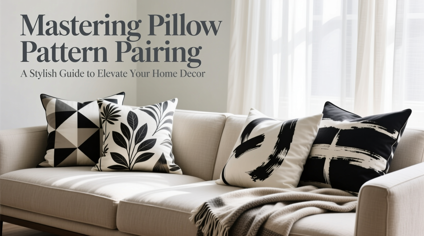
One of the most common mistakes in pillow styling is combining patterns of similar size. When two large-scale florals or busy geometrics compete for attention, the result feels chaotic rather than cohesive. Instead, vary the scale deliberately. Think of pattern scale in three categories: large, medium, and small.
- Large-scale patterns (e.g., oversized botanical prints) serve as statement pieces. Use them sparingly—once per arrangement—to anchor the look.
- Medium-scale patterns (like classic ticking stripes or mid-size paisleys) provide visual interest without overwhelming.
- Small-scale patterns (such as tiny checks, micro-dots, or fine damasks) act as connectors, bridging larger motifs and adding subtle texture.
Creating Visual Hierarchy with Pattern
Just like in fashion, interior design benefits from a clear visual hierarchy. Start by selecting a dominant pattern—this should be the boldest or most colorful—and build around it. Support it with secondary and tertiary patterns that share at least one color or design motif. For example, pair a large ikat print in navy and rust with a medium herringbone in navy and cream, then add a small dot in cream and a solid linen in rust.
“Pattern mixing isn’t about randomness—it’s about creating rhythm. Like music, design needs tempo, repetition, and variation.” — Clara Mendez, Interior Stylist & Author of *Textured Spaces*
The Role of Color in Pattern Coordination
Color is the invisible thread that ties disparate patterns together. Even if styles differ—a tribal print next to a watercolor floral—they’ll feel unified if they share a consistent palette. Choose a base color scheme first (e.g., earth tones, coastal blues, or jewel tones), then select patterns within that range.
Use the 60-30-10 rule as a guide:
| Percentage | Role | Example in Pillow Arrangement |
|---|---|---|
| 60% | Dominant color | Base sofa color or largest pillow shade (e.g., warm gray) |
| 30% | Secondary color | Main patterned pillows (e.g., terracotta and olive) |
| 10% | Accent color | Bold throw or piping detail (e.g., mustard yellow) |
This approach ensures harmony while allowing room for creative contrast.
Texture as a Silent Pattern Partner
Not all visual interest comes from print. Textural fabrics like bouclé, velvet, linen, corduroy, or woven cotton behave like subtle patterns. A nubby wool pillow reads differently than a smooth satin one—even if both are solid-colored. Incorporating varied textures adds dimension and prevents flatness when combining multiple prints.
Consider this: a velvet geometric pillow next to a linen stripe creates contrast through touch and light reflection, enhancing the overall composition without introducing another printed motif.
Step-by-Step Guide to Building a Pillow Ensemble
Follow this five-step process to confidently assemble a balanced pillow grouping for any seating area:
- Start with your anchor piece. Identify the dominant color or pattern in your furniture, rug, or artwork. This sets the foundation.
- Select a primary pattern. Choose one bold design that complements the anchor—this will be your focal pillow.
- Add a secondary pattern. Pick a different style (e.g., switch from floral to stripe) but keep shared colors. Vary the scale.
- Introduce a small-scale or textured neutral. This could be a solid with visible weave or a tiny repeat pattern in beige or charcoal.
- Finish with an accent. Add one pop—a bright hue, metallic thread, or contrasting shape—to spark interest.
Arrange pillows in layers: place larger ones at the back, smaller in front, and mix orientations (vertical vs. horizontal) for dynamism. Odd numbers (3 or 5) typically feel more natural than even groupings.
Real Example: Revamping a Neutral Living Room
Sarah had a beige sectional and a cream rug—cozy but forgettable. She wanted warmth and character without overhauling the space. Using the steps above, she selected:
- A large-scale rust-and-navy floral (primary pattern)
- A medium indigo tribal stripe (secondary)
- A small black-and-white trellis (connector)
- A solid caramel velvet (texture + neutral)
- An embroidered rust pillow with gold thread (accent)
The shared rust tone tied everything together, while varying scales and textures prevented visual fatigue. The result? A living room that felt curated, inviting, and full of quiet drama—all thanks to six pillows.
Do’s and Don’ts of Pillow Pattern Pairing
To avoid common pitfalls, refer to this quick-reference table:
| Do | Don’t |
|---|---|
| Use a consistent color story across all pillows | Mix too many dominant patterns |
| Vary pattern scale and type (floral + stripe + geometric) | Pair two large-scale prints side by side |
| Include at least one solid or textured neutral | Ignore fabric weight and drape |
| Layer odd numbers of pillows for balance | Overcrowd the sofa with too many pillows |
| Rotate seasonal pillows to refresh the look | Forget maintenance—clean and fluff regularly |
Frequently Asked Questions
Can I mix floral and geometric patterns?
Absolutely. The key is shared color tones and balanced scale. Pair a large floral with a small geometric, or vice versa. Avoid clashing proportions—two bold prints in similar sizes will compete.
How many patterned pillows are too many?
In a standard three-seater sofa, 4–6 pillows total is ideal. Among them, 2–3 can be boldly patterned, with the rest serving as neutrals or textural supports. If the arrangement feels busy, remove one patterned pillow and reassess.
What if my room has a lot of existing patterns?
If your rug, curtains, or wallpaper already feature strong prints, scale back on pillow patterns. Opt for solids with rich texture—like bouclé, ribbed cotton, or crushed velvet—to add depth without visual clutter.
Final Checklist: Your Pillow Pairing Game Plan
Before styling your next pillow arrangement, run through this checklist:
- ✅ Have I chosen a dominant color scheme?
- ✅ Is there a clear primary pattern?
- ✅ Do I have a mix of large, medium, and small-scale designs?
- ✅ Are at least one or two pillows solid or textural neutrals?
- ✅ Do all patterns share at least one common color?
- ✅ Is the arrangement odd-numbered and layered?
- ✅ Does the combination feel balanced, not chaotic?
Elevate Your Space One Pillow at a Time
Pillow pattern pairing isn’t about perfection—it’s about intention. With a little planning and an eye for balance, you can turn even the simplest couch into a design statement. The best combinations feel personal, lived-in, and effortlessly stylish. They reflect taste, not trends.


 浙公网安备
33010002000092号
浙公网安备
33010002000092号 浙B2-20120091-4
Comments
No comments yet. Why don't you start the discussion?