
Curved typography adds visual interest, elegance, and dynamic flow to design projects. Whether you're crafting a logo, designing a poster, or laying out a magazine cover, the ability to arch text in Adobe InDesign is a fundamental skill that elevates your work from standard to striking. While other Adobe tools like Illustrator offer more intuitive path-based text manipulation, InDesign handles curved text with precision when you know the right methods. This guide walks through the exact steps, best practices, and common pitfalls so you can create flawless arched text every time.
Why Curved Text Matters in Professional Design
Typography isn’t just about readability—it’s about emotion, movement, and composition. Curved text mimics natural motion, guiding the reader’s eye along a path. It’s especially effective in circular logos, badge designs, packaging, and editorial layouts where symmetry and balance are key.
InDesign, though primarily a layout tool, supports advanced typographic control. Unlike freeform tools, it emphasizes precision and consistency—ideal for print-ready materials. Mastering text arching here ensures your designs remain production-safe while achieving creative impact.
“Typography on a curve isn’t decoration—it’s directional. It tells the viewer where to look and how to feel.” — Lena Torres, Senior Typography Designer at Studio Press & Form
Step-by-Step: Creating Arched Text in InDesign
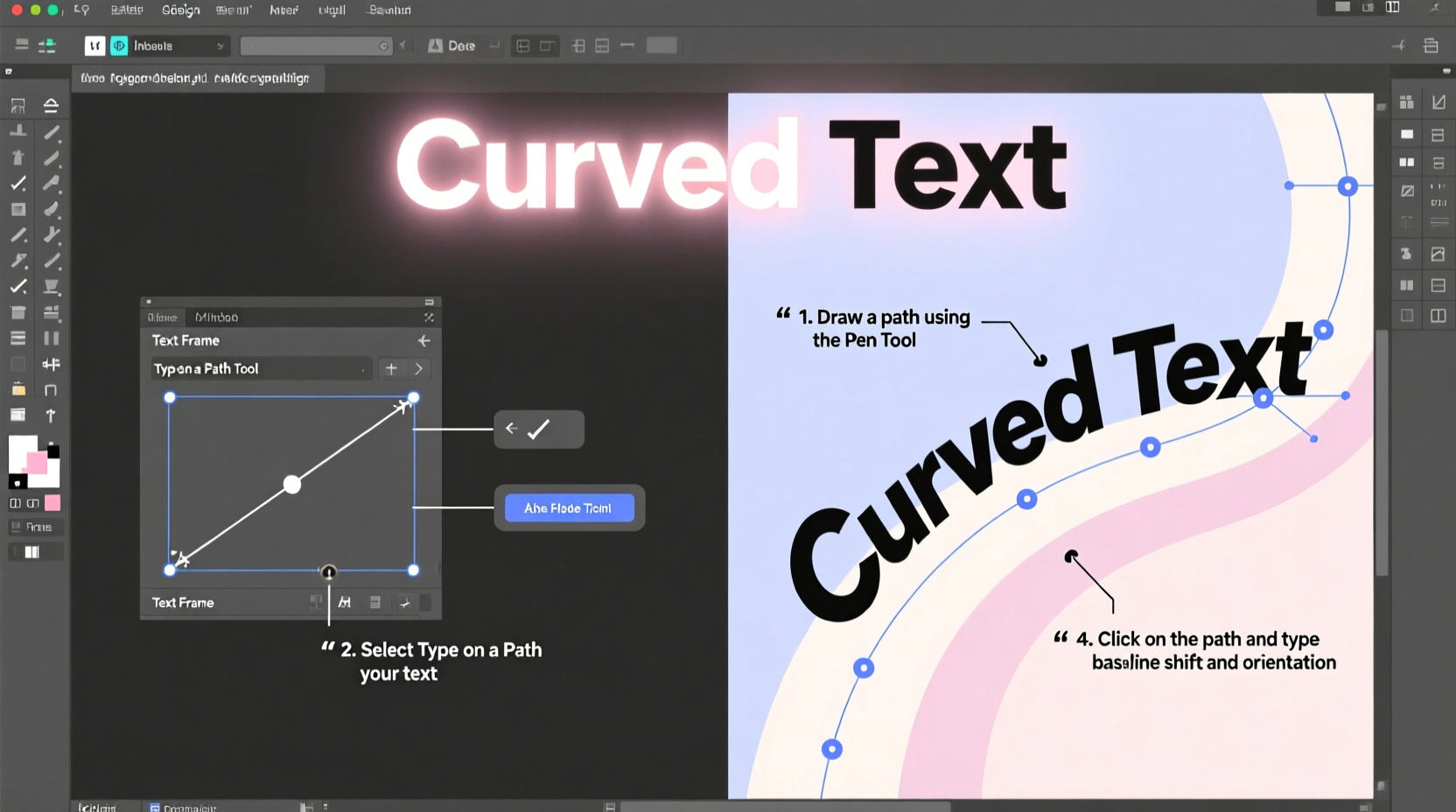
The most reliable method for curving text in InDesign involves using paths and the Type on a Path tool. Follow these steps carefully for clean, editable results.
- Draw a Path: Select the Pen Tool (P) or Ellipse Tool (L) from the toolbar. Draw a perfect half-circle or arc. Hold Shift while dragging with the Ellipse Tool to constrain proportions. For a custom curve, use the Pen Tool to click and drag anchor points.
- Select the Path: Use the Selection Tool (V) to ensure the entire path is highlighted. Make sure no text frame is selected.
- Activate Type on a Path: Choose the Type on a Path Tool (nested under the regular Type Tool in the toolbar). Click directly on the path where you want the text to begin.
- Type Your Text: Enter your desired text. It will automatically follow the contour of the path.
- Adjust Alignment: With the Selection Tool, open the Type on a Path Options panel (Type > Type on a Path > Options). Here, you can set alignment (start, center, end), effect (rainbow, skew, 3D ribbon), and flip the text to the other side of the path.
- Refine Position and Spacing: Use the Direct Selection Tool (A) to tweak anchor points. Adjust character spacing (kerning, tracking) as needed to maintain even distribution.
- Finalize and Convert if Needed: Once satisfied, you can convert text to outlines (Type > Create Outlines) if you need to scale without font dependency—but keep an editable version saved separately.
Advanced Techniques for Precision Control
Basic arching is straightforward, but professional work demands refinement. These techniques help you achieve balanced, visually harmonious curved text.
Flip Text Above or Below the Curve
By default, text appears above the path. To flip it underneath, go to Type on a Path Options and check “Flip.” Alternatively, drag the small bracket icon (text start indicator) across the path using the Direct Selection Tool.
Control Baseline Position
If your text looks misaligned vertically, adjust the Offset value in the Type on a Path Options dialog. A positive offset moves text away from the center; negative pulls it inward—critical for concentric circular text.
Distribute Text Evenly Around a Circle
For full circular arrangements (e.g., badges), draw a complete circle with the Ellipse Tool. Use Type on a Path and set alignment to “Center” to distribute text evenly. Reduce tracking slightly to prevent gaps at the ends.
| Alignment Option | Best Use Case | Tips |
|---|---|---|
| Align to Path | Following a custom curve | Use for organic shapes like waves or swooshes |
| Rainbow Effect | Text curving over a dome-like shape | Positive skew lifts tops of letters outward |
| Skew | Vertical stretching along a curve | Avoid extreme values to preserve legibility |
| 3D Ribbon | Simulating wrapped text | Pair with subtle gradients for realism |
Common Pitfalls and How to Avoid Them
Even experienced designers encounter issues when working with curved text. Recognizing these early prevents rework and maintains quality.
- Uneven letter spacing: Long words on tight curves often stretch or compress characters unevenly. Manually adjust kerning or reduce font size slightly.
- Text flipping unexpectedly: This usually happens when the path direction is reversed. Reverse the path using Object > Path > Reverse Path Direction.
- Loss of editability after outlining: Converting text to outlines makes it uneditable. Always duplicate the layer before creating outlines.
- Low-resolution preview: If curves appear jagged, increase display performance quality under View > Display Performance.
Real-World Example: Designing a Craft Beer Label
A microbrewery approached a designer to create a vintage-style bottle label featuring the brand name arched at the top and bottom of a circular badge. The challenge was fitting two lines of text on opposing curves without distortion.
The solution involved drawing two concentric circles—one larger for the top text, one smaller for the bottom. Using the Type on a Path Tool, the designer applied “Rainbow” effect with a slight positive skew on the upper arc and a negative skew on the lower to maintain upright readability. Kerning was adjusted manually between capital letters to avoid clustering. Final output was exported as PDF/X-1a for print, ensuring all fonts were either embedded or outlined appropriately.
The result? A symmetrical, professionally balanced label that stood out on shelves and passed prepress checks without revision.
Checklist: Perfecting Your Curved Text Workflow
Before finalizing any project involving arched text, run through this checklist:
- ✅ Used vector paths, not shapes converted to outlines
- ✅ Verified correct path direction (prevents flipped text)
- ✅ Checked baseline alignment using offset settings
- ✅ Adjusted tracking/kerning for even spacing
- ✅ Previewed at 100% zoom and actual size
- ✅ Saved an editable version before converting to outlines
- ✅ Confirmed color mode (CMYK for print, RGB for digital)
Frequently Asked Questions
Can I curve text along a freehand-drawn path?
Yes. Use the Pencil Tool or Pen Tool to draw a custom path, then apply the Type on a Path Tool. Just ensure the path is a single, continuous stroke.
Why does my text appear upside down on the curve?
This typically occurs when the path’s direction runs opposite to your intended flow. Reverse the path via Object > Path > Reverse Path Direction, or flip the text in the Type on a Path Options panel.
Is there a way to preview how curved text will look before typing?
While InDesign doesn’t offer a live curvature preview, you can draw the path first, stroke it lightly for visibility, and test with placeholder text (like “Aa”) to judge curvature before entering final copy.
Conclusion: Elevate Your Typography with Confidence
Mastering text arching in InDesign is not about shortcuts—it’s about understanding the relationship between paths, type, and precision. When executed well, curved typography becomes a powerful design element that commands attention and conveys sophistication. From simple arcs to complex circular layouts, the techniques outlined here give you full control over form and function.


 浙公网安备
33010002000092号
浙公网安备
33010002000092号 浙B2-20120091-4
Comments
No comments yet. Why don't you start the discussion?