
Throw pillows are more than just decorative accents—they’re powerful tools for transforming the mood, texture, and visual rhythm of a room. When chosen thoughtfully, pillow covers can unify a space, add contrast, or serve as bold focal points. Yet many homeowners struggle with how to mix patterns and textures without creating visual chaos. The key lies not in avoiding variety, but in mastering coordination through balance, scale, color harmony, and intentional layering.
Understanding Pattern Scale and Visual Weight
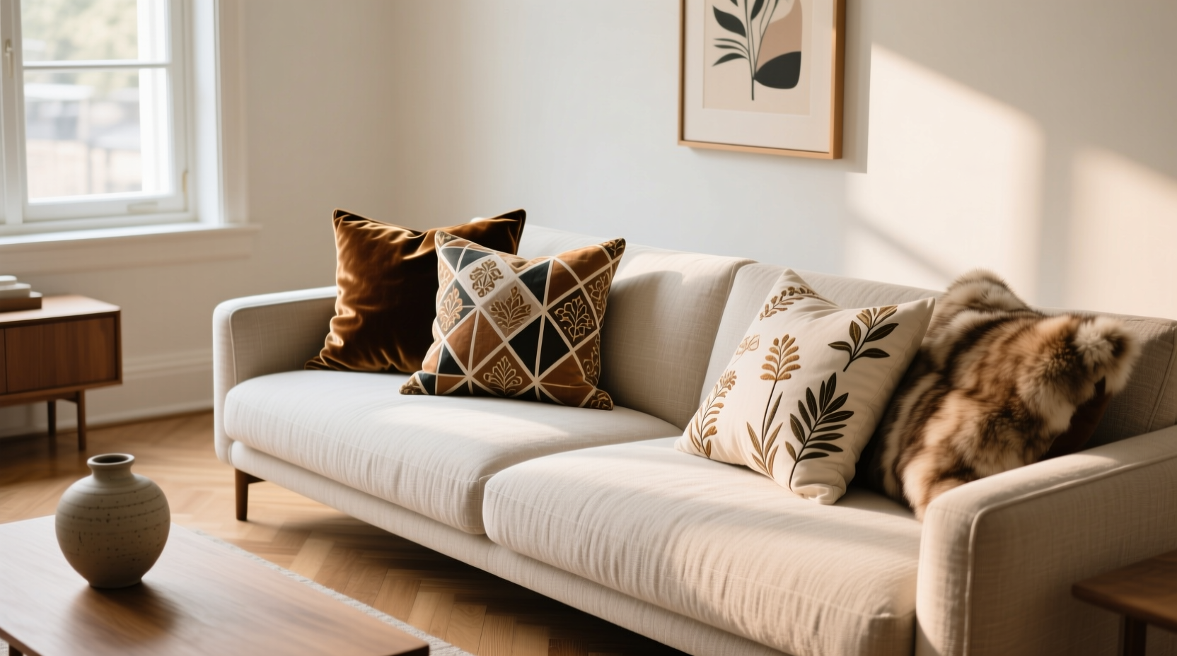
Not all patterns are created equal. A large floral print commands attention differently than a subtle pinstripe. To coordinate effectively, begin by categorizing patterns into three scales: large, medium, and small. Large-scale patterns—such as oversized geometrics or dramatic botanicals—serve best as statement pieces. Medium-scale prints, like classic ticking stripes or moderate-sized checks, provide structure. Small-scale designs, including tiny dots, micro-weaves, or fine herringbone, act as visual “fillers” that bridge bolder choices.
When combining multiple patterns, use the 60-30-10 rule: 60% dominant pattern (often tied to upholstery), 30% secondary pattern (complementary in tone), and 10% accent (bold or contrasting). This creates hierarchy and prevents sensory overload.
Harmonizing Color Without Matching Exactly
Color coordination doesn’t mean everything must match perfectly. In fact, exact matches can feel flat. Instead, aim for cohesion through a shared color story. Choose a base palette of 3–4 colors and distribute them across different pillow covers. For example, if your sofa is navy blue, incorporate pillows in navy, cream, rust, and sage green—each emphasizing a different combination of these tones.
Use a neutral base—like ivory, charcoal, or oatmeal—as a grounding element. These shades allow bolder hues to shine while offering breathing room between vibrant patterns. Consider using one color as an anchor across all pillows, even if it appears only as a minor thread in a textured weave.
“Great pillow styling isn’t about perfection—it’s about curated imperfection. Let colors echo, not repeat.” — Lena Torres, Interior Stylist & Author of *Textured Living*
Layering Textures for Depth and Comfort
Texture adds dimension where color and pattern alone fall short. A velvet pillow catches light differently than linen or bouclé, introducing tactile interest that invites touch and enhances ambiance. When layering textures, think beyond aesthetics—consider how each material feels and functions in daily life.
A well-balanced pillow arrangement often includes:
- Linen or cotton canvas: Breathable, casual, ideal for everyday use.
- Velvet or velour: Luxurious sheen, excellent for adding richness in low-light rooms.
- Bouclé or wool weaves: Tactile and cozy, perfect for modern rustic or Scandinavian spaces.
- Silk blends or brocade: High-luster options for formal areas; best protected from direct sunlight.
- Knits or crocheted fabrics: Soft and inviting, great for nurseries or reading nooks.
Mix at least two textures per seating area. For instance, pair a nubby wool blend with smooth cotton sateen to create contrast that holds attention without clashing.
Step-by-Step Guide: Building a Cohesive Pillow Arrangement
Follow this five-step process to design a polished, intentional look:
- Start with your largest piece of furniture. Identify the dominant color and pattern of your sofa or bedspread. This becomes your foundation.
- Select a color palette. Pull 3–4 colors from the main fabric. Include one neutral, one mid-tone, and one accent.
- Choose pattern types. Pick one large-scale print, one medium geometric or stripe, and one small-scale or textural solid.
- Incorporate varied textures. Assign each pillow a different fabric type—e.g., velvet, linen, and woven cotton.
- Arrange and edit. Lay pillows on the furniture, step back, and remove any that feel redundant or overwhelming. Odd numbers (3, 5, 7) typically look most natural.
Do’s and Don’ts: Pattern Coordination Table
| Do | Don't |
|---|---|
| Use a common color thread across all patterns | Combine too many large-scale prints |
| Mix organic (floral, tribal) and structured (stripes, checks) patterns | Use patterns with clashing undertones (e.g., warm orange + cool pink) |
| Include at least one solid or textured neutral | Ignore fabric weight and durability |
| Vary pillow sizes (e.g., 18”, 20”, lumbar) | Overcrowd a small couch with too many pillows |
| Dry clean delicate fabrics or use removable covers | Place sun-sensitive materials in direct sunlight long-term |
Real Example: Transforming a Beige Sofa
Jamie had a neutral beige sectional that felt bland despite quality craftsmanship. She wanted warmth and character without reupholstering. Her solution? A curated set of five pillow covers:
- One large-scale rust-and-navy ikat (statement piece)
- One medium herringbone in charcoal and cream (structure)
- One small-dot print in rust and white (rhythm)
- One solid navy velvet (texture and depth)
- One oatmeal bouclé knit (soft contrast)
The result was immediate. The sofa became a focal point, the colors warmed the entire living room, and the mix of textures invited relaxation. By anchoring all patterns in navy and rust, the arrangement felt intentional, not random.
Pillowing Checklist: Your Quick Setup Guide
Before finalizing your pillow display, run through this checklist:
- ✅ Do all pillows share at least one common color?
- ✅ Is there a mix of pattern scales (large, medium, small)?
- ✅ Are at least two different textures represented?
- ✅ Is there a visual anchor (e.g., one bold pattern or deep color)?
- ✅ Are the fabrics appropriate for the room’s use (e.g., durable for kids/pets)?
- ✅ Can you comfortably sit without removing half the pillows?
- ✅ Have you stepped back to view the overall effect?
Frequently Asked Questions
How many pillow covers should I use on a standard sofa?
For a three-seater sofa, three to five pillows create balance. Use odd numbers for asymmetry and visual interest. Avoid overcrowding—leave enough space to sit comfortably.
Can I mix floral and geometric patterns?
Yes, but anchor them with shared colors and varied scales. Pair a large floral with a small geometric (like a tiny check or dot), and ensure one element—color, tone, or texture—unifies them.
What if I love bold patterns but want a calm room?
Use bold patterns sparingly—one accent pillow in a vibrant print—and surround it with solids and neutrals. Balance high-energy designs with matte textures and ample negative space.
Final Thoughts: Style with Intention
Coordinating pillow covers isn’t about following rigid rules—it’s about developing an eye for balance, contrast, and emotional resonance. The most stylish interiors aren’t those without risk, but those where risks are taken with purpose. Whether you lean toward minimalist elegance or maximalist vibrancy, your pillow selection should reflect both aesthetic harmony and personal comfort.
Begin with one change: swap out a flat, single-texture set for a layered trio of complementary patterns and tactile fabrics. Observe how it shifts the energy of the room. Over time, refine your approach, rotate seasonal styles, and don’t be afraid to experiment. After all, pillow covers are one of the easiest, most affordable ways to refresh your home.


 浙公网安备
33010002000092号
浙公网安备
33010002000092号 浙B2-20120091-4
Comments
No comments yet. Why don't you start the discussion?