
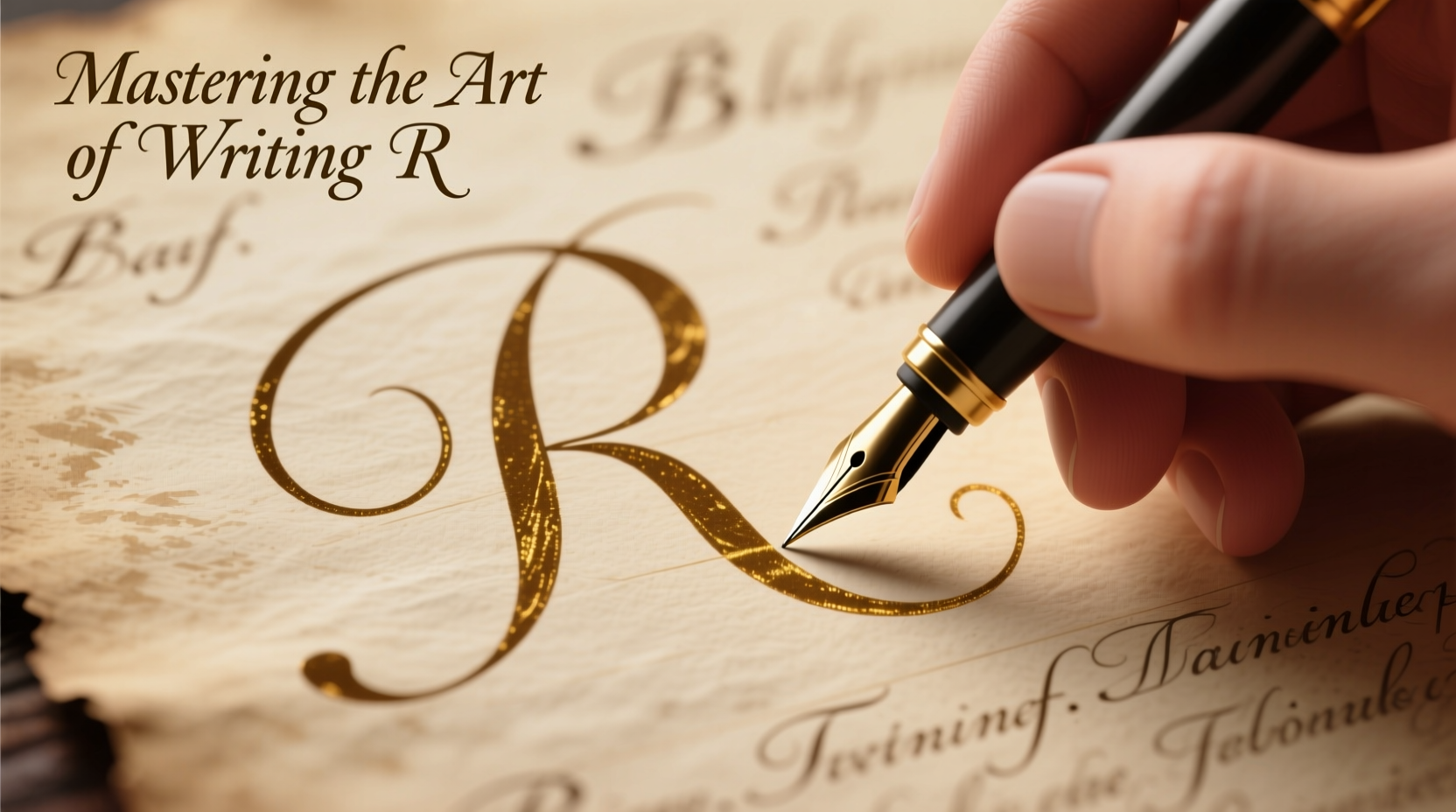
The letter r may seem simple—two strokes, a loop or a bump—but it plays an outsized role in the rhythm and readability of your handwriting. Whether you're drafting a note, signing a document, or practicing calligraphy, mastering the letter r can elevate your entire script. It appears frequently in English words, often in clusters like “read,” “write,” and “rhythm,” and its shape influences how smoothly your hand moves from one letter to the next. A poorly formed r can disrupt flow, create confusion with other letters like n or m, and make your writing appear rushed or inconsistent.
Yet many people write r without conscious attention, defaulting to habits developed in childhood. With deliberate practice and the right techniques, anyone can refine their r—making it clearer, more elegant, and better integrated into their personal handwriting style.
The Anatomy of a Well-Written 'R'
To master the letter r, it helps to understand its structural components. In most cursive and print styles, the lowercase r consists of two primary strokes: the initial vertical or slanted stem, followed by a rounded or angular arch known as the \"shoulder.\" The uppercase R is more complex, combining a vertical line, a rounded belly, and a diagonal leg extending downward and to the right.
The key to clarity lies in proportion and connection. The shoulder of the lowercase r should be distinct but not exaggerated—a small, crisp curve that rises slightly above the baseline and connects smoothly to the following letter. In joined handwriting, this transition determines whether words look fluid or disjointed.
Common Problems and How to Fix Them
Many handwriting issues stem from subtle flaws in the formation of r. Recognizing these patterns is the first step toward improvement.
- Indistinct from 'n': When the shoulder of r is too flat or shallow, it becomes nearly identical to n, leading to confusion in words like “carrot” or “parent.”
- Overlooping: Exaggerated loops or curls make the letter look ornamental rather than functional, slowing down writing speed and reducing legibility.
- Poor connections: If the exit stroke of r doesn’t align with the next letter, words break apart visually, disrupting reading flow.
- Inconsistent sizing: Some writers vary the height of r between words, which undermines uniformity across lines.
These problems are correctable through focused drills and mindful repetition. The goal isn't perfection—it's consistency and clarity.
Step-by-Step Guide to Writing a Clear and Stylish 'r'
- Start with posture and grip: Sit upright, relax your shoulder, and hold the pen lightly between thumb and index finger, supported by the middle finger. Tension inhibits fine motor control.
- Lowercase 'r' – Basic stroke: Begin just below the top line. Draw a short, straight line downward (about half the x-height). Lift the pen slightly, then make a quick upward arc that curves back down to meet the baseline. The result should resemble a checkmark with a rounded top.
- Add the shoulder: From the end of the stem, draw a small, upward loop that peaks just above the midline. Keep it narrow—wider than n but not as broad as m.
- Connect to the next letter: Extend a light exit stroke from the top of the shoulder, angling gently to the right. This prepares for smooth transitions into letters like a, e, or i.
- Uppercase 'R' – Structure: Start with a vertical line from top to baseline. Curve around to form a closed oval (like a capital P). Then, add a diagonal leg starting from the midpoint of the curve, extending down and to the right, finishing slightly below the baseline.
- Practice in context: Write sample words: “run,” “red,” “arrow,” “bright.” Focus on consistent entry and exit strokes.
Do’s and Don’ts of Writing the Letter 'r'
| Do | Don’t |
|---|---|
| Keep the shoulder of r slightly taller than n for distinction | Make the shoulder so large it touches the top line |
| Use a consistent slant (if using italic or cursive styles) | Let some rs lean left and others right |
| Ensure the exit stroke flows naturally into the next letter | End r with a sharp hook or abrupt stop |
| Practice slowly at first to build accuracy | Rush through repetitions without focus |
| Use lined paper or guidelines to maintain alignment | Write on blank paper without reference points |
Expert Insight: What Professionals Say About Letter Formation
“Handwriting is not just about communication—it’s a reflection of cognitive control and motor precision. The letter r is a benchmark for both. A well-formed r shows intentionality and fine-tuned coordination.” — Dr. Laura Bennett, Occupational Therapist & Handwriting Specialist
This insight underscores why refining even a single letter matters. It’s not merely aesthetic; it’s neurological. Each time you write a deliberate, balanced r, you reinforce neural pathways associated with focus and dexterity.
Mini Case Study: Transforming Everyday Writing
Sophie, a 32-year-old administrative assistant, struggled with colleagues misreading her notes. Words like “report” were mistaken for “report,” and “very” looked like “veny.” After analyzing her handwriting, she realized her lowercase r was nearly identical to n—the shoulder was barely visible, and the exit stroke dropped too low.
She began a two-week practice routine: 10 minutes daily tracing model letters, writing sentences with high r-frequency, and using highlighters to mark each r in her journal. By adjusting the arc and lifting the exit stroke, her writing became instantly more legible. Her supervisor commented on the improvement within a week.
Sophie’s experience shows that targeted correction of one letter can have ripple effects across all written communication.
Checklist: Mastering the Letter 'r'
- ☐ Use proper pen grip and relaxed posture
- ☐ Distinguish r clearly from n with a raised shoulder
- ☐ Maintain consistent height and slant across all instances
- ☐ Practice isolated strokes before writing full words
- ☐ Connect r smoothly to following letters
- ☐ Write sample words daily: “right,” “mirror,” “repair,” “current”
- ☐ Review your writing weekly for progress
Frequently Asked Questions
Why does my 'r' look like an 'n'?
This is common when the shoulder of the r doesn’t rise above the baseline enough. To fix it, exaggerate the upward curve slightly during practice until the distinction becomes natural.
Should I use a loop in my lowercase 'r'?
It depends on your handwriting style. Loopless (print-style) rs are faster and clearer in block letters. Looped (cursive) rs suit connected scripts. Choose based on legibility and personal preference.
How long does it take to retrain a letter like 'r'?
With 5–10 minutes of focused practice daily, noticeable improvement typically occurs within 7–14 days. Lasting change requires consistent reinforcement over 4–6 weeks.
Refine Your Handwriting, One Letter at a Time
Mastering the letter r is more than a technical exercise—it’s an act of self-expression and clarity. In a world increasingly dominated by digital text, handwritten communication carries unique weight. A well-crafted r contributes to that impression: thoughtful, precise, and confident.
Start today. Take out a notebook, slow down, and write ten perfect rs. Then ten more tomorrow. Small, consistent efforts compound into lasting transformation. Your handwriting is a signature of your mind—make every letter count.


 浙公网安备
33010002000092号
浙公网安备
33010002000092号 浙B2-20120091-4
Comments
No comments yet. Why don't you start the discussion?