
The letter \"t\" may seem simple—just a vertical stroke with a crossbar—but its execution can significantly influence the overall clarity and aesthetic of your handwriting. Whether you're taking notes, drafting letters, or filling out forms, a well-formed \"t\" contributes to legibility and professionalism. Yet, many people unknowingly develop habits that make their \"t\"s inconsistent, unclear, or awkwardly placed. Mastering this small but pivotal letter involves understanding its structure, refining muscle memory, and applying consistent technique across different writing styles.
The Anatomy of an Effective 't'
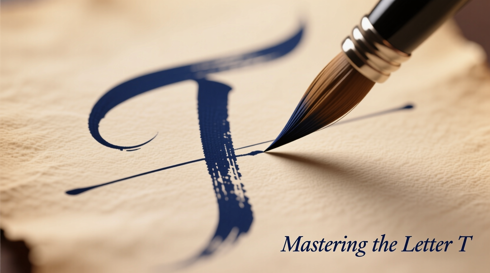
Before improving how you write the letter \"t\", it's essential to understand what makes it visually effective. The standard lowercase \"t\" consists of two main components: a vertical stem and a horizontal crossbar. Unlike letters such as \"l\" or \"i\", which rely solely on vertical strokes, the \"t\" uses balance and proportion between these elements to stand out clearly in text.
The crossbar should intersect the stem slightly above the midpoint—not too low (which makes it look like an \"l\"), and not too high (which risks confusion with other letters). In cursive, the \"t\" often connects from the previous letter and loops into the next, requiring smooth transitions without sacrificing clarity.
Common Problems and How to Fix Them
Even experienced writers fall into traps when forming the letter \"t\". Recognizing these issues is the first step toward correction:
- Inconsistent crossbar placement: Writing some \"t\"s with high bars and others low leads to visual clutter.
- Weak or wobbly stems: Shaky vertical lines undermine the stability of the letter.
- Crossbars extending too far: Excessively long bars can collide with adjacent letters, reducing readability.
- Over-looping in cursive: Adding unnecessary flourishes can obscure the letter’s identity.
Correcting these habits requires deliberate practice and attention to detail. Start by slowing down your writing speed. Speed often masks poor form, so reducing pace allows you to monitor each stroke consciously.
Step-by-Step Guide to Writing a Clean 't'
- Anchor your hand properly: Rest your forearm on the surface and stabilize your wrist to minimize shaking.
- Begin with the stem: Draw a straight vertical line downward using controlled pressure. Keep it perpendicular to the baseline.
- Add the crossbar: Lift the pen slightly, then draw a short horizontal line across the stem, positioned about one-third from the top.
- Check alignment: Ensure the crossbar is level and centered. Use lined paper or light grid paper for guidance.
- Repeat in context: Write common \"t\"-containing words like “the,” “that,” and “it” to integrate the letter naturally.
Choosing the Right Tools for Precision
Your writing instrument plays a crucial role in shaping the appearance of the \"t\". Different pens produce varying levels of control and line definition:
| Pens Type | Pros for Writing 't' | Cons |
|---|---|---|
| Ballpoint | Stable ink flow, good for consistent pressure | Can skip or require more pressure, leading to fatigue |
| Gel Pen | Smooth glide, vibrant lines, excellent precision | May smudge if not quick-drying |
| Fountain Pen | Promotes proper grip and fluid motion | Requires skill; inconsistent lines if misused |
| Mechanical Pencil | Precise, erasable, ideal for practice | Lacks permanence; less expressive line variation |
For mastering the \"t\", a fine-tipped gel pen or mechanical pencil is recommended during practice sessions. These tools offer visibility and control, allowing you to see exactly where adjustments are needed.
Expert Insight: Why Small Letters Matter
“Handwriting isn’t just about communication—it’s a reflection of cognitive discipline. A cleanly formed ‘t’ shows intentionality. When people master the smallest details, their entire script improves.” — Dr. Laura Bennett, Cognitive Psychologist & Handwriting Analyst
This insight underscores a broader truth: focusing on individual letters isn't pedantic—it's strategic. Refining one letter builds awareness that transfers to others. Once you’ve mastered the \"t\", similar principles apply to \"f\", \"l\", and even punctuation marks like periods and dashes.
Real Example: From Illegible to Polished
Consider James, a university student who struggled with messy notes. His professors often commented that his written work was difficult to read. Upon reviewing his handwriting, he noticed that his \"t\"s varied wildly—one had a high bar, another a tilted stem, and some lacked crossbars entirely. He decided to dedicate ten minutes daily to practicing only the letter \"t\" using grid paper and a fine liner pen.
After three weeks, not only did his \"t\" become uniform, but his overall letter spacing and slant improved. His peers began complimenting his notes, and he found himself writing more confidently during exams. This small focus created a ripple effect across his entire writing style.
Checklist for Mastering the Letter 't'
- ✅ Use lined or grid paper for alignment
- ✅ Keep crossbar at consistent height (slightly above center)
- ✅ Maintain straight, vertical stem with even pressure
- ✅ Limit crossbar length to avoid crowding adjacent letters
- ✅ Practice daily for 5–10 minutes in isolation and in words
- ✅ Record progress with dated samples to track improvement
Frequently Asked Questions
Should the crossbar go before or after the stem?
Traditionally, the stem is written first, followed by the crossbar. This order supports better motor control and prevents misalignment. However, some cursive styles begin with a connecting stroke that integrates both elements fluidly.
How do I stop my 't's from looking like 'l's?
Ensure the crossbar is clearly visible and intersects the stem high enough—ideally in the upper third. Also, avoid making the stem too short. Compare your \"t\" and \"l\" side by side to spot differences in height and bar presence.
Can typing affect my handwriting quality?
Yes. Frequent typists sometimes lose touch with fine motor skills required for precise handwriting. Regular handwriting practice—even journaling or note-taking by hand—helps maintain dexterity and muscle memory.
Conclusion: Elevate Your Writing One Letter at a Time
Mastering the letter \"t\" is more than a calligraphic exercise—it's a commitment to clarity and care in personal expression. In a world increasingly dominated by digital text, handwritten communication stands out for its humanity and individuality. A well-crafted \"t\" may be small, but its impact on readability, professionalism, and confidence is significant. By applying focused technique, using the right tools, and practicing consistently, you can transform a simple stroke into a hallmark of neat, effective writing.


 浙公网安备
33010002000092号
浙公网安备
33010002000092号 浙B2-20120091-4
Comments
No comments yet. Why don't you start the discussion?