
A powerful logo does more than look good—it communicates identity, builds trust, and creates lasting recognition. In a crowded marketplace, your logo may be the first impression potential customers have of your brand. That’s why it must be distinctive, meaningful, and professionally executed. Whether you're launching a startup or rebranding an established business, this comprehensive guide walks you through every stage of designing a standout logo with clarity and confidence.
Understand Your Brand Identity First
Before sketching a single line, define what your brand represents. A logo is not just decoration; it’s a visual embodiment of your mission, values, personality, and target audience. Ask yourself: Who are you serving? What emotions do you want to evoke? Are you bold and innovative, or classic and trustworthy?
Conduct internal interviews with stakeholders, review customer feedback, and analyze competitors. This foundational work ensures your logo aligns with your brand strategy rather than being designed in isolation.
Define Core Brand Attributes
List 3–5 adjectives that describe your brand personality—such as modern, reliable, playful, luxurious, or sustainable. These will inform color choices, typography, and overall aesthetic direction.
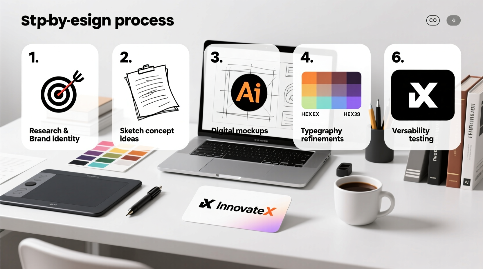
The Design Process: A 7-Step Framework
Creating a professional logo isn’t about inspiration alone—it’s a structured process combining research, creativity, and refinement. Follow these seven steps to build a logo that resonates and endures.
- Research & Inspiration Gathering – Study industry leaders and adjacent markets. Collect logos you admire (and those you don’t), noting patterns in shape, color, and style.
- Sketch Initial Concepts – Use pen and paper to explore rough ideas freely. Avoid digital tools at this stage to encourage creative exploration without constraints.
- Choose Typography Strategically – Select fonts that reflect your brand voice. Serif fonts suggest tradition and authority; sans-serif conveys modernity; script fonts add elegance or playfulness.
- Select a Color Palette – Colors trigger psychological responses. Blue evokes trust, red signals energy, green suggests growth. Limit your palette to 1–3 colors for clarity.
- Develop Vector Artwork – Use vector-based software like Adobe Illustrator or Affinity Designer to create scalable, clean graphics that remain sharp at any size.
- Test Across Mediums – View your logo on business cards, websites, signage, and mobile screens. Ensure legibility and impact in both color and black-and-white formats.
- Finalize & Deliver Assets – Export multiple file types (SVG, PNG, EPS, PDF) and variations (horizontal, vertical, icon-only) for full versatility.
Common Logo Mistakes to Avoid
Even experienced designers can fall into traps that undermine professionalism. The following table highlights frequent errors and how to sidestep them.
| Mistake | Why It Hurts | Solution |
|---|---|---|
| Overly complex design | Hard to recognize at small sizes; fails on social media icons | Simplify to core elements; aim for instant readability |
| Trend-chasing | Becomes outdated quickly; lacks timelessness | Focus on enduring principles over fleeting styles |
| Poor font pairing | Distracts or confuses; appears unprofessional | Use no more than two complementary typefaces |
| Inconsistent spacing | Looks amateurish; disrupts visual harmony | Use grids and alignment tools during layout |
Real-World Example: How BrewHaven Rebranded Successfully
BrewHaven, a local coffee roaster, initially used a cluttered logo featuring a detailed illustration of a steamy mug surrounded by vines and stars. While creative, it was nearly illegible on packaging and mobile apps.
They worked with a designer to refine their identity around simplicity and warmth. The new logo uses a minimalist coffee bean icon paired with a clean, lowercase sans-serif wordmark in deep brown and cream tones. The result? Instant recognition, improved shelf appeal, and a 40% increase in social media engagement within three months.
This transformation underscores a key truth: clarity often trumps complexity when building brand equity.
Expert Insight: What Industry Leaders Say
“A great logo doesn’t need to explain everything. It needs to be memorable, appropriate, and timeless.” — Paula Scher, Partner at Pentagram and Pioneer of Modern Branding
“If your logo works in black and white, it will work anywhere.” — David Airey, Author of *Logo Design Love*
These insights emphasize restraint and functionality—qualities that separate professional logos from decorative graphics.
Essential Logo Checklist
Before finalizing your logo, run through this checklist to ensure completeness and readiness:
- ✅ Reflects brand values and tone accurately
- ✅ Scalable: looks clear at both 1 inch and 10 feet
- ✅ Legible in black and white (for fax, engraving, etc.)
- ✅ Works across digital and print platforms
- ✅ Original and legally usable (no stock art misuse)
- ✅ Paired with consistent typography and color codes (CMYK, RGB, HEX, Pantone)
- ✅ Delivered in multiple formats (vector and raster)
- ✅ Includes usage guidelines (minimum size, clear space, incorrect versions)
Frequently Asked Questions
Can I design a professional logo myself without experience?
Yes—with careful research and the right tools. Platforms like Canva, Looka, or Adobe Express offer templates and AI-assisted design. However, for long-term brand strength, consider hiring a professional designer who understands branding beyond aesthetics.
How much should I budget for a custom logo?
Prices vary widely. Freelancers may charge $150–$500, while agencies typically start at $1,500 and go up to $10,000+ for full brand systems. View this as an investment: a strong logo supports marketing, credibility, and customer loyalty for years.
Should my logo include my business name?
Most small businesses benefit from including the name, especially if they’re not yet well-known. As brands grow (like Nike or Apple), the symbol alone becomes sufficient. Start with name integration unless you already have high recognition.
Conclusion: Build a Logo That Lasts
A standout logo isn't created overnight. It emerges from thoughtful strategy, disciplined design, and iterative refinement. By grounding your work in brand truth, avoiding common pitfalls, and testing rigorously across real-world applications, you create more than a graphic—you build a symbol of trust and identity.
Your logo will appear on websites, invoices, storefronts, and social profiles. Make sure it earns its place with clarity, professionalism, and character. Whether you design it yourself or collaborate with a pro, the effort you invest today will shape how customers see your business tomorrow.


 浙公网安备
33010002000092号
浙公网安备
33010002000092号 浙B2-20120091-4
Comments
No comments yet. Why don't you start the discussion?