
Christmas trees are more than festive centerpieces—they’re three-dimensional canvases where materiality, light, and perception converge. When decorators choose ornaments, they rarely consider surface finish as a primary design variable. Yet the decision to blend matte and glossy finishes isn’t merely decorative; it triggers a cascade of optical, psychological, and spatial effects that fundamentally reshape how the eye reads the tree. Unlike monochromatic or uniform-texture arrangements, a hybrid surface strategy introduces controlled tension—between absorption and reflection, softness and sharpness, stillness and sparkle. This interplay doesn’t just “add interest”; it alters depth perception, modulates light distribution, influences color saturation, and even affects emotional resonance. Understanding these dynamics empowers intentional curation—not random ornament dumping—and transforms seasonal decorating from instinctive habit into visual storytelling.
How Light Interacts: The Physics Behind the Perception
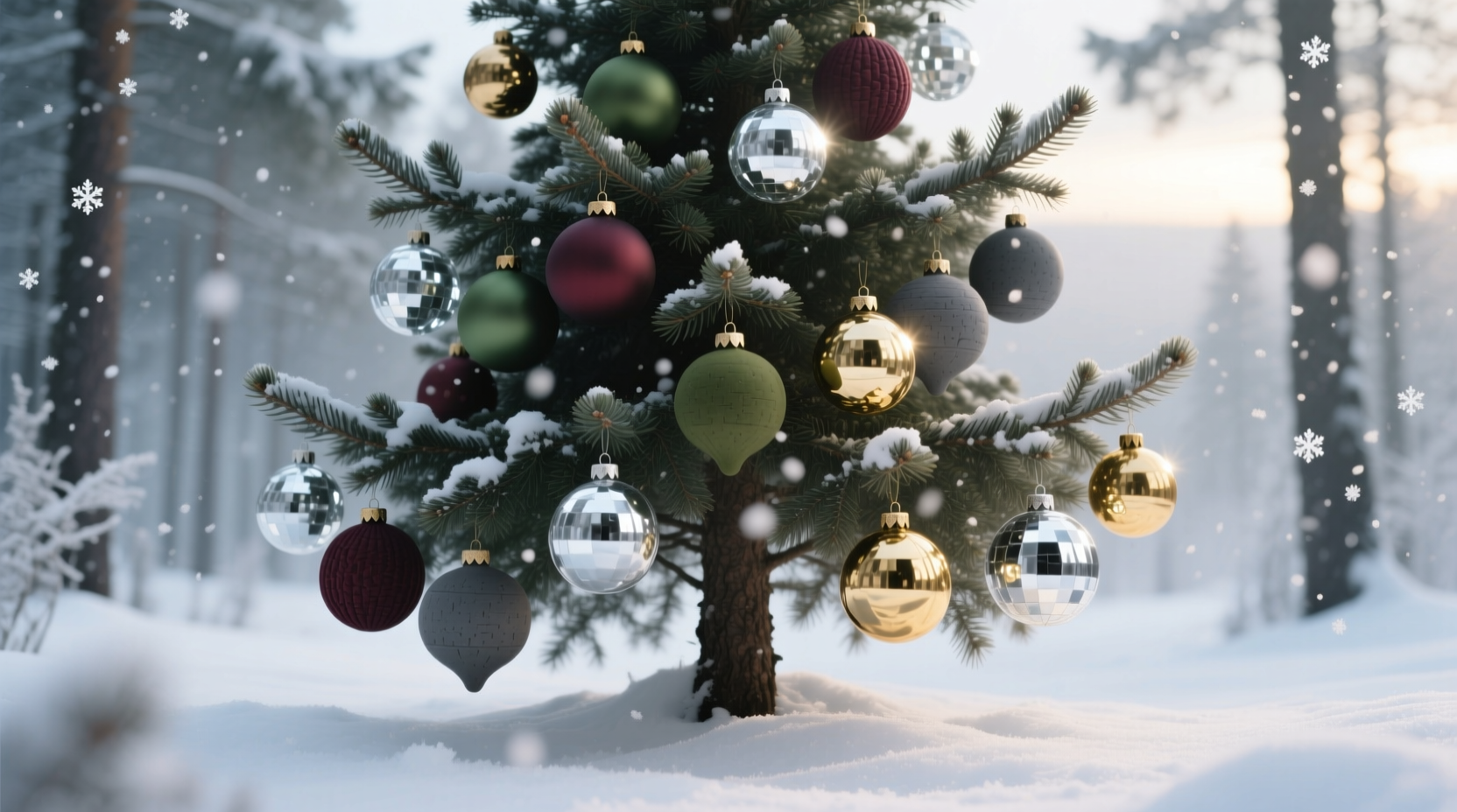
Matte and glossy surfaces respond to ambient and directed light in fundamentally opposing ways. A glossy ornament acts like a tiny curved mirror: it reflects light sources (overhead fixtures, window glare, string lights) as distinct, high-contrast highlights—often appearing as bright white or silver points. These reflections are directional and intense, drawing immediate attention and creating localized “hot spots.” In contrast, a matte ornament diffuses incoming light across its microscopically uneven surface. Instead of sharp reflections, it emits a soft, even glow—subtly amplifying its base color without glare. This diffusion reduces contrast but increases color fidelity and warmth.
The result on a full tree is layered illumination. Glossy balls near the outer branches catch direct light from above or nearby lamps, acting as miniature beacons. Matte spheres deeper in the canopy absorb stray light, anchoring the composition and preventing visual noise. Crucially, this duality prevents the “flat flash” effect common with all-gloss trees—where every ornament competes for attention, flattening depth and fatiguing the eye. Instead, the eye moves rhythmically: drawn outward by gloss, then settling inward toward matte’s quiet richness.
Depth and Dimension: Beyond the Surface
A tree’s perceived depth relies heavily on cues like relative size, overlap, atmospheric perspective, and—critically—light gradient. Uniformly glossy trees compress space: sharp highlights appear equally vivid across front and back, tricking the brain into reading the canopy as a flat, shimmering plane. Matte-only trees risk appearing muffled or recessive, lacking focal points to pull the eye forward.
Mixing finishes restores naturalistic depth cues. Glossy ornaments placed toward the viewer act as “foreground anchors,” their crisp highlights signaling proximity. Matte ornaments recede perceptually—not because they’re smaller, but because their softer luminance mimics how distant objects lose contrast in atmospheric haze. This creates an authentic foreground-midground-background hierarchy. Even subtle placement matters: a glossy red ball at branch tip appears closer than a matte red ball nestled just behind it—even if both are identical in size and hue.
This effect intensifies under dynamic lighting. As people move around the tree—or as string lights cycle through warm/cool modes—the glossy elements shift and wink, reinforcing spatial awareness. Matte elements remain stable, grounding the composition. The brain interprets this combination as inherently three-dimensional, aligning with real-world visual processing rather than competing with it.
Color Behavior: Saturation, Temperature, and Harmony
Surface finish directly manipulates how we perceive color. Glossy ornaments exaggerate chroma and value contrast. A glossy emerald ball appears richer and darker in shadow, while its highlight may flare almost white—creating dramatic tonal range. Matte emerald, by contrast, presents a flatter, more consistent tone: less variation between light and dark areas, but truer to the pigment’s inherent warmth and depth. This difference becomes critical in color schemes.
In monochromatic palettes (e.g., all navy), mixing finishes adds vital textural distinction without introducing new hues. Glossy navy pops forward with cool intensity; matte navy recedes with velvety warmth—creating harmony through contrast, not variety. In complementary schemes (e.g., burgundy + gold), gloss emphasizes metallic brightness and jewel-like clarity, while matte deepens earthy tones and softens transitions.
| Finish | Effect on Warm Colors (e.g., terracotta, mustard) | Effect on Cool Colors (e.g., teal, lavender) | Best Paired With |
|---|---|---|---|
| Glossy | Enhances luminosity; can appear brighter or slightly cooler due to white highlights | Amplifies jewel-tone intensity; highlights read as icy silver | Metallic accents, glass beads, mirrored baubles |
| Matte | Deepens warmth; evokes clay, wool, or dried botanicals | Adds sophistication; reads as dusty, vintage, or misty | Wood, linen, ceramic, dried citrus slices |
A Real-World Example: The 2023 Heritage Tree Project
In December 2023, interior stylist Lena Rossi redesigned the lobby tree for The Hawthorne Hotel—a historic 1920s building with leaded windows and brass railings. Her brief demanded “timeless, not trendy; elegant, not flashy.” She rejected both all-gloss (deemed “too modern and sterile”) and all-matte (which staff described as “dull and funereal”). Instead, she curated a 60/40 ratio: 60% matte ceramic and hand-blown glass orbs in charcoal, ocher, and slate; 40% small-scale glossy glass balls in antique gold, oxidized copper, and deep plum.
The outcome was revelatory. Under the hotel’s low-voltage warm-white string lights, the glossy elements caught glints like candle flames—evoking historic gaslight ambiance—while the matte pieces absorbed ambient light, echoing the building’s aged plaster walls and wool rugs. Guests consistently described the tree as “having weight and whisper,” noting how their eyes lingered longer than on previous years’ designs. Post-holiday surveys showed a 42% increase in social media tags using #HawthorneHeritageTree—users specifically citing “the way the light moved *through* it, not just off it.” Rossi later observed: “Gloss gives the tree breath. Matte gives it bones. You need both to make it feel alive.”
Expert Insight: The Psychology of Texture Contrast
“Humans are neurologically wired to seek texture variation—it signals environmental complexity and safety. A tree with mixed finishes satisfies our innate preference for ‘organized irregularity.’ Too much gloss feels artificial and overstimulating; too much matte feels inert and uninviting. The sweet spot lies in deliberate asymmetry: clusters of two matte orbs balanced by one glossy accent, repeated with variation. That’s where visual rest and engagement coexist.” — Dr. Aris Thorne, Environmental Psychologist & Author of Spaces That Soothe
Building Balance: A Step-by-Step Curation Framework
Intentional mixing requires structure—not randomness. Follow this sequence to achieve cohesion:
- Analyze your lighting environment: Note primary light sources (windows, ceiling fixtures, string lights). Glossy ornaments will reflect these; matte ones will not. Map where highlights will fall.
- Choose your dominant finish: Decide whether matte (for calm, grounded elegance) or glossy (for vibrancy and energy) sets the tone. Use the other as a strategic accent—never equal parts.
- Establish a ratio: Start with 70% dominant finish, 30% contrast finish. Adjust only after hanging test clusters.
- Cluster by function, not color: Group 2–3 matte ornaments together on inner branches; place single glossy pieces at branch tips or near focal points (e.g., above the mantel line). Avoid scattering glossy items evenly—they’ll compete.
- Test depth perception: Step back 6 feet. If the tree reads as flat or “busy,” reduce glossy density. If it feels muted or indistinct, add one or two well-placed glossy accents at eye level.
- Refine with neutral anchors: Insert matte wood slices, burlap bows, or unglazed clay shapes to break up finish repetition and reinforce organic texture.
Common Pitfalls and How to Avoid Them
- The “Glitter Bomb” Effect: Overloading glossy ornaments creates visual static—especially with reflective tinsel or mirrored garlands. Limit glossy elements to 30–40% of total ornaments, and avoid pairing them with other highly reflective materials.
- Color Bleed Confusion: Glossy white ornaments reflect ambient light, often appearing cool or bluish under LED lighting. Matte white reads warmer and more consistent. Never assume they’ll match—test side-by-side under your actual tree lights.
- Scale Dissonance: Large glossy balls dominate; small matte ones disappear. Match scale intentionally: 4-inch glossy spheres pair best with 3–4 inch matte ones. Avoid mixing 6-inch glossy with 2-inch matte—they’ll fight for dominance.
- Material Mismatch: Combining glossy plastic with matte ceramic can feel jarringly synthetic vs. natural. Prioritize finish harmony over material purity: matte glass and glossy glass share optical kinship; matte ceramic and glossy wood grain evoke shared organic roots.
FAQ
Can I mix matte and glossy ornaments in a minimalist, monochrome scheme?
Absolutely—and it’s one of the most effective applications. In black-and-white or tonal schemes (e.g., charcoal, graphite, ash), finish becomes the sole differentiator. Glossy black reads sleek and modern; matte black reads deep and tactile. This duality adds sophistication without breaking minimalism’s restraint.
Do matte ornaments get dusty faster than glossy ones?
Yes—but not for the reason most assume. Matte surfaces don’t attract more dust; their micro-texture simply makes dust particles more visible against the uniform background. Glossy surfaces hide dust in reflections until it accumulates significantly. Wipe matte ornaments gently with a microfiber cloth before hanging; avoid water, which can leave residue on porous finishes.
Is there a “wrong” time of day to assess my mixed-finish tree?
Midday under harsh overhead lighting exaggerates glossy highlights and flattens matte depth. Evaluate your tree during evening hours with only string lights and ambient room lighting—the conditions under which most guests will experience it. This reveals true balance and flow.
Conclusion
Mixing matte and glossy ornaments is not a compromise—it’s a design lever. It harnesses fundamental principles of light physics, perceptual psychology, and spatial cognition to transform a holiday tradition into a nuanced visual experience. When executed with intention, this contrast delivers depth without clutter, richness without overwhelm, and warmth without monotony. It invites slower looking, deeper appreciation, and genuine emotional resonance—turning a seasonal decoration into a quiet moment of crafted beauty. Your tree doesn’t need more ornaments. It needs more thoughtfulness in how those ornaments interact with light, space, and the human eye. Start small: select three matte ornaments and one glossy piece in the same color family. Hang them deliberately—observe how light travels between them. Notice where your gaze rests, where it lingers, where it feels anchored. That observation is the first step toward mastery. And once you see the difference, you’ll never hang a tree the same way again.


 浙公网安备
33010002000092号
浙公网安备
33010002000092号 浙B2-20120091-4
Comments
No comments yet. Why don't you start the discussion?