
The colors you choose for your walls, furniture, and décor are far more than aesthetic decisions—they shape how you experience a room. Some hues can subtly compress the sense of space, making even generously sized rooms feel cramped or enclosed. This phenomenon isn’t just perception; it’s rooted in color psychology, light absorption, and visual depth cues. Understanding why certain colors create this effect—and how to counteract it—can transform your living spaces into airy, open environments regardless of square footage.
Whether you're dealing with a compact apartment, a narrow hallway, or a basement bedroom, strategic color use can dramatically alter spatial perception. The key lies not in avoiding darker tones entirely, but in understanding their behavior and balancing them with other design elements that promote openness and flow.
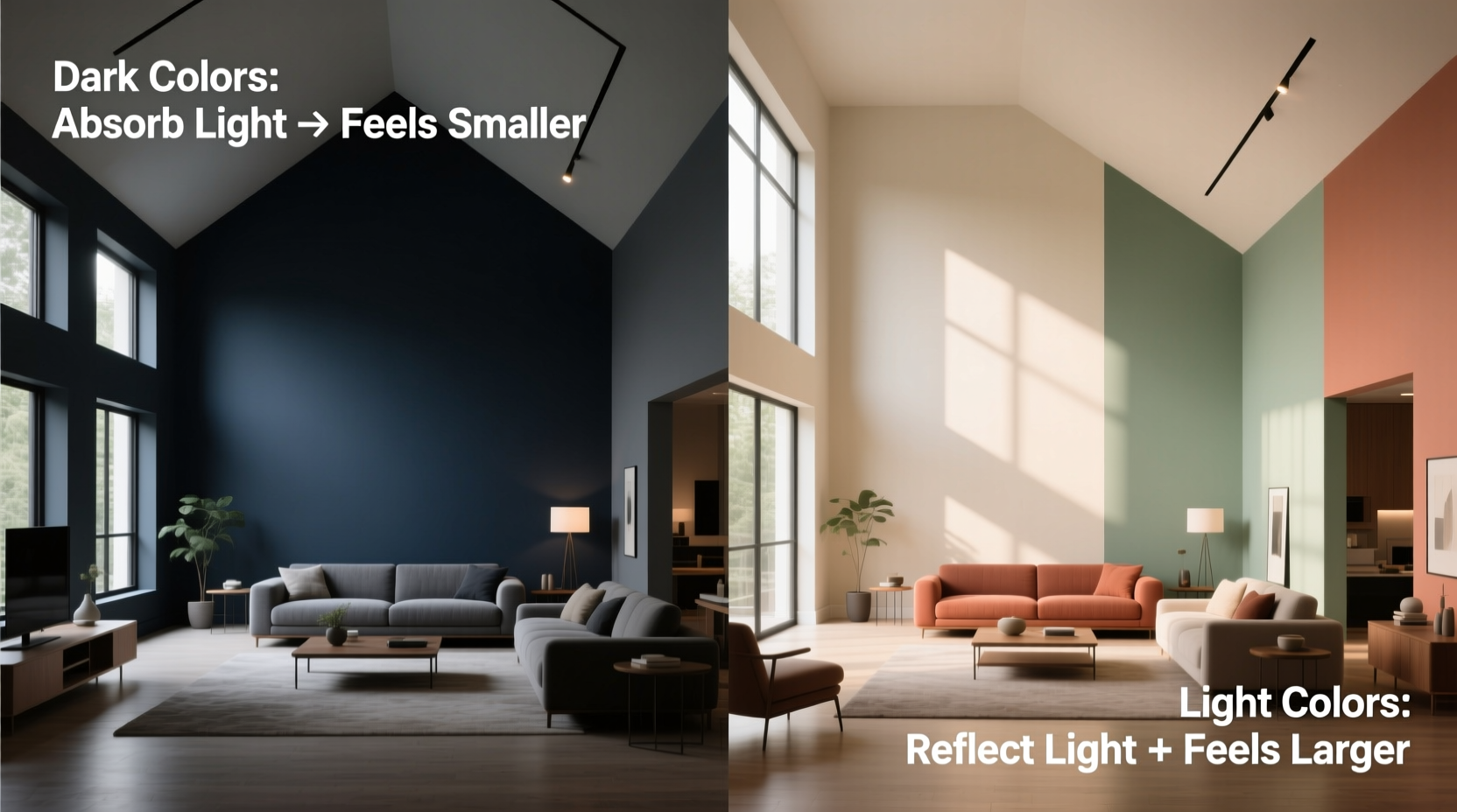
How Color Influences Spatial Perception
Colors affect our sense of space because they interact with light and the way our brains interpret depth. Light reflects off surfaces and enters our eyes, sending signals to the brain about distance, contrast, and dimension. Warm, dark, or highly saturated colors absorb more light, reducing reflection and diminishing the visual cues that help us perceive boundaries and volume.
Cool colors like soft blues and greens tend to recede visually, creating an illusion of distance. In contrast, warm tones such as deep reds, oranges, and rich browns advance toward the viewer, making walls appear closer. This is known as the \"advancing and receding\" effect in color theory. Interior designer Sarah Chen explains:
“Color isn’t just decorative—it’s architectural. A single shade can shift how large or intimate a room feels by altering perceived depth and light distribution.” — Sarah Chen, Interior Design Consultant
This means that painting all four walls of a small room in a bold, warm hue may unintentionally shrink the space. However, this doesn’t mean dark colors should be avoided altogether. When used thoughtfully, even deep tones can enhance a room without sacrificing openness.
Why Dark and Warm Colors Make Rooms Feel Smaller
Dark colors absorb more light than they reflect. In a room with limited natural or artificial lighting, this lack of reflected light reduces visibility at the edges of the space, blurring the distinction between wall and corner. As a result, the eye struggles to map the full dimensions of the room, leading to a sensation of enclosure.
Warm colors—especially those on the red, orange, and yellow side of the spectrum—naturally appear closer due to their high chromatic intensity. Psychologically, these hues evoke feelings of intimacy and warmth, which can be comforting but also contribute to a sense of compression when overused in confined areas.
Consider a bedroom painted in deep burgundy. While luxurious and cozy, the color may cause the ceiling to feel lower and the walls to close in, especially if paired with heavy curtains or low lighting. The same room in a pale gray-blue would likely feel more expansive, even if no structural changes were made.
Strategies to Prevent Colors from Shrinking Your Space
Avoiding the shrinking effect of color doesn’t require abandoning bold or warm palettes. Instead, apply design principles that balance color with light, texture, and layout. Below are proven techniques to maintain spaciousness while still expressing personal style.
1. Maximize Natural and Artificial Light
Light is the most powerful tool in counteracting the visual weight of color. Even dark-painted rooms can feel open if flooded with light. Position mirrors opposite windows to bounce daylight across the room. Choose sheer or light-filtering window treatments instead of heavy drapes.
In terms of artificial lighting, layer your sources: ambient (ceiling lights), task (reading lamps), and accent (wall sconces or LED strips). Recessed lighting along the perimeter can lift the perceived height of ceilings, while upward-facing floor lamps reflect light onto walls, softening their appearance.
2. Use Lighter Ceilings and Trim
Painting the ceiling white or a very light neutral—even when walls are darker—creates a “floating” effect that lifts the room. Similarly, crisp white trim around doors and windows frames the space and provides visual separation, preventing walls from feeling like solid blocks.
3. Apply the 60-30-10 Color Rule
This classic interior design guideline helps maintain balance:
- 60% dominant color (usually walls)
- 30% secondary color (upholstery, rugs)
- 10% accent color (pillows, art, accessories)
Using a light or neutral tone for the 60% base allows bolder colors to shine in smaller doses, preserving openness. For example, pair light beige walls (60%) with warm taupe furniture (30%) and terracotta accents (10%). The result feels rich but not oppressive.
4. Introduce Reflective Surfaces
Materials like glass, polished metal, high-gloss paint, and lacquered finishes reflect light and visually expand boundaries. A mirrored backsplash in a kitchen, a glass-top coffee table, or glossy cabinetry can offset the density of deeper wall colors.
Do’s and Don’ts of Color Selection for Small Spaces
| Do | Don’t |
|---|---|
| Use light neutrals like white, cream, soft gray, or pale blue on walls to maximize light reflection. | Paint all walls, ceiling, and trim in a dark color without adding strong lighting. |
| Choose satin or eggshell finishes for paint, which reflect more light than flat/matte finishes. | Use only flat paint in low-light rooms—it absorbs too much light and flattens depth. |
| Introduce contrast with darker furniture or art against light walls to add interest without closing in space. | Match furniture exactly to wall color—it eliminates definition and makes walls feel closer. |
| Use vertical stripes or tall artwork to draw the eye upward and emphasize height. | Install horizontal stripes across short walls—they widen the room visually but can make it feel lower. |
Real-World Example: Transforming a Narrow City Apartment
Take the case of a 450-square-foot studio in downtown Chicago. The tenant initially painted all walls a deep charcoal gray hoping for a modern, sophisticated look. Instead, the space felt cave-like, especially in winter months with limited daylight.
After consulting a color specialist, the tenant repainted three walls in a soft warm white (with a slight greige undertone) and kept the charcoal only on the wall behind the bed as an accent. They added a large mirror opposite the window, switched to a glossy white ceiling, and introduced a glass-topped side table and chrome lamp bases.
The change was immediate. Though the room remained small, it no longer felt confining. The accent wall retained its dramatic flair, but the lighter surrounding surfaces allowed light to circulate. Occupants reported feeling less fatigued and more energized in the space—a testament to how color affects both physical and emotional perception.
Step-by-Step Guide to Choosing the Right Colors for Spatial Balance
Follow this sequence to ensure your color choices enhance rather than diminish your room’s size:
- Evaluate natural light: Observe the room at different times of day. North-facing rooms receive cool, low light and benefit from warm neutrals. South-facing rooms get abundant sunlight and can handle cooler or deeper tones.
- Test paint samples: Paint large swatches (at least 2x2 feet) on multiple walls. View them in morning, afternoon, and evening light before deciding.
- Choose a ceiling color: Opt for white or a shade 2–3 levels lighter than the walls to create lift.
- Select trim and molding: Keep these lighter than walls for definition. White or off-white works best in most cases.
- Add depth with accents: Use darker furniture, rugs, or artwork to ground the space without painting walls dark.
- Incorporate reflective elements: Include at least one mirror, metallic finish, or glossy surface to bounce light.
- Reassess after setup: Live with the colors for a few days. Notice how they affect mood and spatial comfort.
Frequently Asked Questions
Can I use dark colors in a small room?
Yes, but strategically. Use dark hues on one accent wall, in furniture, or in decor items. Pair them with ample lighting, light ceilings, and reflective surfaces to prevent the room from feeling closed in.
Are cool colors always better for small spaces?
Not necessarily. While cool tones like soft blue or sage green can recede visually, overly cold shades may make a room feel sterile. The best approach is to choose balanced neutrals with subtle undertones that complement your lighting and furnishings.
Does paint finish affect how big a room looks?
Absolutely. Flat finishes absorb light and minimize texture, which can flatten walls and reduce depth. Satin, semi-gloss, or eggshell finishes reflect more light, enhancing dimension and brightness. For small or dim rooms, avoid flat paint on large surfaces.
Final Checklist: Avoiding the “Shrinking Room” Effect
- ☑ Assess the room’s natural and artificial light exposure
- ☑ Choose wall colors that reflect at least 50% of light (check LRV values)
- ☑ Paint the ceiling lighter than the walls
- ☑ Use glossy or satin finishes for enhanced light reflection
- ☑ Incorporate mirrors or glass elements to amplify space
- ☑ Maintain contrast between walls and large furniture pieces
- ☑ Limit bold or dark colors to accents, not full-wall applications
- ☑ Test paint samples under real lighting conditions before committing
Conclusion: Design with Intention, Not Fear
Choosing colors for your home shouldn’t mean sacrificing style for the illusion of space. By understanding how color interacts with light and perception, you can confidently use any hue while maintaining an open, inviting atmosphere. The goal isn’t to avoid dark or warm tones, but to deploy them with intention—balancing them with light, contrast, and reflective elements that preserve visual depth.
Whether you’re refreshing a single room or reimagining your entire home, take the time to observe how color shapes your experience of space. Test, refine, and personalize your palette. Great design isn’t about following rigid rules—it’s about creating environments that feel both beautiful and boundless.


 浙公网安备
33010002000092号
浙公网安备
33010002000092号 浙B2-20120091-4
Comments
No comments yet. Why don't you start the discussion?