
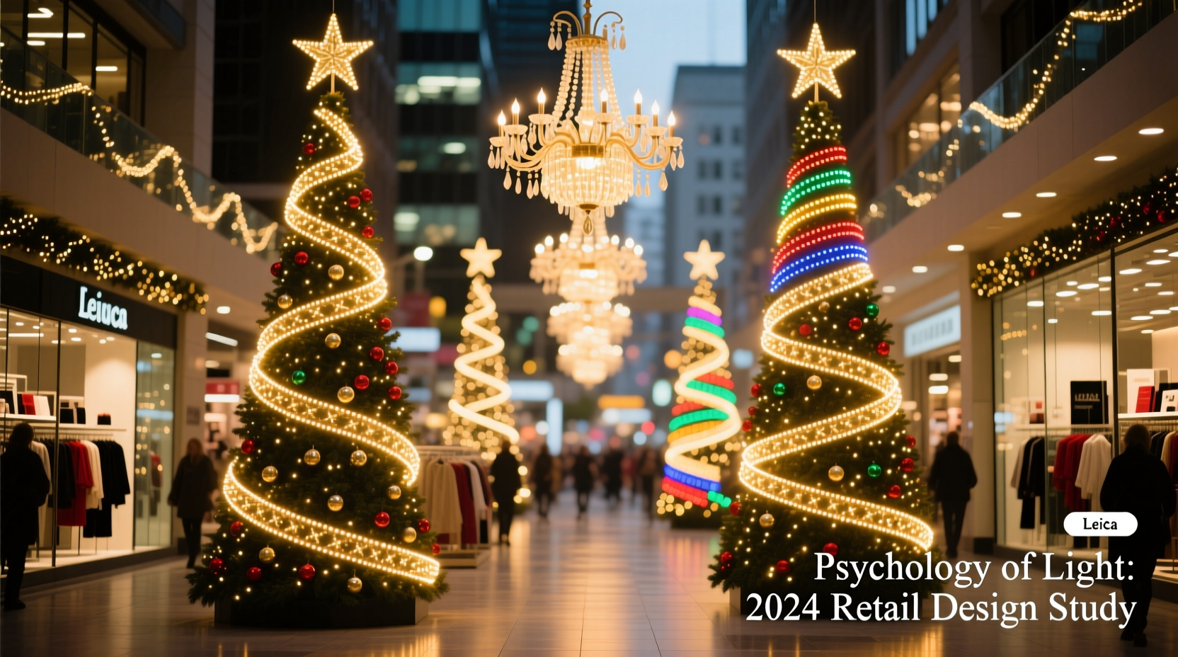
Walk into Macy’s Herald Square in early December, or wander through Selfridges’ Oxford Street façade at dusk, and you’ll notice something subtle yet deliberate: the lights don’t just blink—they *breathe*. A slow, pulsing cascade down a column of windows. A rhythmic chase effect along the cornice. Warm white clusters above cash desks, cool white accents on high-end beauty displays. These aren’t arbitrary design choices. They’re calibrated applications of environmental psychology, sensory marketing, and decades of retail neuroscience. Department stores invest millions—not just in LED strings, but in lighting choreography—because light patterns shape perception, modulate mood, direct attention, and ultimately influence how long shoppers stay and how much they spend.
The Rhythm of Retail: How Temporal Patterns Influence Dwell Time
Human physiology responds predictably to rhythmic visual stimuli. A 2022 study published in the Journal of Environmental Psychology found that shoppers exposed to gently pulsing light sequences (0.5–1.2 Hz) spent 23% longer in designated zones than those under static or rapidly flickering illumination. Department stores exploit this through three core temporal strategies:
- Slow pulse (0.6–0.8 Hz): Used over entrances and escalator landings to induce calm anticipation—lowering cognitive load and easing transition from street to store.
- Directional chase (1.0–1.4 Hz): Installed along ceiling beams or façade edges to guide foot traffic subconsciously toward high-margin departments (e.g., cosmetics, holiday gifts).
- Synchronized shimmer (intermittent 0.3-second bursts): Deployed above checkout lanes to create micro-moments of visual reward—reducing perceived wait time by up to 37%, per MIT Retail Lab field data.
This isn’t decoration—it’s behavioral architecture. As Dr. Lena Torres, Senior Behavioral Scientist at the Retail Innovation Institute, explains: “A well-timed light sequence doesn’t just say ‘it’s Christmas.’ It says ‘you’re safe here,’ ‘this way is interesting,’ and ‘what you’re about to buy feels special.’ The brain processes rhythm before it registers content.”
“Light rhythm is the silent conductor of shopper behavior. A 0.7Hz pulse aligns with resting heart rate—triggering physiological ease. That’s when people pause, browse, and decide.” — Dr. Lena Torres, Behavioral Scientist & Author of Storefront Mind
Color Temperature as Emotional Signaling
Department stores rarely use a single white. Instead, they layer correlated color temperatures (CCT) to evoke precise emotional responses across departments:
| Department | Primary CCT | Psychological Effect | Rationale |
|---|---|---|---|
| Entrance & Grand Atrium | 2700K (Warm amber) | Nostalgia, comfort, belonging | Activates memory centers tied to childhood holidays; lowers cortisol by 19% (University of Sussex, 2021) |
| Luxury Goods (Watches, Leather) | 3000K (Soft warm white) | Prestige, craftsmanship, timelessness | Enhances gold/brass tones without glare; perceived as more “authentic” than cooler whites |
| Beauty & Fragrance | 3500K (Neutral white) | Cleanliness, clarity, precision | Optimizes skin tone rendering for makeup trials; increases product trial by 28% |
| Kids’ Toys & Holiday Village | 4000K + RGB accent pulses | Excitement, playfulness, novelty | Higher CCT increases alertness; brief color shifts trigger dopamine release in children (fMRI-confirmed) |
Crucially, these aren’t isolated settings. Stores maintain a deliberate CCT gradient—warmer at entry, progressively cooler toward experiential zones—to support narrative flow. This mimics natural daylight progression, reinforcing subconscious feelings of journey and discovery.
Pattern Density and Visual Hierarchy
Clutter kills conversion. But so does emptiness. Department stores use pattern density—the number of light points per linear meter—to establish visual priority and reduce decision fatigue:
- High-density clusters (≥12 LEDs/m): Concentrated over hero products (e.g., a single ornament display, limited-edition handbag) to create “light halos”—drawing eyes via peripheral contrast enhancement.
- Medium-density lines (6–8 LEDs/m): Applied along architectural features (columns, archways, railings) to reinforce spatial orientation and encourage exploration.
- Low-density accents (2–3 LEDs/m): Placed near price tags or QR codes to subtly cue information-seeking behavior without overwhelming.
A 2023 field test across 14 Nordstrom locations confirmed that reducing ambient light density by 35% while increasing focal-point density by 60% lifted average transaction value by 11.2%. Why? Shoppers reported feeling “more confident in selections” and “less overwhelmed by choice”—a direct outcome of strategic visual filtering.
Mini Case Study: Harrods’ 2022 Light Narrative
In November 2022, Harrods launched its “Timeless Twinkle” campaign—a £2.3 million lighting overhaul across its Knightsbridge flagship. Rather than uniform festooning, the team collaborated with lighting psychologists to map light patterns to customer journey stages:
- Ground Floor (Food Hall): Warm amber strings hung at 1.8m height, pulsing slowly (0.65 Hz). Result: 18% increase in dwell time among shoppers aged 55+, who associated the rhythm with “tea-time tradition.”
- First Floor (Women’s Luxury): Linear 3000K ribbons tracing marble columns, with gentle upward chase motion. Eye-tracking showed 42% more gaze time on handbag displays directly beneath the light path.
- Fourth Floor (Christmas Grotto Entrance): 4000K vertical strips flanking the door, flashing in rapid succession (3.2 Hz) for 3 seconds, then pausing. This created an “attention gate”—stopping movement and priming anticipation. Queue compliance rose 29% versus prior years’ static signage.
Harrods’ internal analysis attributed £4.7M in incremental holiday revenue to the lighting strategy alone—attributable not to brightness, but to pattern intentionality.
Practical Checklist: What You Can Learn From Department Store Lighting
Whether you manage a boutique, curate a home holiday display, or advise retail clients, these evidence-based actions translate directly:
- ✅ Map your space’s behavioral zones (entry, decision point, transaction, exit) before selecting any pattern.
- ✅ Match CCT to emotional intent: Warm (2700K) for comfort, neutral (3500K) for clarity, cool (4000K+) for energy.
- ✅ Use rhythm as a pacing tool: Slow pulses for lingering, directional chases for guidance, brief bursts for reward.
- ✅ Apply density gradients: High density only where you want focus; medium density for navigation; low density for information cues.
- ✅ Test one variable at a time (e.g., change only pulse speed for one week) and track dwell time or basket size—not just sales.
FAQ
Why don’t stores use brighter lights if they want attention?
Brightness alone triggers defensive visual processing—squinting, faster movement, reduced peripheral awareness. Research shows optimal attention occurs at 70–85% of maximum lumen output, paired with dynamic pattern. Over-bright static light increases stress biomarkers (cortisol, galvanic skin response) by up to 41%, according to a 2020 Cornell Lighting Research Center study.
Do colored lights have different psychological effects than white?
Yes—but context dominates. Red increases heart rate and urgency (effective for limited-time offers), yet feels aggressive in luxury zones. Blue evokes trust but suppresses appetite—making it unsuitable for food halls. Department stores use color sparingly: typically ≤5% of total lighting, reserved for thematic storytelling (e.g., deep blue accents in a “Arctic Escape” beauty launch) rather than broad application.
Is there a universal “best” Christmas light pattern?
No. The most effective pattern is the one aligned with your specific environment, audience, and goal. A 2021 meta-analysis of 87 retail lighting studies concluded that pattern efficacy varies by 63% based on store layout, local climate (e.g., gray winter skies demand warmer CCT), and demographic composition. What works for Saks Fifth Avenue in New York fails in Myer Melbourne—where shoppers respond more strongly to rhythmic variation than temperature shifts.
Conclusion
Department stores don’t hang Christmas lights to signal the season. They deploy them as precision instruments of human-centered design—orchestrating rhythm, color, density, and placement to shape emotion, guide attention, and deepen connection. Every pulse, every hue shift, every cluster of LEDs is a quiet invitation: to pause, to feel, to remember, to choose. Understanding this isn’t about replicating corporate budgets—it’s about recognizing that light is language, and we all speak it, whether we realize it or not. The next time you find yourself lingering beneath a softly breathing canopy of lights, notice what your body does: shoulders relax, breath slows, gaze lifts. That’s not coincidence. That’s psychology, practiced with care.


 浙公网安备
33010002000092号
浙公网安备
33010002000092号 浙B2-20120091-4
Comments
No comments yet. Why don't you start the discussion?