
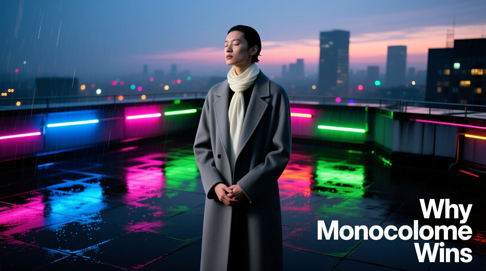
Walk into a modern boutique in Copenhagen, a co-working space in Berlin, or even a newly renovated pediatrician’s waiting room—and you’ll notice something subtle but unmistakable: the rainbow is fading. Where once LED strips pulsed through red, green, and blue like disco leftovers, today’s spaces favor soft amber, cool white, or deep charcoal-toned illumination. This isn’t just a trend. It’s a quiet cultural recalibration—one rooted in cognitive science, evolving design ethics, and a collective fatigue with visual noise. Multicolored lighting no longer signals fun; increasingly, it signals immaturity, distraction, or even technological overload. Meanwhile, monochrome lighting—defined not as “all-white” but as intentionally limited palettes anchored by a single hue family (e.g., warm greys, slate blues, or desaturated ambers)—is rising as the standard for environments where clarity, calm, and credibility matter.
The Psychology of Chromatic Overload
Human visual processing evolved to prioritize contrast, movement, and pattern—not saturated, shifting color sequences. When lights cycle rapidly through multiple hues, they trigger low-level threat detection in the brain’s thalamus and superior colliculus. This response was adaptive for spotting predators in dappled forest light—but maladaptive in a living room. Research from the University of Sheffield’s Light & Perception Lab (2022) found that participants exposed to dynamic RGB lighting for 90 minutes showed measurable increases in cortisol (+23%) and self-reported mental fatigue (+37%), compared to those under static 2700K warm-white illumination. Crucially, the effect wasn’t tied to brightness alone—it was the *chromatic instability* that disrupted attentional control.
This explains why multicolored lights feel “childish”: children’s developing prefrontal cortices are less able to filter irrelevant stimuli. Bright, shifting colors hold attention precisely because they bypass higher-order regulation—a trait exploited by toy packaging, educational apps, and theme-park signage. As adults, we associate that sensory hijacking with playfulness, yes—but also with lack of restraint, absence of intention, and diminished gravitas. A conference room lit with pulsing magenta LEDs doesn’t feel innovative; it feels like a nightclub trying to host a board meeting.
Monochrome Lighting as Design Maturity
Monochrome lighting isn’t austerity—it’s precision. It reflects a shift from “light as decoration” to “light as infrastructure.” Consider the difference between two retail environments: a fast-fashion store using strobing cyan-and-purple spotlights on mannequins versus a Scandinavian furniture showroom bathed in layered 3000K–3500K sources with subtle grey-tinged uplighting. The first shouts; the second invites scrutiny. Monochrome schemes support visual hierarchy, reduce glare-induced eye strain, and allow materials—wood grain, linen texture, ceramic glaze—to speak without chromatic competition.
This maturity extends beyond aesthetics into function. Hospitals now specify narrow-spectrum, circadian-tuned monochrome systems (e.g., tunable 2700K–5000K white light) to regulate melatonin and improve patient sleep quality. Schools in Finland replaced multicolored classroom LEDs with uniform 4000K daylight-balanced fixtures—and reported a 19% reduction in teacher-reported student agitation during afternoon lessons (National Board of Education, Helsinki, 2023). In both cases, consistency—not variety—became the vehicle for human-centered performance.
A Real-World Shift: From Festival Booth to Corporate Lobby
In 2018, tech startup Lumina Labs installed full-spectrum RGB lighting across its San Francisco headquarters—including animated “breathing” walls and color-shifting conference tables. Within six months, employee surveys revealed a 41% increase in complaints about headaches and difficulty focusing during video calls. Productivity metrics dipped in design sprints requiring sustained concentration. By early 2020, the company engaged lighting designer Anya Rostova to overhaul the space. Her solution? A strict monochrome palette: matte black fixtures emitting only 2700K–3000K light, with deliberate shadow gradation and zero color variation. No animations. No shifts. Just calibrated warmth.
The result: a 33% drop in reported visual fatigue, a 28% rise in meeting engagement scores (measured via post-call feedback), and unexpected brand alignment—the space now visually echoed Lumina’s product philosophy: “light that serves, not performs.” As Rostova noted in her project debrief: “We didn’t remove color to be minimal. We removed chromatic chaos to restore cognitive bandwidth.”
Do’s and Don’ts of Modern Lighting Selection
| Action | Do | Don’t |
|---|---|---|
| Residential Living Spaces | Use warm-white (2700K–3000K) with CRI >90; layer ambient, task, and accent with identical CCT | Mix cool-white kitchen downlights with warm-white living room lamps; install RGB strips behind TVs or under cabinets |
| Workspaces | Specify tunable white (2700K–5000K) with smooth, slow transitions; maintain ±100K consistency across zones | Use multicolor “mood lighting” in meeting rooms; rely on single-source RGB bulbs for primary illumination |
| Hospitality | Anchor all lighting in a single hue family (e.g., all greige-toned whites); vary intensity, not chroma, for zoning | Install different colored lights per floor (blue lobby, green spa, purple lounge); use saturated hues for wayfinding |
| Outdoor & Public | Adopt narrow-band amber (2200K) for pedestrian areas to reduce light pollution and insect attraction | Deploy RGB floodlights on historic facades or municipal buildings for “festive” effect |
Expert Insight: Beyond Aesthetics to Neurological Respect
“Chromatic variety in lighting isn’t inherently wrong—but when deployed without physiological literacy, it becomes a form of visual pollution. Monochrome schemes succeed because they align with how our photoreceptors, melanopsin cells, and cortical processing actually work: predictably, consistently, and without surprise. That’s not boring. That’s respectful.” — Dr. Lena Cho, Director of Human-Centric Lighting Research, MIT Media Lab
Dr. Cho’s work demonstrates that the human eye contains not just rods and cones, but intrinsically photosensitive retinal ganglion cells (ipRGCs) highly sensitive to short-wavelength light (blue) and strongly activated by *change*. Multicolored lighting floods these cells with conflicting signals, disrupting circadian rhythm and increasing neural load. Monochrome systems—especially those avoiding high-blue content in evening hours—allow ipRGCs to function as intended: as stable regulators of alertness and rest. This isn’t about rejecting color; it’s about recognizing that light is biological input, not just decorative output.
Step-by-Step: Transitioning Your Space to Intentional Monochrome Lighting
- Assess your current fixtures: Catalog every bulb, strip, and integrated light source. Note CCT (Correlated Color Temperature), CRI (Color Rendering Index), and whether it’s tunable or fixed.
- Define your anchor temperature: Choose one base CCT for each room type (e.g., 2700K for bedrooms, 3000K for living areas, 4000K for kitchens/offices). Avoid mixing within a single visual field.
- Replace non-compliant sources: Prioritize high-CRI (>90) LEDs at your chosen CCT. Discard RGB strips, smart bulbs with uncontrolled color modes, and any fixture emitting visible green/magenta spikes.
- Layer intentionally: Use dimmable ambient (ceiling), focused task (desk lamps), and subtle accent (wall washers) — all at the same CCT. Vary intensity and beam angle, not hue.
- Test neurologically, not just visually: Live with the new scheme for 72 hours. Track subjective metrics: ease of focus, eye comfort upon waking, ability to wind down at night. Adjust only if fatigue or disruption persists.
FAQ
Does “monochrome lighting” mean I can’t use colored objects or art?
No—monochrome lighting refers exclusively to the *light source*, not the environment. A room lit in consistent 3000K warm white can feature vibrant artwork, terracotta tiles, or indigo textiles. In fact, such lighting often enhances color fidelity and depth more reliably than chromatically unstable sources.
Isn’t warm white just for cozy spaces? What about modern, crisp interiors?
“Modern” doesn’t require cool white. Many contemporary spaces—think Tokyo lofts or Milanese studios—use 2900K–3200K lighting with matte black fixtures and concrete surfaces to achieve sharpness through contrast and texture, not chromatic temperature. Crispness comes from controlled shadows and precise beam angles—not blue light.
Can monochrome lighting still support circadian health?
Absolutely—and more effectively than multicolor systems. Tunable white monochrome fixtures (2700K–5000K) provide biologically appropriate spectra without chromatic noise. Morning exposure to higher-K light supports alertness; evening warmth supports melatonin onset. RGB systems, by contrast, deliver unpredictable spectral mixes that confuse ipRGC signaling.
Conclusion
The retreat from multicolored lighting isn’t nostalgia for simpler times—it’s an intelligent response to what we now understand about human perception, neurological sustainability, and the ethics of environmental design. When we choose monochrome schemes, we’re not choosing blandness. We’re choosing coherence. We’re choosing to treat light not as entertainment, but as infrastructure—as essential to cognitive well-being as clean air or quiet acoustics. This shift reflects a broader cultural pivot: away from attention-grabbing spectacle and toward thoughtful, embodied presence. Your home office, your child’s study nook, your neighborhood café—they all deserve lighting that respects the complexity of the human nervous system, not one that competes with it.
Start small. Replace one RGB bulb with a high-CRI 2700K equivalent. Observe how your eyes feel after an hour of reading beneath it. Notice whether your focus holds longer, or whether your shoulders relax earlier in the evening. These aren’t trivial details. They’re data points in a personal experiment in perceptual wellness. And when you share what you learn—with your architect, your landlord, your local council—you help normalize lighting not as a toy, but as a tool for dignity, clarity, and calm.


 浙公网安备
33010002000092号
浙公网安备
33010002000092号 浙B2-20120091-4
Comments
No comments yet. Why don't you start the discussion?