
In digital photography and post-processing, color accuracy is not a luxury—it’s a necessity. When you open an image in Adobe Camera Raw, you may not immediately notice the quiet but powerful role of color profiles. One profile in particular—Display P3—has become increasingly central to modern workflows. But why does Camera Raw use Display P3, and what does it mean for your images? Understanding this shift requires more than technical jargon; it demands a clear grasp of how color is represented, rendered, and preserved from capture to output.
Camera Raw, as the foundation of Adobe’s RAW processing ecosystem, must anticipate the diverse range of displays and output devices photographers use. As high-gamut screens like Apple’s Retina displays and professional-grade monitors have adopted the Display P3 color space, Adobe integrated support to ensure consistent, vivid color representation. This isn’t arbitrary—it reflects a broader industry evolution toward wider color gamuts and more lifelike visual experiences.
What Is Display P3 and How Does It Differ from sRGB?
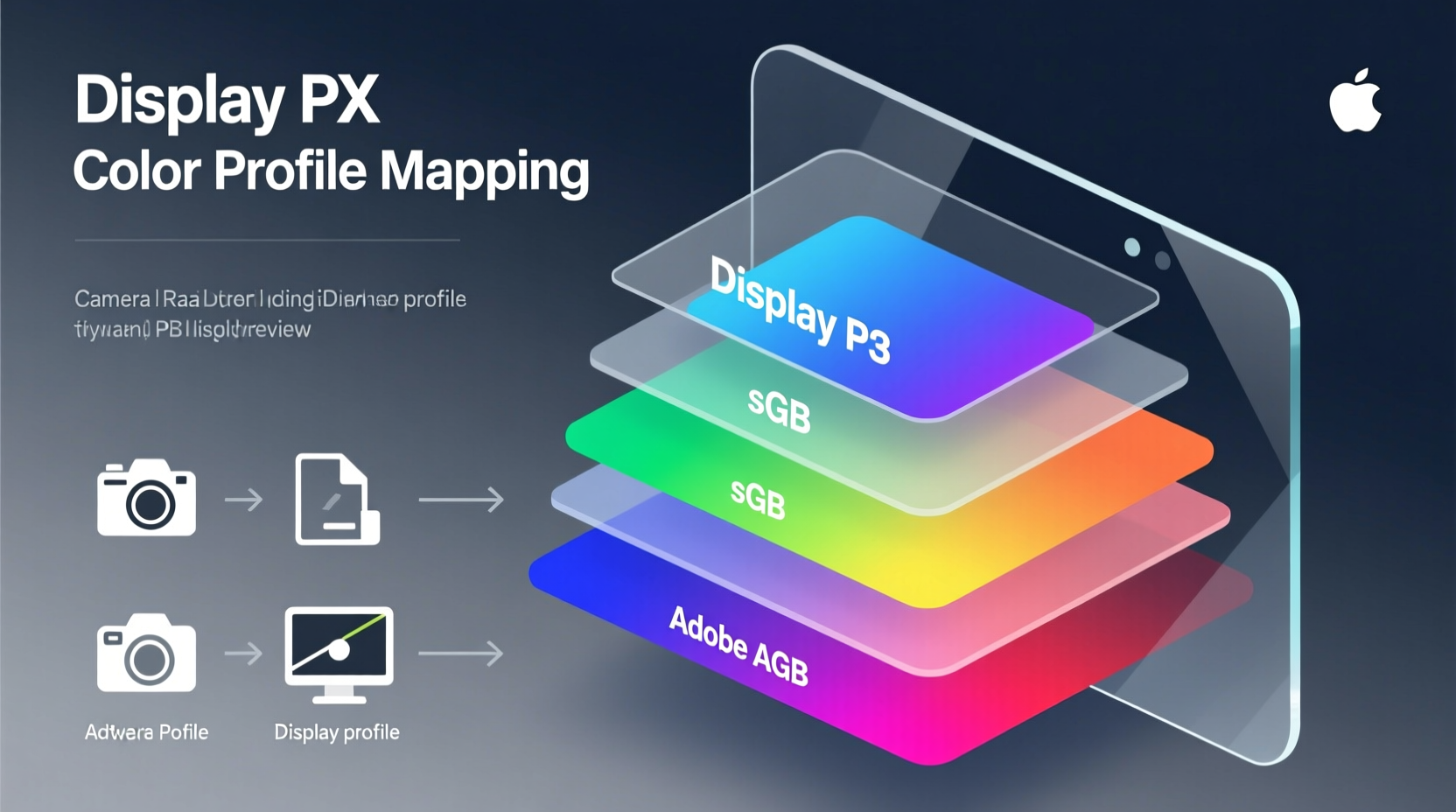
Color profiles define the range of colors—known as a gamut—that a device can capture, display, or print. The two most common working spaces in digital imaging are sRGB and Display P3. While both are RGB-based, their capabilities differ significantly.
sRGB has long been the standard for web content and consumer displays. It covers approximately 35% of visible colors under the CIE 1931 color space model. In contrast, Display P3, originally developed for digital cinema, expands that coverage by about 25%, particularly in the green and red regions. This means richer sunsets, deeper forest greens, and more natural skin tones—all critical in professional photography.
Display P3 achieves this by using a different set of primary chromaticities than sRGB. Specifically, its red and green primaries are more saturated, allowing for more intense hues without clipping or banding. When Camera Raw renders previews using Display P3 on compatible hardware, it leverages this expanded gamut to show colors closer to what the human eye perceives in real life.
Why Camera Raw Uses Display P3 by Default on Compatible Systems
Adobe Camera Raw dynamically adapts to the host system’s display capabilities. On Macs with Retina displays and Windows machines equipped with wide-gamut monitors, Camera Raw automatically switches to using the Display P3 color space for on-screen previews. This decision is rooted in fidelity: showing your photos as they’re meant to be seen.
The software doesn’t alter the embedded color data in your RAW file—those remain in the camera’s native color space until conversion. Instead, Camera Raw applies a viewing transform that maps the image data into Display P3 for accurate visualization. This soft-proofing approach prevents misjudgments during editing, such as oversaturating already vibrant tones because the display couldn't render them properly in sRGB.
This behavior aligns with modern operating systems. macOS, for instance, treats Display P3 as its default working space for UI and media. By matching this environment, Camera Raw ensures seamless integration and eliminates color shifts when moving between applications like Photoshop, Lightroom, and even Safari.
How Color Profiles Impact Your Editing Workflow
Misunderstanding color profiles can lead to inconsistent results. A common issue arises when an image edited in Display P3 is exported in sRGB without proper conversion. Colors may appear duller online because the rich P3 data gets compressed into a narrower gamut. Conversely, failing to tag images correctly can cause some browsers or apps to misinterpret the colors entirely.
To maintain control, consider the following workflow adjustments:
- Monitor Calibration: Use a hardware calibrator to ensure your display accurately reproduces Display P3.
- Soft Proofing: Enable soft proofing in Camera Raw to simulate how the image will look when converted to sRGB or printed.
- Export Settings: When sharing online, convert to sRGB and embed the profile. For client presentations on high-end devices, retain Display P3.
- Metadata Awareness: Always verify that color profile metadata is preserved during file transfers.
| Aspect | sRGB | Display P3 |
|---|---|---|
| Red/Green Gamut | Narrower, standard saturation | Wider, especially in reds and greens |
| Typical Use Case | Web, social media, standard monitors | High-end displays, video, print prep |
| White Point | D65 (6500K) | D65 (6500K) |
| Gamma | 2.2 | 2.2 (display linearized via EOTF) |
| Best For | Consistency across devices | Vibrancy and realism on capable screens |
Expert Insight: The Importance of Color Management in Practice
“Without proper color management, what you edit isn’t what you deliver. Camera Raw’s adoption of Display P3 isn’t just technical—it’s a commitment to visual truth.” — Dr. Lena Torres, Digital Imaging Scientist at MIT Media Lab
This quote underscores a fundamental principle: editing environments must reflect final output conditions. As more clients and publishers adopt wide-gamut workflows, photographers who ignore Display P3 risk delivering subpar results—even if their technique is flawless.
Real-World Example: Landscape Photographer Adjusts Workflow for P3
Consider Sarah Kim, a landscape photographer based in Colorado. She noticed that her vivid autumn foliage shots looked flat when viewed on her client’s MacBook Pro, despite looking perfect on her calibrated sRGB monitor. After investigation, she realized her exports were missing proper profile tagging. Her client’s machine expected P3 content, but received untagged sRGB files, leading to incorrect rendering.
Sarah updated her workflow: she began using Camera Raw’s display-managed mode, enabled soft proofing for sRGB, and started exporting two versions—one in sRGB for web, another in Display P3 for high-end presentations. The result? Clients consistently praised the vibrancy and realism of her work, and her images translated accurately across platforms.
Checklist: Optimizing Your Camera Raw Setup for Display P3
- ✅ Confirm your monitor supports Display P3 (e.g., Apple Studio Display, Dell UltraSharp 32, LG UltraFine)
- ✅ Calibrate your display using a hardware colorimeter
- ✅ Enable color management in Camera Raw preferences (Under “Display” > “Use Display Color Management”)
- ✅ Turn on “Proof Colors” (Ctrl+Y) to preview sRGB conversion while editing in P3
- ✅ Export with embedded profiles: choose “Embed Color Profile” in the Save dialog
- ✅ Test outputs on multiple devices to validate consistency
Frequently Asked Questions
Does using Display P3 mean my images will look oversaturated?
No—if your monitor is properly calibrated. Display P3 allows more saturated colors, but only renders them accurately if the display and software are correctly managed. Without calibration, colors may appear exaggerated. Always pair P3 usage with hardware profiling.
Can I edit in Display P3 and export to sRGB safely?
Yes, and you should—if your final destination is the web. Camera Raw handles the conversion intelligently, preserving tonal relationships. Use soft proofing to preview how colors will shift and make minor adjustments if needed before export.
Do all RAW files benefit from Display P3 editing?
All do, indirectly. RAW files contain more color data than any output space. Editing in a wider gamut like Display P3 gives you more headroom to adjust white balance, exposure, and saturation without posterization. Even if you export to sRGB, the editing precision improves.
Conclusion: Embracing Display P3 for Truer Visual Fidelity
The integration of Display P3 in Camera Raw is not a fleeting trend—it’s a response to the advancing capabilities of modern displays and the growing demand for authentic color reproduction. By understanding how and why Camera Raw uses this color profile, photographers gain more than technical knowledge; they gain confidence that their creative decisions are being seen as intended.
Whether you're curating a portfolio, preparing images for print, or publishing online, color accuracy forms the backbone of professional credibility. Take the time to audit your setup, embrace soft proofing, and respect the role of color profiles. The difference may not always be obvious at first glance—but those who see your work on high-fidelity screens will feel it.


 浙公网安备
33010002000092号
浙公网安备
33010002000092号 浙B2-20120091-4
Comments
No comments yet. Why don't you start the discussion?