
Adding text to photos in Photoshop is more than just typing a caption. When done creatively, it transforms images into compelling visual stories—perfect for social media, branding, editorial design, or personal projects. With the right techniques, you can make text blend seamlessly with the image, stand out dramatically, or even become part of the scene itself. This guide explores advanced yet accessible methods to elevate your typographic designs within Photoshop.
Mastering the Basics: Text Tools and Layers
Before diving into creative effects, ensure you’re comfortable with Photoshop’s core text functionality. The Text Tool (T) allows you to insert horizontal or vertical type directly onto your canvas. Each time you add text, Photoshop creates a new type layer, preserving editability so you can change font, size, color, and alignment at any time.
Type layers remain vector-based until rasterized, meaning they stay sharp at any resolution. To access advanced options, use the Character and Paragraph panels (Window > Character / Paragraph). Here, you can fine-tune kerning, leading, baseline shift, and text justification.
Creative Techniques for Text Integration
Once the foundation is set, explore these imaginative approaches to integrate text into your photos in visually engaging ways.
1. Masking Text with Image Content
Use clipping masks to fill text with parts of your photo. Type your message, then place the desired image above the text layer. Right-click the image layer and select “Create Clipping Mask.” The image will appear only within the text shape, creating a dynamic fusion between typography and visuals.
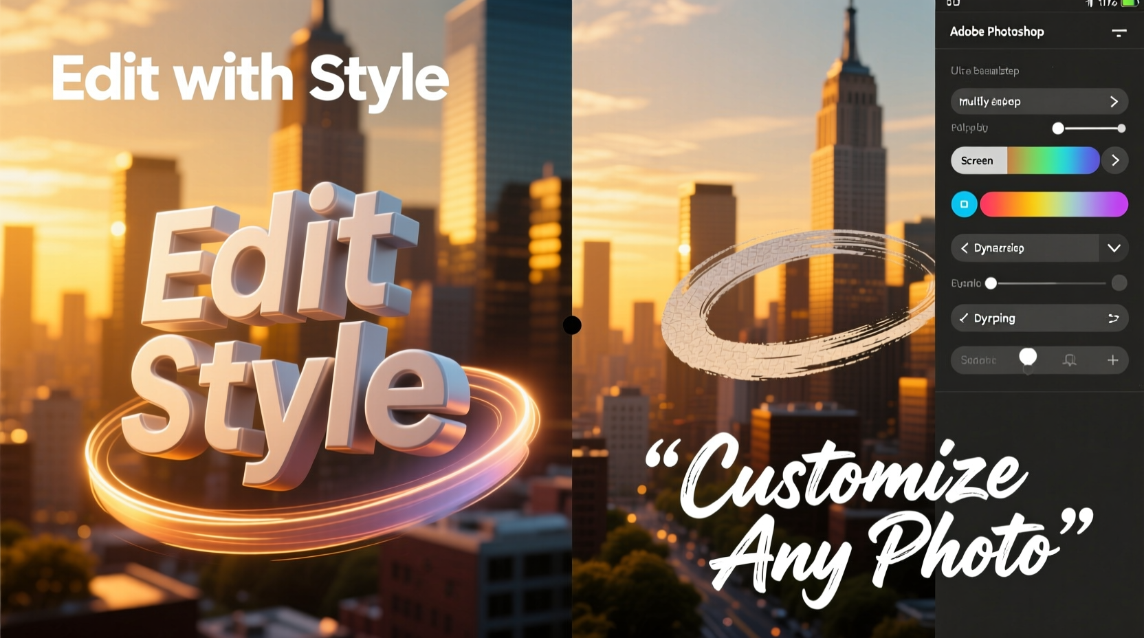
2. Blending Modes for Seamless Overlays
Adjust blending modes like Multiply, Overlay, or Screen to help text interact naturally with underlying tones. For example, Multiply darkens areas where text overlaps, ideal for light-colored fonts over bright backgrounds. Overlay enhances contrast, making text pop without harsh edges.
3. Warping Text to Match Perspective
To make text appear as if it's painted on a wall or lying on a surface, use Edit > Transform > Warp or the Puppet Warp tool. Choose a preset warp style like “Arc” or “Flag,” or manually adjust control points to match the photo’s perspective. This technique works exceptionally well in urban photography or mockup designs.
4. Adding Depth with Layer Styles
Double-click a text layer to open Layer Style options. Apply drop shadows, inner glows, bevels, and strokes to create dimension. Combine subtle gradients with noise textures to simulate realistic paint, metal, or neon finishes. Avoid overdoing effects—subtlety often enhances readability and realism.
“Typography that respects the image context doesn’t compete—it collaborates.” — Lena Torres, Visual Designer & Adobe Certified Expert
Step-by-Step: Creating Realistic Chalkboard Text
This practical walkthrough demonstrates how to turn plain text into a textured chalkboard effect suitable for rustic or nostalgic themes.
- Open your base image – ideally one featuring a chalkboard, slate, or dark matte surface.
- Add text using the Type Tool in white or light gray.
- Apply a slight Gaussian Blur (Filter > Blur > Gaussian Blur, ~0.5px) to soften edges.
- Add noise: Go to Filter > Noise > Add Noise (set to 15–20%, Gaussian, Monochromatic).
- Change blending mode to Overlay or Soft Light to blend with texture underneath.
- Optional: Use a dry brush texture overlay (on soft light mode) to enhance graininess.
- Final touch: Manually draw faint imperfections with a small textured brush to mimic real chalk smudges.
Advanced Customization: Using Smart Objects and Filters
For non-destructive editing, convert text layers into Smart Objects before applying filters. Right-click the layer and choose “Convert to Smart Object.” Now, you can apply filters like Liquify, Displace, or Lens Flare without permanently altering the original text.
The Displacement Map filter is particularly powerful. Create a separate grayscale texture (e.g., crumpled paper), save it as a .PSD, then go to Filter > Distort > Displace. Link this map to warp your text realistically over uneven surfaces. This method excels in simulating text printed on fabric, wood, or aged walls.
Custom Fonts and Licensing Awareness
While default fonts work well, custom typefaces amplify uniqueness. Install third-party fonts by placing .OTF or .TTF files in your system’s Fonts folder. However, always verify licensing—some fonts are free for personal use only. Sites like Google Fonts, DaFont (check licenses), and Adobe Fonts offer safe, legal options.
| Technique | Best For | Recommended Blending Mode |
|---|---|---|
| Clipping Mask Fill | Filling text with scenery or portraits | Normal |
| Drop Shadow + Bevel | 3D button or metallic text | Overlay / Hard Light |
| Noise + Texture Overlay | Chalk, grunge, vintage styles | Soft Light / Multiply |
| Puppet Warp | Curved surfaces like bottles or hills | N/A (shape manipulation) |
Mini Case Study: Social Media Campaign for a Coffee Brand
A boutique coffee roaster wanted to launch a seasonal campaign featuring quotes about morning rituals overlaid on moody café scenes. The challenge was ensuring legibility while maintaining atmosphere.
The designer used light cream-colored text with a minimal drop shadow and converted each quote into a Smart Object. A subtle texture of coffee stains was applied via overlay, clipped to the text layer. By warping certain words to follow steam rising from a cup, the text felt integrated rather than imposed. Engagement increased by 40% compared to previous text-heavy posts, proving that thoughtful integration drives connection.
Checklist: Professional Text-on-Photo Workflow
- ☑ Start with high-resolution images to preserve clarity
- ☑ Use non-destructive techniques (Smart Objects, adjustment layers)
- ☑ Match font style to image mood (e.g., serif for elegance, handwritten for casual)
- ☑ Test readability across devices and sizes
- ☑ Limit fonts to two per composition to maintain visual harmony
- ☑ Save layered .PSD files for future edits
- ☑ Export final versions in appropriate formats (JPEG for web, PNG for transparency)
Frequently Asked Questions
Can I make text follow a curved path in Photoshop?
Yes. Select the Pen Tool, draw a curved path, then click with the Text Tool directly on the path. Your text will flow along the curve. Adjust spacing manually if needed using baseline shift or character width settings.
Why does my text look pixelated after resizing?
This happens when the type layer is rasterized or resized after scaling up excessively. Always keep text as a vector layer until final export. If scaling large, increase canvas resolution beforehand or retype at the intended size.
How do I remove background behind text while keeping effects intact?
Use a transparent canvas or erase only the background layer. Never erase the text layer itself. Alternatively, use Layer Masks to hide unwanted areas non-destructively.
Conclusion: Elevate Your Visual Storytelling
Text is not merely an addition to a photo—it’s a design element with equal weight to color, composition, and subject. By mastering masking, warping, blending, and texturing in Photoshop, you unlock endless possibilities for creative expression. Whether crafting digital art, marketing assets, or personalized keepsakes, the way you treat typography defines the viewer’s experience.


 浙公网安备
33010002000092号
浙公网安备
33010002000092号 浙B2-20120091-4
Comments
No comments yet. Why don't you start the discussion?