
Selecting a prelit wreath isn’t just about size or greenery—it’s about light as an emotional and spatial tool. Warm white and cool white LEDs emit fundamentally different color temperatures, each shaping how a room feels, how your decor reads, and even how relaxed your eyes feel after hours of holiday viewing. Yet most shoppers default to whichever option is on sale, or worse—assume “white” is neutral and interchangeable. That assumption leads to mismatched mantels, garish entryways, and seasonal regret. This guide cuts through marketing ambiguity using interior design principles, photobiology research, and real-world installation experience—not theory, but tested outcomes.
Understanding Color Temperature: Beyond “Warm” and “Cool” Labels
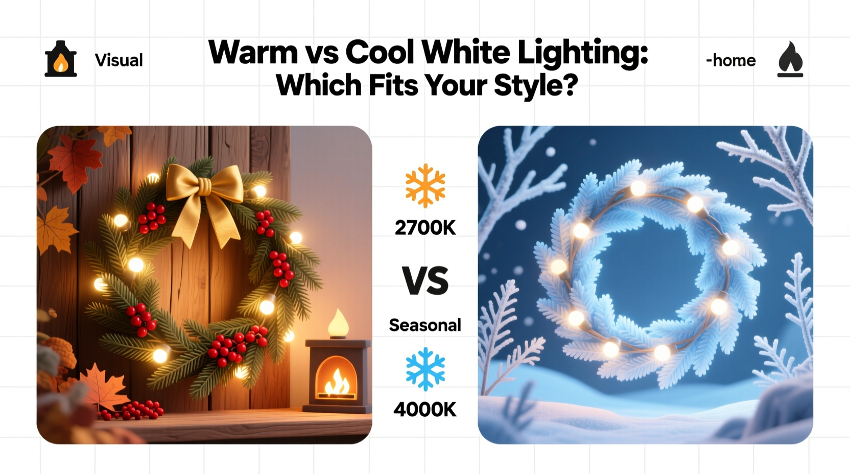
Color temperature is measured in Kelvin (K) and describes the hue of white light—not its brightness or energy use. It’s based on the theoretical color of light emitted by a heated black body. Lower Kelvin values appear yellowish; higher values lean bluish. In practice:
- Warm white ranges from 2200K to 3000K. At 2200K, it mimics candlelight—soft, intimate, slightly amber. At 3000K, it resembles incandescent bulbs—creamy, inviting, and gently diffused.
- Cool white spans 4000K to 6500K. At 4000K, it’s crisp and clean—like morning light through a north-facing window. At 6500K, it replicates midday summer sun: bright, high-contrast, and clinically sharp.
Crucially, neither is “better”—but misalignment creates visual dissonance. A 6000K wreath hung beside 2700K sconces doesn’t just look “off”; it triggers subconscious alertness where relaxation should dominate. Our circadian rhythms respond to blue-rich light, and cool white LEDs emit significantly more short-wavelength (blue) photons than warm whites. This isn’t aesthetic preference alone—it’s neurophysiology influencing mood and perception.
Matching Light to Your Decor Style and Architecture
Your home’s existing lighting infrastructure and material palette dictate the optimal wreath choice far more than personal taste alone. Consider these pairings:
| Decor Style / Setting | Recommended Wreath Light Temp | Why It Works |
|---|---|---|
| Traditional, farmhouse, or cottagecore (wood beams, brick, cream walls, brass fixtures) | 2200K–2700K | Amber tones harmonize with wood grain, aged metals, and natural textiles. Prevents the “hospital hallway” effect when cool light reflects off matte surfaces. |
| Modern, minimalist, or Scandinavian (white lacquer, concrete, stainless steel, monochrome schemes) | 4000K–4500K | Provides crisp definition without harsh glare. Enhances architectural lines and lets clean materials read clearly under even illumination. |
| Mid-century modern or retro (orange accents, walnut, vintage glass, bold wallpaper) | 2700K–3000K | Complements warm-toned woods and saturated pigments without washing them out. Avoids the flat, desaturated look cool white imparts on rich reds and ochres. |
| Coastal, Mediterranean, or all-white interiors (marble, linen, bleached oak, ceramic tile) | 3000K–3500K | A subtle middle ground: warm enough to avoid sterility, cool enough to preserve clarity on reflective surfaces like marble or glazed tile. |
| Commercial or high-traffic entryway (glass doors, polished stone floors, security lighting) | 4000K–4500K | Boosts perceived safety and visibility while maintaining a welcoming tone—unlike 6500K, which reads as institutional. |
This isn’t stylistic dogma—it’s physics meeting perception. Cool white light increases visual acuity but reduces color fidelity for warm hues. A 2700K wreath makes burgundy velvet curtains glow; a 5000K one renders them dull and muddy. Conversely, cool white lifts cool-toned blues and grays, making them appear crisper and more dimensional.
The Human Factor: Eye Comfort, Circadian Rhythm, and Social Atmosphere
Holiday decor lives in living spaces where people gather for hours—not in showrooms. How light affects biological comfort matters profoundly:
- Pupil response: Warm white causes less pupil constriction than cool white at equal lumen output. This means less visual fatigue during evening gatherings, especially for older adults whose lenses naturally yellow and filter more blue light.
- Circadian impact: Exposure to blue-rich light (abundant in cool white above 4500K) after sunset suppresses melatonin production. A 2022 study in Lighting Research & Technology found participants exposed to 5000K ambient lighting for two hours post-dinner experienced 38% greater melatonin suppression than those under 2700K light—directly impacting sleep onset.
- Social warmth perception: Researchers at the University of Toronto observed that dining groups under 2700K lighting reported higher levels of perceived intimacy and conversation flow versus identical groups under 5000K lighting—even when room temperature and noise were controlled.
“Lighting isn’t background—it’s behavioral architecture. A wreath isn’t decoration; it’s a node in your home’s light ecosystem. Choose temperature first, then aesthetics.” — Dr. Lena Torres, Environmental Psychologist and Lighting Researcher, Harvard Graduate School of Design
A Real-World Case Study: The Mismatched Mantel Correction
In December 2023, interior designer Marcus Chen was called to a Boston brownstone where the client had installed a stunning 6500K prelit wreath above a marble fireplace. The mantel held family heirlooms: a 19th-century brass clock, hand-stitched wool stockings, and framed sepia photographs. Within days, the client complained the space felt “cold, clinical, and unwelcoming”—despite investing in premium decor.
Marcus diagnosed the issue immediately: the 6500K light created high-contrast glare on the marble, washed out the brass’s patina, and made the wool textures appear flat and synthetic. He replaced the wreath with a 2400K LED version featuring dimmable, non-flickering filaments. The transformation wasn’t subtle—it was visceral. The brass regained its depth, the wool’s texture became tactile again, and the photographs’ tonal range reappeared. Most importantly, guests began lingering longer by the hearth instead of retreating to softer-lit rooms.
This wasn’t about “prettiness.” It was about spectral compatibility—the wreath’s light spectrum needed to coexist with the reflectance spectra of brass, wool, and aged paper. Warm white succeeded because its dominant wavelengths aligned with the absorption peaks of those materials, allowing them to express their inherent qualities.
Step-by-Step Selection Process: From Doubt to Decision
Follow this field-tested sequence—no guesswork, no returns:
- Inventory your fixed lighting: Note the Kelvin rating of every bulb within 10 feet of your intended wreath location (overhead fixtures, sconces, lamps). Use a color temperature meter app (like Lux Light Meter Pro) if specs aren’t visible.
- Determine your dominant decor temperature: Hold a white sheet of paper next to key elements—wood tones, metal finishes, wall paint, upholstery. Does the paper look yellowish (warm), bluish (cool), or neutral? Match the wreath to the dominant bias.
- Assess usage context: Will this wreath be viewed mostly in daylight (favor cooler temps for contrast) or primarily at night (favor warmer temps for comfort)? If both, aim for 2700K–3000K—it’s the most universally adaptable range.
- Test intensity and diffusion: Look for wreaths labeled “filament-style” or “vintage LED” (warmer appearance) versus “spot LED” (cooler, more directional). Filament bulbs diffuse light evenly; spot LEDs create hotspots that exaggerate color temperature flaws.
- Verify dimmability and CRI: Choose wreaths with a Color Rendering Index (CRI) of 90+—this ensures accurate color representation. Ensure compatibility with your existing dimmer switch if you plan to lower brightness. A high-CRI 2700K wreath will make pine needles look lush and natural; a low-CRI 3000K version may render them sickly green or gray.
Frequently Asked Questions
Can I mix warm and cool white wreaths in the same space?
Only intentionally—and only with strict hierarchy. For example: a 2700K wreath over the front door (primary welcome point) paired with 4000K mini-wreaths on stair railings (secondary, functional lighting). Random mixing creates visual chaos because our peripheral vision detects temperature mismatches before conscious recognition. If in doubt, unify.
Do battery-operated prelit wreaths offer the same temperature options as plug-in models?
Generally, no. Battery-powered wreaths often use cheaper, non-specified LEDs with inconsistent color rendering—many hover around 3500K–4000K regardless of labeling. For precise temperature control, prioritize plug-in models with published Kelvin ratings and UL/ETL certification. Reserve battery options for temporary or outdoor use where precision is secondary to convenience.
Will a warm white wreath look “too dim” compared to cool white?
No—lumens (brightness) and Kelvin (color) are independent metrics. A 2700K wreath can deliver 800 lumens just as effectively as a 5000K one. What changes is perception: warm light feels softer and more enveloping, while cool light feels sharper and more “present.” If you need high output in a large space, choose a high-lumen warm white—not a cool white as a workaround.
Final Considerations: Longevity, Sustainability, and Seasonal Shifts
LED longevity varies by color temperature. Warm white LEDs (especially 2200K–2700K filament types) typically last 25,000–30,000 hours. Cool white LEDs (5000K+) degrade faster—often 15,000–20,000 hours—because higher-energy blue photons accelerate phosphor degradation in the diode. That means your warm white wreath may outlast three cool white versions over a decade.
Also consider seasonal flexibility. A 2700K wreath transitions seamlessly into Valentine’s Day (paired with red accents) or Easter (with blush linens), while a 6000K wreath reads as stark and unseasonal outside December. Warm white supports year-round adaptability; cool white locks you into a narrow aesthetic window.
Finally, acknowledge regional climate. In northern latitudes with short winter days, cool white wreaths can unintentionally amplify seasonal affective tension—adding visual “cold” to environmental cold. In sun-drenched southern homes, warm white prevents the space from feeling overly drowsy or heavy.
Conclusion: Light With Intention, Not Impulse
Your wreath isn’t a seasonal accessory—it’s a deliberate act of spatial storytelling. Choosing between warm and cool white isn’t about trend or tradition; it’s about honoring the sensory reality of your home and the people who inhabit it. Warm white invites stillness, deepens material richness, and supports restful evenings. Cool white clarifies form, energizes modern spaces, and enhances functional visibility. Neither is superior—but alignment is non-negotiable.
Before you click “add to cart,” pause. Check your nearest lamp’s Kelvin rating. Hold your phone’s flashlight against your sofa fabric. Ask: does this light serve the feeling I want to cultivate—or simply fill space? The most beautiful wreaths don’t shout. They resonate. They harmonize. They belong.


 浙公网安备
33010002000092号
浙公网安备
33010002000092号 浙B2-20120091-4
Comments
No comments yet. Why don't you start the discussion?