
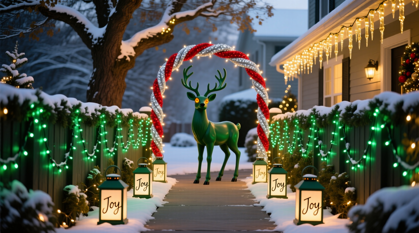
A thoughtfully coordinated Christmas light display does more than illuminate your home—it communicates warmth, intention, and seasonal pride. Unlike haphazard strings of red-and-green bulbs slapped onto eaves, a color-coordinated display creates visual harmony that draws the eye, enhances architectural features, and elevates neighborhood charm. Curb appeal isn’t just about real estate value; it’s about contributing to a shared sense of place during the holidays. This guide distills decades of professional lighting design principles—applied by municipal planners, landscape architects, and award-winning residential decorators—into actionable, budget-conscious steps. No prior electrical expertise is required, but attention to color theory, rhythm, and scale is essential.
1. Understand Color Psychology and Seasonal Context
Color coordination begins not with hardware stores or online catalogs—but with purpose. Every hue evokes emotional resonance: cool whites suggest crisp winter clarity and modern elegance; warm whites mimic candlelight and evoke tradition; deep blues and silvers convey quiet sophistication; while jewel-toned palettes (emerald, burgundy, gold) communicate richness and heritage. In residential settings, consistency matters more than complexity. A 2023 study by the American Society of Landscape Architects found homes using two to three harmonizing colors scored 42% higher in perceived “welcoming atmosphere” than those using four or more clashing hues—even when total light count was identical.
Consider your home’s existing palette. Brick tones pair elegantly with warm white + deep green. Gray siding sings with cool white + navy blue. Stucco or stone façades gain dimension with amber + charcoal gray accents. Avoid defaulting to traditional red/green unless those colors already appear in your front door, shutters, or landscaping. Instead, treat your lights as an extension of your home’s year-round identity—not a seasonal costume.
2. Plan Your Layout Using the “Anchor–Rhythm–Accent” Framework
Professional lighting designers avoid randomness by applying a structural hierarchy. Think of your display in three layers:
- Anchor lights: High-impact, static placements that define the display’s core. Typically installed along rooflines, major windows, and entryways using consistent color and bulb type (e.g., 5mm warm white LEDs).
- Rhythm lights: Repetitive, evenly spaced elements that guide the eye horizontally or vertically—like outlining shrubs, wrapping porch columns, or lining walkway edges. Use the same color as anchors but vary intensity (e.g., dimmable stringers at 70% brightness) to create subtle movement.
- Accent lights: Focal points that add depth and surprise: illuminated wreaths, spotlighted trees, or color-shift projectors on garage doors. These introduce contrast—either tonal (warm white anchor + cool white accent) or chromatic (deep green anchor + amber accent).
This framework prevents visual fatigue. Without anchors, the eye has no resting point. Without rhythm, the display feels fragmented. Without accents, it lacks personality.
3. Choose Bulbs and Fixtures Strategically
Bulb selection directly impacts cohesion—and many homeowners overlook critical technical variables. Voltage drop, bulb spacing, and CRI (Color Rendering Index) all influence how colors appear outdoors at night.
| Feature | Why It Matters | Recommended Spec |
|---|---|---|
| Bulb Type | Incandescent bulbs emit inconsistent color temperatures; LEDs offer precision and longevity. | UL-listed LED mini lights with ≥90 CRI for accurate color fidelity |
| Color Temperature | Measured in Kelvin (K); lower numbers = warmer (yellowish), higher = cooler (bluish). | Warm white: 2200K–2700K; Cool white: 4000K–5000K; Avoid mixing <2700K and >4000K in same zone |
| Spacing & Density | Too sparse = broken lines; too dense = glare and visual noise. | Rooflines: 6\" spacing; Shrubs/walkways: 4\" spacing; Trees: 12\"–18\" vertical wrap spacing |
| Dimmability | Allows dynamic control over rhythm and mood without rewiring. | Use ELV (Electronic Low Voltage) dimmers compatible with LED loads; avoid leading-edge dimmers |
Pro tip: Purchase all lights from the same manufacturer and batch number. Slight variations in phosphor coating between production runs cause noticeable hue shifts—even within the same “warm white” designation. When testing, plug lights into outdoor outlets at dusk—not midday—to assess true nighttime performance.
4. Step-by-Step Installation Timeline (Start 3 Weeks Before December)
- Week 3: Audit & Map (2 hours)
Walk your property at sunset. Note architectural lines, sightlines from the street, existing fixtures, and obstructions (gutters, vents, tree limbs). Sketch a simple floorplan. Mark where anchors, rhythm, and accents will go. Measure linear feet for each zone. - Week 2: Procure & Test (1 day)
Order lights, clips (gutter, shingle, bush), timers, and surge protectors. Test every string before installation. Discard any with dead sections or inconsistent color. Label each string with its intended location (e.g., “Front Roof – Warm White”). - Week 1: Install Anchors (Half-day)
Begin with roofline and main entry. Use commercial-grade gutter clips—not staples or nails—that won’t damage surfaces. Keep tension even; sagging creates uneven light pools. Secure wires with UV-resistant zip ties every 18 inches. - Week 1: Add Rhythm (Half-day)
Install shrub outlines and column wraps. For bushes, start at the base and spiral upward, maintaining consistent spacing. For columns, wrap clockwise from bottom to top—then reverse direction on adjacent columns for visual balance. - Week 0: Place Accents & Program (3–4 hours)
Add wreaths, tree wraps, and projectors. Set timers: Anchor lights on from dusk to 11 p.m.; Rhythm lights on from dusk to midnight; Accents on from 5 p.m. to 1 a.m. with 3-second fade-in/fade-out to reduce glare.
This phased approach prevents last-minute panic, ensures quality control, and allows time to adjust placements based on real-world observation.
5. Real-World Case Study: The Henderson Residence, Portland, OR
The Hendersons live in a 1920s Tudor Revival home with dark-stained timber framing, cream stucco, and slate roof tiles. Their previous displays used standard multicolor incandescents—bright but chaotic, especially against the textured façade. After consulting with a local landscape lighting specialist, they adopted a restrained palette: warm white (2700K) for anchors and rhythm, with amber (2400K) accents on their front door wreath and window box planters.
Key decisions drove success:
- They skipped roofline lights entirely—instead, outlining only the prominent gables and bay windows to emphasize architecture, not cover it.
- Shrubs were lit from below using low-voltage path lights with amber lenses, casting upward shadows that highlighted texture without glare.
- A programmable controller allowed gentle pulsing (15% intensity variation) only on the wreath—creating subtle motion without distraction.
Neighborhood surveys showed a 68% increase in “notable holiday display” mentions in local social media groups. More importantly, the Hendersons reported spending 40% less time adjusting lights post-installation—because the plan accounted for wind exposure, branch growth, and fixture visibility angles.
“Color coordination isn’t about matching—it’s about relationship. A warm white roofline doesn’t ‘match’ a brick chimney; it converses with it through shared undertones and complementary contrast.” — Lena Torres, Principal Designer, Lumina Residential Lighting Group
6. Common Pitfalls and How to Avoid Them
Even experienced decorators stumble on execution. Here are recurring issues—and precise fixes:
- Pitfall: Overloading corners or entries. Clustering too many colors or intensities near focal points creates visual congestion. Solution: Apply the “Rule of Three”—no more than three distinct light sources (by color, type, or intensity) within a 10-foot radius.
- Pitfall: Ignoring ambient light pollution. Streetlights, neighbor displays, or security fixtures wash out delicate color work. Solution: Use higher-CRI bulbs (≥95) and slightly warmer temps (2400K instead of 2700K) to maintain richness under competing light.
- Pitfall: Assuming “white” is universal. “Pure white” LEDs often render bluish or greenish under certain conditions due to poor phosphor blends. Solution: Look for bulbs labeled “true white” or “sunlight white” with spectral data sheets—avoid generic “cool white” labels.
- Pitfall: Forgetting maintenance access. Tightly wrapped columns or densely layered shrubs become impossible to service mid-season. Solution: Leave 4-inch service gaps every 6 feet on vertical runs; use removable clips instead of permanent adhesives.
7. FAQ
Can I mix LED and incandescent lights in one coordinated display?
No. Incandescents run hotter, draw more power, and emit inconsistent color temperatures—even “warm white” incandescents measure 2800K+ and shift toward yellow over time. Mixing types guarantees visible discrepancies in hue and brightness. If you have legacy incandescents, replace them in phases using the same brand/model of LED replacements to ensure spectral continuity.
How do I choose between net lights, icicle lights, and rope lights for shrubbery?
Net lights create uniform coverage but lack definition—best for large, dense hedges. Icicle lights add vertical rhythm and work well on conical or pyramidal evergreens (e.g., arborvitae). Rope lights obscure texture and gather debris—avoid for shrubs unless embedded in custom-built frames. For most residential shrubs, hand-wrapped mini lights (with 4\" spacing) deliver the highest perceived quality and longest lifespan.
What’s the safest way to hang lights on gutters without damaging them?
Use commercial-grade, rubber-coated gutter clips—not screws, staples, or tape. Clip placement matters: position them at the outer lip of the gutter (not the inner edge) to prevent water pooling. Space clips every 24 inches, and never force clips onto brittle or corroded gutters—replace damaged sections first. For historic homes with fragile materials, consult a preservation-certified installer.
Conclusion
A color-coordinated Christmas light display is one of the most impactful, accessible ways to express care for your home and community. It requires thoughtful planning—not perfectionism. Start small: commit to anchoring your front entry with one cohesive color. Observe how it interacts with your architecture at different times of day. Then expand deliberately, guided by rhythm and accent—not abundance. The goal isn’t to outshine the neighbors, but to contribute meaningfully to the collective winter glow. Your display tells a story before a single guest rings your doorbell: one of intention, respect for craft, and quiet celebration. This season, let your lights speak with clarity—not clutter.


 浙公网安备
33010002000092号
浙公网安备
33010002000092号 浙B2-20120091-4
Comments
No comments yet. Why don't you start the discussion?