
A well-designed website does more than just look good—it builds trust, guides users intuitively, and converts visitors into customers. In today’s digital landscape, aesthetics are inseparable from function. A cluttered layout, poor contrast, or confusing navigation can drive users away within seconds. On the other hand, a clean, cohesive design enhances credibility and user experience. The key lies in mastering foundational design principles that balance visual appeal with usability.
1. Master Visual Hierarchy for Clear Communication
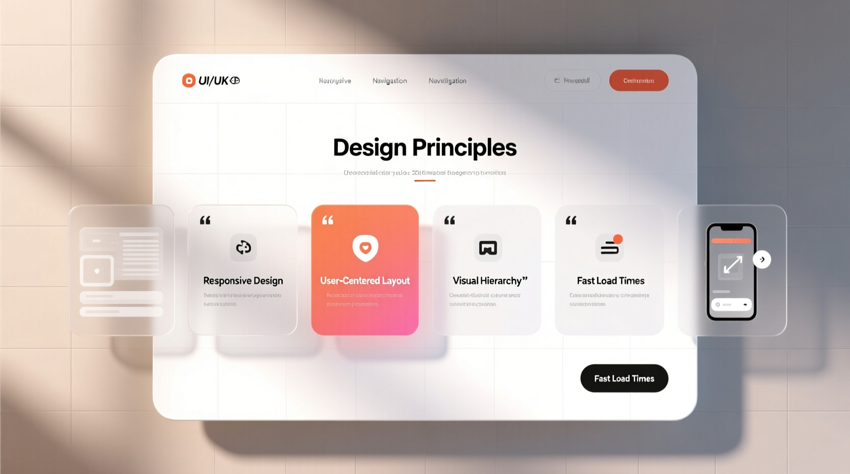
Visual hierarchy determines how users perceive and process information on your site. It guides the eye through content in order of importance using size, color, spacing, and contrast. Without it, even great content can be overlooked.
Start by defining the primary goal of each page. Is it to get sign-ups? Showcase a portfolio? Drive sales? Once clear, structure elements accordingly. Headlines should dominate, subheadings support, and body text remain readable but secondary. Use font weights—bold for emphasis, regular for standard text—and vary sizes to distinguish sections.
Whitespace (or negative space) is equally vital. Crowded pages feel overwhelming. Generous margins and padding between elements improve readability and create a sense of elegance. Apple’s website is a masterclass in this: minimal text, ample space, and powerful visuals that draw focus precisely where intended.
2. Choose Colors and Typography Strategically
Color psychology plays a subtle but powerful role in user perception. Blue conveys trust, often used by financial and tech sites. Red evokes urgency, common in retail calls to action. Green suggests growth or sustainability. Your palette should align with your brand identity and target audience.
Limited palettes work best. Stick to one primary color, one secondary, and neutral tones (white, gray, beige) for backgrounds and text. Overuse of colors distracts and dilutes impact. Tools like Adobe Color or Coolors.co help generate harmonious schemes based on color theory.
Typography impacts both tone and legibility. Sans-serif fonts like Open Sans or Inter are modern and clean, ideal for digital interfaces. Serif fonts like Georgia add sophistication but may reduce readability on small screens. Avoid using more than two typefaces—one for headings, one for body text—to maintain consistency.
“Typography is not just about picking a pretty font. It’s about creating rhythm, clarity, and emotional resonance.” — Erik Spiekermann, Type Designer & Author
Line height (1.5x font size), character spacing, and paragraph width (50–75 characters per line) all contribute to comfortable reading. Never sacrifice readability for style.
Do’s and Don’ts of Color and Typography
| Aspect | Do | Don't |
|---|---|---|
| Color Contrast | Use high contrast (e.g., dark text on light background) | Use low-contrast combinations like gray on white |
| Font Size | Minimum 16px for body text | Go below 14px on desktop |
| Typefaces | Leverage web-safe or Google Fonts for consistency | Mix more than two fonts without purpose |
| Text Alignment | Left-align for readability | Justify large blocks of text (creates uneven spacing) |
3. Design for Mobile-First Responsiveness
Over 60% of global web traffic comes from mobile devices. A site that looks great on desktop but breaks on phone is failing most users. Responsive design isn’t optional—it’s essential.
Adopt a mobile-first mindset: start designing for the smallest screen, then scale up. This forces prioritization of core content and eliminates unnecessary elements. Use fluid grids (percentage-based widths) instead of fixed pixels. Flexible images scale within containers, preventing overflow.
Touch targets matter. Buttons and links should be at least 44x44 pixels so fingers can tap them easily. Navigation menus must collapse into hamburger icons on smaller screens, with clear labels and sufficient spacing.
4. Optimize Layout and User Flow
A professional site feels intuitive. Users should know where to look and what to do next without thinking. Achieve this through consistent layout patterns and logical content grouping.
The F-pattern and Z-pattern are proven eye-tracking models. Most readers scan left to right, top to bottom in an F or Z shape. Place critical information—value proposition, CTAs, contact details—along these paths. The hero section above the fold should answer three questions immediately: What do you offer? Who is it for? What should I do next?
Grid systems bring order. Whether using CSS Grid or a framework like Bootstrap, aligning elements to a grid creates visual harmony. Consistent card sizes, equal spacing, and symmetrical balance enhance professionalism.
Mini Case Study: Revamping a Local Bakery Website
A small bakery had a website with blurry photos, inconsistent fonts, and no clear call to action. After redesigning with a warm color palette (cream, chocolate brown), high-quality product images, and a prominent “Order Online” button at the top right, conversions increased by 70% in six weeks. The new layout grouped products in a clean grid, added customer testimonials near the footer, and simplified navigation. By focusing on clarity and emotional appeal—using imagery of fresh bread and smiling staff—the site felt trustworthy and inviting.
5. Essential Design Checklist Before Launch
Before going live, verify these key elements to ensure your site looks polished and functions smoothly.
- ✅ Consistent branding: Logo, colors, and fonts match across all pages.
- ✅ Fast loading speed: Compress images, minify code, and use caching.
- ✅ Readable text: Sufficient contrast, proper font size, and line spacing.
- ✅ Mobile compatibility: Test on multiple devices and orientations.
- ✅ Clear navigation: Menu is visible, labeled simply, and includes a search bar if needed.
- ✅ Strong CTAs: Action buttons stand out with contrasting colors and compelling copy (e.g., “Get Started Free” vs. “Click Here”).
- ✅ Error-free forms: Labels, placeholders, and validation messages are clear.
- ✅ Accessibility compliance: Alt text for images, ARIA labels, keyboard navigability.
FAQ: Common Design Questions Answered
How many fonts should I use on my website?
Limit yourself to two fonts: one for headings, another for body text. Using more creates visual noise and undermines professionalism. Pair a bold sans-serif headline font with a clean, readable body font for optimal contrast and cohesion.
Is it okay to use stock photos?
Yes, but choose wisely. Generic, overused stock images hurt authenticity. Opt for high-quality, lifestyle-oriented photos that reflect real interactions. Better yet, invest in custom photography or curated illustrations that align with your brand voice.
How do I make my site feel more premium?
Premium feel comes from restraint. Use generous whitespace, elegant typography, subtle animations (like smooth hover effects), and a muted, intentional color palette. Avoid flashy banners, excessive pop-ups, or cluttered sidebars. Simplicity, when executed well, signals confidence and quality.
Conclusion: Design With Purpose
Creating a website that looks nice isn’t about chasing trends—it’s about applying timeless design principles with intention. From establishing visual hierarchy to choosing accessible typography and ensuring seamless responsiveness, every decision shapes user perception. A professional site doesn’t just impress; it guides, reassures, and converts.
Start small. Audit your current site. Does the headline grab attention? Can users find what they need in seconds? Is the design consistent across devices? Apply one improvement at a time, measure the impact, and iterate. Great design is never finished—it evolves with your audience and goals.


 浙公网安备
33010002000092号
浙公网安备
33010002000092号 浙B2-20120091-4
Comments
No comments yet. Why don't you start the discussion?