
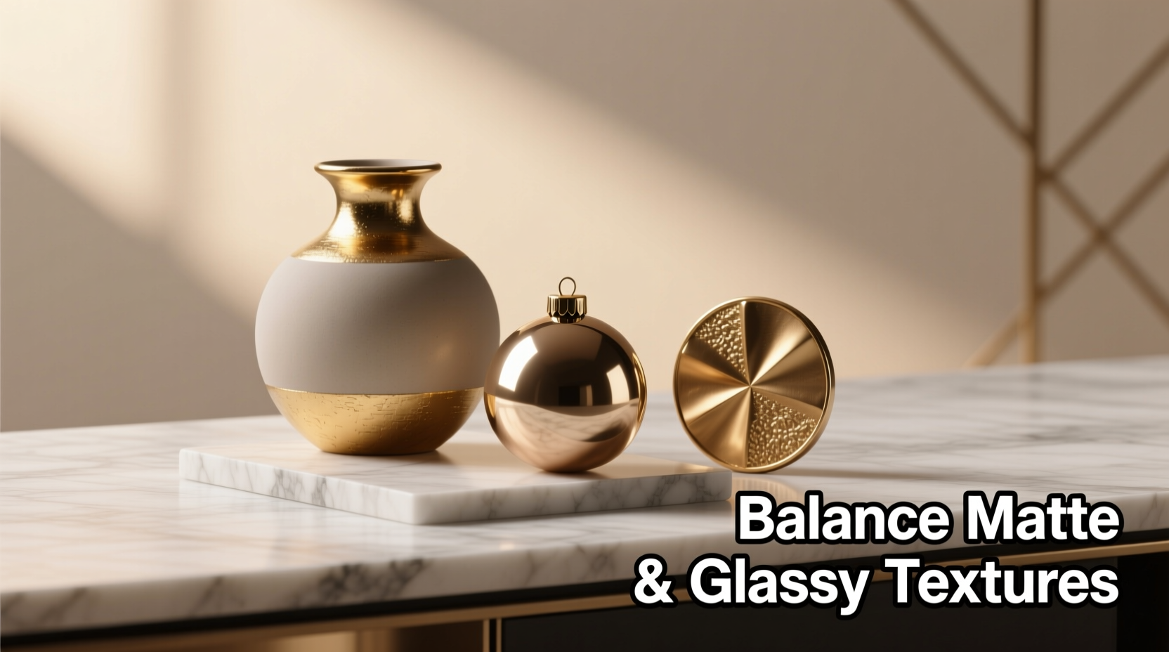
Texture harmony is one of the most subtle yet powerful levers in visual design—and one of the most frequently overlooked. Matte and glossy ornaments occupy opposite ends of the light-reflection spectrum: matte surfaces absorb light, offering quiet depth and tactile softness; glossy surfaces reflect it, delivering crisp definition, luminosity, and presence. When combined carelessly, they compete—creating visual static, tonal confusion, or a sense of disarray. But when balanced intentionally, they generate dimension, rhythm, and sophistication that neither finish could achieve alone. This isn’t about “matching” finishes—it’s about orchestrating contrast with purpose. Whether you’re styling a holiday mantel, curating a minimalist dining table, arranging ceramic collectibles on a shelf, or selecting accessories for a photoshoot, mastering this duality elevates your aesthetic from competent to compelling.
The Core Principle: Contrast Is Intentional, Not Accidental
Clashing rarely stems from using both finishes—it arises from imbalance. Glossy elements demand visual “breathing room”; matte ones thrive in layered proximity. Think of gloss as punctuation—a period, an exclamation, a bold underline—and matte as the body text: steady, legible, grounding. A space overloaded with glossy ornaments feels hyperactive or sterile; one saturated with matte pieces can read as flat or monotonous. The goal is not 50/50 parity, but strategic hierarchy: one finish anchors, the other accents.
Interior designer Lena Voss, whose work appears in Architectural Digest and Monocle, puts it plainly: “Gloss is never neutral. It’s always speaking—even when it’s silent. Matte, by contrast, listens. So ask yourself: what do you want the space to say? And who gets to speak first?”
Step-by-Step: Building a Balanced Ornament Composition
Follow this five-stage process to compose confidently—whether you’re styling a vignette, setting a festive table, or refreshing a gallery wall:
- Define Your Dominant Texture: Choose either matte *or* glossy as your base (60–70% of visible ornament count). If aiming for warmth and calm (e.g., a winter living room), start with matte ceramics, stone, or brushed metal. For energy and modernity (e.g., a boutique retail display), begin with high-gloss lacquer, glass, or polished resin.
- Select a Focal Glossy Element: Introduce exactly one strong glossy piece as your anchor—something with form, weight, or color intensity (e.g., a cobalt-glazed vase, a mirrored orb, or a black patent-leather box). Its role is to draw the eye and establish visual gravity.
- Add Supporting Matte Pieces: Layer 3–5 matte ornaments around the glossy anchor. Prioritize variation in scale and silhouette (e.g., a chunky linen-wrapped candle beside a slender matte porcelain bud vase and a low-slung travertine coaster). Avoid identical shapes—they flatten rhythm.
- Introduce a Secondary Glossy Accent: Add just *one* smaller, quieter glossy item—ideally in a complementary hue or material family (e.g., if your anchor is glossy ceramic, use a tiny brass ring dish with a satin-gloss patina). This creates echo, not repetition.
- Test the Light Flow: Observe your composition at two different times: under direct daylight and under warm ambient lighting. Does the glossy piece flare or disappear? Do matte items recede too far? Adjust placement—not quantity—to refine balance.
Do’s and Don’ts: A Practical Decision Matrix
Use this table to troubleshoot common missteps before they happen. Each row addresses a specific compositional risk:
| Risk Scenario | Do | Don’t |
|---|---|---|
| Glossy ornaments overpowering the space | Reduce glossy count to ≤2 per 3-ft linear zone; increase matte volume with organic shapes (pebbles, dried botanicals, unglazed clay) | Introduce more glossy items hoping to “balance” with more gloss |
| Matte ornaments looking dull or lifeless | Add one small, highly reflective glossy element (e.g., a mercury-glass bauble, a chrome-plated pinecone) placed where ambient light naturally hits it | Apply spray gloss sealant—this disrupts material integrity and creates unnatural sheen |
| Mixed metals + mixed finishes causing chaos | Unify via undertone: pair warm matte brass with warm glossy amber glass; cool matte nickel with cool glossy cobalt ceramic | Mix warm matte gold with cool glossy silver—unless deliberately creating intentional tension (advanced only) |
| Glossy items reflecting clutter instead of enhancing | Position glossy pieces facing clean, simple backdrops (a solid-color wall, a folded linen drape, a blank shelf panel) | Place glossy ornaments against busy wallpaper, patterned textiles, or crowded shelves |
| Seasonal decorations feeling “off” | In winter: matte wool, felt, and chalkware + 1–2 glossy lacquered balls or glass icicles. In summer: matte terracotta and sea-worn wood + glossy enameled citrus or mother-of-pearl shells | Using the same glossy-to-matte ratio year-round—seasons shift our perception of light and texture |
Real-World Case Study: The Bookshelf Transformation
Sarah K., a graphic designer in Portland, spent months frustrated by her built-in bookshelf. She’d collected matte stoneware mugs, raw-edge walnut boxes, and unglazed ceramic figurines—but after adding a pair of glossy black lacquer bookends she loved, the entire shelf looked “jarring and disjointed.” She tried removing the bookends, then replacing them with matte versions—but lost the structural clarity she needed.
Working with a stylist, Sarah applied the step-by-step method above. First, she designated matte as her dominant texture (keeping all existing ceramics and wood). She chose the larger lacquer bookend as her focal glossy anchor. Then she added three new matte pieces: a hand-thrown matte-white planter (varying height), a set of linen-bound poetry books (softening the line), and a single matte-black basalt paperweight (echoing the bookend’s hue without competing). Finally, she introduced a *tiny* glossy accent: a 1.5-inch obsidian sphere, placed precisely on the third shelf—where morning light caught it like a dark star.
The result? The shelf gained depth, intention, and quiet confidence. The glossy elements no longer shouted—they punctuated. Visitors now comment on its “calm authority,” not its texture conflict. Crucially, Sarah didn’t discard anything. She recontextualized.
Material Intelligence: Understanding Finish Behavior
Not all matte is equal. Not all gloss behaves the same. Ignoring material context leads to unintended clashes—even when ratios are perfect. Consider these intrinsic properties:
- Matte Ceramics: Often porous and slightly chalky; pairs best with soft-gloss finishes (e.g., satin enamel, frosted glass) rather than mirror-polished surfaces.
- Glossy Metals: Chrome or polished brass reflect full-spectrum light; they’ll amplify nearby colors. Place them near neutral matte tones (stone gray, oat, charcoal) to avoid chromatic vibration.
- Matte Glass: Appears foggy or velvety; works surprisingly well with high-gloss acrylic or lacquer because both are synthetic—creating a cohesive “man-made” dialogue.
- Natural Matte Textures (wood, stone, wool): Carry inherent variation. They tolerate bolder gloss accents because their irregularity absorbs visual noise.
- Glossy Plastics & Resins: Can feel cheap if isolated. Always ground them with at least two substantial matte-natural elements (e.g., a glossy resin orb beside a river-smooth stone and a handwoven jute basket).
“Texture mixing fails not because of incompatibility—but because we treat finish as decoration, not language. Gloss says ‘look here.’ Matte says ‘stay awhile.’ You wouldn’t shout over someone offering tea. Why would you let a glossy ornament shout over a serene matte landscape?” — Rafael Mendez, Material Curator, Cooper Hewitt Smithsonian Design Museum
FAQ: Clarifying Common Confusions
Can I mix matte and glossy in the same material—like matte-gloss ceramic glazes?
Absolutely—and it’s one of the most elegant solutions. Dual-finish ceramics (e.g., a vase with matte body and glossy rim, or a plate with glossy center and matte edge) embed contrast intrinsically. These pieces function as self-contained harmonies, requiring fewer supporting elements. Use them as your focal anchor, then build around them with monofinish ornaments to avoid overcomplication.
What if my space has lots of natural light? Does that change the ratio?
Yes—abundant natural light amplifies gloss. In sun-drenched rooms, reduce glossy ornament count by 30–50% and prioritize “soft gloss” (satin, eggshell, or semi-gloss) over high-shine. Matte pieces will hold their presence better in bright conditions, so lean into rich, deep matte tones (navy, forest green, burnt umber) to prevent visual washout.
Is there a minimum number of ornaments needed to make this work?
No minimum—but there is a functional threshold. With fewer than four ornaments, contrast becomes binary (matte vs. gloss), not compositional. Aim for at least one glossy + three matte pieces minimum to create rhythm. Two glossy items require at least five matte pieces to avoid competition. Simplicity demands greater precision, not less.
Conclusion: Your Texture Toolkit Starts Now
Mixing matte and glossy ornaments isn’t about solving a problem—it’s about unlocking expressive potential. Every glossy surface holds a sliver of light; every matte one cradles shadow. Together, they replicate the fundamental duality of perception itself: highlight and recess, emphasis and repose, moment and memory. You don’t need more objects. You need clearer intent. Start small: take three matte ornaments you already own and one glossy piece. Arrange them using the step-by-step method. Observe how light moves across them at different times of day. Notice where your eye lingers—and why. Refine one detail. Then another. Texture harmony is learned through attention, not acquisition.
This skill transfers far beyond décor. It sharpens your eye for product photography, informs thoughtful gift-wrapping, elevates event styling, and even deepens how you coordinate jewelry with clothing. Mastery lives in the pause between selection and placement—the moment you ask, “What does this piece need to be seen fully?”


 浙公网安备
33010002000092号
浙公网安备
33010002000092号 浙B2-20120091-4
Comments
No comments yet. Why don't you start the discussion?