
Designing a sports team T-shirt goes beyond aesthetics—it’s about identity, unity, and performance. Whether for a high school squad, amateur league, or corporate recreational team, the right T-shirt can boost morale, enhance team spirit, and even influence how opponents perceive your group. But crafting an effective design requires more than slapping a logo on fabric. It demands strategic planning, attention to detail, and an understanding of both visual communication and garment functionality.
A well-designed team shirt reflects values, fosters pride, and withstands the rigors of active use. From choosing colors that represent your team's energy to selecting breathable fabrics for peak comfort, every decision shapes the final impact. This guide walks through the essential stages of creating a standout sports team T-shirt, blending creative insight with practical execution.
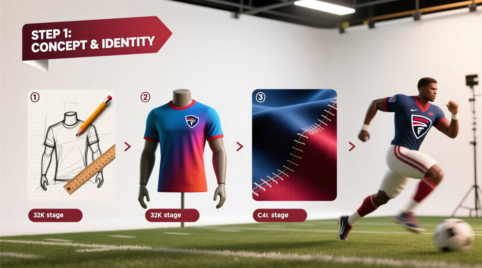
Step 1: Define Your Team Identity
Before sketching a single element, clarify what your team stands for. Is it speed? Resilience? Community? The answers shape everything from color schemes to typography. A strong identity ensures consistency across uniforms and strengthens brand recognition, especially in tournaments or local leagues.
Start by gathering input from players, coaches, and staff. Ask questions like:
- What emotions should the shirt evoke?
- Are there existing symbols, mascots, or slogans we want to preserve?
- Do we prefer bold and aggressive visuals or clean, professional styling?
This collaborative foundation prevents misaligned expectations and builds buy-in before production begins.
Step 2: Choose Colors and Typography Strategically
Color psychology plays a critical role in sports branding. Red signals intensity and aggression; blue conveys trust and calm focus; black exudes power and sophistication. Choose primary and secondary colors that reflect your team’s personality—but also consider visibility and contrast, especially if numbers or names must be legible from a distance.
Limit your palette to three main colors to maintain visual clarity. Overcomplicating with too many hues can make the design look cluttered and reduce print durability.
Typography should match the tone of your team. A sleek sans-serif font may suit a modern, fast-paced basketball team, while a rugged stencil style might fit a rugby or military-style challenge league. Always ensure readability at various sizes—especially on player backs during gameplay.
“Your jersey isn’t just clothing—it’s battlefield signage. Clarity and confidence win attention.” — Jordan Li, Sports Brand Consultant
Step 3: Design Layout with Purpose and Balance
A balanced layout enhances professionalism and visual appeal. Most team shirts follow standard placement zones:
| Element | Recommended Placement | Notes |
|---|---|---|
| Team Name/Logo | Chest or center front | Ensure visibility without crowding neckline |
| Player Number | Center back (large), sleeve or side (small) | Use high-contrast colors |
| Player Name | Above number on back | Capitalize last names for uniformity |
| Sponsor Logos | Front lower hem, sleeves, or shorts | Keep small and non-distracting |
| Mascot/Illustration | Back panel or full print | Avoid obstructing numbers |
White space is just as important as graphics. Crowded designs appear chaotic and wear poorly over time. Prioritize hierarchy: the most important information—team name, number—should dominate visually.
Mini Case Study: Riverside High Track Team Rebrand
Riverside High’s track team struggled with outdated, mismatched T-shirts that lacked cohesion. After conducting a student survey, they adopted a new identity centered on “speed and precision.” They chose a gradient of electric blue to white, symbolizing acceleration, paired with a sharp, angular custom font. The logo—a stylized cheetah silhouette—was placed subtly on the left chest, while large back numbers used reflective ink for nighttime meets.
The result? Not only did athletes feel more unified, but recruitment increased by 30% the following season. Opponents began referring to them as “the blue blur,” reinforcing the psychological edge their design created.
Step 4: Select Fabric and Fit for Performance
No matter how striking the design, poor fabric choice undermines utility. Athletes need moisture-wicking, breathable materials that move with the body. Common options include:
- Polyester blends – Durable, quick-drying, ideal for intense activity
- Tri-blend cotton – Soft feel with improved stretch and breathability
- Recycled performance fabric – Eco-friendly option gaining popularity in amateur and pro leagues
Fits should accommodate movement without excess bulk. Slim-fit cuts offer aerodynamic advantages for runners; relaxed fits work better for casual or mixed-gender teams. Always order size samples before bulk production to test comfort and print alignment.
Step 5: Finalize and Approve with a Design Checklist
Before sending your design to print, run through this verification checklist to avoid costly errors:
- ✅ Confirm all spellings (names, team, slogan)
- ✅ Verify color codes (PMS, HEX, or CMYK) match physical swatches
- ✅ Check file resolution (300 DPI minimum for prints)
- ✅ Ensure safe margins (no critical text within 1 inch of seams)
- ✅ Test contrast between background and text/numbers
- ✅ Validate sponsor logo usage rights and sizing compliance
- ✅ Obtain signed approval from team captain, coach, or committee
Using a digital proof tool provided by your printer allows stakeholders to view mockups on different body types and lighting conditions. Never skip this step—what looks good on screen may not translate to fabric.
Common Pitfalls to Avoid
Even experienced teams make avoidable mistakes. Watch out for these recurring issues:
- Overdesigning: Too many elements dilute impact. Less is often more.
- Ignoring scalability: A detailed mascot may look great on a poster but become a blur on a chest patch.
- Choosing fashion over function: Shiny foils or thick plastisol prints crack under stress—prioritize flexibility.
- Forgetting wash care: Provide care instructions to maintain color and print longevity.
FAQ
How do I copyright my team T-shirt design?
Original artwork and logos can be protected under copyright law. Register your design with your national copyright office (e.g., U.S. Copyright Office) for legal protection. Trademarks are recommended for logos and team names used commercially.
Can I use popular sports fonts legally?
Some fonts are free for personal use but require licensing for commercial application. Always check the license terms. Consider using open-source alternatives like \"Oswald\" or \"Bebas Neue\" with proper attribution if required.
What’s the best way to get feedback before printing?
Create a digital poll with two or three top design options and share it with team members. Include printed mockups at a team meeting for tactile review. Aim for consensus, not unanimity.
Conclusion
Creating a powerful sports team T-shirt is equal parts art and strategy. It’s not just about looking good—it’s about building identity, enhancing performance, and leaving a lasting impression. By defining your team’s essence, making informed design choices, and validating every detail before production, you create more than apparel: you forge a symbol of unity.
Now that you have the tools to craft a compelling, functional, and memorable team shirt, take the next step. Gather your team, refine your vision, and bring your design to life. A great jersey doesn’t just represent a team—it inspires one.


 浙公网安备
33010002000092号
浙公网安备
33010002000092号 浙B2-20120091-4
Comments
No comments yet. Why don't you start the discussion?