
Data visualization transforms complex information into accessible insights. Yet even the most sophisticated chart can mislead or confuse if its foundation—especially the Y axis—is poorly configured. Whether you're presenting financial trends, scientific measurements, or user behavior patterns, how you structure the vertical axis directly influences interpretation. A misleading scale can exaggerate minor fluctuations; a cluttered label set can obscure key takeaways. This guide breaks down the essential principles and practical techniques for customizing the Y axis to enhance clarity, accuracy, and impact in your visualizations.
Why the Y Axis Matters More Than You Think
The Y axis represents magnitude: values, frequencies, percentages, or other quantitative measures. Unlike decorative elements, it carries analytical weight. When improperly scaled or labeled, it distorts perception. For instance, starting a bar chart’s Y axis at 50 instead of zero may make small differences appear dramatic—a practice often criticized as “chart junk.” Conversely, an overly broad range can flatten meaningful variation, making trends invisible.
Effective customization isn’t about aesthetics alone—it’s about integrity. As Edward Tufte, pioneer of data visualization theory, stated:
“The representation of numbers, as computer graphics, should be directly proportional to the quantities represented.” — Edward Tufte, The Visual Display of Quantitative Information
This principle underpins all responsible Y axis design. Every decision—from scale type to tick mark placement—should serve truthfulness and comprehension.
Choosing the Right Scale Type
Not all data behaves linearly. Selecting the appropriate scale ensures that patterns are neither hidden nor exaggerated.
| Scale Type | Best For | Caution |
|---|---|---|
| Linear | Equal intervals (e.g., temperature, revenue) | Avoid when values span multiple orders of magnitude |
| Logarithmic | Exponential growth (e.g., virus spread, compound interest) | May confuse non-technical audiences; always label clearly |
| Percentage-based | Proportions out of 100% | Ensure total adds up correctly; avoid mixing % with absolute values |
| Dual-axis | Comparing two metrics with different units (e.g., sales vs. customer satisfaction) | Risk of misleading correlation; use only when logically justified |
For example, plotting global population growth from 1800 to today using a linear scale compresses early centuries into near invisibility. A logarithmic scale reveals steady exponential increase while preserving historical context.
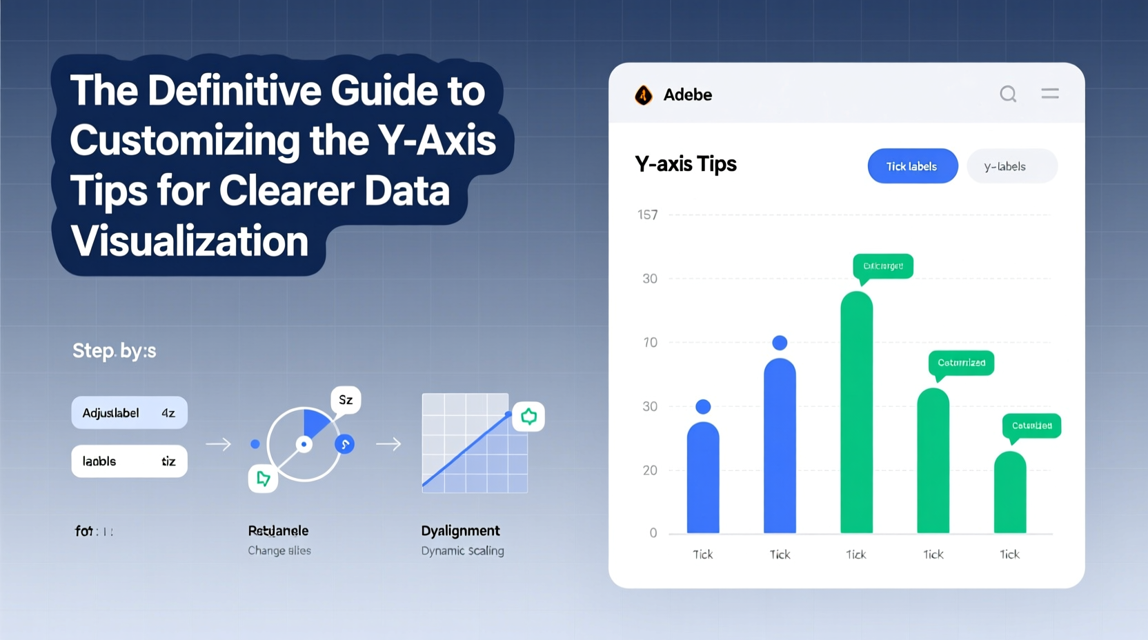
Optimizing Labeling and Tick Marks
Clean, well-placed labels prevent guesswork. Cluttered or ambiguous numbering forces viewers to work harder than necessary. Follow these guidelines:
- Use consistent decimal precision (e.g., 1.2K instead of 1,200 and 1.234K inconsistently).
- Round numbers where possible without losing meaning.
- Align labels vertically along the left edge unless space constraints require otherwise.
- Limit major tick marks to 5–7 per axis to reduce cognitive load.
Consider currency formatting: $1.2M communicates faster than 1200000. Similarly, time-series charts benefit from contextual units—“months since launch” often works better than raw dates.
Mini Case Study: Improving a Sales Dashboard
A SaaS company noticed stakeholders frequently misread quarterly revenue reports. The original line chart used a full-year timeline but started the Y axis at $750K despite revenues ranging from $760K to $820K. Stakeholders believed growth was explosive. After revising the chart to start at $700K and adding percentage change annotations, leadership made more measured decisions. The new version showed modest but steady improvement—accurately reflecting business performance.
Step-by-Step Guide to Customizing the Y Axis
Follow this sequence to ensure your Y axis supports clear communication:
- Define the purpose: Are you showing trends, comparisons, distributions, or deviations? Your goal shapes scale choices.
- Assess data range: Identify minimum, maximum, and average values. Note outliers.
- Select scale type: Choose linear, log, percentage, or dual based on distribution and intent.
- Set meaningful bounds: Avoid truncating unless absolutely necessary. If starting above zero, justify it with a footnote.
- Choose tick intervals: Use round numbers (e.g., 0, 20, 40) rather than arbitrary ones (e.g., 17, 34, 51).
- Format labels clearly: Include units ($, %, °C), abbreviate large numbers (K, M), and maintain font readability.
- Test with real users: Show the chart to someone unfamiliar with the data. Can they interpret it correctly within seconds?
Avoiding Common Pitfalls
Even experienced analysts fall into traps that undermine credibility. Here are frequent mistakes and how to fix them:
- Truncating without warning: Cutting off the bottom of a bar chart inflates perceived differences. Always add a zigzag break symbol or note: “Y axis does not start at zero.”
- Misaligned baselines: In grouped bar charts, ensure all series share the same baseline. Shifting origins create false impressions of superiority.
- Overloading dual axes: Combining unrelated metrics (e.g., profit margin and website visits) suggests causation where none exists. Only use dual axes when both variables relate directly to a shared narrative.
- Poor color contrast: Light gray ticks on white background disappear. Use high-contrast colors for axis lines and labels.
“Every element in a visualization should earn its place. If it doesn't clarify, it likely confuses.” — Alberto Cairo, data journalism professor and author of *The Truthful Art*
Checklist: Final Review Before Publishing
Before sharing any chart, run through this checklist:
- ✅ Does the Y axis start at zero? If not, is there a valid reason and clear disclosure?
- ✅ Are units and symbols (%, $, etc.) consistently applied?
- ✅ Is the scale appropriate for the data type (linear vs. log)?
- ✅ Are tick marks spaced evenly and labeled clearly?
- ✅ Can the main insight be grasped in under 10 seconds?
- ✅ Have I tested it with a colleague unfamiliar with the dataset?
Frequently Asked Questions
When is it acceptable to start the Y axis above zero?
In line charts showing subtle but important changes over time—such as stock price movements or sensor readings—a non-zero baseline can reveal detail that would otherwise be flattened. However, this must be done transparently, ideally with a note explaining the choice. Bar charts should almost always start at zero, as their area encodes value.
How do I handle extremely large or small numbers on the Y axis?
Use scientific notation or unit scaling. Instead of displaying 1,500,000, write 1.5M and label the axis “Revenue (in millions).” For very small values, switch to thousands (e.g., 0.75K) or apply SI prefixes (μ, n, p) where appropriate. Always prioritize audience familiarity over technical precision.
Can I rotate Y axis labels?
Only if necessary due to long text (e.g., category names). For numerical labels, keep them horizontal. Rotated number labels impair quick scanning. If space is tight, consider reducing font size slightly or adjusting chart dimensions before rotating.
Conclusion: Elevate Your Data Storytelling
Customizing the Y axis is not a technical afterthought—it’s a core component of honest, effective communication. By thoughtfully selecting scales, refining labels, and avoiding deceptive practices, you empower your audience to see what matters. Great visualizations don’t just display data; they reveal truth. Apply these strategies to every chart you create, and watch your insights gain clarity, trust, and impact.


 浙公网安备
33010002000092号
浙公网安备
33010002000092号 浙B2-20120091-4
Comments
No comments yet. Why don't you start the discussion?