
In a world where we switch between smartphones, tablets, laptops, and smart TVs daily, consistent readability is essential. Yet many users struggle with text that’s too small on one device or too large on another. Whether you're dealing with aging eyesight, sharing devices with family members, or simply optimizing your digital experience, knowing how to adjust font sizes efficiently can make a dramatic difference in comfort and productivity.
This guide breaks down practical, device-specific methods to control font size—without sacrificing design integrity or usability. From operating system settings to browser tools and app-level controls, you’ll learn how to create a seamless reading experience across every screen you use.
Why Font Size Consistency Matters
Text size affects more than just legibility—it influences user experience, accessibility, and even eye strain. According to the American Optometric Association, prolonged screen time with poorly scaled text contributes to digital eye fatigue, headaches, and reduced focus. A 2023 study by the Web Accessibility Initiative found that 68% of users over 50 adjusted their device’s default font settings within the first week of use.
“Font size isn’t just about preference—it’s a critical component of inclusive design.” — Dr. Lena Patel, Human-Computer Interaction Researcher at MIT
Consistent typography ensures that content remains accessible regardless of the device. It also supports users with visual impairments, dyslexia, or attention disorders who rely on larger, clearer text to process information effectively.
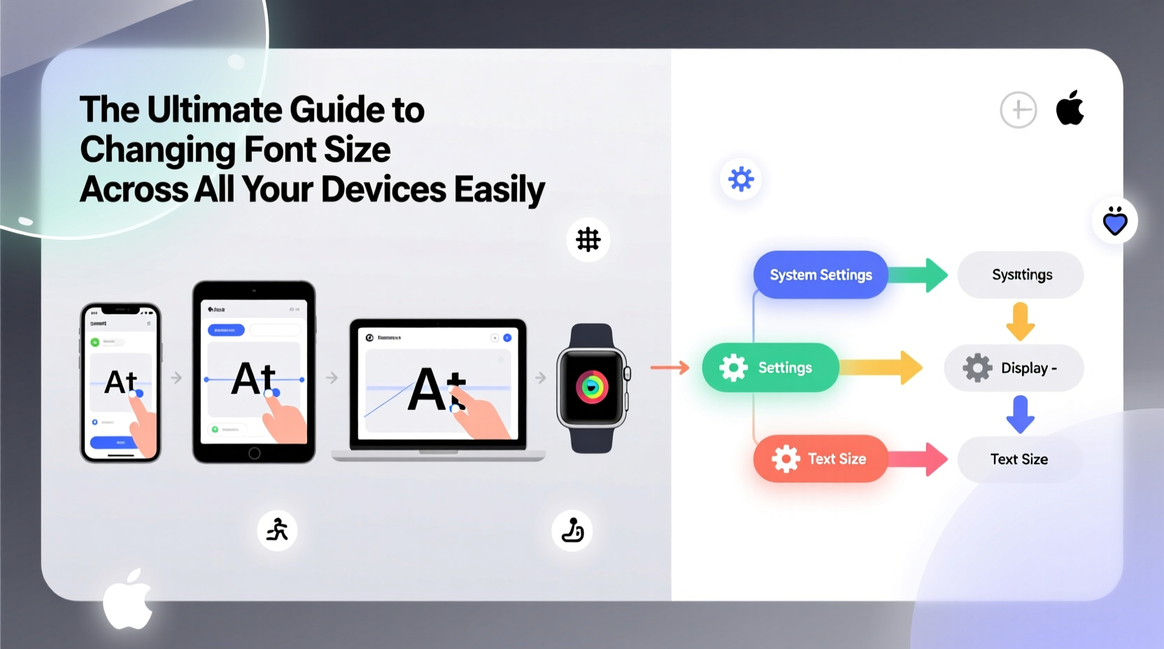
How to Change Font Size on Major Operating Systems
Each operating system offers built-in tools to scale text globally or per application. These settings override most individual app defaults, making them ideal for users seeking uniformity.
Windows 10 & 11
Windows allows both display scaling and specific text resizing:
- Open Settings > System > Display.
- Adjust the “Scale” percentage (e.g., 100%, 125%, 150%).
- For finer text control, click “Advanced scaling settings” and set a custom scale (up to 500%).
- To change only text size: Go to Settings > Accessibility > Text size, then use the slider.
macOS
Apple uses dynamic scaling based on resolution rather than direct font adjustment:
- Navigate to System Settings > Display.
- Select a scaled resolution under “Display Scaling” to increase UI elements, including text.
- For apps like Mail or Books, use View > Bigger Text for document-specific changes.
Note: macOS doesn’t allow global font substitution, but third-party tools like JustResize can offer additional control.
iOS (iPhone & iPad)
Apple excels in accessibility here:
- Go to Settings > Accessibility > Display & Text Size.
- Select “Larger Text” and enable “Larger Accessibility Sizes” for extreme scaling (up to 1,000%).
- Use the slider to adjust system-wide font size instantly.
This setting affects Messages, Safari, Mail, and most third-party apps that follow Apple’s UI guidelines.
Android
Android provides flexible font and display size options:
- Open Settings > Display > Font size and style.
- Drag the slider to adjust font size (options vary by manufacturer).
- Some brands (e.g., Samsung) offer “Accessibility font size” for even larger text.
On Samsung devices, go to Settings > Accessibility > Font size and color for granular control, including bolding.
Browser-Level Font Adjustments for Web Content
When websites ignore responsive design principles, browser tools become essential for readability.
Google Chrome
- Press Ctrl + (or Cmd + on Mac) to zoom in.
- Press Ctrl - to zoom out.
- Set default zoom: Go to Settings > Appearance > Page Zoom.
- Enable “Force direction-aware caret navigation” under Accessibility settings for smoother scrolling with enlarged text.
Mozilla Firefox
Firefox offers advanced typography control:
- Type
about:configin the address bar and accept the warning. - Search for
layout.css.devPixelsPerPx. - Change the value from “1.0” to “1.25” or higher to globally scale content.
You can also install add-ons like “Zoom Page WE” for persistent site-specific scaling.
Safari (Desktop & iOS)
- Use Cmd + or Cmd - to zoom pages.
- Set minimum font size: In Safari > Preferences > Advanced, check “Never use font sizes smaller than” and choose a value (e.g., 16px).
| Browser | Global Scale Option | Minimum Font Control | Persistent Zoom |
|---|---|---|---|
| Chrome | Yes (via page zoom) | No | Site-specific |
| Firefox | Yes (via DPI override) | Yes | Yes (with extensions) |
| Safari | Limited (zoom only) | Yes | No |
| Edge | Yes (syncs with Windows scale) | No | Site-specific |
App-Specific Font Controls You Should Know
Many popular apps include internal font settings that override system preferences. Here are key examples:
- Kindle App: Tap the top of the screen while reading, then select “Aa” to adjust font type, size, and margins.
- Google Docs: Highlight text and use the font size dropdown (default is 11pt; consider 12–14pt for easier reading).
- Outlook / Gmail: Compose emails using larger fonts, or set default message formatting in settings.
- Twitter/X: Enable “Larger text” in Accessibility settings within the app.
Mini Case Study: Sarah’s Cross-Device Workflow
Sarah, a freelance writer in her late 50s, works across a MacBook Pro, iPad, and Android phone. She initially struggled with switching between devices due to inconsistent text sizing—emails looked fine on her laptop but were nearly unreadable on her phone.
She resolved this by:
- Setting her Android font to “Large” and enabling bold text.
- Using Safari with a minimum font size of 16px on her iPad.
- Configuring Chrome on her Mac to default to 125% zoom on news and email sites.
- Switching to apps like Notion and Google Keep that sync font preferences via account settings.
Within a week, her eye strain decreased significantly, and she reported a 20% improvement in editing speed due to reduced scrolling and squinting.
Best Practices Checklist
Follow this checklist to ensure optimal font readability across all your devices:
- ✅ Audit each device’s default font size and adjust for comfort.
- ✅ Enable system-wide accessibility text scaling where available.
- ✅ Set minimum font sizes in browsers to block tiny web text.
- ✅ Use high-contrast themes to enhance legibility at larger sizes.
- ✅ Test readability in ambient lighting conditions (e.g., sunlight, dim rooms).
- ✅ Sync preferences via cloud accounts (e.g., Google, Apple ID) for consistent app behavior.
Frequently Asked Questions
Can changing font size affect battery life?
Not directly. However, increasing display scaling may cause slightly higher GPU usage on low-resolution screens, but the impact is negligible on modern devices.
Why do some websites ignore my browser’s font settings?
Some sites use fixed pixel values (e.g., “12px”) instead of relative units like “rem” or “em,” making them resistant to browser zoom. This is poor accessibility practice, but common in older designs.
Is there a universal font size recommendation?
For general reading, 16px is considered the baseline for web content. On mobile devices, aim for at least 18px body text. Print equivalents suggest 10–12pt for standard documents.
Final Thoughts: Take Control of Your Digital Readability
Font size should never be an afterthought. With a few strategic adjustments, you can transform your digital environment into one that’s comfortable, accessible, and efficient. The goal isn’t just bigger text—it’s smarter typography tailored to your lifestyle and needs.


 浙公网安备
33010002000092号
浙公网安备
33010002000092号 浙B2-20120091-4
Comments
No comments yet. Why don't you start the discussion?